Most of us are familiar with standard Excel chart types such as a pie chart, a column chart, and a line chart, as well as the types of data they are used to showcase visually. Excel, however, offers a wide variety of charts and chart subtypes such as the doughnut chart, bubble chart, and pie of pie chart.
Charts such as the doughnut chart, bubble chart, and pie of pie chart are often utilized in infographics and dashboard reports. Infographics are very popular in the world of content marketing and are advanced forms of data visualizations that usually contain charts, graphics, and text.
So, let’s get started with a few simple examples in order to see how to create the doughnut chart, bubble chart, and pie of pie chart.
How to Create a Doughnut Chart
A doughnut chart is similar to a pie chart, in that it also shows the relationship of parts to a whole. The doughnut chart can, however, showcase more than one series.
We have a simple data set showing regions and the corresponding sales data for each region in our example below.
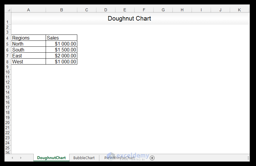
1) First things first, select the data.
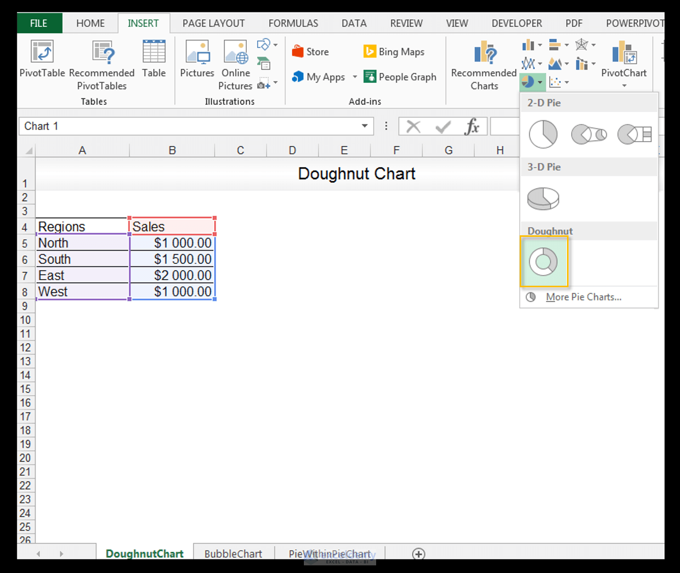
2) Go to Insert>Charts>click on the drop-down arrow next to Pie Chart and select Doughnut Chart.
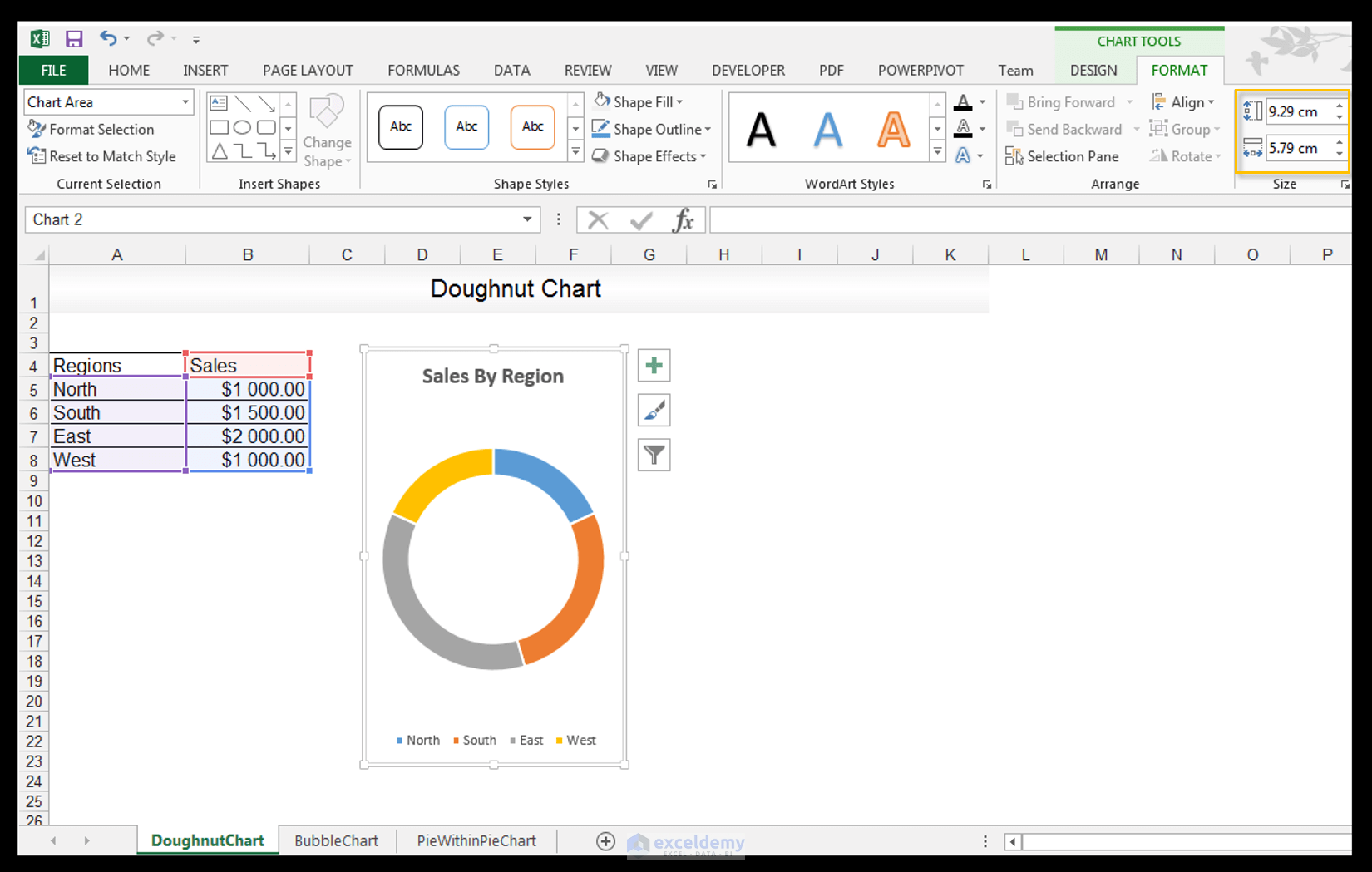
3) Select the default chart title of Sales and change the title to Sales by Region and set the font to bold.

4) Select the chart and resize the chart to 9.29 cm by 5.79 cm, by going to Chart Tools>Format>Size and changing the size of the chart as shown below.
5) Select the plot area of the chart and go to Chart Tools> Format>Shape Styles and fill with White, Background 1, Darker 5% fill.
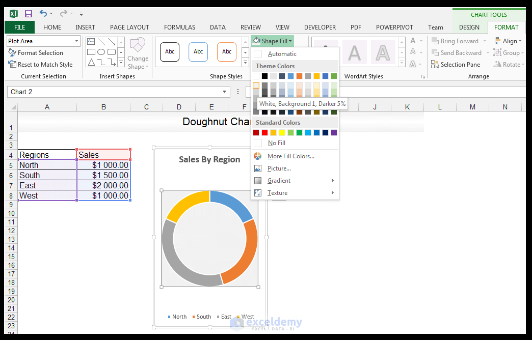
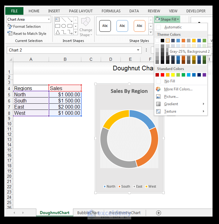
6) Now select the entire chart area and go to Chart Tools> Format>Shape Styles and fill with Gray -25 %, Background 2 as shown below.
7) Select only the plot area again and go to Chart Tools> Format>Shape Styles but this time click on the drop-down arrow next to Shape Effects. Choose Outer Shadow and select the Offset Center outer shadow as shown below.

8) Now select the legend and increase the font size to 10.
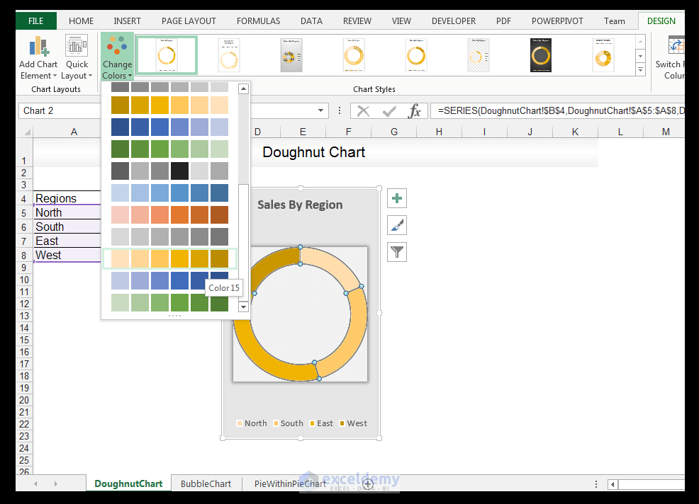
9) Select all the series and go to Chart Tools>Design>Chart Styles and click on the drop-down arrow next to Change Chart Colors. Change the color scheme to Monochromatic, color 15 as shown.
10) With the series still selected, change the Shape Outline color to White, Background 1, Darker 35%.

11) Change the weight of the outline to ½ pt as shown.

12) Change the outline color/border of the whole chart to White, Background 1, Darker 35%, and there you have it.

Read More: How to Change Color Based on Value in Excel Doughnut Chart
How to Create a Bubble Chart
A bubble chart is a type of XY-scatter chart, with an additional dimension represented by the size of the bubbles. A bubble chart plots x, y, and z values.
Read More: Elements of an Excel Chart
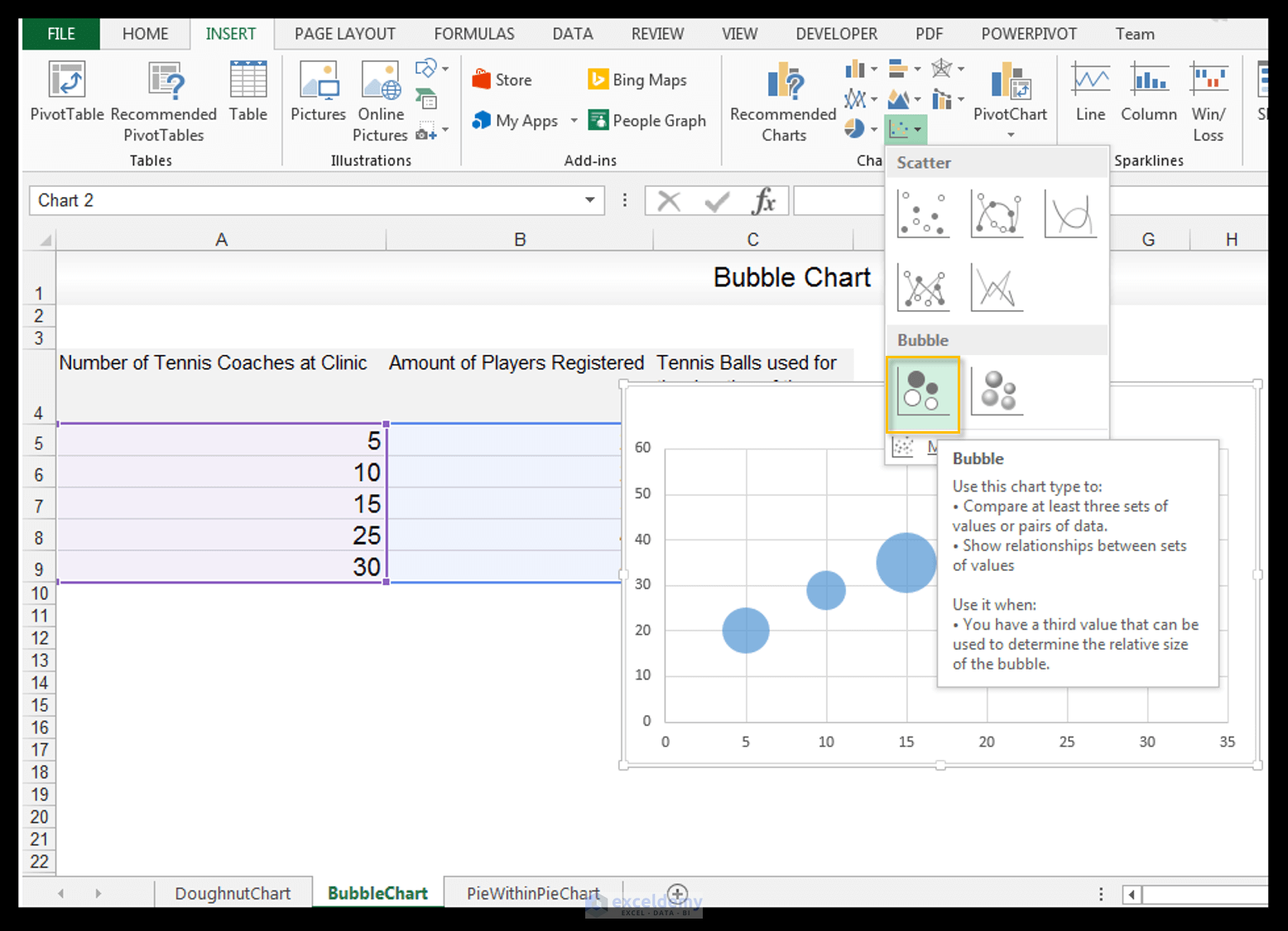
We have a simple data set showing the number of tennis coaches employed to help run a tennis clinic, a number of tennis players registered that received training at the clinic, and a number of tennis balls used up for the duration of the tennis clinic, below.

1) First things first, select the data.

2) Go to Insert>Charts>Click on the drop-down arrow next to XY scatter and select Bubble Chart.
3) Select the default chart title Sales and change the title to Number of Coaches versus Players versus Balls used.
Read More: How to Make a Control Chart with Excel VBA!
4) Change the font of the title to bold and the size to 10 and delete the vertical and horizontal gridlines.

5) Add a primary horizontal axis called the Number of Coaches. This is for the x values. Add a primary vertical axis called Amount of Players. This is for the y values. This is done the same way one would do for a normal XY scatter plot. With the chart selected, go to Chart Tools>Design>Chart Layouts. Click on the drop-down arrow next to Add Chart Element>Axis Titles>Primary Horizontal to add the x-axis title, and then follow the same process but choose Primary Vertical to add the y-axis title.

6) With the chart selected, click the plus sign next to the chart to activate the Chart Elements Menu. Select Data Labels>More Options.

7) In the Format Data Labels Panel, with Label Options expanded, deselect the Y Value if checked and check Bubble Size instead.
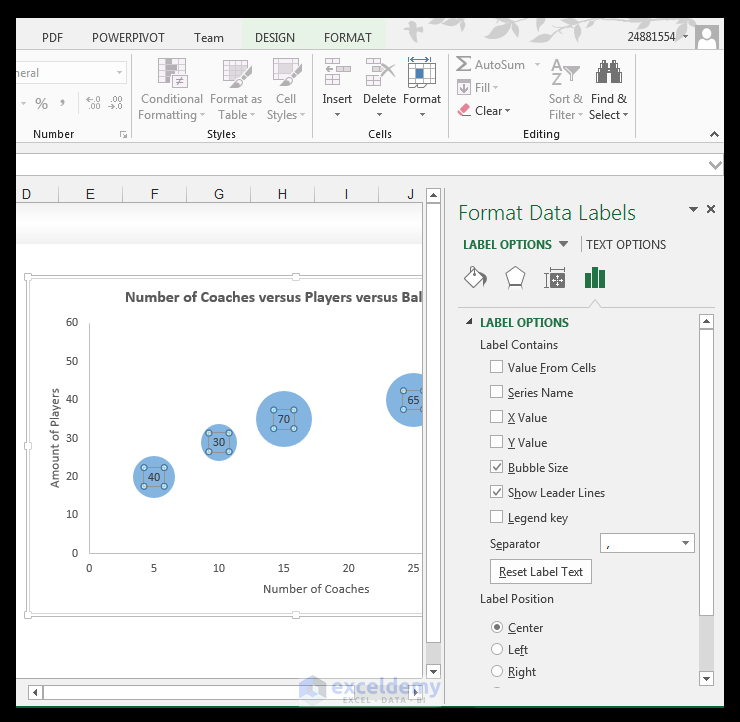
8) Format the data labels, while they are all still selected, by going to Chart Tools>Format>Shape Styles and choosing a Shape Fill of Gray -25%, Background 2 color.

9) And there you have it the z-values are also showcased on the chart, and of course, denoted by the size of the actual bubbles.

Read More: How to Make a Pie Chart in Excel [Video Tutorial]
How to Create a Pie of Pie Chart
A pie of pie chart is utilized, when one wants to showcase the parts to the whole, but you have more than seven items and as a result, one’s pie will have too many slices.
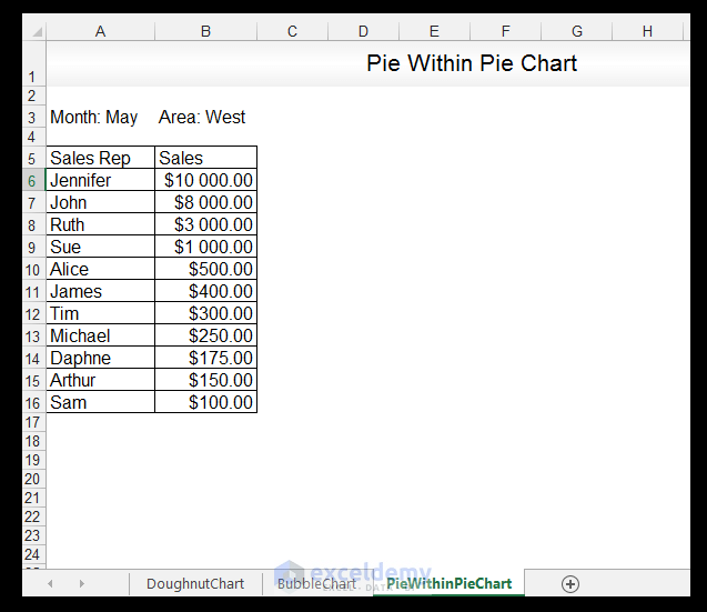
We have a simple data set showing the name of the sales rep designated to the West area, and their corresponding sales for the month of May in our example below.
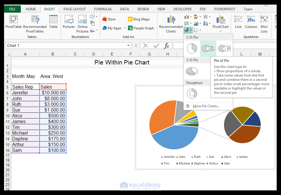
1) First things first for this type of chart, sort the data by largest to smallest on the Sales column, if the data is not sorted already. Once done sorting, select the data.

2) Go to Insert> Charts> click on the drop-down arrow next to Pie Chart and select the Pie of Pie Chart.
3) Delete the legend.
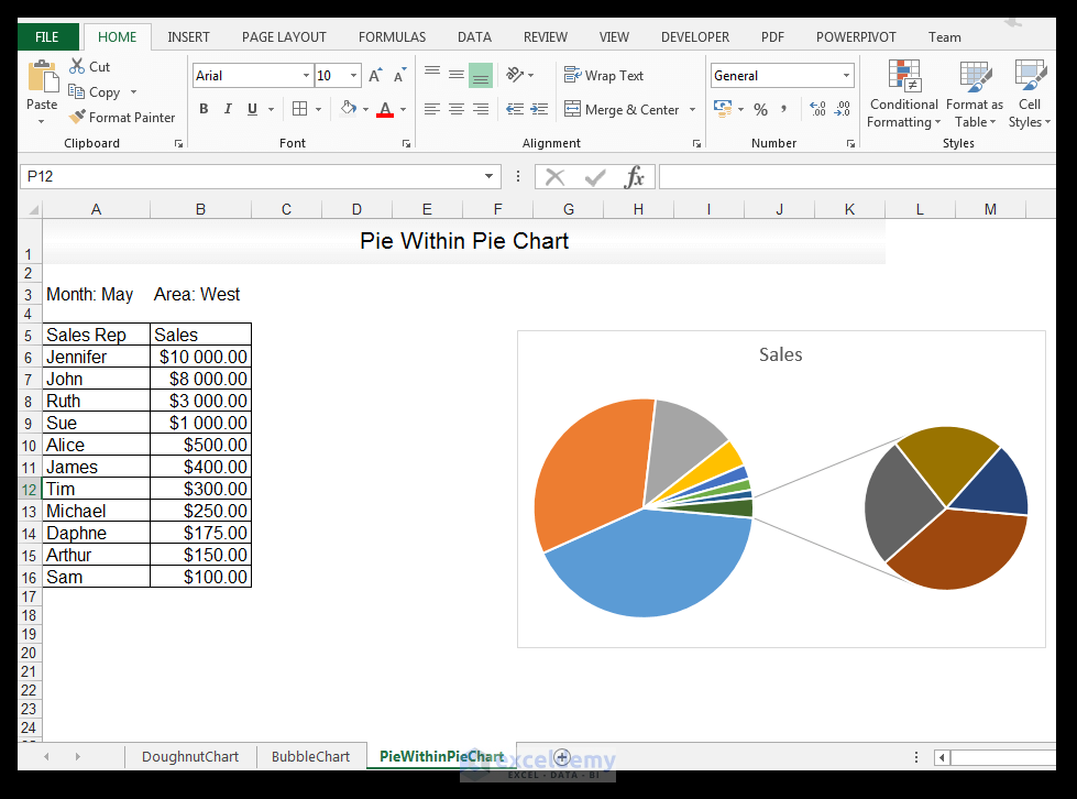
4) Change the chart title to Sales Rep Sales for the Month of May. Change the font size to 11 and set the style to bold.
Read More: How Excel Handle Charts, Embedded Charts and Chart Sheets
5) Select all the data series, right-click and choose Format Data Series…….
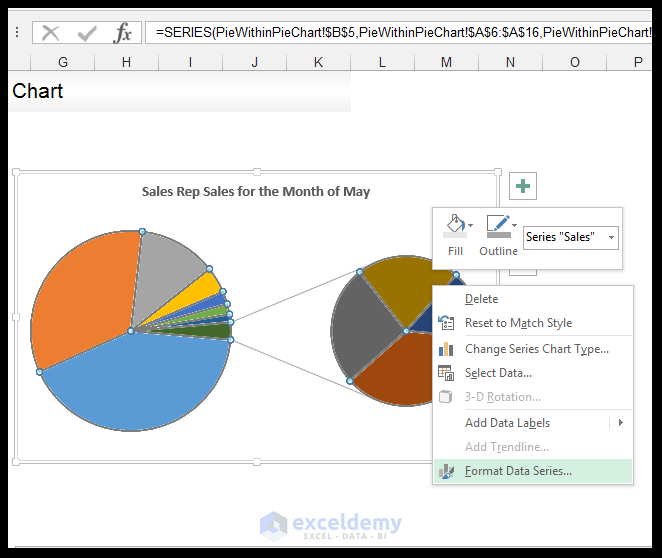
6) In the Format Data Series Panel, with Series Options expanded, set the Values in the second plot to 6.
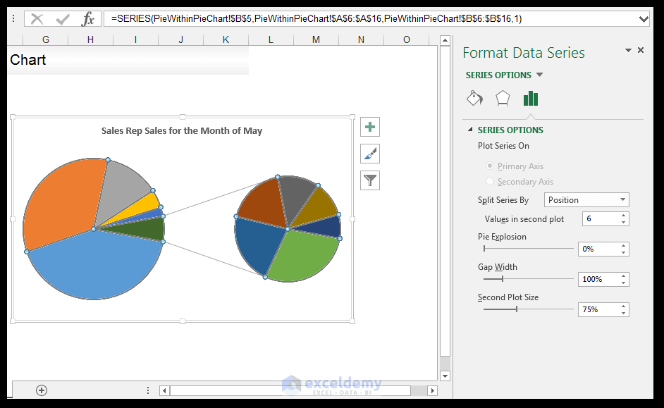
7) Close the options panel.
8) With the chart selected, click the plus sign next to the chart to activate the Chart Elements Menu, select Data Labels>More Options.
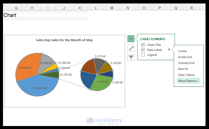
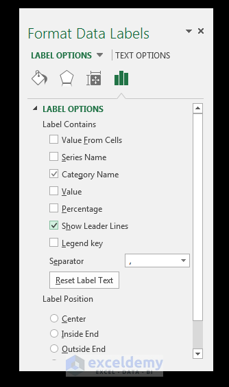
9) In the Format Data Labels Panel, with Label Options expanded, make sure only Category Name and show Leader Lines are checked.
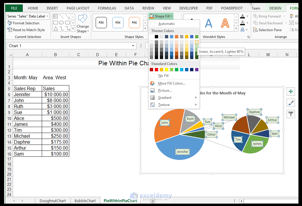
10) Format the data labels, while they are all still selected, by going to Chart Tools>Format>Shape Styles and choosing a Shape Fill of Green, Accent 6, Lighter 80%.
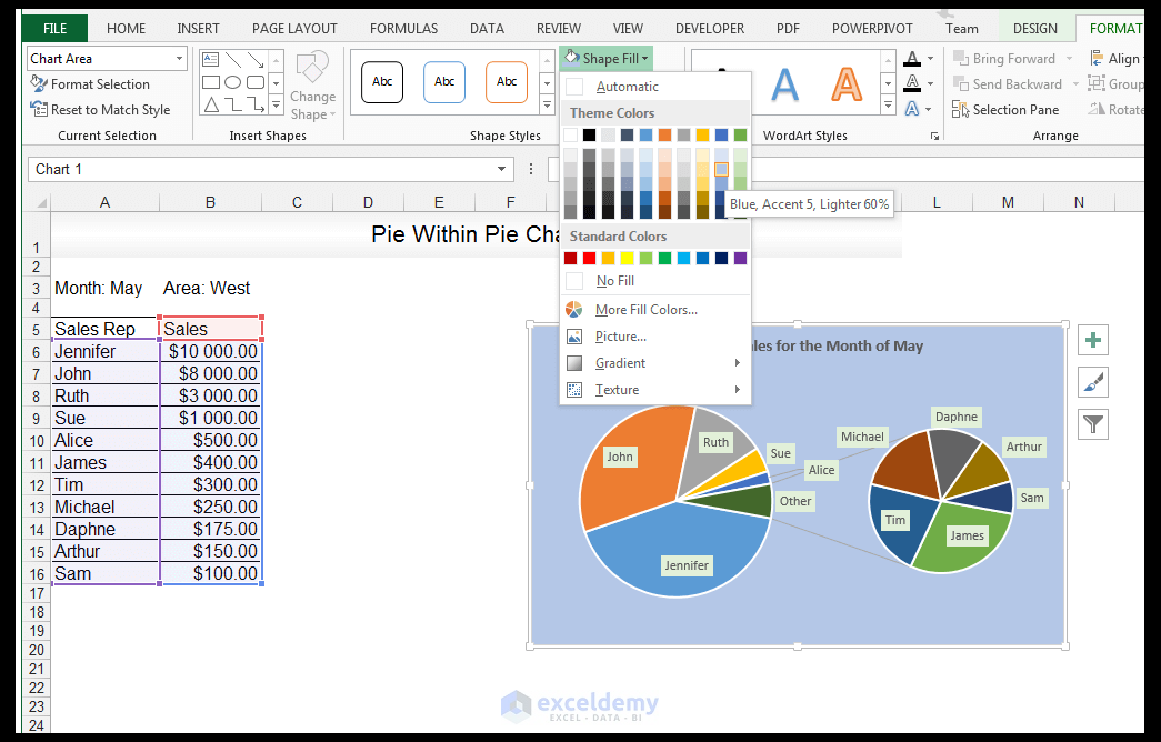
11) Now select the entire chart area and go to Chart Tools> Format>Shape Styles and fill with Blue, Accent 5, Lighter 60%.
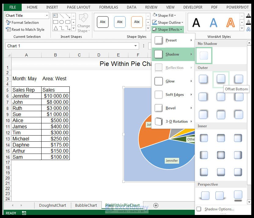
12) Select the chart title and change the chart title background to white and give it an Offset Bottom background shadow.
13) Increase the size of the chart.

14) Select the two gray lines leading to the second pie chart, go to Chart Tools>Format>Shape Styles, and select Intense Line – Accent 1 from the drop-down options.
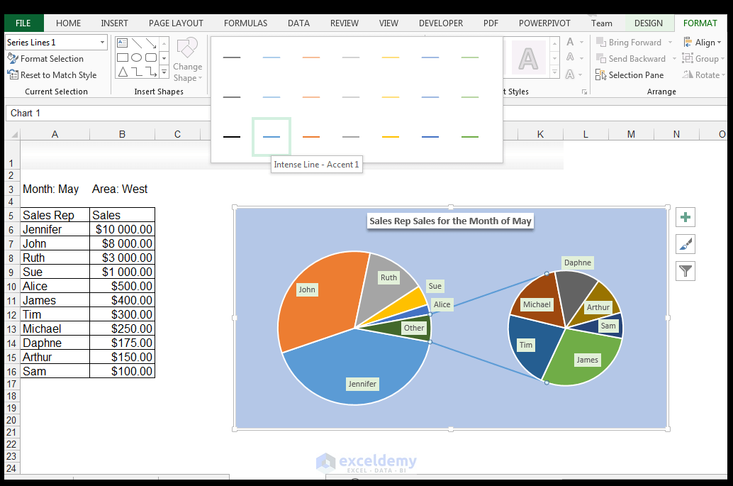
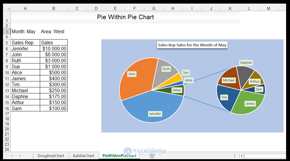
And there you have it.
Read More: How to Make a Pie Chart with Multiple Data in Excel (2 Ways)
Download Working File
DoughnutChart-BubbleChart-PieWithinPieChart
Conclusion
The doughnut chart, the bubble chart, and the pie of pie chart are increasingly being utilized in the infographic space. Excel provides ways of creating and formatting these charts for use in infographics and as part of standard data visualization.
Please feel free to comment and tell us if you utilize doughnut charts, bubble charts, and pie of pie charts to showcase/display your data in spreadsheets, presentations, or infographics.
Related Articles
- How to Change Hole Size of Excel Doughnut Chart
- How to Create Curved Labels in Excel Doughnut Chart (With Easy Steps)
- How to Make Doughnut Chart with Total in Middle in Excel
- Excel Doughnut Chart with Multiple Rings (Create with Easy Steps)
- How to Make a Pie Chart in Excel with Words (with Easy Steps)
- How to Show Pie Chart Data Labels in Percentage in Excel

