Method 1 – Create a Doughnut Chart
Steps:
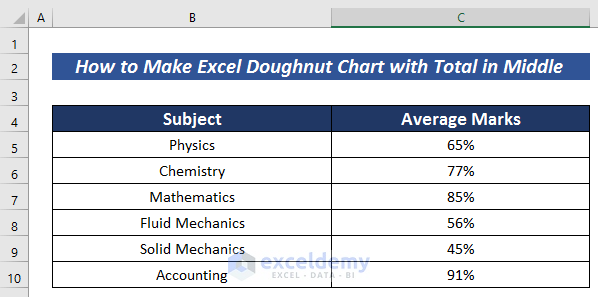
- Created a dataset with an institution’s average marks in different subjects. Categorize them into the Subject and Average Marks columns.
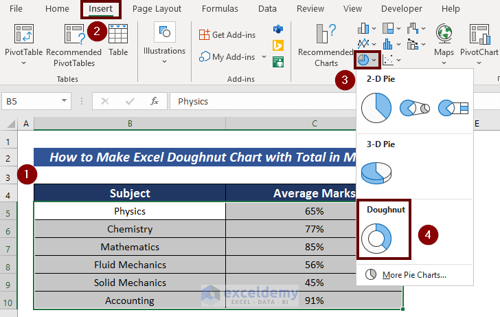
- Select all the data.
- Go to the Insert tab.
- Click Insert Pie or Doughnut Chart from the ribbon.
- Choose the Doughnut option.
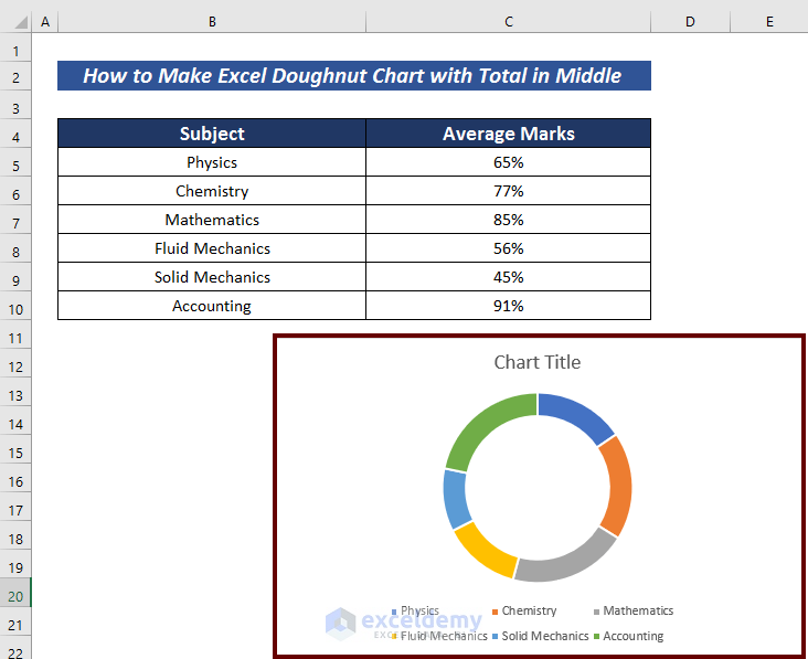
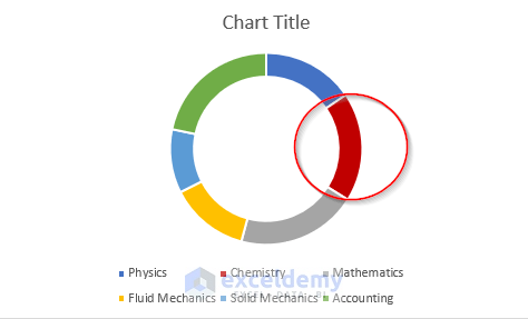
Hhave a doughnut chart.
Method 2 – Customize the Doughnut Chart
Steps:
- Right-click on a portion of the doughnut chart to change its color.
- Click on the Fill option.
- Choose a color.
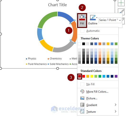
Set the color of that portion of the doughnut chart. You can change the color of each doughnut portion according to your choice.
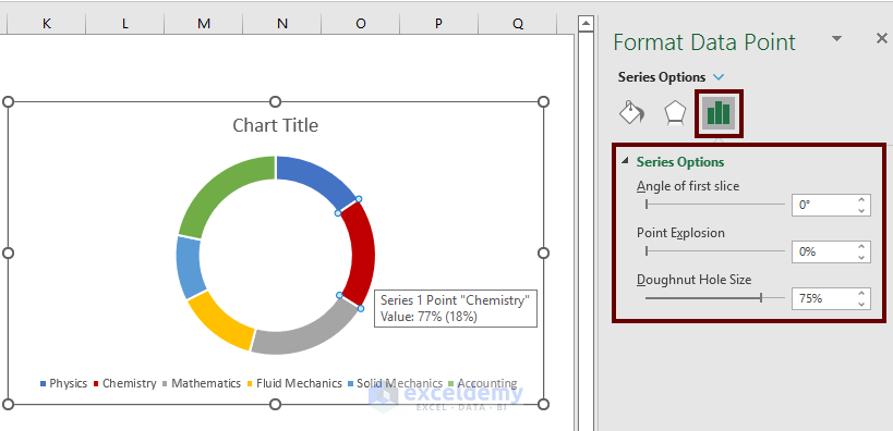
- Click the doughnut chart to have more editing options.
Edit your whole doughnut chart. Change the shape of the doughnut; changing the hole size of the Doughnut Chart from Format Data Point option.
- Add a suitable title from the Chart Title section.
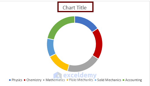
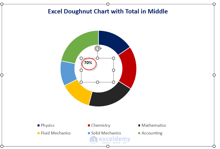
We added a doughnut chart where we customized the color of several portions of the doughnut chart, added a suitable title, and enhanced the doughnut size.
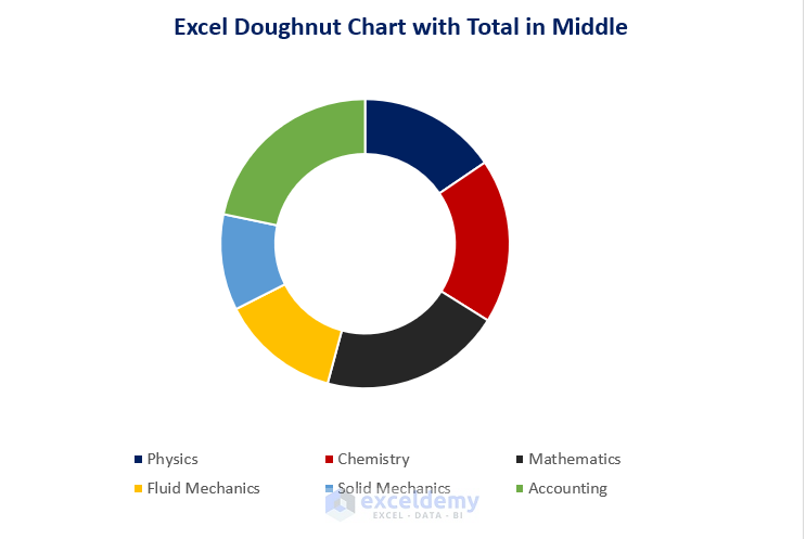
Method 3 – Add Total in the Middle of Doughnut Chart
Steps:
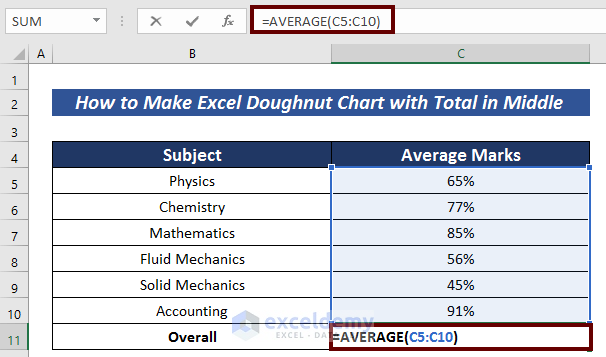
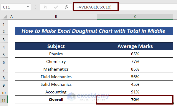
- Find the suitable value to add in the middle. Add the overall average value in the middle of the doughnut chart. We calculated the average of those institutions in combined subjects.
=AVERAGE(C5:C10)The AVERAGE function returns the average value in cells C5:C10.
- Press ENTER to have the average value.
- Go to the Insert tab.
- Click on the Text option.
- Choose Text Box.
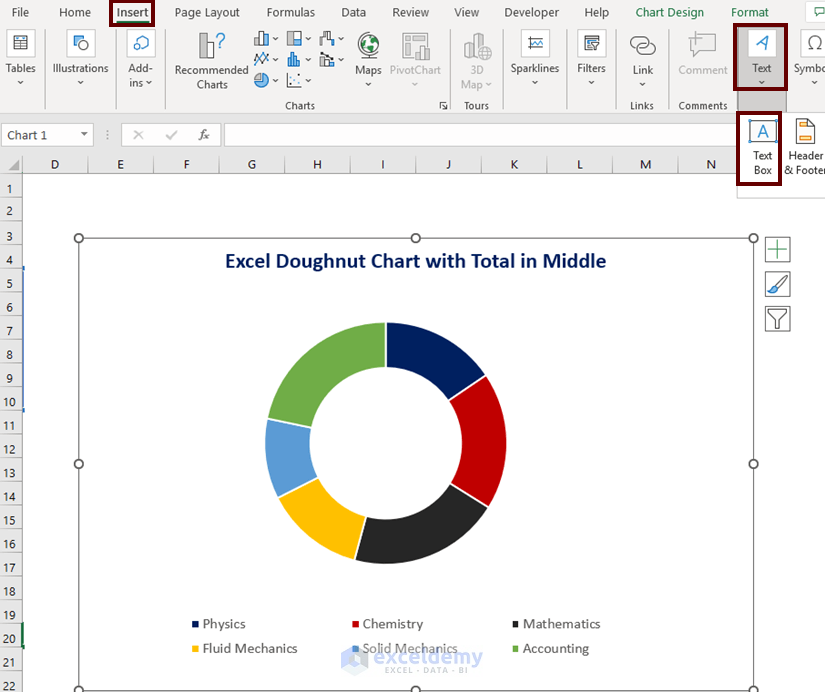
We have a text box.
- Place the Text Box in the middle of the doughnut chart.
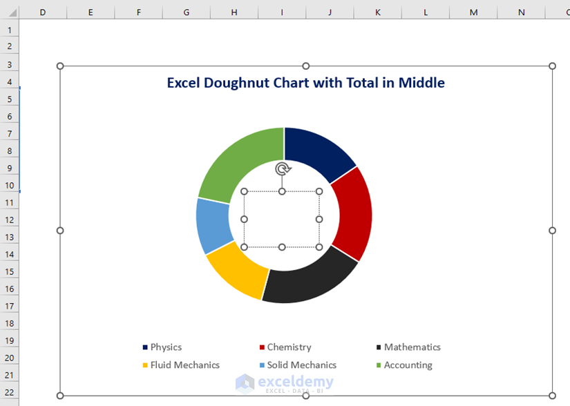
- Go to the formula bar.
- Input the following formula to mention the value in the middle of the doughnut chart.
='Doughnut Chart'!$C$11The Doughnut Chart signifies the worksheet name and C11 represents that the value in that cell will be shown in the middle of the doughnut chart.
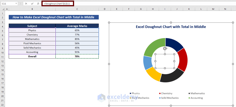
- Press ENTER to have the output in the middle of the doughnut chart.
- Customize the font size, and position of the output to have a better outlook.
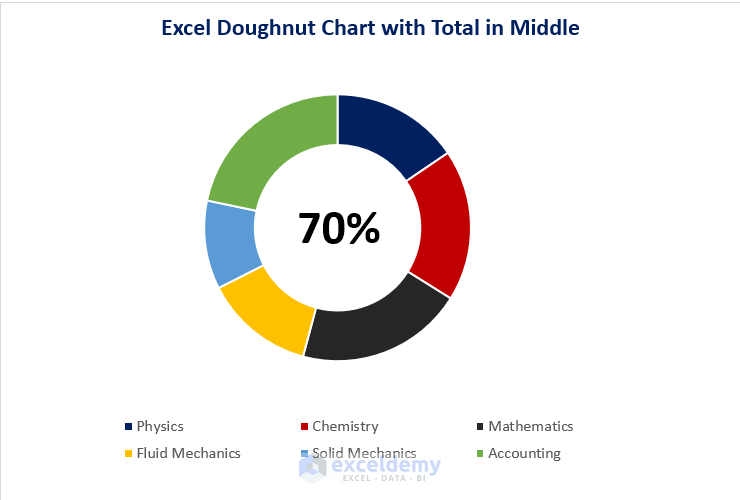
This is the Excel Doughnut Chart with the total in the middle.
Download Practice Workbook
Related Articles
- How to Insert Leader Lines into Doughnut Chart in Excel
- How to Show Labels Outside in Excel Doughnut Chart
- How to Create Progress Doughnut Chart in Excel
<< Go Back to Excel Doughnut Chart | Excel Charts | Learn Excel
Get FREE Advanced Excel Exercises with Solutions!
