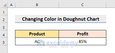
STEP 1 – Input Data
- Input the dataset.
- In this example, we’ll consider a Profit percentage of a product.
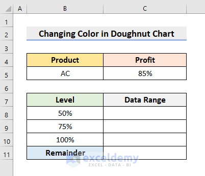
STEP 2 – Set up the Data Range Based on Value
- For 0-50%, we’ll use the Red color, Blue for the range 50%-75%, and Green color for 75%-100%.
- Type the Levels.
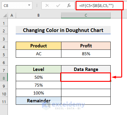
- Select cell C8.
- Use this formula:
=IF(C5<$B$8,C5," ")- Press Enter.
- This formula looks for values under 50%.
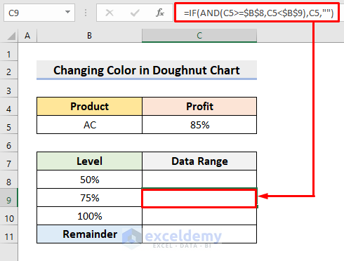
- Choose cell C9 and insert the following:
=IF(AND(C5>=$B$8,C5<$B$9),C5," ")- Press Enter to get the result.
- This’ll return the C5 cell value if C5 is between 50% and 75%.
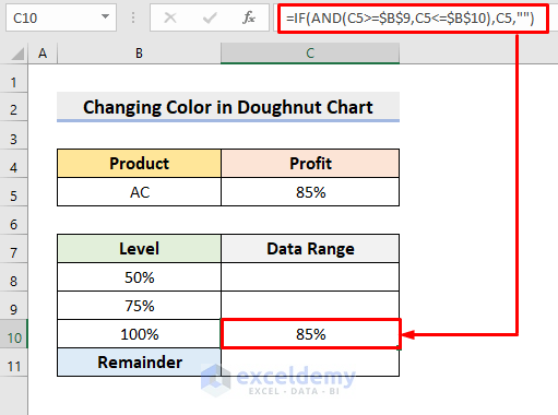
- In cell C10, input the formula:
=IF(AND(C5>=$B$9,C5<=$B$10),C5," ")- Press Enter. It’ll look for values from 75% to 100%.
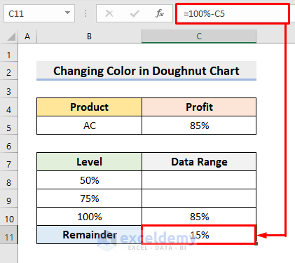
- Select cell C11 and insert:
=100%-C5- Press Enter.
Read More: How to Make Doughnut Chart with Total in Middle in Excel
STEP 3 – Insert a Doughnut Chart
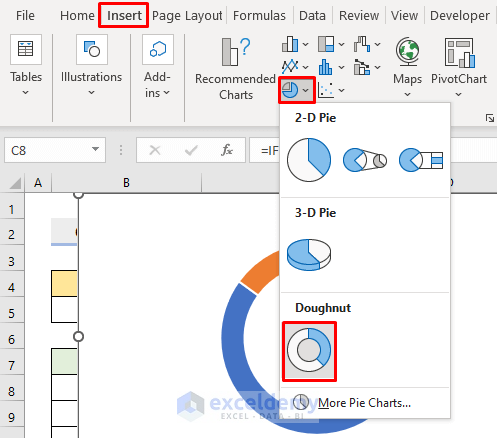
- Select the range C8:C11.
- Go to the Insert tab.
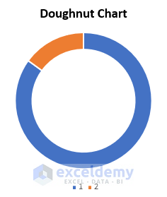
- Choose the Doughnut Chart from the Pie drop-down icon as shown below.
- This’ll return a chart like the following figure.
STEP 4 – Format the Doughnut Chart
- Delete the legend.
- Double-click the 85% slice and right-click on it.
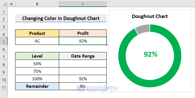
- Fill it with Green through the Fill drop-down.
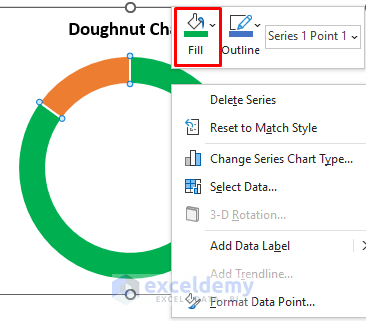
- Color the remainder slice with Gray.
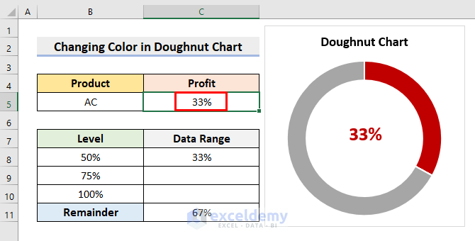
- For values lower than 50%, use the Red color.
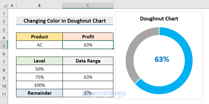
- For the values 50%-75%, choose the Blue color.
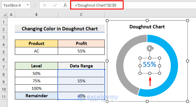
- A Text Box can make our Doughnut Chart more efficient.
- Go to Insert, then to Illustrations, and choose Shapes then pick Text Box.
- Draw the text box inside the doughnut chart hole.
- In the formula bar, click on cell C9. It’ll link the text box with the desired cell range.
- Repeat the steps for other levels.
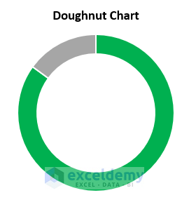
Final Output
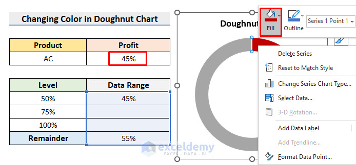
- Type any value under 50%.
- It’ll return the precise output like the following figure.
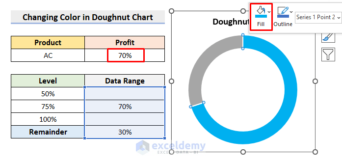
- For values within 50%-75%, you’ll get the image below.
- You’ll see the following chart for values 75%-100%.
Download the Practice Workbook
Related Articles
- How to Insert Leader Lines into Doughnut Chart in Excel
- How to Show Labels Outside in Excel Doughnut Chart
- How to Create Curved Labels in Excel Doughnut Chart
- How to Create Progress Doughnut Chart in Excel
- How to Change Hole Size of Excel Doughnut Chart
<< Go Back to Excel Doughnut Chart | Excel Charts | Learn Excel
Get FREE Advanced Excel Exercises with Solutions!

Thanks.
Hello Odedele Olufemi,
You are welcome.
Regards
ExcelDemy