Method 1 – Making a Doughnut Chart in Excel with Single Data Series
Step-01: Inserting Doughnut Chart
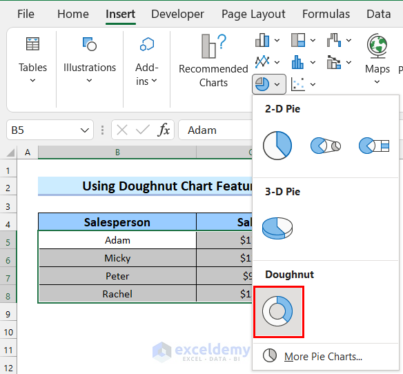
- Select the dataset that you want to represent in your doughnut chart.
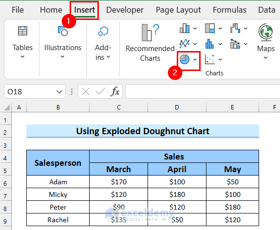
- Go to the Insert tab.
- Select Insert Pie or Doughnut Chart from the Charts options.

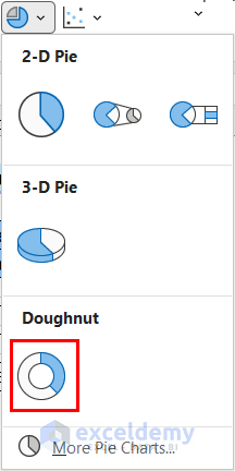
A drop-down menu will open.
- Select Doughnut Chart from the drop-down menu.
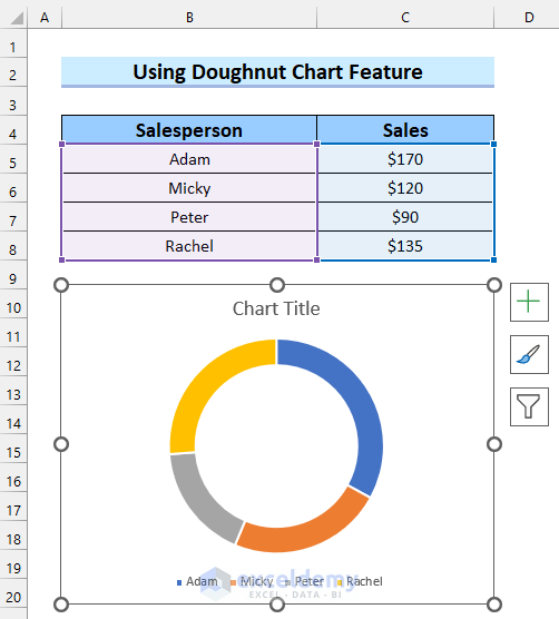
See that your doughnut chart has been inserted into your worksheet.
Step-02: Formatting Doughnut Chart
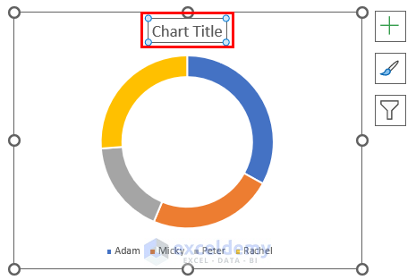
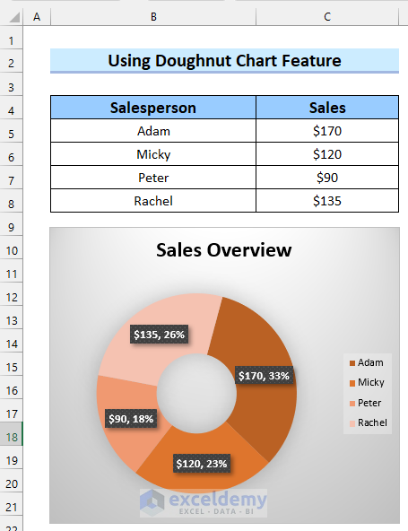
- Add a chart title. Here, added mine as Sales Overview.
Add data labels to your doughnut chart.
- Right-click on the chart.
- Select Add Data Labels.
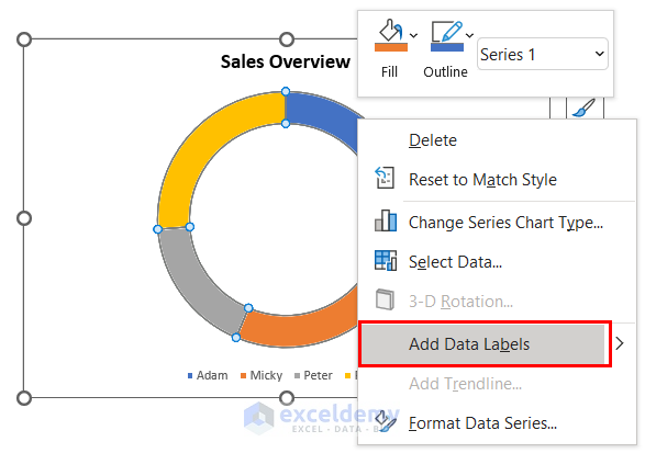
You will see that data labels have been added to your chart. After that, you can select any other format you want for your doughnut chart.
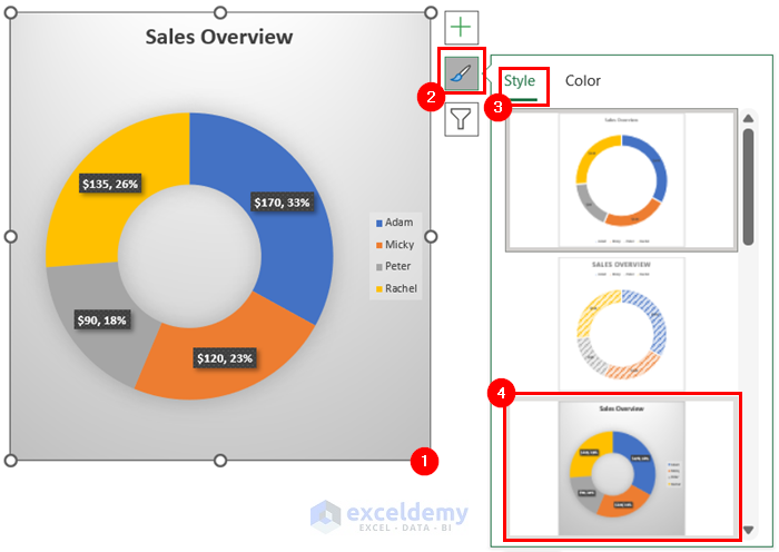
- Select the chart.
- Go to Chart Styles.
- Select Style.
- Select any chart format from there. We selected the marked format in the image below but you can choose any other format you like.
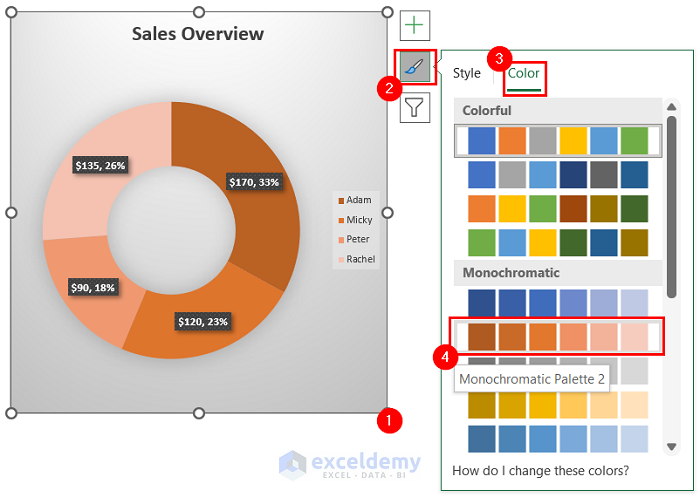
Now, you can also change the color of your doughnut chart.
- Select the doughnut chart.
- Go to Chart Styles.
- Select Color.
- Select the color palette you like. We selected the marked color Palette in the image.
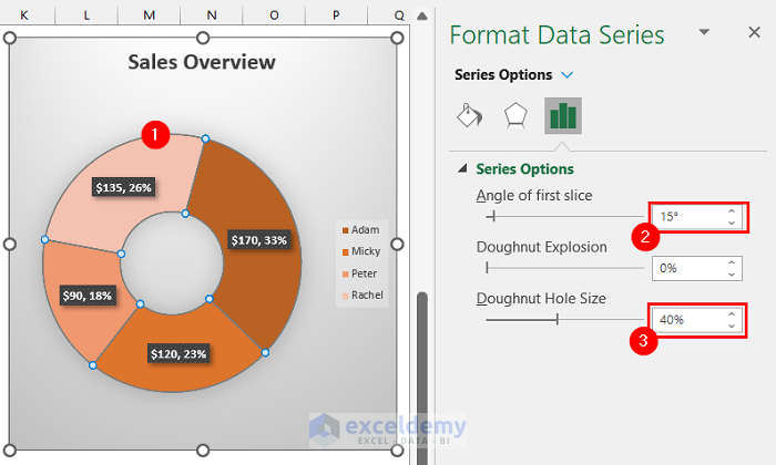
You can also change the doughnut thickness and other properties of the doughnut.
- Select the doughnut chart.
Format Data Series will appear on the right side of the screen.
- Change the Angle of first slice if you want. We kept it 15 degrees.
- Change the Doughnut Hole Size to change the thickness of the doughnut chat. We kept it at 40%.
You can see that I have got my desired doughnut chart for a single data series.
Method 2 – Creating a Doughnut Chart in Excel with Multiple Data Series
Step-01: Inserting Doughnut Chart
- Go to the Insert tab.
- Select Insert Pie or Doughnut Chart from the Charts options.
A drop-down menu will open.
- Select Doughnut Chart from the drop-down menu.
See that a blank doughnut chart has been inserted into your worksheet.

Step-02: Inserting Data into Doughnut Chart
- Select the chart.
- Go to Chart Design.
- Select Select Data.
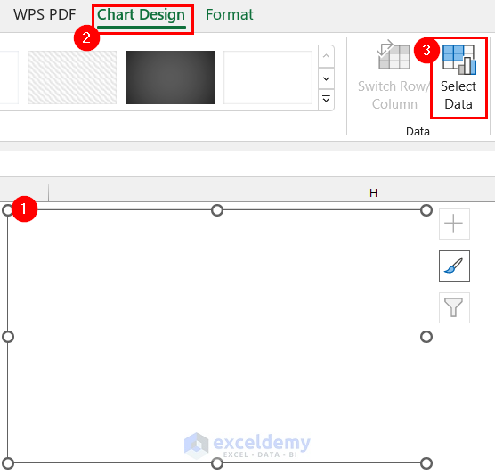
A dialog box named Select Data Source will appear on the screen.
- Select Add to add your first data series.
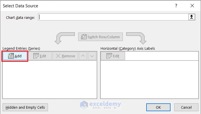
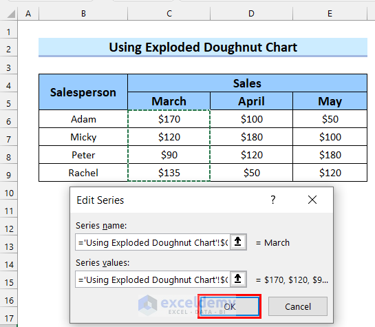
Get a new dialog box named Edit Series to add your data to the chart.
- Select the marked button to add the Series name.
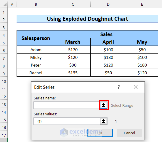
- Select the range for your Series name.
- Cick on the marked button to add this to your Edit Series.
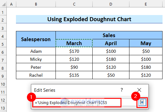
You will see that your Series name is added to your Edit Series.
- Select the marked button to add Series values.
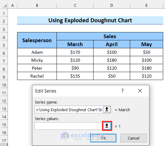
- Select the range for Series values.
- Select the marked button to add the value to your Edit Series.
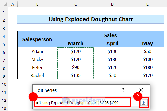
See that both Series name and Series values are added to the Edit Series.
- Select OK.
- Select Edit to add the Horizontal (Category) Axis Labels.
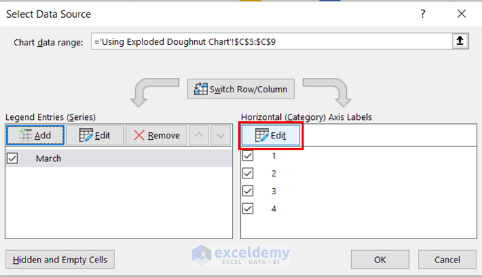
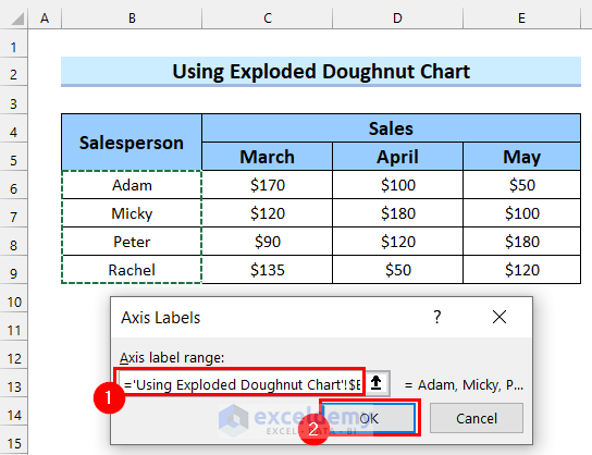
- Select your Axis label range.
- Select OK.
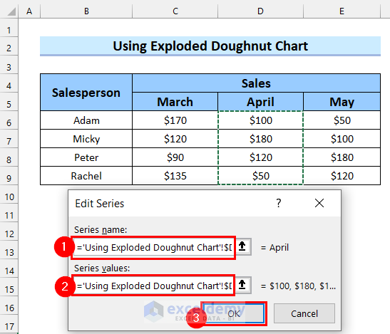
Add the second data series.
- Select Add.
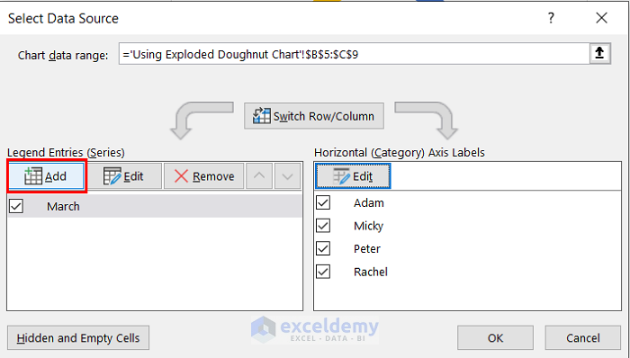
The Edit Series dialog box will appear I will add the data following the process of Step-02 of Method-2.
- Add the Series name.
- Add the Series values.
- Select OK.
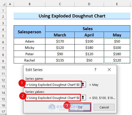
Data for the second data series has been added to the doughnut chart. Here, we will add the third data series.
- Select Add.
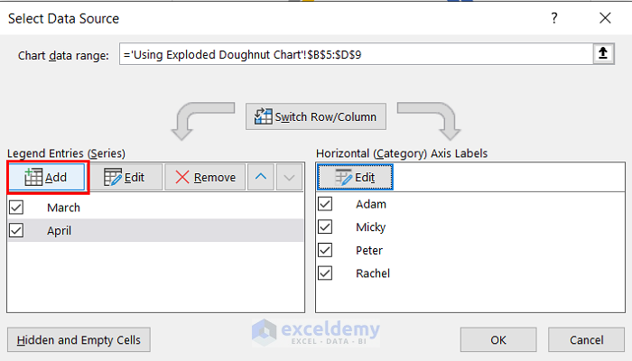
The Edit Series dialog box will appear. Now, I will add the data following the process in Step-02 of Method-2.
- Add the Series name.
- Add the Series values.
- Select OK.
All the data series have been added to your chart.
- Select OK.
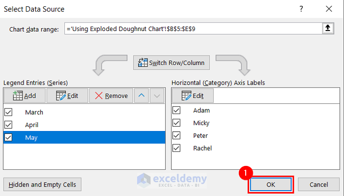
See that I have got the doughnut chart for multiple data series.
Step-03: Formatting Doughnut Chart
- Select the chart.
- Select the elements you want from Chart Elements. We selected Chart Title and Data Labels.
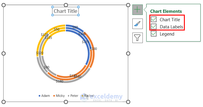
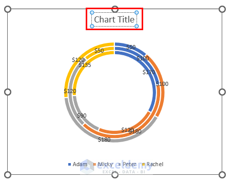
- Add Chart Title as you want for your doughnut chart.
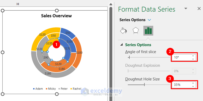
Change the thickness of your doughnut chart.
- Select the doughnut chart.
Format Data Series will appear on the right side of the screen.
- Change the Angle of first slice if you want. We kept it 10 degrees.
- Change the Doughnut Hole Size to change the thickness of the doughnut chat. We kept it at 35%.
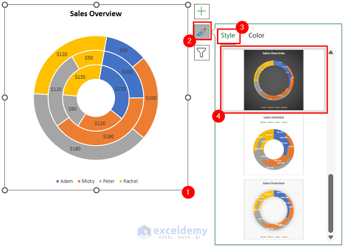
Change the format for your doughnut chart.
- Select the chart.
- Go to Chart Styles.
- Select Style.
- Select any chart format from there. We selected the marked format in the image below, but you can choose any other format.
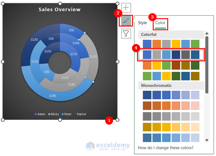
You can also change the colors of your doughnut chart.
- Select the doughnut chart.
- Go to Chart Styles.
- Select Color.
- Select the color palette you like. We selected the marked color Palette in the image. Choose any other color.
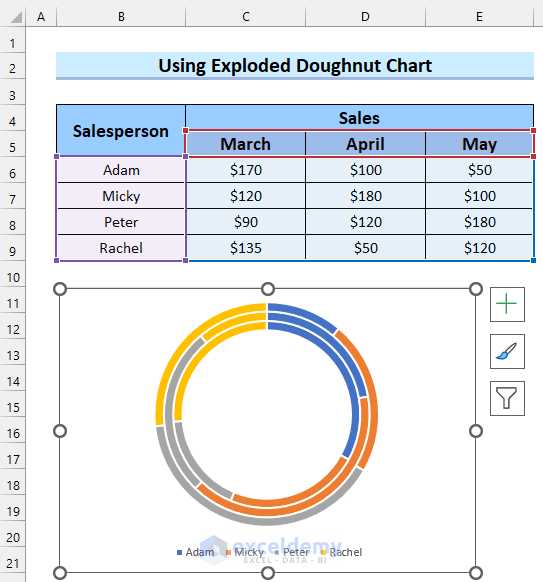
Here, I will make an exploded doughnut chart.
- Select the outer series of the doughnut chart.
- Change Doughnut Explosion to get your desired exploded doughnut chart. We kept it at 20%.
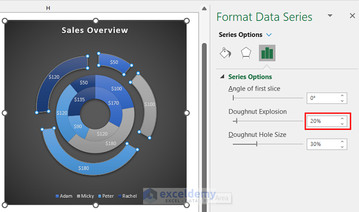
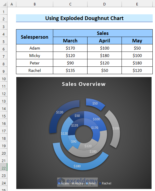
See that I have got my desired exploded doughnut chart for multiple data series.
Download Practice Workbook
Related Articles
<< Go Back to Excel Doughnut Chart | Excel Charts | Learn Excel
Get FREE Advanced Excel Exercises with Solutions!
