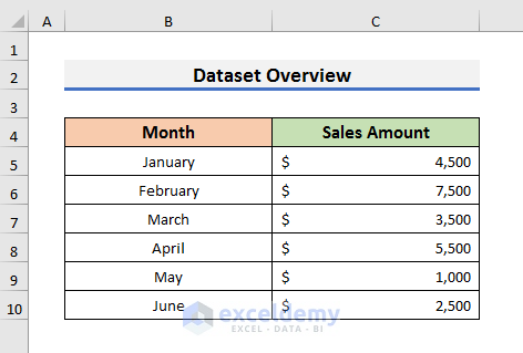
We will use a dataset that contains information on the Sales Amount of the first six months of a company. We will plot the data on a doughnut chart and create curved labels with WordArt.
STEP 1 – Create a Doughnut Chart in Excel
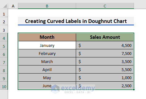
- Select all the cells of your dataset.
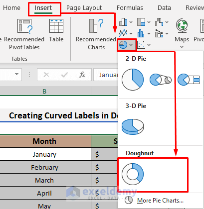
- Go to the Insert tab and click on Insert Pie or Doughnut Chart.
- Select the Doughnut Chart from the drop-down menu.
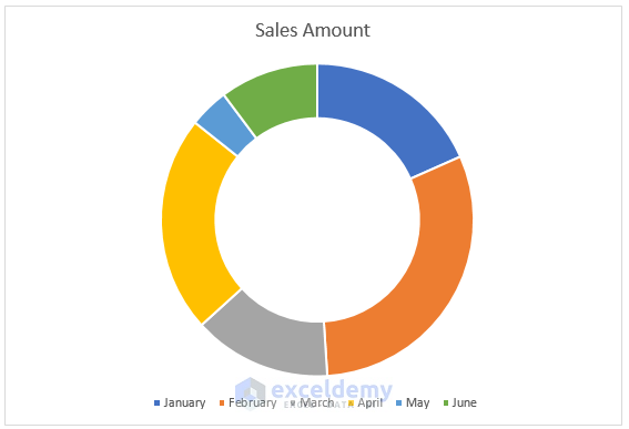
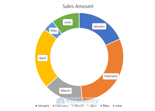
- The Sales Amount chart will appear.
- If you check the Data Labels option, the Data Labels will appear like the picture below.
- You can see the Data Labels are in straight lines.
Read More: How to Make Doughnut Chart with Total in Middle in Excel
STEP 2 – Deselect Data Labels in the Doughnut Chart
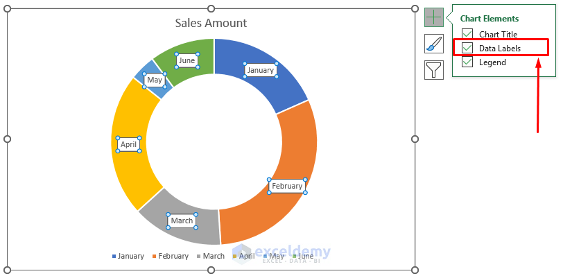
- Select the chart, and a plus (+) sign will appear.
- Click on the plus (+) sign and deselect or uncheck the Data Labels option.
STEP 3 – Insert Data Labels Using WordArt
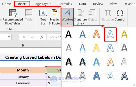
- Navigate to the Insert tab and click on the WordArt option. A drop-down menu will appear.
- Select any text format you want to use. We have selected the white text with a blue outline format.
- A box with the message ‘Your text here’ will appear.
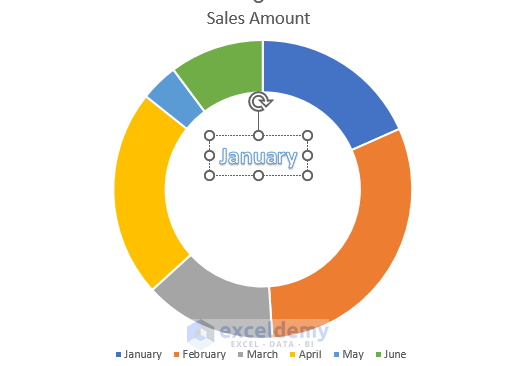
- We will insert the Data Labels here. We have typed January in the ‘Your text here’ section.

STEP 4 – Resize the Font in WordArt
- Right-click on the font and select Font from the Context Menu.
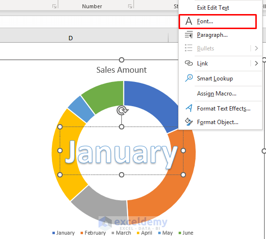
- Set the font size to 18. You can choose a size according to your Data Labels length.
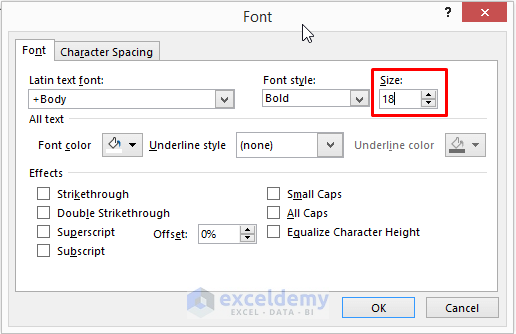
- Click OK to proceed.
Read More: How to Change Color Based on Value in Excel Doughnut Chart
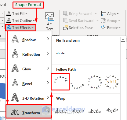
STEP 5 – Change Data Label Effects
- Select the Data Label and go to the Shape Format tab.
- Select Text Effects and then, select the Transform option. A drop-down menu will appear.
- Click on the Arch icon.
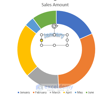
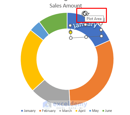
- The Data Label will look like the picture below.
- Put the Data Label on the specific part of the doughnut chart and change its rotation using the Plot Area button.
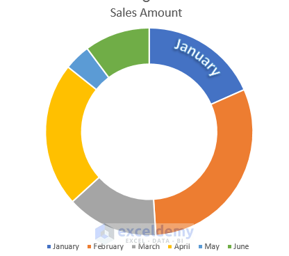
- Click anywhere in the Excel sheet and you will see results like the screenshot below.
STEP 6 – Repeat above Steps
- Repeat the previous steps to add more labels and place them where they’re needed.
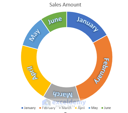
- You can see the second Data Label in the doughnut chart.

Final Output
Download the Practice Book
Related Articles
- How to Insert Leader Lines into Doughnut Chart in Excel
- How to Show Labels Outside in Excel Doughnut Chart
- How to Create Progress Doughnut Chart in Excel
- How to Change Hole Size of Excel Doughnut Chart
<< Go Back to Excel Doughnut Chart | Excel Charts | Learn Excel
Get FREE Advanced Excel Exercises with Solutions!
