Microsoft Excel is a powerful software. We create different charts with leader lines in our business analyses and presentations. Unfortunately, Excel does not provide in-built leader lines feature for Doughnut charts. Therefore, we will merge a Pie chart with a Doughnut chart and later remove the Pie chart to display leader lines. With that in mind, we will learn 6 easy steps to insert leader lines into Doughnut charts in Excel.
How to Insert Leader Lines to Doughnut Chart in Excel: Step-by-Step Procedures
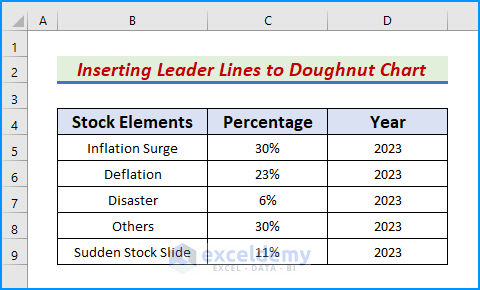
A Doughnut chart acts differently from a Pie chart, for instance, while creating and positioning chart labels if it is simply a pie chart with a hole in it. We cannot just move the chart label outside the wedge to create a label with an L-shaped leader line in a Doughnut chart. A leader line connects a data label and the data point it is linked with. When we put data labels far from a data point, displaying the results more quickly is useful. In this article, we will access various Excel features to implement the procedure. For demonstration, we take a dataset that includes Stock Elements in column B and their Percentages in column C of the year 2023.
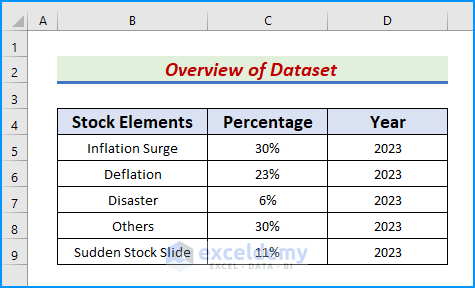
Step 1: Create Dataset with Proper Parameters
In the first step, we will add 3 sub-headings namely Stock Elements, Percentage, and Year in columns B, C, and D respectively. Also, populate the headers with the correct values.
Read More: How to Show Labels Outside in Excel Doughnut Chart
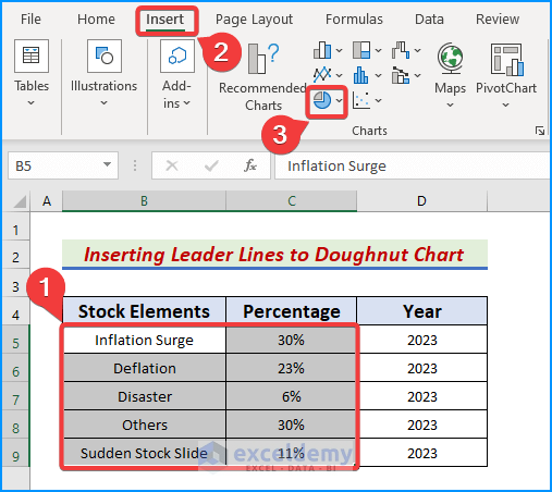
Step 2: Generate a Doughnut Chart in Excel
The objective of the second step is to create an in-built Doughnut chart from the Excel Chart group. Follow the easy procedures to display the chart in our workbook.
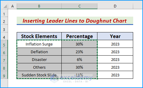
- Firstly, select the range B5:C9.
- Afterward, go to the Insert tab and click Insert Pie or Doughnut Chart in the Chart group.
- See the picture below for a better understanding.
- Subsequently, a dialog box appears.
- There, choose the Doughnut chart option.

- As a result, a Doughnut chart pops up on the screen.

Step 3: Use Paste Special Feature to Insert Data into Doughnut Chart
In this step, we will thoroughly insert the data into obtained Doughnut chart. We will use a keyboard shortcut to copy the data and paste them using the Paste Special tool in Excel. See the below pictures to understand more clearly.
- First, select the range B4:C9 again and press Ctrl+C to copy the dataset.
- Likewise, tap anywhere on the chart.
- Later, go to the Home tab and tap the dropdown icon below Paste and click Paste Special.

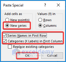
- Further, check the New series, Series Names in First Row, and Categories (X Labels) in First Column boxes.
- Now, hit OK to paste the value into the chart.
Read More: How to Make Doughnut Chart with Total in Middle in Excel
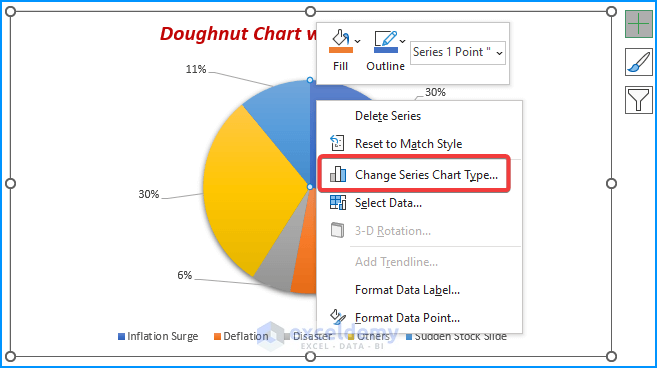
Step 4: Utilize Change Series Chart Type to Combine Doughnut and Pie Charts
This step aims to add a Pie chart to the Doughnut chart to insert the leader line. This is because Excel provides leader lines for Pie charts. Let’s follow the below procedure to do so.
- First, right-click on the outermost layer of the chart.
- Next, tap the Change Series Chart Type option.
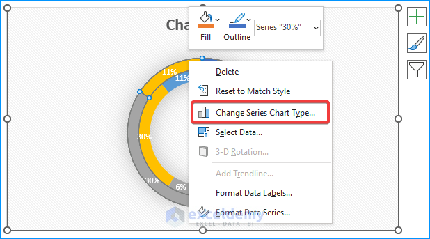
- Consequently, the Change Chart Type dialog box appears.
- There, select the Pie → Pie chart option → OK as given below.

- Thus, we convert the Doughnut chart into a Pie chart.

Read More: How to Change Hole Size of Excel Doughnut Chart
Step 5: Add Data Labels in Pie Charts to Identify the Data Series
In this step, we will access chart formatting options such as Add Data Labels to display the Leader lines. Follow the below instructions properly.
- To begin with, right-click the Pie chart to open the format context menu.
- Furthermore, tap the Add Data Labels option.
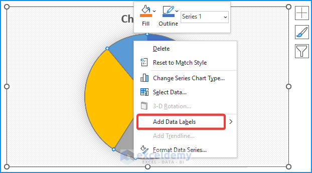
- Thus, we add the labels to the pie chart.
- Now, drag the labels outside the chart to display the Leader lines.
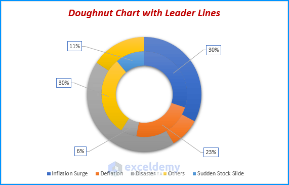
- Lastly, we obtain the desired result.
Step 6: Manually Remove Pie Chart Accessing Change Series Chart Type
In our last step, we will remove the added Pie chart from the Doughnut chart using the Change Series Chart Type feature again. To do so, follow the steps carefully.
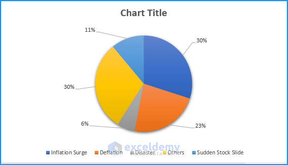
- Firstly, write the chart name in the Chart Title box and right-click on the chart again.
- After that, choose the Change Series Chart Type option.
- Consequently, the Change Chart Type dialog box appears.
- Meanwhile, go to All Charts → Combo → type Doughnut in the Chart Type boxes → OK.
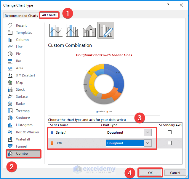
- Lastly, we obtain our Doughnut chart with leader lines in our Excel dataset.
How to Add Leader Lines to Pie Chart in Excel
As already discussed, we can use Excel in-built features to display leader lines in Pie charts in Excel. To do so, follow the easy steps.
- Firstly, generate a Pie chart and click on the Plus icon ( + ) → Data Labels → Outside End.
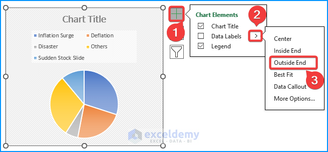
- Finally, drag the labels one by one to display the leader lines.

Download Practice Workbook
Download this practice workbook to exercise while reading this article. It contains all the datasets in different spreadsheets for a clear understanding. Try it yourself while you go through the step-by-step process.
Conclusion
In conclusion, we have discussed some easy steps to insert leader lines into Doughnut chart in Excel. Please leave any further queries or recommendations in the comment box below. Goodbye!
Related Articles
- How to Change Color Based on Value in Excel Doughnut Chart
- How to Create Curved Labels in Excel Doughnut Chart
- How to Create Progress Doughnut Chart in Excel
<< Go Back to Excel Doughnut Chart | Excel Charts | Learn Excel
Get FREE Advanced Excel Exercises with Solutions!
