While working with Microsoft Excel, we frequently use the chart tool in excel to communicate with the data graphically. To visualize the data more often, we utilize charts as this is the graphical representation of any information in Excel. In this article, we will demonstrate the procedures to Change the hole size of the Excel doughnut chart.
What Is Doughnut Chart in Excel?
The Doughnut Chart is a built-in chart in Excel. We use doughnut charts to make pie charts easier to understand. We also utilize the doughnut diagrams to illustrate a ‘part-to-whole’ connection where all parts are taken collectively equal hundred percent. The most effective way to present data with few classifications is with doughnut charts (2 to 5). It is mainly an upgraded chart version of a Pie chart. It’s a simple and condensed approach.
How to Change Hole Size of Excel Doughnut Chart: Step-by-Step Procedures
Excel develops the doughnut charts to remove the difficulty of understanding pie charts. With the exception of the central hole, a doughnut chart resembles a pie chart in appearance and we use this for efficient interpretation and interpretation. Let’s look at the procedures to change hole size of the Excel doughnut chart.
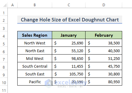
Step 1: Create Dataset
To change the hole size of the Excel doughnut chart, first, we need to have a dataset. As we know, the datasets are the continuous cell range holding data for analysis. We are going to create a dataset of a company’s Sales Region, and two months’ total sales for each region.
- Firstly, we will put the sales region in column B. In our case, we have six regions where we sell the product.
- Secondly, we put the total sale of each region. For instance, we will record only from January and February in our dataset.
Read More: How to Make Doughnut Chart with Total in Middle in Excel
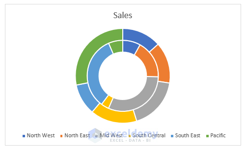
Step 2: Insert Doughnut Chart
To add a data table, we must insert a doughnut chart. A chart can provide a sharper view of a set of data values.
- In the first place, select the data range which you want to visualize with a graph. In our case, we will select the whole range of data B4:D10.
- Then, go to the Insert tab from the ribbon.
- After that, in the Charts category, click on the Insert Pie or Doughnut Chart drop-down menu.
- Choose Doughnut.
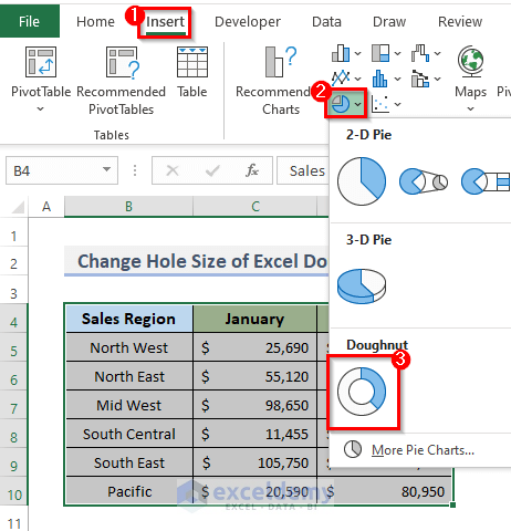
- This will display the doughnut chart in your workbook.

Read More: How to Change Color Based on Value in Excel Doughnut Chart
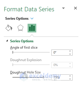
Step 3: Display Format Data Series
Now, to change the hole size we must need to display the format data series window.
- To begin with, right-click on the chart and you will see a contextual menu.
- Thus, you will see a dialog box with different options for the chart.
- Instead of doing this, you can double-click on the chart to open the Format Data Series dialog box.
- Select the Format Data Series options.

- This will appear the Format Data Series window on the right side of the Excel workbook.
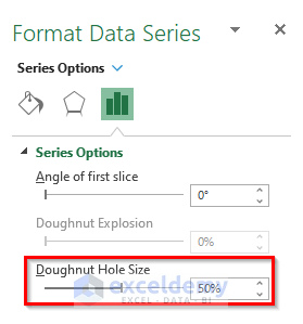
Step 4: Customize Doughnut Chart Hole Size
Finally, in this step, we will customize the hole size of the excel doughnut chart.
- Go to Series Options in the Format Data Series window.
- Change the hole size 75% to 50% from Doughnut Hole Size.
Final Output after Changing Hole Size of Doughnut Chart
Thus, we can easily change the doughnut charts’ hole size. And, we can see the chart after changing the hole size in the screenshot below.
Read More: Excel Doughnut Chart with Multiple Rings
How to Change Doughnut Chart Type?
If you want to change the chart type, you can also do this with just simple clicks in Excel. Let’s follow the instructions to change the chart type.
STEPS:
- While selecting the chart, the spreadsheet will display the Change Chart Type tab on the ribbon.
- So, first, go to the Chart Design tab from the ribbon.
- Then, click on Change Chart Type from the Type category.

- This will display the Change Chart Type dialog box.
- After that, you may select any other kind of graphs or charts.
- Finally, click OK.

Things to Keep in Mind
- Avoid flooding the doughnuts with all these circles. It not only makes it tough to understand, but it also makes it seem disorganized and unappealing.
- Doughnut charts should not be used to depict non-relative data or straightforward assessments.
Download Practice Workbook
You can download the workbook and practice with them.
Conclusion
The above procedures will assist you to Change Hole Size of Excel Doughnut Chart. I hope this will help you! Please let us know in the comment section if you have any questions, suggestions, or feedback.
Related Articles
- How to Insert Leader Lines into Doughnut Chart in Excel
- How to Show Labels Outside in Excel Doughnut Chart
- How to Create Curved Labels in Excel Doughnut Chart
- How to Create Progress Doughnut Chart in Excel
<< Go Back to Excel Doughnut Chart | Excel Charts | Learn Excel
Get FREE Advanced Excel Exercises with Solutions!
