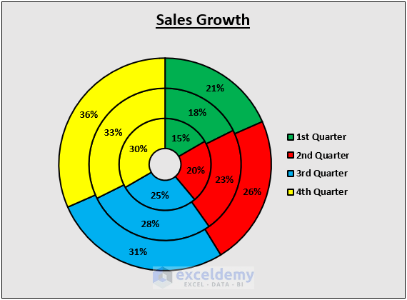
Here’s an overview of a doughnut chart with multiple rings, outlining sales data in different quarters.
How to Create a Doughnut Chart with Multiple Rings in Excel: Easy Steps
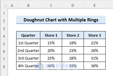
Step 1 – Organize Data
- We’ll use a dataset that contains the quarterly growth of different stores.
Step 2 – Insert Doughnut Chart
- Click anywhere in the dataset.
- Go to the Insert tab and select Insert Pie or Doughnut Chart, then choose Doughnut.

- A doughnut chart with multiple rigs will be inserted. Each ring represents a particular store. The inner-most ring always indicates the first store in the dataset.
- Click on the Chart Title to rename it as required.
Step 3 – Increase the Ring Size
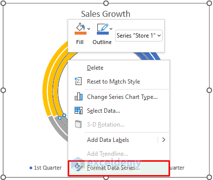
- Right-click on any doughnut ring and select Format Data Series.
- Reduce the Doughnut Hole Size to the minimum value.
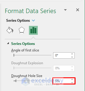
- You will see the following result.
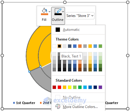
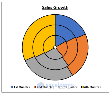
Step 4 – Change the Outline
- Right-click on a doughnut ring and choose an outline color.
- Repeat this for all of the rings.
- Here’s our sample result.
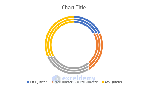
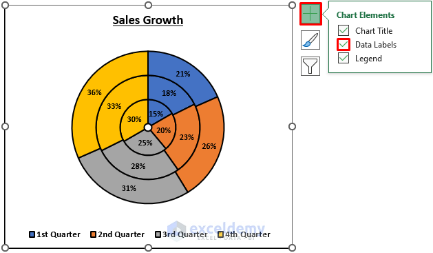
Step 5 – Add Data Labels
- Click on the doughnut chart to access the Chart Element menu.
- Check the Data Labels checkbox to show the data labels.
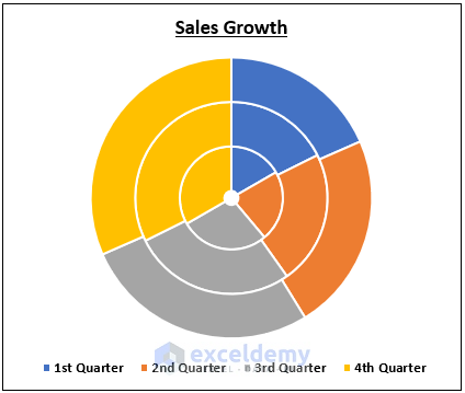
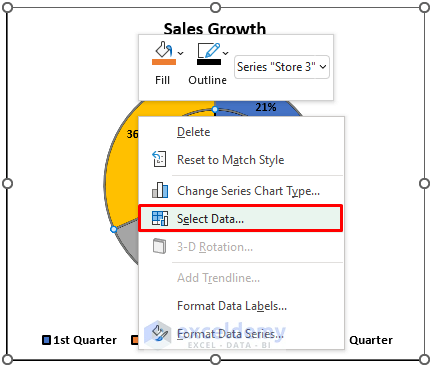
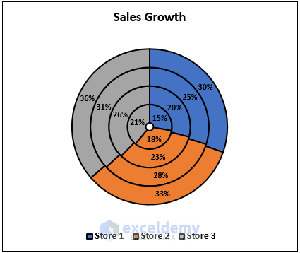
Step 6 – Switch Rows and Columns
- We need to switch the rows and columns to show the growth in each quarter by each doughnut ring.
- Right-click on a doughnut ring and click on Select Data.
- Select Switch Row/Column and click OK.
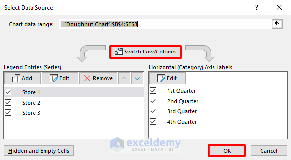
- You will get the following result.
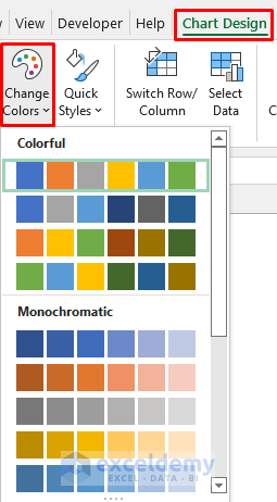
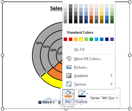
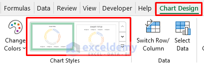
Step 7 – Change the Color & Style
- Click on the doughnut chart to access the Chart Design tab.
- Select Change Colors and pick the desired color.
- Alternatively, you can change the color of each slice manually. For that, click twice on a doughnut slice to select it, then right-click to choose the fill color.
- You can also pick a different chart style from the Chart Design tab.
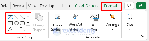
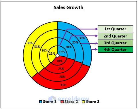
Step 8 – Add the Legend
- Click on the chart to access the Format tab.
- Insert text boxes and arrows to describe the doughnut rings.
- Here’s what we did.
Things to Remember
- You must select the doughnut chart to access the editing tools.
- You need a dataset with multiple rows and columns to create a doughnut chart with multiple rings.
Download the Practice Workbook
Related Articles
<< Go Back to Excel Doughnut Chart | Excel Charts | Learn Excel
Get FREE Advanced Excel Exercises with Solutions!
