If you are looking for ways to make a 3D doughnut chart in Excel, then this article will serve this purpose. We often use Doughnut Chart in Excel to represent our data graphically. Doughnut Chart provides a great visualization of the different properties of a dataset. In Excel, 3D Doughnut Chart is not available by default. So, let’s start with the main article to know the detailed steps of making a 3D doughnut chart.
What Is a Doughnut Chart?
We can have a basic idea about Doughnut Chart from its name. It’s shaped like a doughnut. In a Doughnut Chart, we can represent the data of each cell as a slice of a doughnut. Moreover, Doughnut Chart can be used to describe the inter-relationship of part of the data to the whole.
For example, let us consider sales of a flower shop. We can show sales of different flowers with the help of a Doughnut Chart.

Note: There is one thing to keep in mind, using Doughnut Chart is suitable for a relatively small-sized dataset. If the dataset is large, Doughnut Chart might not be the best way to represent your data.
How to Make 3D Doughnut Chart in Excel: 5 Steps
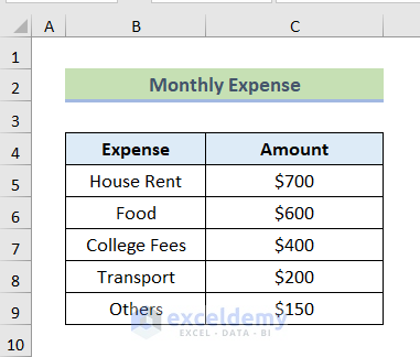
This section of the article covers the steps to make a 3D Doughnut Chart in Excel. In the following dataset, we have the Monthly Expense of Peter for June. We aim to create a 3D Doughnut Chart to express these data.
We have used Microsoft Excel 365 version for this article, you can use any other version according to your convenience.
Step-01: Calculating Percentage and Difference
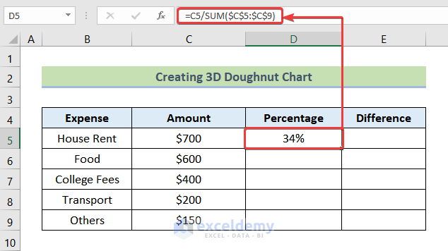
- Firstly, we will calculate the percentage of the different expenses concerning the total expense. For this, we will use the following formula in cell D5.
=C5/SUM($C$5:$C$9)Here, C5 is the Amount for House Rent, and $C$5:$C$9 is the range of amounts for all the expenses.
Formula Breakdown
- SUM($C$5:$C$9) → we will use the SUM function, to add up the cells starting from cell C5 up to cell C9. By using Absolute Cell Reference, we are fixing the range.
- Output → 2050
- C5/SUM($C$5:$C$9) → becomes the Percentage of the expense.
- C5/2050 → Now, we will divide cell C5 by the added value.
- Output → 34%
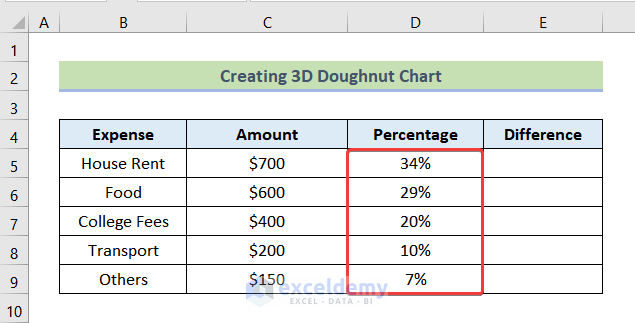
- After that, use the Auto Fill feature of Excel to get the rest of the percentages.
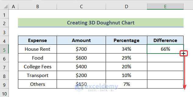
- Next, we will compute the difference of each percentage from 100%. By using the following formula we can get the Difference.
=1-D5Here, cell D5 represents the cell of Percentage of the respective expenses.
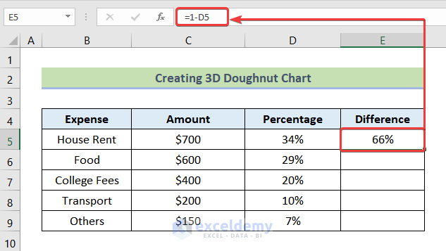
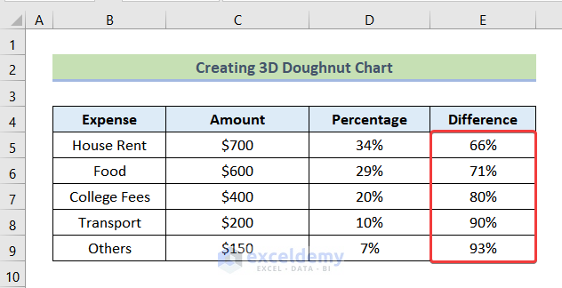
- By dragging the Fill Handle, we can get the remaining differences.
After using the Fill Handle, we will get the following output.
Read More: Excel Doughnut Chart with Multiple Rings
Step-02: Inserting and Formatting Shape to Create 3D Doughnut Chart
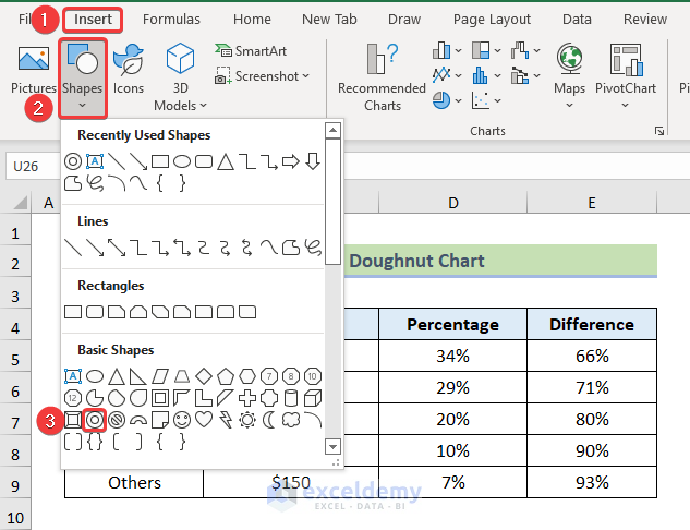
- First, go to the Insert tab from the ribbon.
- Select Shapes and from the drop-down click on the Doughnut icon.
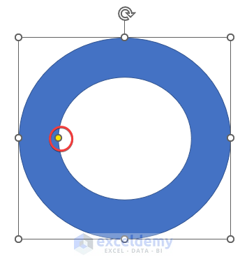
- Now, hold and drag the small yellow circle to resize your Doughnut to your preference.
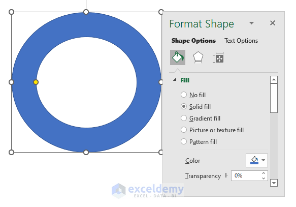
- When you are happy with your doughnut, right-click on the shape of the doughnut and select Format Shape.
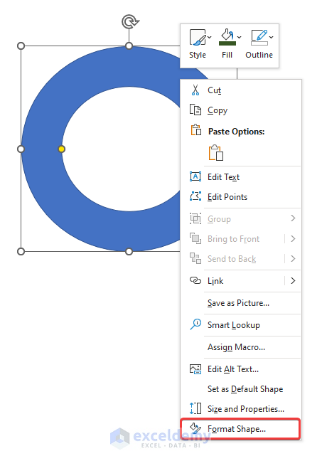
After selecting Format Shape you will see the following picture on your screen.
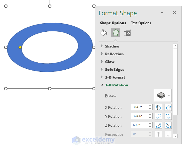
- After that, from the Effects tab click on 3-D Rotation.
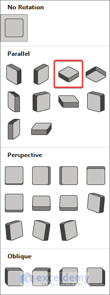
- Then select Presets.
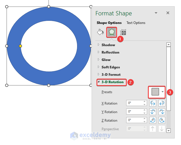
- Now, choose Isometric: Top Up as marked in the following picture.
Afterward, you will be able to see the following image.
- After that, insert X Rotation = 330°, Y Rotation = 310°, and Z Rotation = 35°.
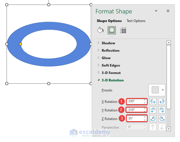
After inserting these data, the below-given image will appear on your screen.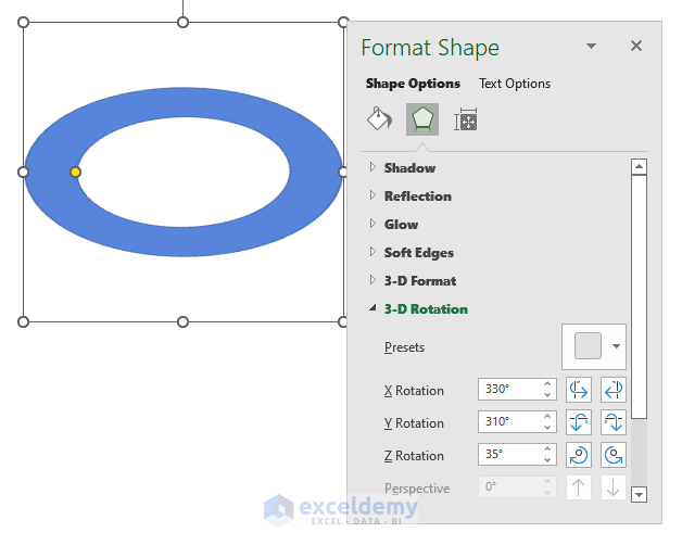
- Afterward, choose 3-D Format and click on Top bevel.
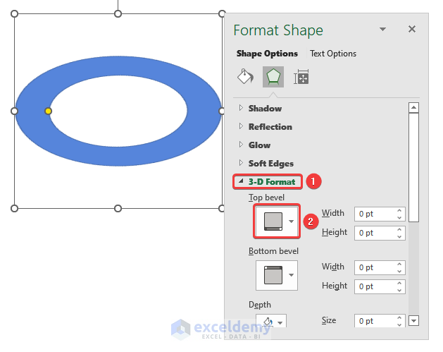
- Now, select the Slant option as highlighted in the following image.
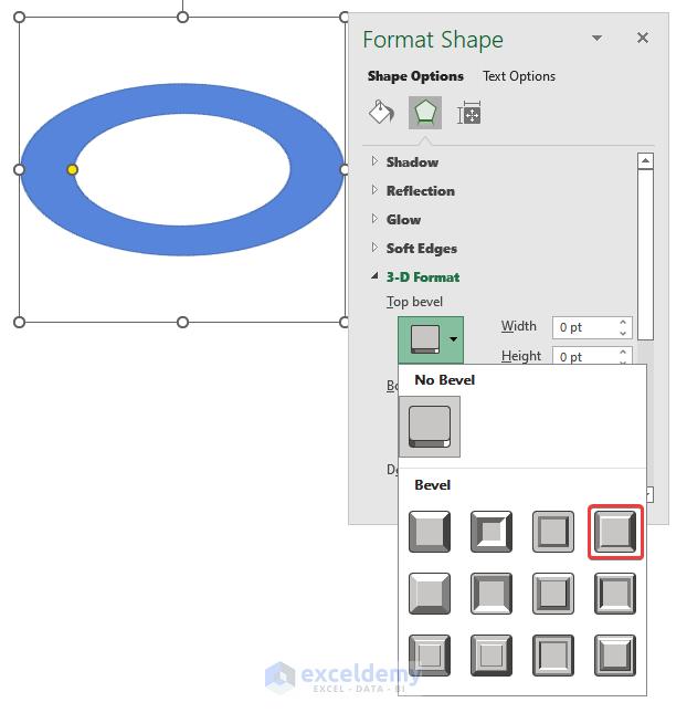
Now, the Top bevel will be visible on the doughnut shape.
- Next, give the Depth Size 6.
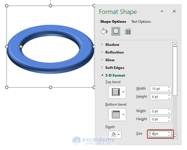
Afterward, you will be able to see the following picture in your workbook.
- After that, go to Shadow under the Effects tab.
- Now, select Presets.
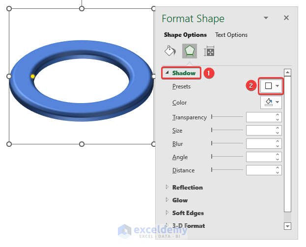
- Afterward, select Perspective: Upper Left from the Perspective group in the Presets.
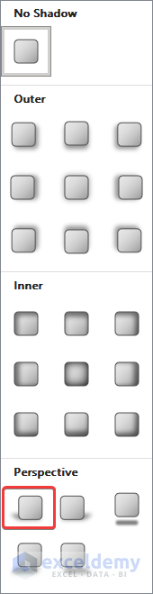
After selecting the Perspective, a shadow will be added to the shape.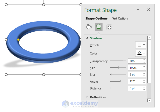
At this stage, the shape of your doughnut should be looking like this.

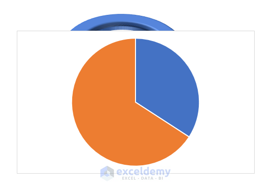
Step-03: Addition of a Pie Chart
Now, we will add a Pie Chart on top of our created 3D doughnut shape.
- First, select the cells D5 and E5 and go to the Insert tab from the ribbon.
- Then, click on Insert Pie or Doughnut Chart icon.
- After that, choose 2-D Pie from the drop-down.
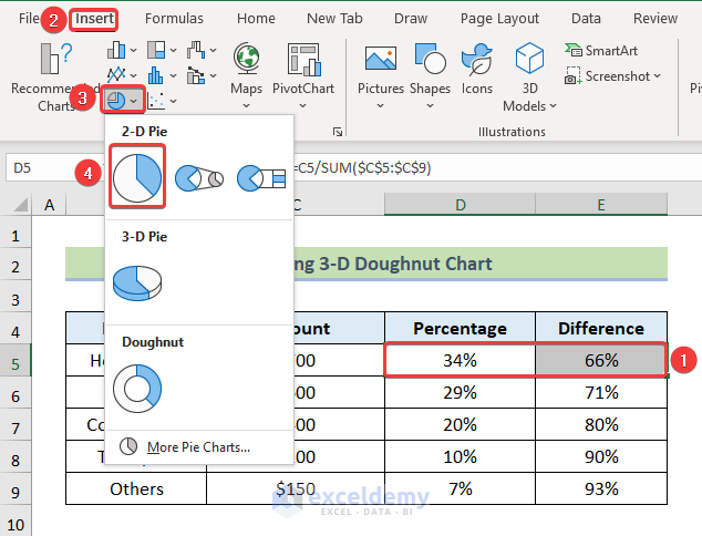
Afterward, the following chart will be available on your screen.
Step-04: Formatting Pie Chart to Make 3D Doughnut Chart in Excel
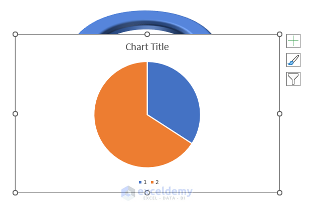
- Firstly, click on Chart Elements and un-check all the boxes.

Now, you can see that the Chart Title, Data Labels, and Legend are not showing on the Pie Chart.
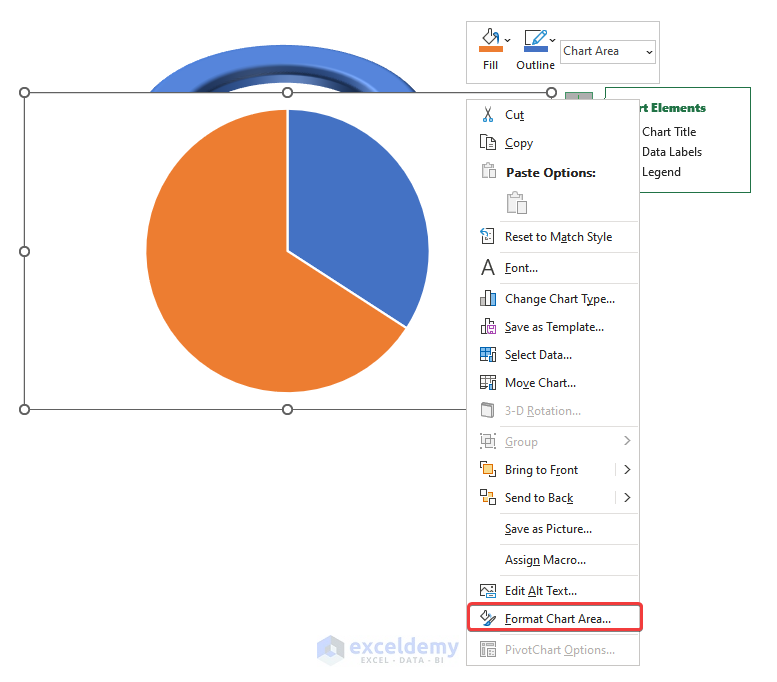
After clicking on Format Chart Area, the below-given image will appear in your workbook.
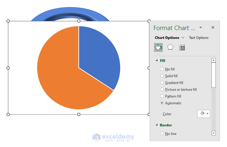
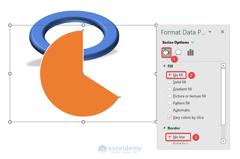
- Now, from the Format Chart Area dialogue box, under the Fill & Line tab choose No Fill in the Fill option.
- After that, select the No line from the Border option.
Afterward, the background of the pie chart will be transparent and there will be no borderline. 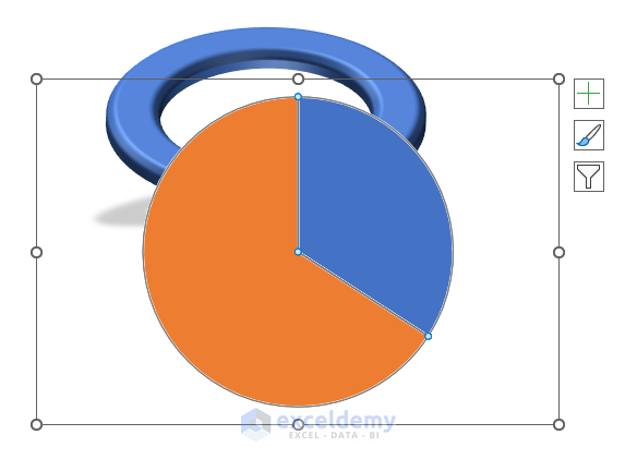
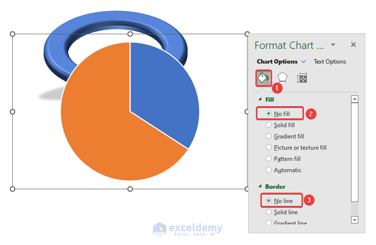
- Now, double-click on the Blue portion of the Pie Chart so that only the Blue portion is selected.
- Similarly, choose No Fill and No Line under the Fill & Line tab.
Now, you will be able to see the following image on the screen.

- After that, reposition your Pie Chart on top of the Doughnut in such a way that both of their centers are the same.

- Afterward, double-click on the Orange part of the Pie Chart.
- Click on the Solid Fill under the Fill option and choose the White color.
- Now, give a Transparency of 15% to the fill.
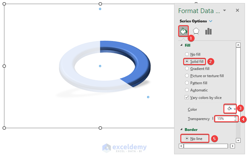
At this stage, your 3D Doughnut Chart should be looking like this.
Read More: How to Change Color Based on Value in Excel Doughnut Chart
Step-05: Insertion of Percentage and Name of Expenses
- First, we will use the following formula in cell F16 to show the Percentage of the Expense.
=D5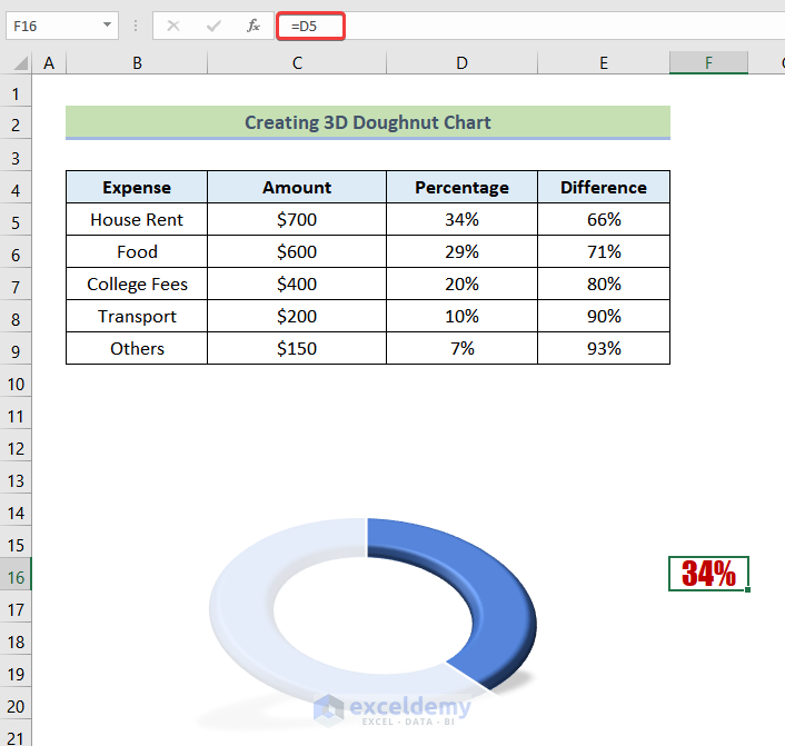
- Afterward, by using the following formula in cell E17 we will bring the name of the Expense beside our chart.
=B5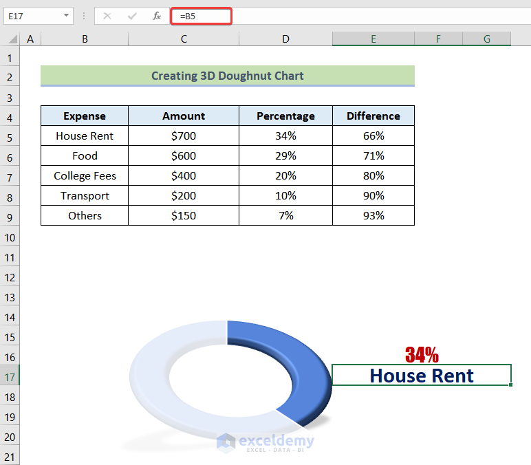
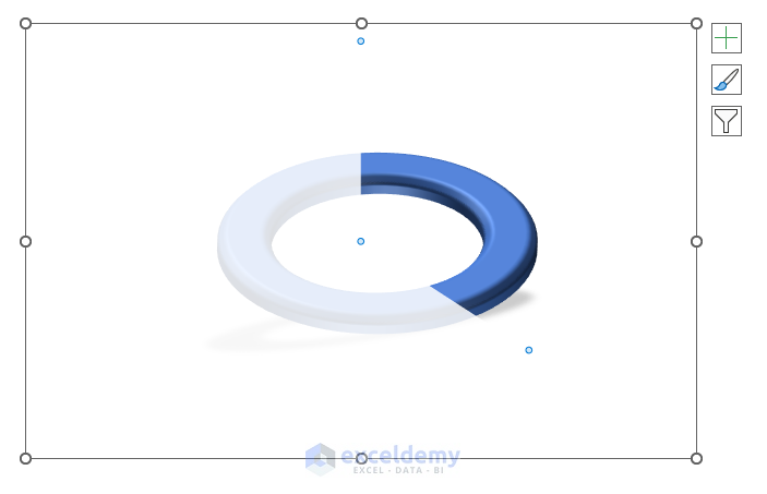
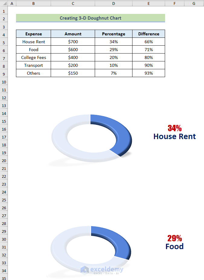
Similarly, we can create another 3D Doughnut Chart for the next Expense (Food). Then it should be looking like the following image.
Practice Workbook
In the Practice Workbook, the first 3 Expenses are done for you. The remaining 2 are for your practice.
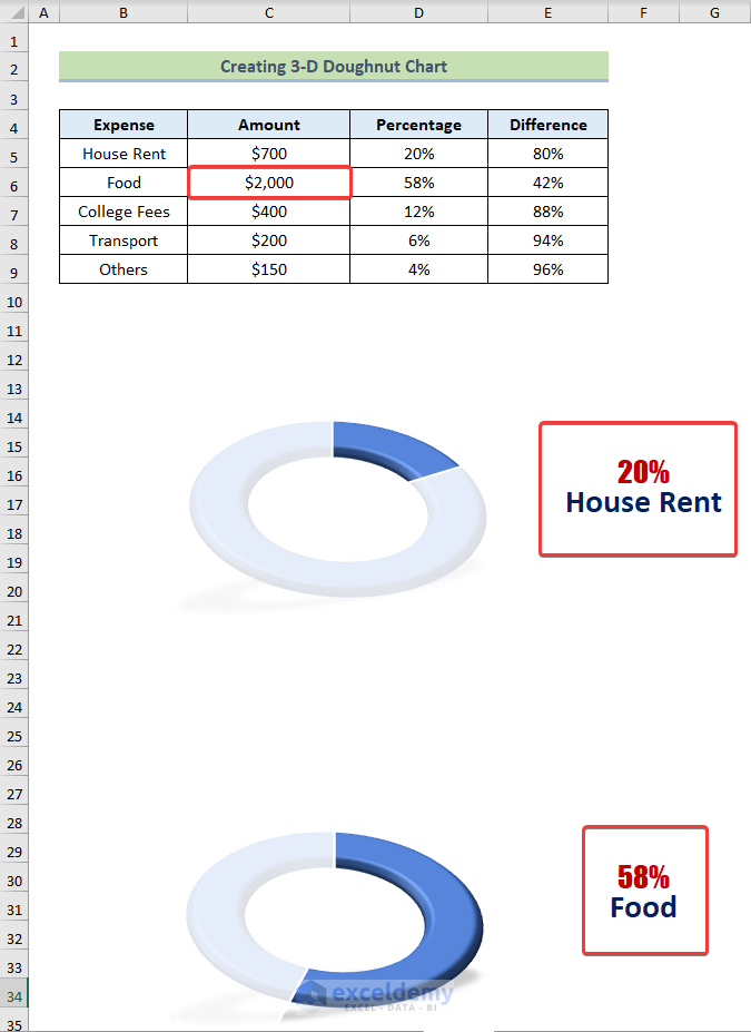
This 3D Doughnut Chart responds to any change in any of the Monthly Expenses. For example, if you change the Expense of Food to $2000, all of the 3D Doughnut Charts will adjust accordingly.
Things to Remember
- The number format of the Percentage and Difference column should be in a Percentage format.
- In the Format Chart Area option, make sure you right-click on an empty part of the chart area.
- Ensure that you double-click the portion of the Pie Chart you want to format. If you don’t double-click, it will format the whole Pie Chart.
Conclusion
Finally, we have come to the very end of the article. I sincerely hope that this article was able to help and guide you to make a 3D Doughnut Chart in Excel. Please feel free to leave a comment if you have any queries or recommendations for improving the article’s quality. Goodbye!
Related Articles
- How to Create Curved Labels in Excel Doughnut Chart
- How to Change Hole Size of Excel Doughnut Chart
- How to Create Half Doughnut Chart in Excel
<< Go Back to Excel Doughnut Chart | Excel Charts | Learn Excel
Get FREE Advanced Excel Exercises with Solutions!
