A half-doughnut chart, also known as a half-donut chart or a semicircle donut chart, is a circular chart that displays data in a half-circle shape with a hole in the center. It is a variation of the standard doughnut chart, which is a type of pie chart with a hole in the center.

Half Doughnut Chart in Excel: Advantage and Uses
Half Doughnut Chart Advantages:
- The main advantage of a half-doughnut chart is that it allows you to display more data in a smaller space.
- It is particularly useful when you want to show a single data series as a percentage of a whole, and you want to compare multiple data points within that series.
Half Doughnut Chart Uses:
- One common use case for a half-doughnut chart is in financial reporting, where it is often used to show the percentage breakdown of expenses or revenue by category.
- Another use case is in marketing, where it can be used to show the distribution of sales by product or by region.
How to Create Half Doughnut Chart in Excel: with Easy Steps
Step 1 – Add an Extra Data Series Named “Total”
Insert a new row inside the table to calculate the Total Revenue. Enter the following formula inside cell C10 and Press ENTER.
=SUM(C5:C9)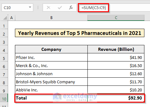
The sum of the revenues will be visible inside cell C10.
Read More: How to Make a Doughnut Chart in Excel
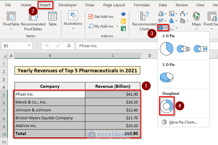
Step 2 – Insert a Simple Full Doughnut Chart
Select the data from the table and insert a Doughnut Chart following the procedure shown in the the image below.
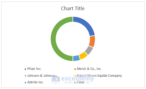
A doughnut chart will be inserted in the worksheet.
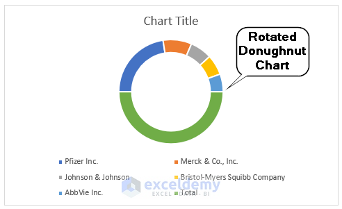
Step 3 – Rotate the Doughnut Chart
To rotate the doughnut chart, double-click on the marked area inside the image. Under the Format Data Series select Series Options and set the Angle of first slice to 270 Degrees.
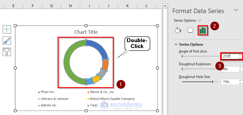
Press ENTER. The doughnut chart will be rotated.
Step 4 – Hide the Extra Series Named “Total”
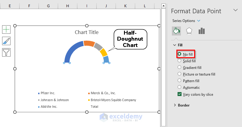
To turn this full-doughnut chart into a half-doughnut chart, we need to hide the portion designated as “Total”. Select the undesired part of the chart and double-click. Under Format Data Point select Fill and from the dropdown list, select No Fill.
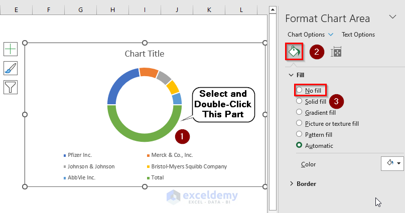
The full-doughnut chart will change to a half-doughnut chart.
Step 5 – Delete Extra Chart Legend and Fix Chart Title
Delete the extra legend inside the chart and give the chart an appropriate title. To do that, select “Total” from the legend list and press the DELETE key. Click on “Chart Title” and rename the title.
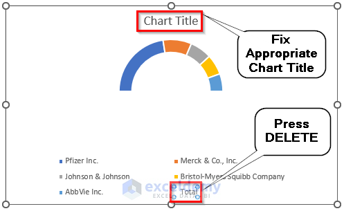
Your half-doughnut chart is now complete. You can adjust the legend and title fonts as required.

Difference Between Excel Pie Chart and Doughnut Chart
Pie charts and doughnut charts are both used to represent data in a circular format, but there are some key differences between the two:
- Appearance: Pie charts have a solid circle in the center, while doughnut charts have a hole in the center, giving them the appearance of a doughnut.
- Usage: Pie charts are best used to show the relative size of each category in relation to the whole data set. Doughnut charts are similar but are better used when you want to show the breakdown of a single category into subcategories.
- Data Display: In a pie chart, data is displayed in the form of slices, where each slice represents a category and its size corresponds to its proportion of the whole. In a doughnut chart, data is displayed in the form of concentric rings, where the outer ring represents the main category and the inner rings represent its subcategories.
- Information: Pie charts are simple and easy to read, but they can become cluttered and difficult to understand if there are too many categories. Doughnut charts can be more informative, as they can show the relationship between a main category and its subcategories, but they can also become difficult to read if there are too many subcategories.
Why Should You Choose Half Doughnut Chart Over Full Doughnut Chart?
The half-doughnut chart is advantageous over the full-doughnut chart in certain situations because it can display data in a more compact and visually appealing way.
The half doughnut chart occupies less space than the full doughnut chart because it only uses half of the circle, which makes it more suitable for smaller screens or print materials where space is limited.
The half-doughnut chart has a more symmetrical shape, which can make it easier to read and interpret the data accurately. In contrast, the full doughnut chart can sometimes look unbalanced, especially if the inner circle is small.
The half-doughnut chart can be used to emphasize a specific data point, since the other half of the chart is blank. For example, if you want to draw attention to a particular category or data point, you can use a half-doughnut chart to highlight it.
However, it is important to note that the choice between a half-doughnut chart and a full-doughnut chart depends on the specific data being presented and the context of the chart. In some cases, a full doughnut chart may be more appropriate, especially if there are multiple data series that need to be compared within the same chart.
Things to Remember
- A half-doughnut chart is best suited for displaying a single data series as a proportion of a whole, so it is important to choose data that can be presented in this way. If you have multiple data series, it may be better to use a different type of chart, such as a stacked bar chart or a multi-series line chart.
- You should label each segment of the chart with the corresponding data point and the percentage it represents. You may also want to provide additional information or a legend to help readers interpret the chart accurately.
Download Practice Book
Related Articles
<< Go Back to Excel Doughnut Chart | Excel Charts | Learn Excel
Get FREE Advanced Excel Exercises with Solutions!

Hi,
I need to show the percentage on the series data labels, but in the solution you suggested the pecentages are showing in half also.
Is there any workaround solution to show the correct percentages on the shown series?
Thanks.
Hi Mahmoud,

You can create a half doughnut chart to show the correct percentages with data labels by following the steps mentioned in this article. Only exception is you will need a different data table with the yearly revenues converted into percentages of the total.
You can do this by applying the following formula inside any cell:
=C5/$C$10. Use fill handle to populate the dataset and keep the percentage column into percentage format. Now follow the exact steps described in this article. Upon finishing check the Data Labels option from Chart Element. Your half doughnut chart with percentage Data labels is now ready.I hope it solves your problem.
Regards,
ExcelDemy.