Method 1 – Creating Combo of Pie and Doughnut Charts
Steps:
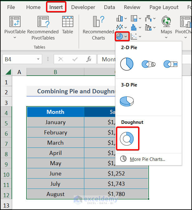
- Select the entire data range >> navigate to the Insert tab >> Insert Pie or Doughnut Chart >> choose Doughnut.
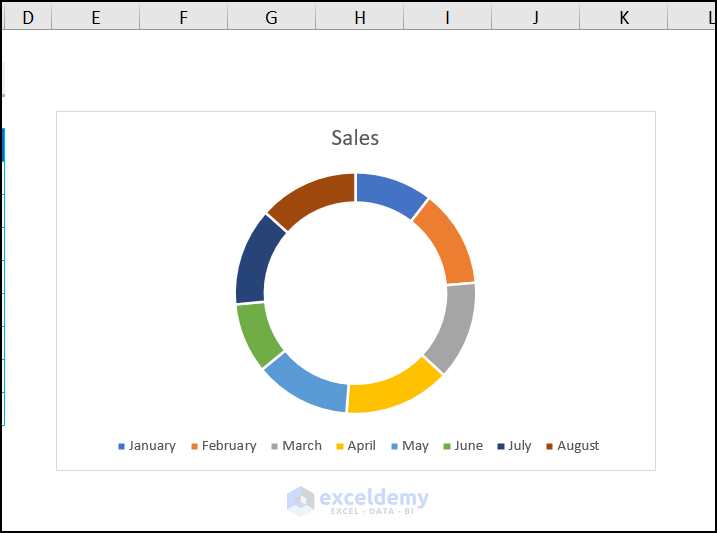
- A doughnut chart will be displayed in your file, and as you can see, it does not have labels.
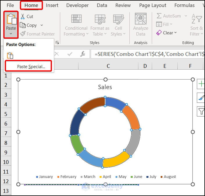
- Select the dataset again and hover over the Home tab >> choose Paste from Clipboard >> pick Paste Special.
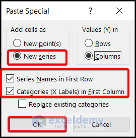
- The Paste Special window appears. Check New series in Add cells as type. Also, check the Series Names in First Row and the Categories (X Labels) in First Column.
- Hit OK.
- Another doughnut chart is inserted. Right-click on the chart and pick the Change Series Chart Type from the Context Menu.
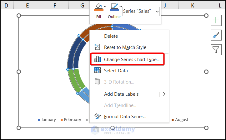
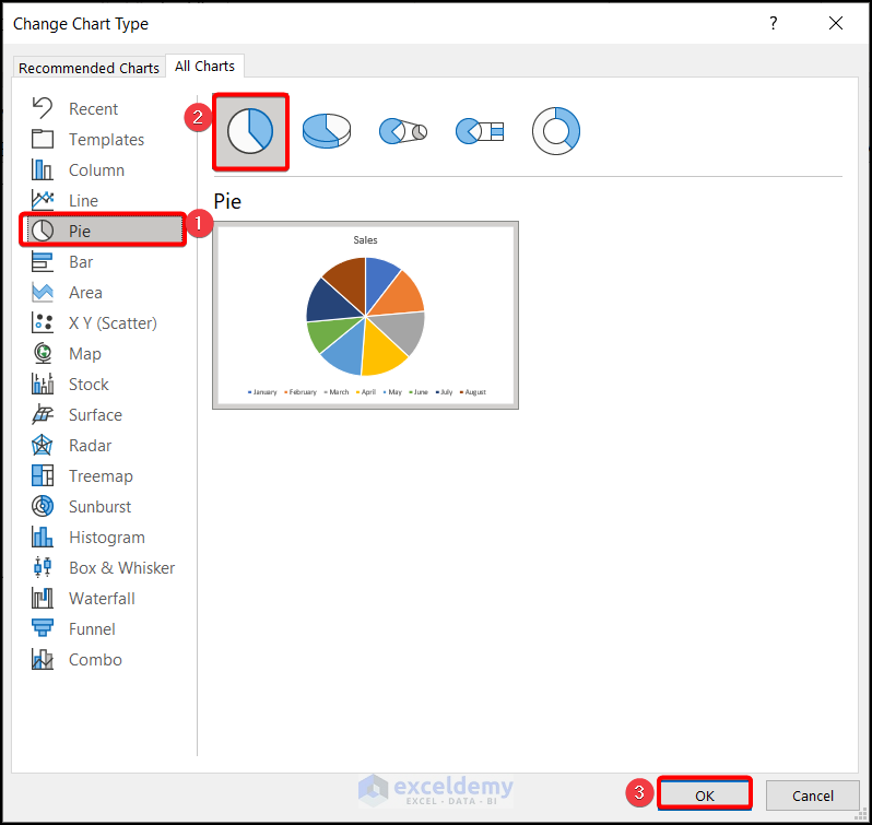
- The Change Chart Type window pops out. Choose Pie >> Pie chart from the All Charts option. Click OK.
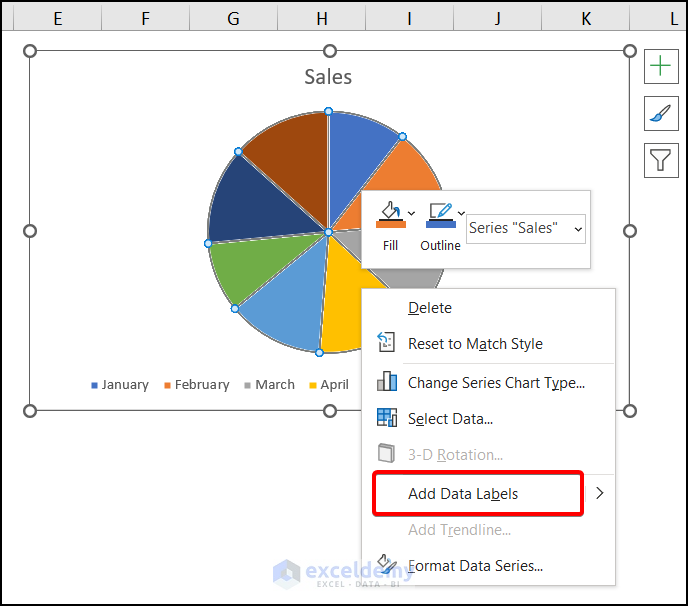
- A new pie chart has been inserted, covering the doughnut chart.
- Right-click on the chart and choose Add Data Labels from the Context Menu.
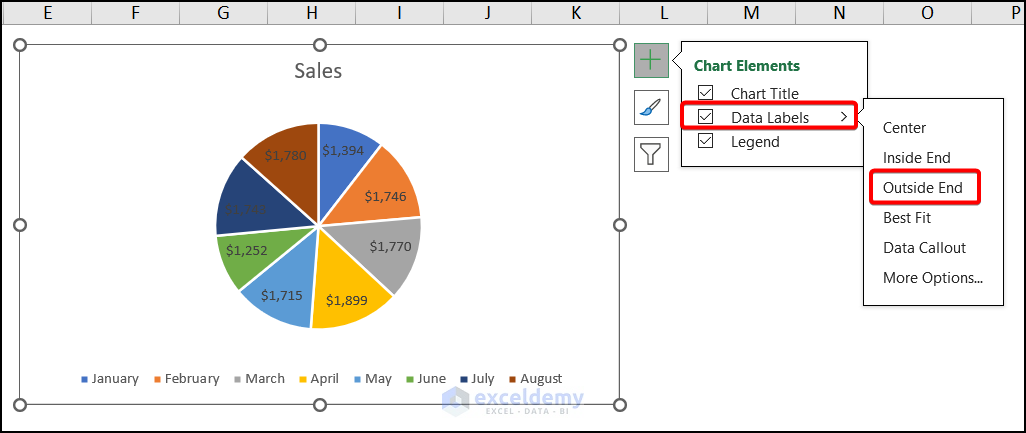
- The data labels have been added to the chart. Choose the Data Labels from the Chart Elements and pick the Outside End.
- The labels are outside the chart. Pick up the Format Data Series from the Context Menu after right-clicking the chart.
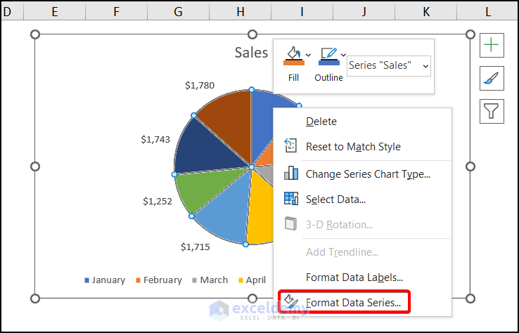
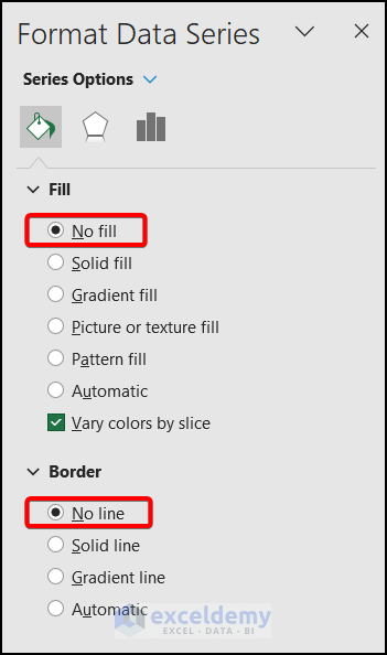
- In the Format Data Series window, check the No fill in the Fill section and No line in the Border section.
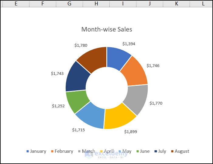
The doughnut chart has labels outside the chart, like the image below.
Note: You cannot show the Legends from the above process. But if you insert another doughnut chart having the same size as before, where you can show the Legends.
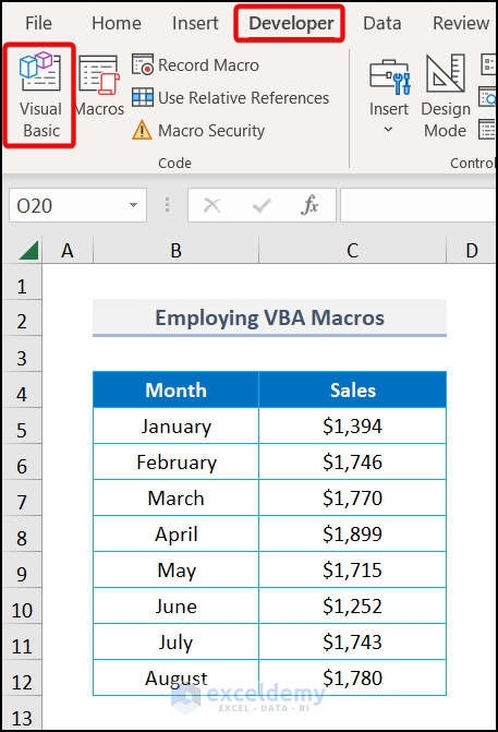
Method 2 – Employing VBA to Label Outside in Doughnut Chart
Steps:
- Navigate to the Developer tab >> choose Visual Basic.
- Choose the Insert tab >> Module >> Module 1.
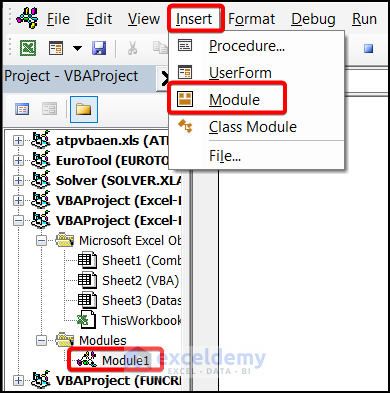
- Write up the following code in the Module 1 box.
Option Explicit
Sub pie_as_Sheet2()
Dim Wbook As Workbook
Dim WSheet As Worksheet
Dim Chng_Shape As Shape
Dim lab As DataLabel
Dim x As Long, y As Long, w As Long, h As Long, cd As Long
Dim circ As Shape
Set Wbook = ThisWorkbook
Set WSheet = Wbook.Sheets("VBA")
Set Chng_Shape = WSheet.Shapes.AddChart2
cd = 75
With Chng_Shape.Chart
    With .ChartArea
        .Format.Fill.ForeColor.RGB = RGB(244, 244, 244)
        .Height = 250
        .Width = 400
        .Left = 80
        .Top = 80
    End With
    .ChartType = xlPie
    .SetSourceData WSheet.Range("B4:C12")
    .HasTitle = False
    .HasLegend = False
    .ApplyDataLabels xlDataLabelsShowLabel, , , , , True, , True, , vbLf
    With .FullSeriesCollection(1).DataLabels
        .Position = xlLabelPositionOutsideEnd
        .NumberFormat = "0.0%"
    End With
    With .PlotArea
        x = .Left
        y = .Top
        h = .Height
    End With
    Set circ = .Shapes.AddShape(msoShapeOval, x + h / 2 - cd / 2, _
        y + h / 2 - cd / 2, cd, cd)
    With circ
        .Line.Visible = msoFalse
        .Fill.ForeColor.RGB = RGB(244, 244, 244)
        .Shadow.Type = msoShadow30
    End With
End With
End Sub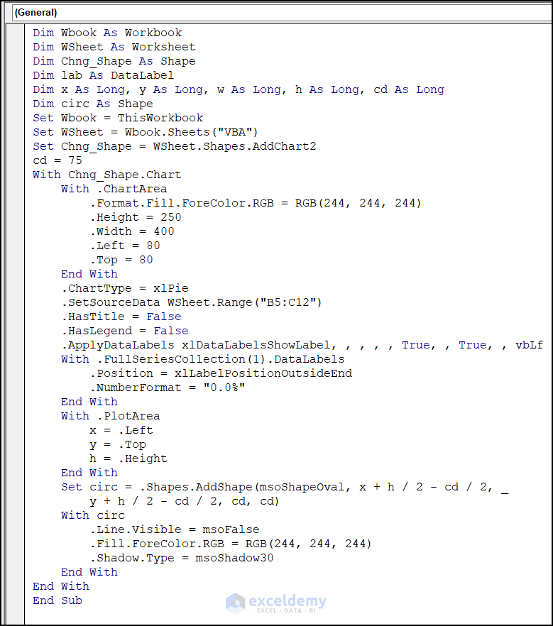
Code Breakdown
- Set all the variables needed to construct the code.
- We fixed the worksheet name to VBA, where we want to insert the chart.
- The chart size was fixed, and the circle radius was 75.
- The dataset was selected, and we applied the xlDataLabelsShowLabels command to display the data labels. We also set the Number Format command to 0.0%.
- We inserted the PlotArea object to specify the plot area of the created chart.
- We declared the circle shape and the chart’s color with RGB (244, 244, 244).
- We chose the msoShadow30 as a MsoShadowType to define a certain type of shadow.
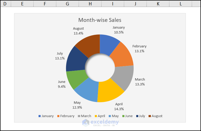
Finally, a doughnut chart has been inserted, which labels the outside of the chart like the image below.
Download Practice Workbook
Download the following practice workbook. It will help you to realize the topic more clearly.
Related Articles
- How to Make Doughnut Chart with Total in Middle in Excel
- How to Insert Leader Lines into Doughnut Chart in Excel
- How to Create Curved Labels in Excel Doughnut Chart
- How to Create Progress Doughnut Chart in Excel
- How to Change Hole Size of Excel Doughnut Chart
<< Go Back to Excel Doughnut Chart | Excel Charts | Learn Excel
Get FREE Advanced Excel Exercises with Solutions!
