In this article, we will demonstrate how to create a Progress Doughnut Chart to show the percentage of progression of a task in Excel.
To demonstrate the method, we will use a simple dataset containing information about what percentage of a task is completed.
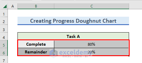
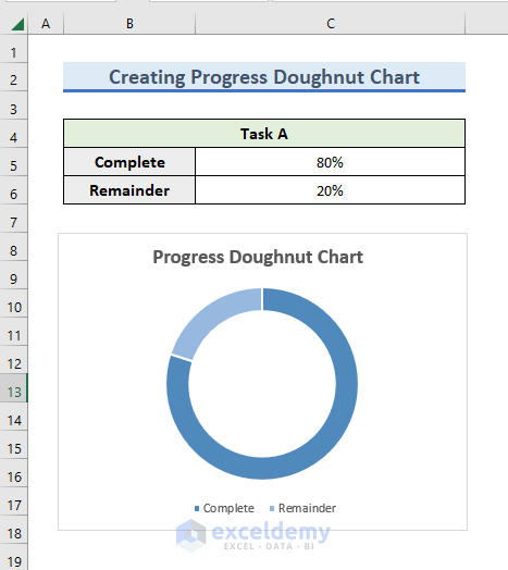
Step 1 – Prepare the Dataset
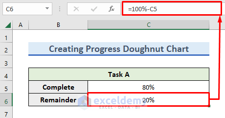
In the following dataset, 80% of the task is completed.

Let’s calculate what percentage of the task is remaining.
- Enter the following formula in cell C6:
=100%-C5- Press OK to return the percentage of the task remaining.
Read More: How to Make Doughnut Chart with Total in Middle in Excel
Step 2 – Insert the Chart
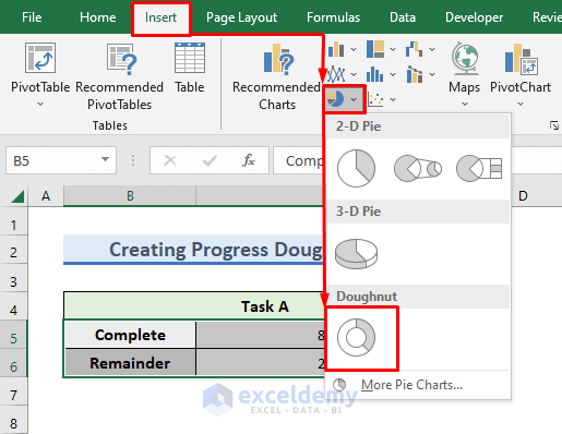
Now we can create the doughnut chart.
- Select the B5:C6 range.
- Go to the Insert tab and click on the drop-down menu of the Insert Pie or Doughnut Chart.
- Select Doughnut from the wizard that pops up.
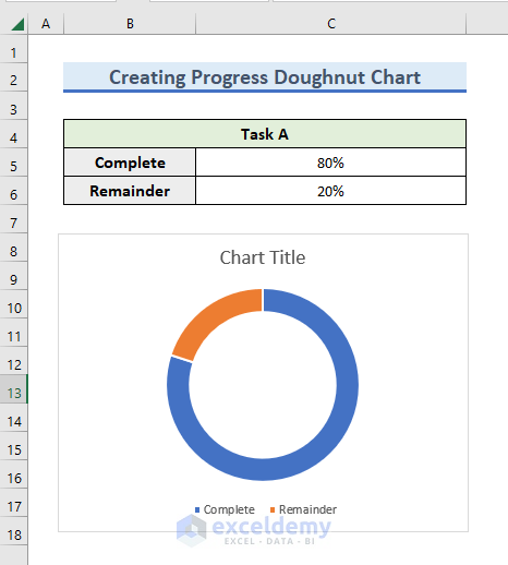
- The doughnut chart is inserted in the sheet.
Now we’ll modify the chart.
Read More: How to Insert Leader Lines into Doughnut Chart in Excel
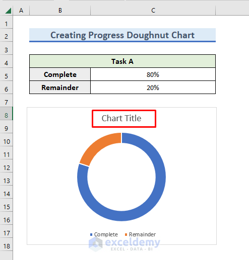
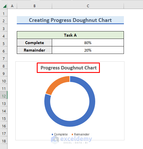
Step 3 – Change the Chart Title
- Double-click on the Chart Title.
- Enter a relevant title for the chart.
We have given the title Progress Doughnut Chart.
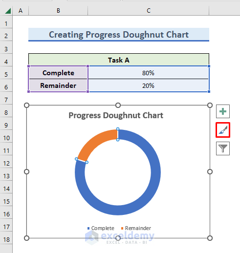
Step 4 – Format the Color of the Progress Doughnut Chart
Now we’ll beautify the chart by changing its color and format. In Excel, there are many options available.
- Click on the blue bar of the chart.
Some icons will appear next to the chart.
- Click on the following Chart Styles icon:
A wizard for setting Style and Color appears.
- In the Color tab, select the range of colors as follows:
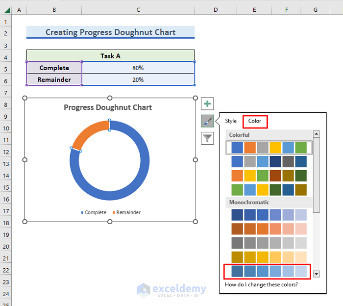
The color of the doughnut chart changes accordingly.
Let’s color Complete and Remainder in differently colors.
- Select the Remainder bar on the chart and go to the Format tab.
- In the Shapes Style group, click on the drop-down menu of the Shape Fill option.
- Select a color.
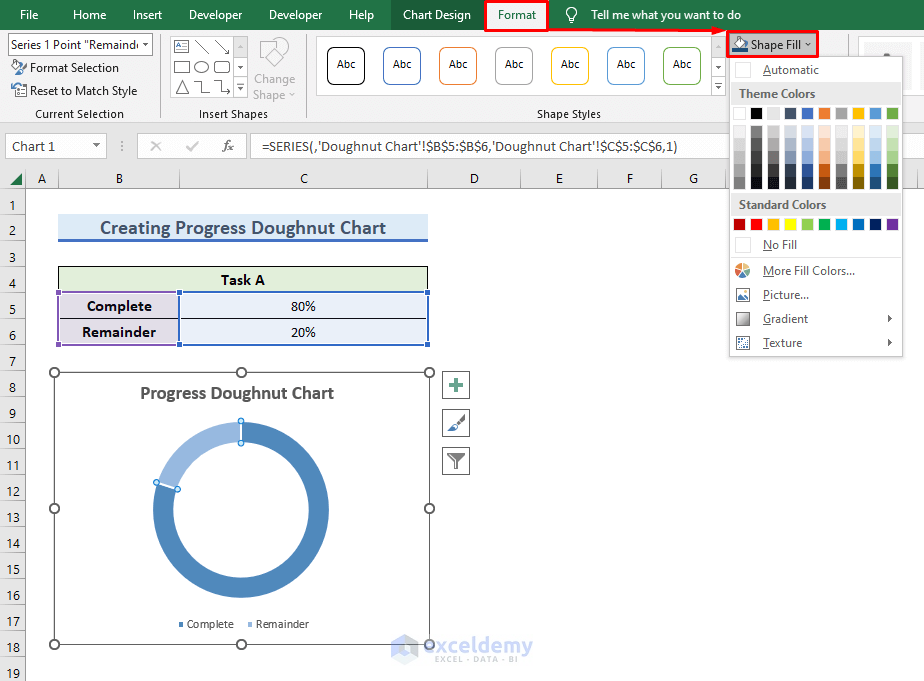
The color of the Remainder bar changes to the Ash color.
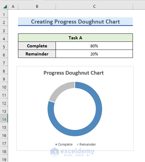
Read More: How to Change Color Based on Value in Excel Doughnut Chart
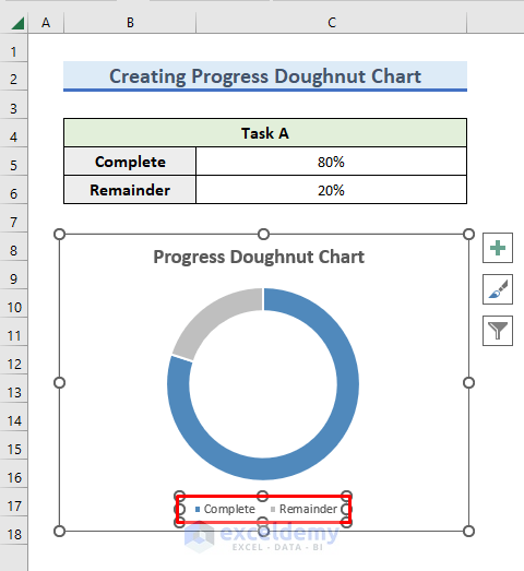
Step 5 – Reform the Legend of the Chart
- Since we do not need these legends here, click on the legends and press Delete.
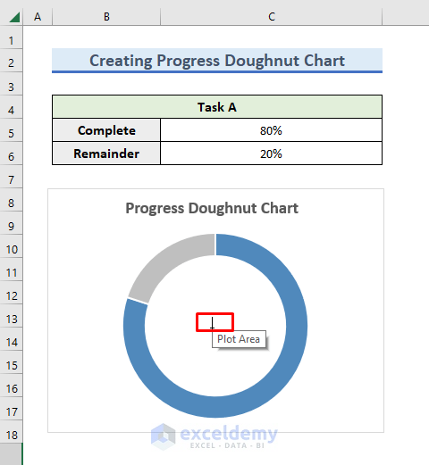
Instead of legends, we will use a textbox to show the percentage.
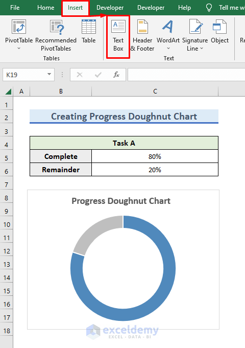
- Select Insert >> Text Box to draw the textbox.
An icon appears.
- Place the icon in the location where you want to draw the textbox, here, in the middle of the chart.
- Modify the shape of the textbox by dragging the radio buttons.
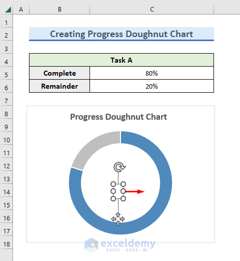
- After shaping the textbox, click on it to open editing mode.
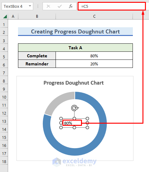
- Enter the following formula in the formula bar:
=C5So, the textbox will show the value of the percentage of completed tasks in cell C5.
- Press Enter to display the result.
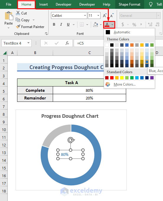
Let’s change the color and size of the text.
- Click on the text of the textbox.
- Go to the Home tab.
- Click on the drop-down menu of Font Color from the Font group.
- Change the color of the text to match the chart, namely to the color blue.
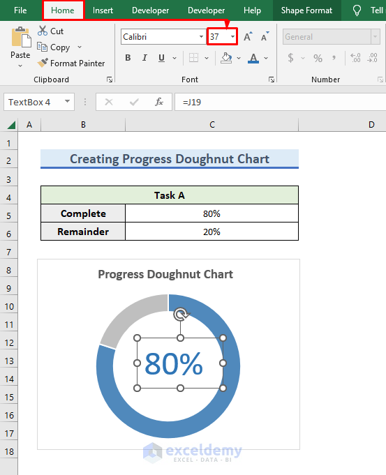
- To increase the font size of the text, go to the Home tab.
- Type 37 in the Font Size option of the Font group.
Step 6 – Modify the Edges
- Click on the blue bar of the chart and double-click on the mouse.
The Format Data Series window will appear.
- Click on the Fill & Line panel.
- Select Solid Line in the Border field.
- Set the Width to 4 pt.
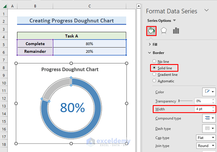
- Return to the sheet.
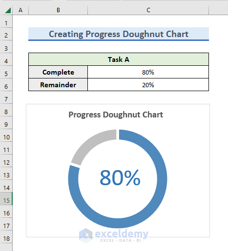
Our progress doughnut chart is almost ready.
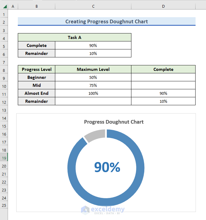
Step 7 – Adjust the Dataset with Conditional Formatting
This step is an optional procedure to take your Progress Doughnut Chart to another level by showing different colors depending on the level of completion of the task as follows:
- If the task is under 50% complete, then it is at Beginner level.
- If the task is 50% to 75% complete, then it is at Mid-level.
- If the task is over 75% complete, then it is at Almost End level.
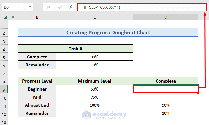
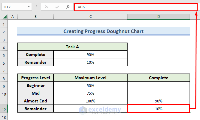
In the Complete column, we will take the value from cell C5. But, if the level of the task is Beginner, then we will insert the value in cell D9.
- Enter the following formula in cell D9:
=IF(C$5<=C9,C$5," ")- Press Enter.
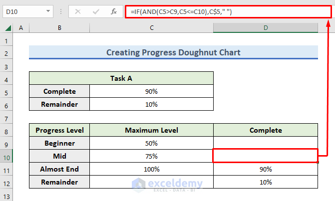
- Enter the following formula in cell D10:
=IF(AND(C5>C9,C5<=C10),C$5," ")- Press Enter.
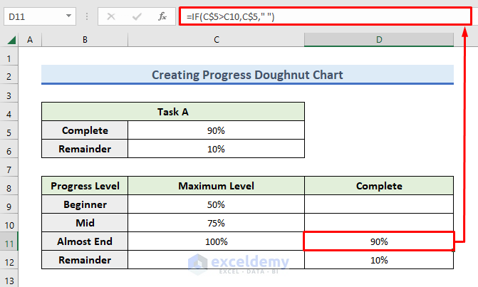
- In cell D11, enter the following formula:
=IF(C$5>C10,C$5," ")- Press Enter to proceed.
- Insert the calculated value of cell C6 in cell D12 by using the following formula:
=C6- Press Enter.
Step 8 – Apply Conditioning Formatting
- Click on the chart and right-click on the mouse.
- In the dialog box that opens, click on the Select Data option.
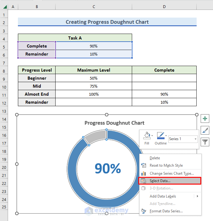
The Select Data Source window opens.
- Under the Legend Entries (Series) field, click on the Remove button.
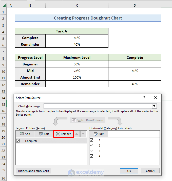
As a result, previous entries are deleted.
- Click on the Add button.
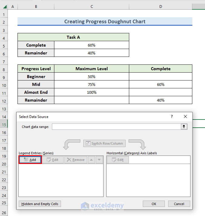
- In the Series name field, enter “=’Doughnut Chart’!$B$5”.
Here, the name of our Excel Sheet as Doughnut Chart and B5 represents the header, Complete.
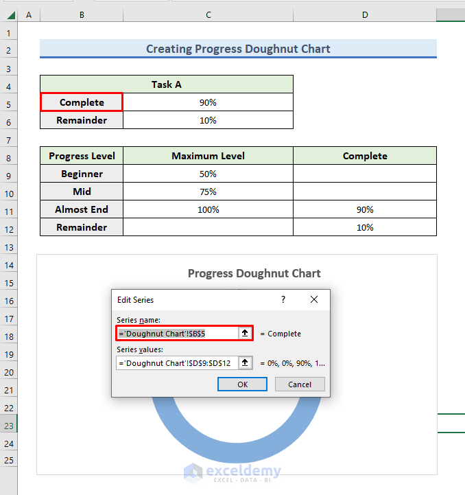
- As our Excel Sheet name is Doughnut Chart, enter “=’Doughnut Chart’!$D$9:$D$12” in the Series Values field.
- Press OK.
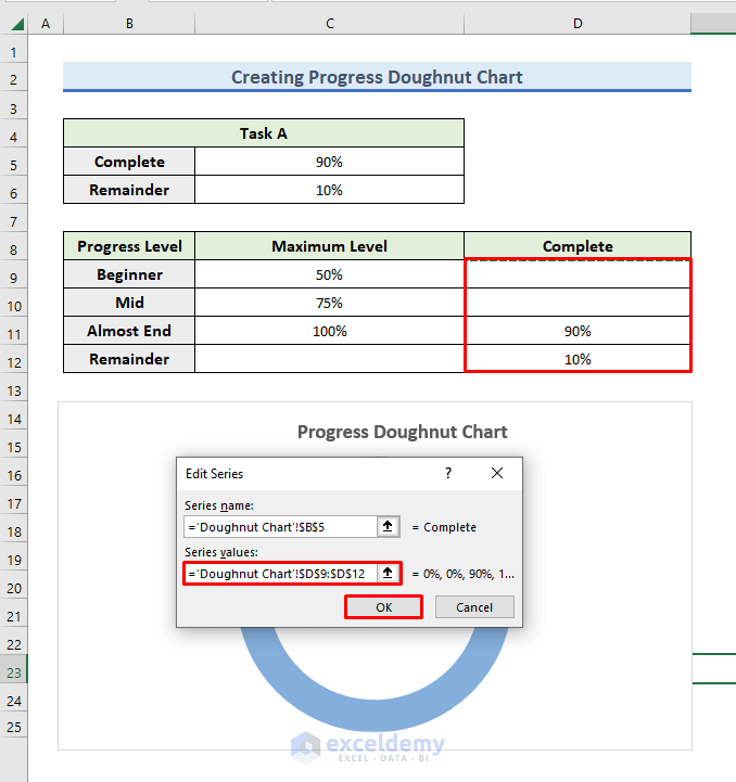
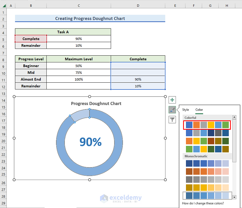
- Click on the following Chart Style icon:
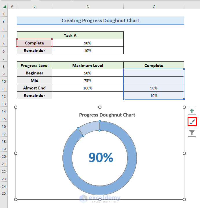
- Change the color of the chart as desired.
Final Output
Our Progress Doughnut Chart is complete.
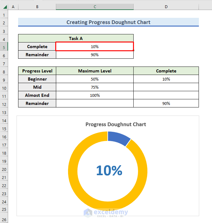
To check that it works properly, let’s change the completion status of the task.
- Enter 0.1 in cell C5.
The modified Completion percentage is displayed in blue, with the Remaining percentage displayed in yellow.
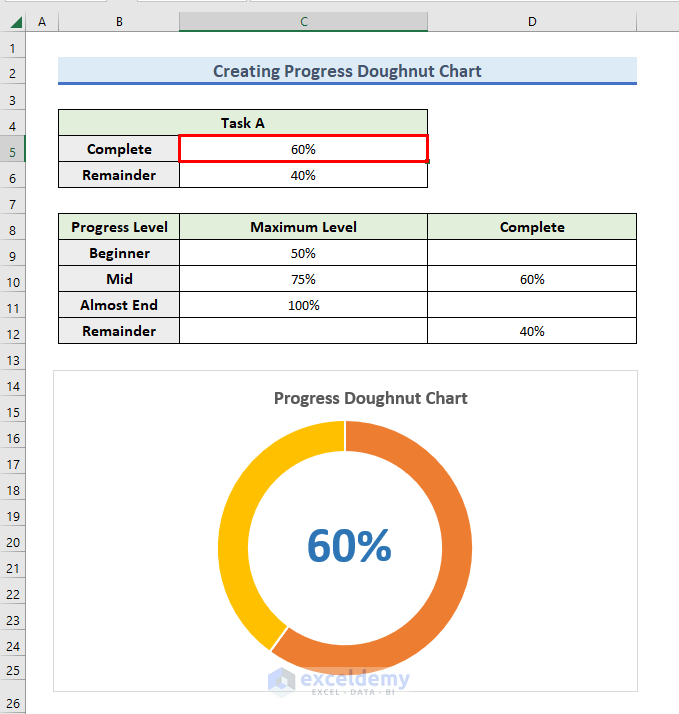
- Enter 0.6 in cell C5.
The Completion percentage is now displayed in orange.
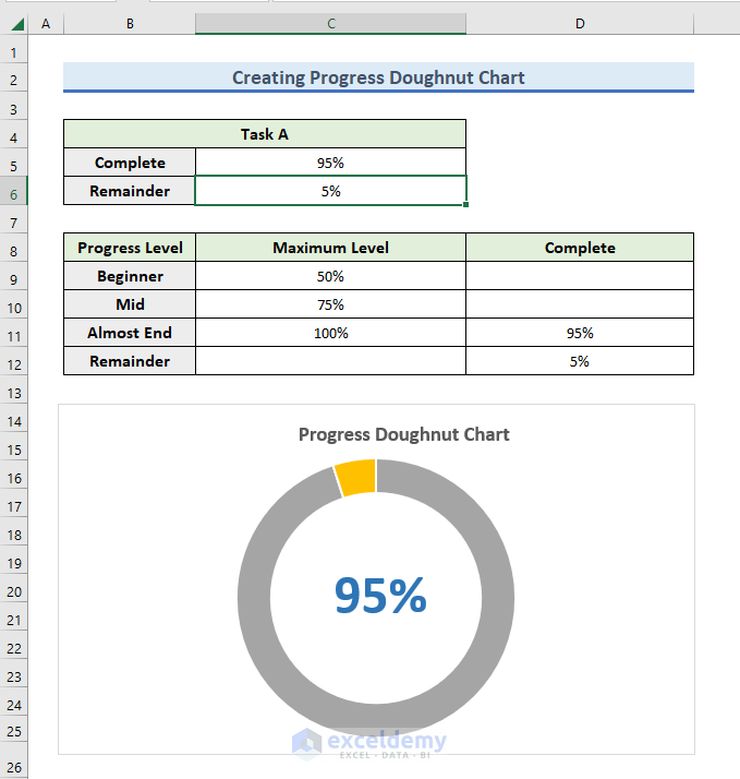
- For the final check, type 0.95 in cell C5.
The completion percentage is now displayed in the ash color. So, depending on the progress level, the chart displays in different colors.
Download Practice Workbook
Related Articles
- Excel Doughnut Chart with Multiple Rings
- How to Show Labels Outside in Excel Doughnut Chart
- How to Change Hole Size of Excel Doughnut Chart
- How to Create Curved Labels in Excel Doughnut Chart
<< Go Back to Excel Doughnut Chart | Excel Charts | Learn Excel
Get FREE Advanced Excel Exercises with Solutions!
