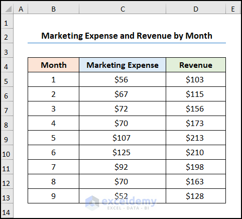
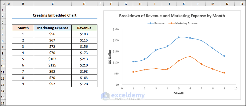
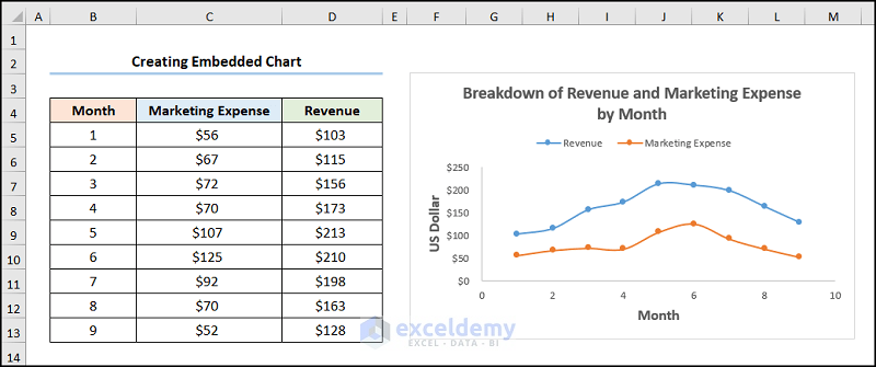
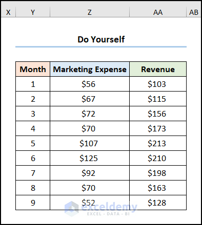
The dataset showcases Month number, Marketing Expense, and the Revenue in USD.
Step 1 – Add a Series to the Chart
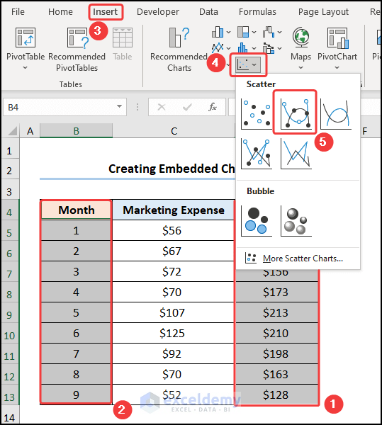
- Select D4:D13 (the Revenue column).
- Hold CTRL and select B4:B13 (the Month column).
- Go to Insert >> click Insert Scatter (X,Y) or Bubble Chart >> choose Scatter with Smooth Lines and Markers.
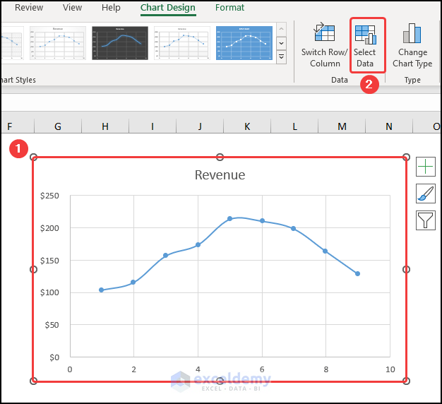
Step 2 – Add a Second Series to the Chart
- Select the chart >> choose Select Data in Chart Design.
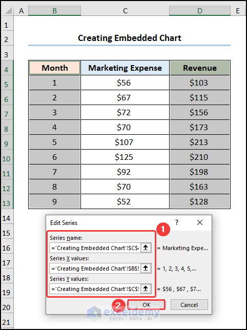
- Click Add to enter a new series.
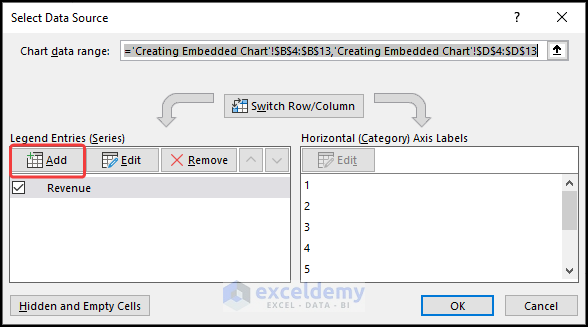
In the Edit Series dialog box.
- Enter the Series name, here, Marketing Expense.
- Choose B5:B13 as Series X values >> select C5:C13 as Series Y values >> Click OK.
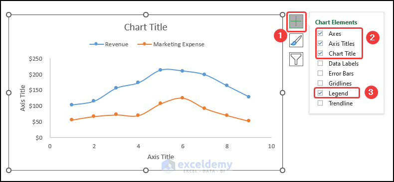
Step 3 – Format the Chart
- Go to Chart Elements, enable the Axes Title to name the axes. Here, Month and US Dollar.
- Add a Chart Title, here, Breakdown of Revenue and Marketing Expense by Month.
- Check Legend to show the two series.
- Uncheck Gridlines.
This is the output.
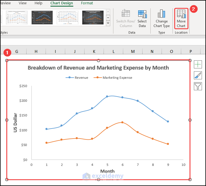
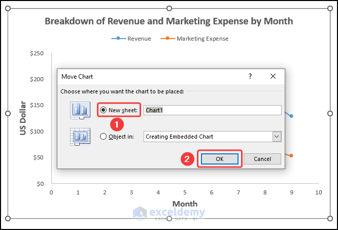
Moving an Embedded Chart into a Chart Sheet
Steps:
- Select the chart >> go to Chart Design and choose Move Chart.
In the Move Chart wizard:
- Select New sheet >> click OK.
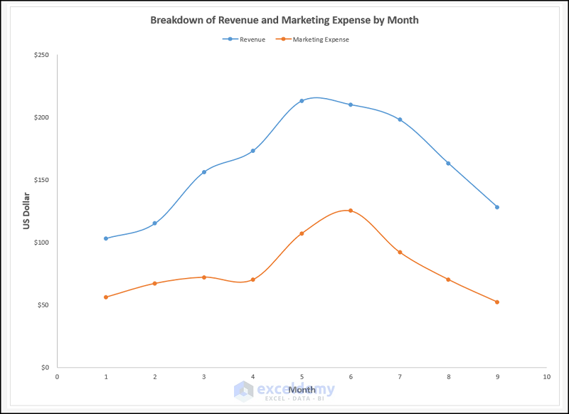
This is the output.
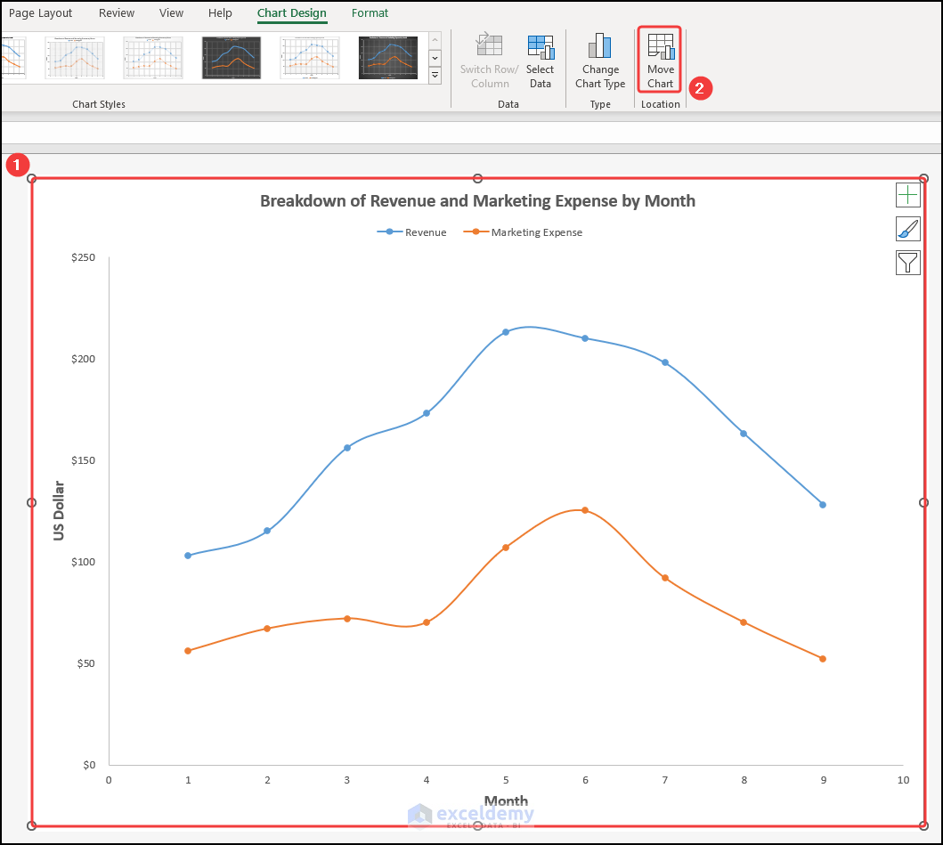
Moving a Chart Sheet into an Embedded Chart
Steps:
- Select the chart in the chart sheet >> click Move Chart.
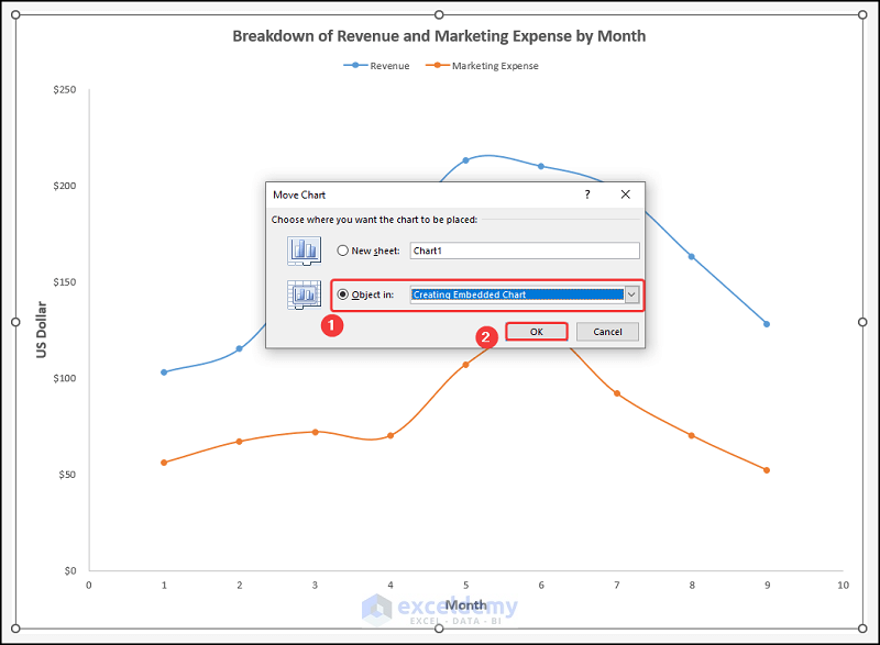
In the Move Chart wizard:
- Select Object in and enter the name of the sheet to insert the chart, here: Creating Embedded Chart.
- Click OK.
This is the output.
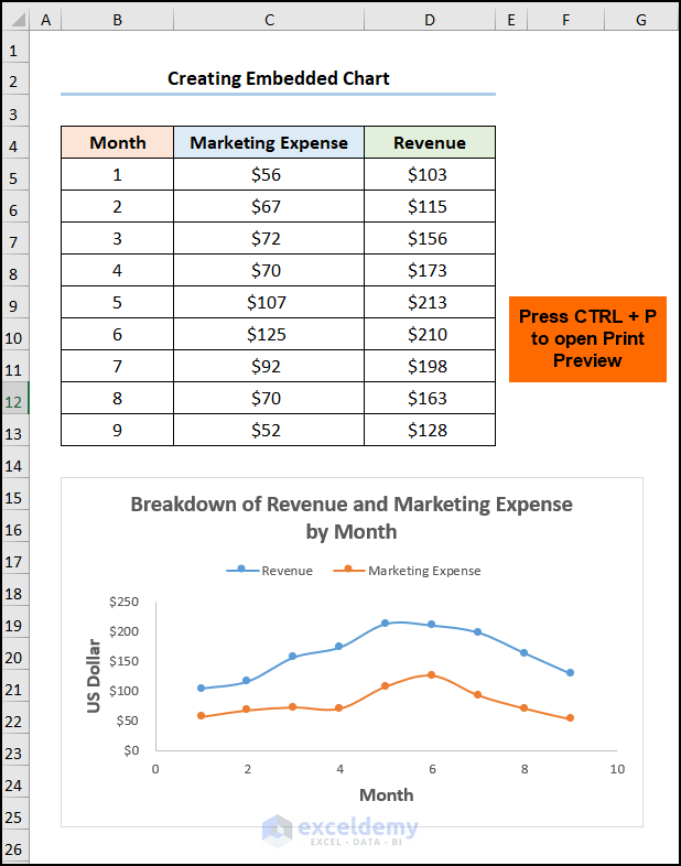
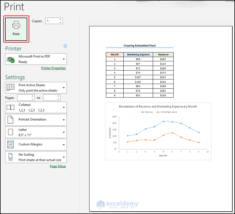
Printing an Embedded Chart
Steps:
- Insert a chart.
- Press CTRL + P to open print preview.
- Click Print.
Read More: How to Print Graph in Excel
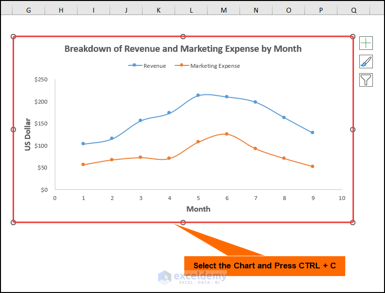
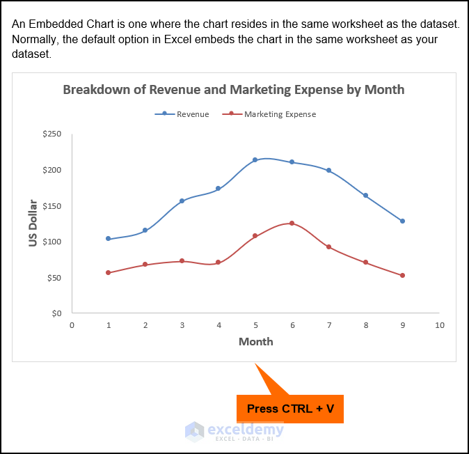
How to Embed an Excel Chart into a Word Document
Steps:
- Select the chart >> press CTRL + C to copy the chart.
- Open a Word document >> choose a location to insert the chart.
- Press CTRL + V to paste it.
Read More: How to Refresh Chart in Excel
Practice Section
Practice here.
Download Practice Workbook
Download the practice workbook.
<< Go Back To Excel Charts | Learn Excel
Get FREE Advanced Excel Exercises with Solutions!

Hello Kawser Ahmed,
Greetings!
I am very much delighted by this tutorial. if you explain why and where the use of this embedded chart.
Thanking You,
Sincerely,
Manohar
Hello Manohar,
Thank you for your kind words! I’m glad you found the tutorial helpful.
The embedded chart is used when you want to place a chart directly within the same worksheet as your data. It’s especially useful for quick data analysis and presentation since you can easily compare the chart with its corresponding dataset side by side.
In contrast, a chart sheet displays the chart on a separate sheet—best suited for reports or presentations.
Hope this clarifies the purpose and use of the embedded chart!
Regards,
ExcelDemy
Hi Shamima,
Great, and nice to see the feedback from you.
helpful feedback,
Thanking You,
Manohar
Hello Manohar,
Thank you so much! I’m really glad you found the feedback helpful. Appreciate your kind words!
Best regards,
Shamima