What Is a Gantt Chart?
A Gantt Chart is a graph that generally shows the relationship between tasks or milestones and time. It is a very useful tool to keep track of a project. A Gantt Chart can help you reflect on the following things through a chart.
- Starting and ending dates of various tasks or milestones.
- Overlapped tasks or milestones over a certain period of time.
- Duration of each task or milestone.
- A list of all the tasks or milestones.
How to Make a Gantt Chart in Excel
Unfortunately, there is no direct way to make a Gantt Chart in Excel. However, we can use a Stacked Bar Chart and then apply some changes to that chart, which will create a Gantt Chart.
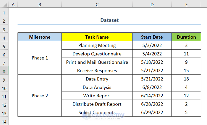
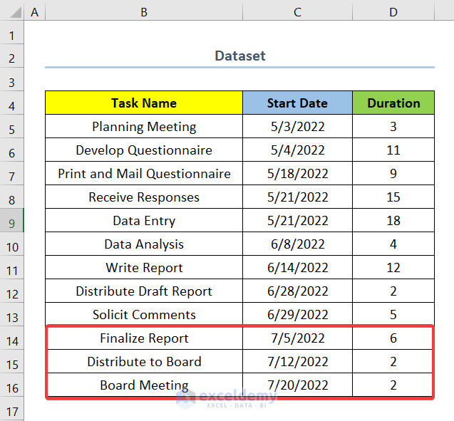
Suppose we have a dataset containing different Task Names for a project, their Start Date, and Duration. Each task competition achieves a milestone.
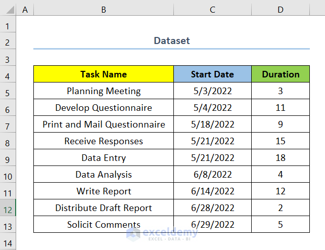
Let’s create a Gantt Chart from this dataset. First, we need to insert a Stacked Bar Chart.
STEPS:
- Select the whole column for Start Date, the range C4:C13.
Cell C4 is the column heading, and cell C13 is the last cell of the range.
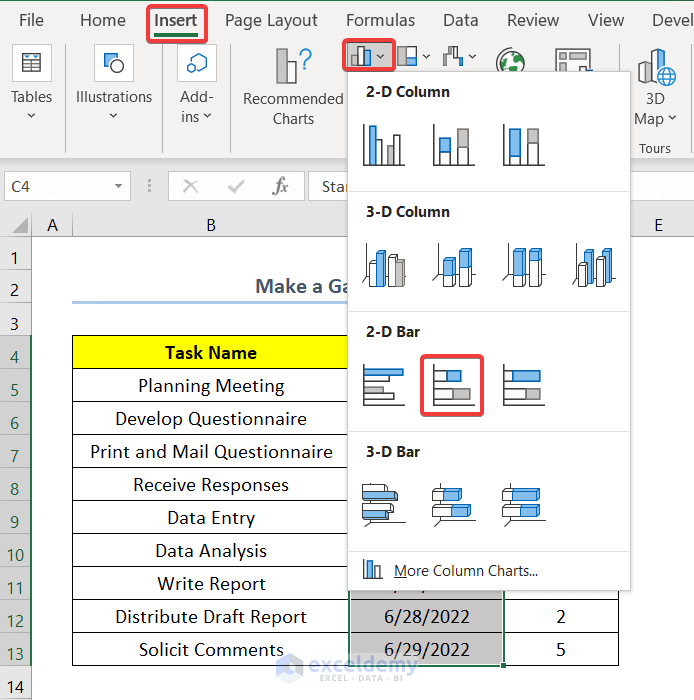
- Go to the Insert tab.
- Select Insert Column or Bar Chart.
- Click on Stacked Bar to insert a Bar Chart.
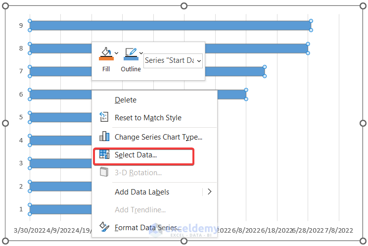
- Right-click on the chart.
- Click on Select Data.
- Click on Add under Legend Entries (Series).
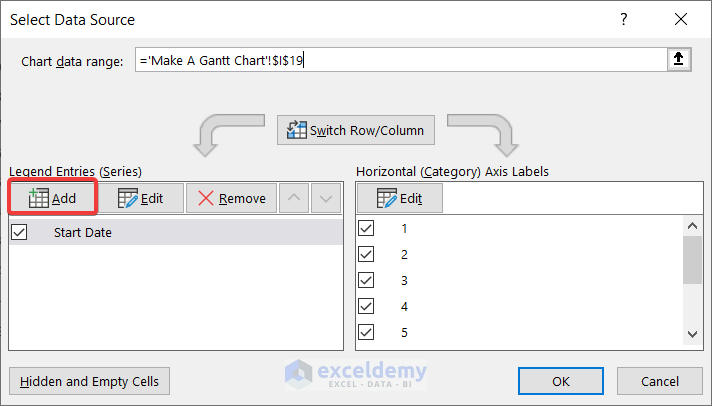
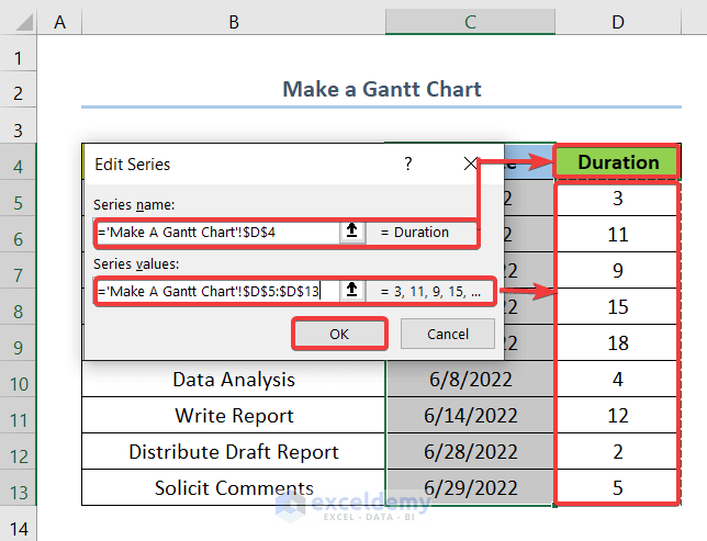
- Add cell D4 as the Series name.
- Select range D5:D13 as the Series Values.
- Click on OK.
- Click on Edit under Horizontal (Category) Axis Labels.
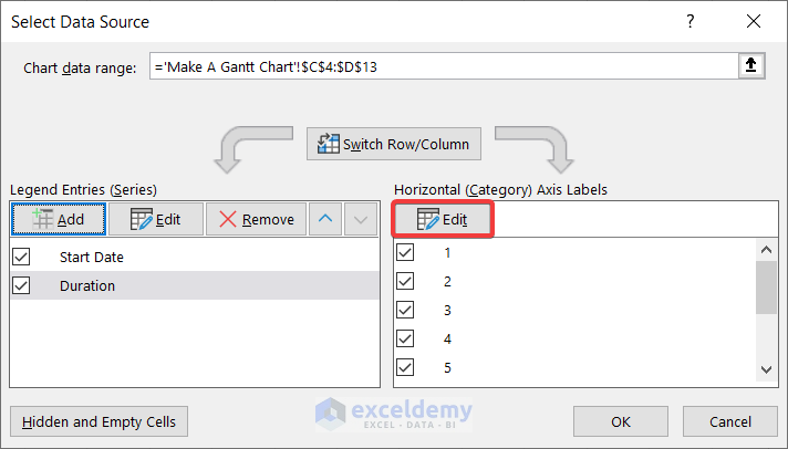
- Select the range B5:B13 (the first and last cells of the column Task Names respectively).
- Click OK.
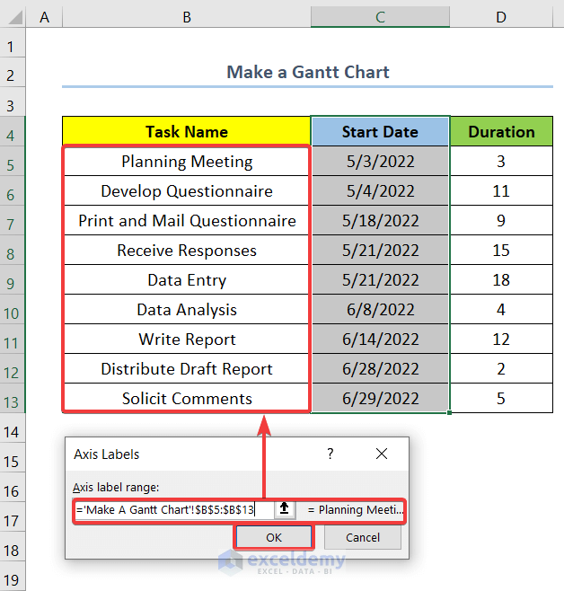
- Click OK to exit the Select Source Data box.

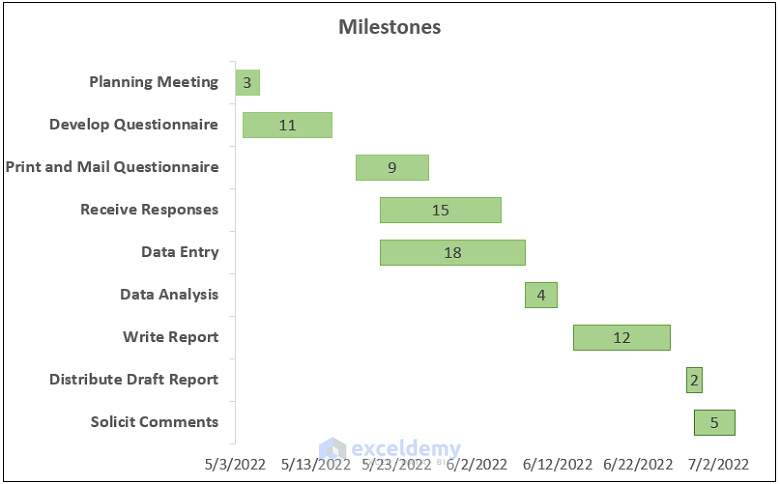
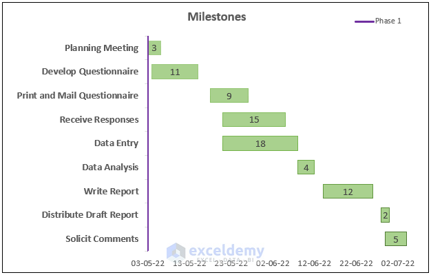
Our basic Gantt chart is complete.
Let’s now make a Gantt Chart with Milestones that looks like the screenshot below.
Suppose we want to add milestones to the Gantt Chart named Phase 1 and Phase 2.
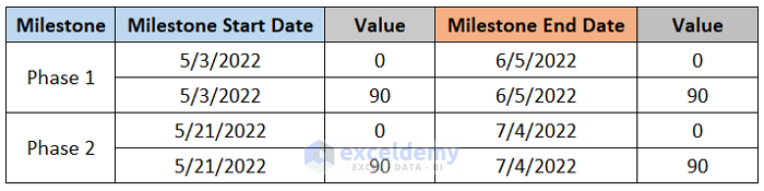
Step 1 – Create a Table to Insert Milestones Data in Gantt Chart
- Insert a new column to add milestones to the Gantt Chart as shown in the screenshot below.
- For each phase, write the dates twice each and assign a value of 0 to one and 90 to the other.
- The Milestone End Date is the start date of the last task of the milestone plus the duration.
Read More: How to Create Excel Gantt Chart with Multiple Start and End Dates
Step 2 – Insert a Data Series for Milestones in Gantt Chart
Now we insert a new Data Series into the Gantt Chart using values from the table.
- Copy the cells for Milestone Start Date and Values for Phase 1.
- Select the chart and paste it.
Excel will paste the copied cells as a Series 3 and a Stacked Bar Chart by default.
Step 3 – Change the Chart Type of the Data Series
We change the chart type of the Data Series to a Scatter with Straight Lines chart.
- Select the new Data Series and right-click on it.
- Click on Change Series Chart Type.
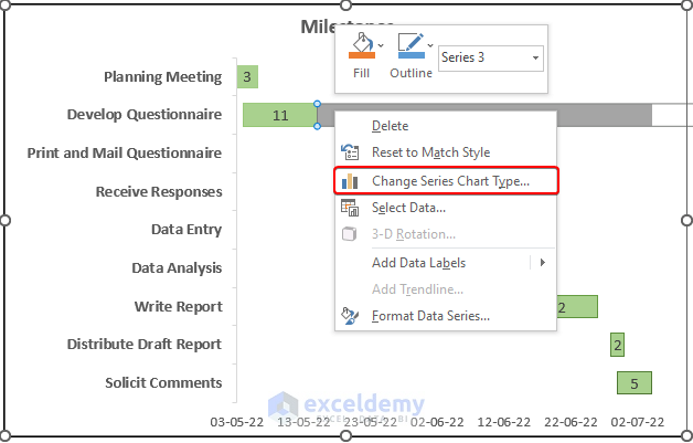
- For Series 3, change the chart type to Scatter with Straight Lines.
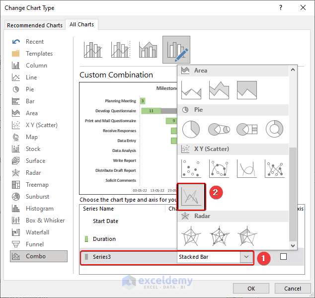
- A preview of the output is displayed.
- Click OK.
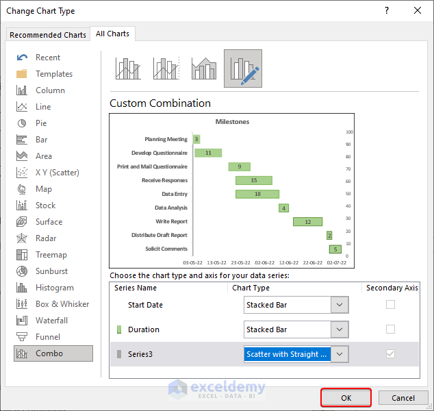
Step 4 – Format and Edit the Chart
Excel will automatically add a secondary axis for the new chart type. Let’s format and edit the secondary axis and legends to make our Gantt Chart more understandable and visually more appealing.
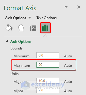
- Double-click on the secondary axis to open the Format Axis options.
- Go to Axis Options.
- Change the Maximum value to 90.
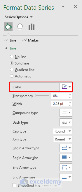
- Click on the new Data Series or Series 3 and change the color according to your preference.
- Add and edit legends for the new chart.
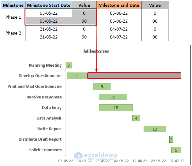
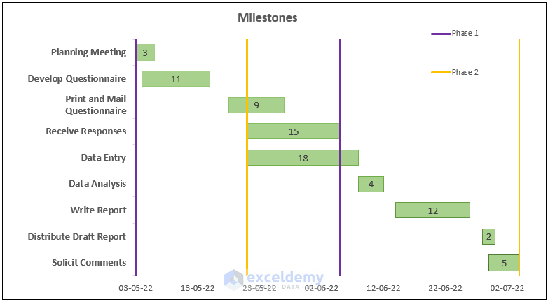
We now have an output for the starting date of the milestone as shown in the screenshot below.
- Copy and paste the other data for Phase 1 and Phase 2 to the chart.
- Similarly, format and edit the chart.
After adding the data, the output will look like the screenshot below.
Read More: How to Create Gantt Chart for Multiple Projects in Excel
How to Add New Tasks to Gantt Chart in Excel
Suppose after making the Gantt chart, we want to add new tasks to it. There are two methods to do so.
Method 1 – Using Copy and Paste
This is the fastest method to add new tasks or milestones to a Gantt Chart.
Steps:
- Select the new cells for the new Task names, their Star Dates, and Duration.
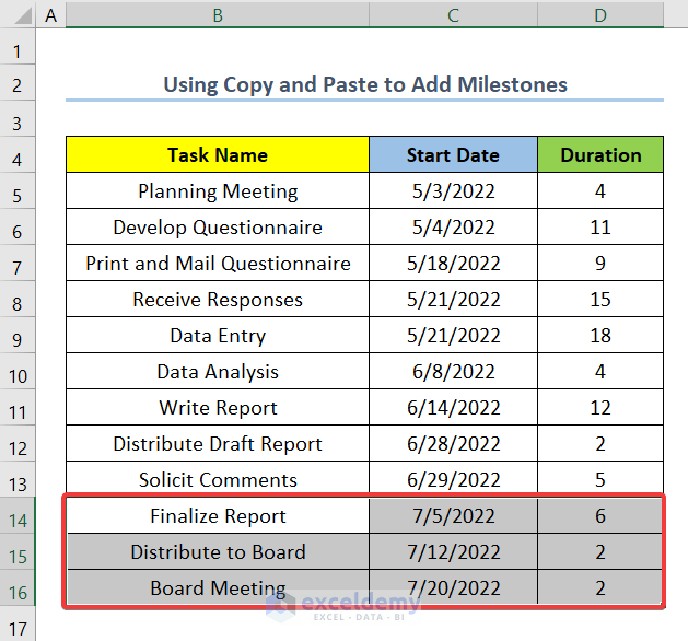
- Copy and paste into the Gantt chart.
The output should be as shown in the screenshot below.
Method 2 – Using Select Data Source
This method gives you more flexibility while adding new tasks or milestones to the Gantt Chart.
Steps:
- Right-click on the chart.
- Click on Select Data.
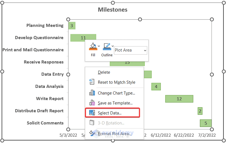
- Click on Edit under Horizontal (Category) Axis Labels.
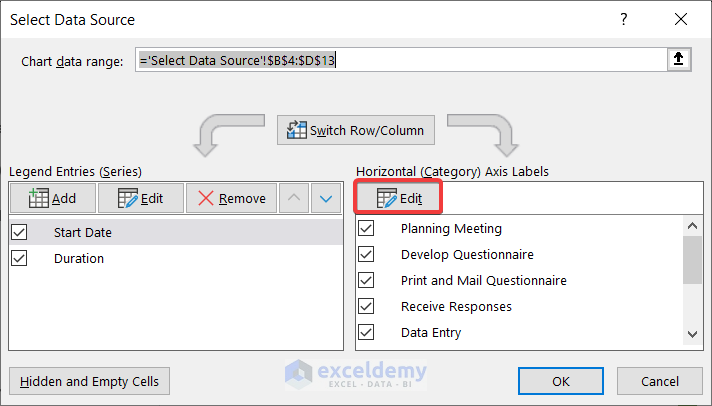
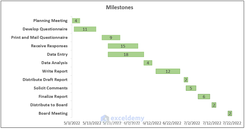
- Select range B5:B16 (the first and new last cells of the column Task Names respectively).
- Click OK.
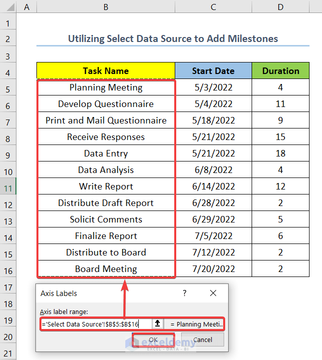
- Select Start Date and then click on Edit.
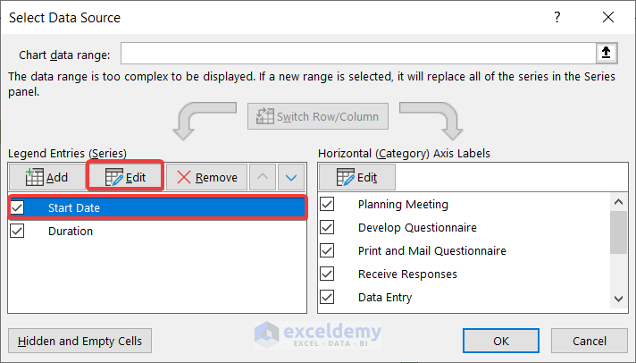
- Change the range to C5:C16 under Series Values.
- Click OK.

- Similarly, edit the date series for Duration.
- Click on OK.
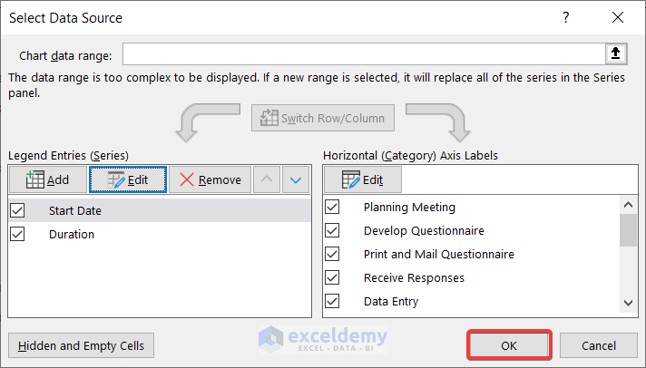
The output will be as shown in the screenshot below.
Download Practice Workbook
Related Articles
- How to Use Excel Gantt Chart (Create and Customize)
- How to Show Dependencies in Excel Gantt Chart
- Excel Gantt Chart with Conditional Formatting
<< Go Back to Gantt Chart Excel | Excel Charts | Learn Excel
Get FREE Advanced Excel Exercises with Solutions!
