While using charts in Excel we often need to edit the legend. Legends are basically representation of data. We mainly use legends when data has the same type of values in every category. They help us to better understand the data. In this article, we will learn how to edit legend in Excel.
How to Edit Legend in Excel: 2 Methods
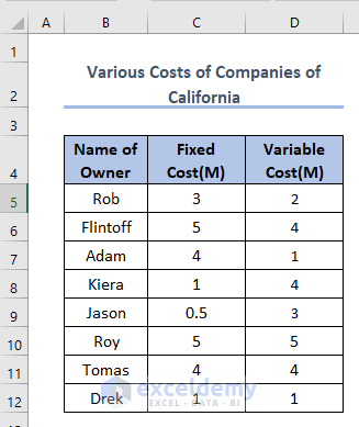
We have made a dataset based on the costing of some companies in California in January 2022. Then we have made a chart to show the relations and comparisons of costs where the legends are Fixed Cost (M) and Variable Cost (M). The dataset is like this.
After creating a chart from the above dataset, we’ll get the following output.
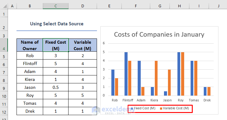
Here, Fixed Cost (M) and Variable Cost (M) are legends.
Certainly, we can edit legend in Excel very easily by using 2 useful methods.
1. Using Select Data Source to Edit Legend in Excel
Using Select Data source to edit legend is useful when the legend needs to be different from the title. Usually, if we change the title the legend is changed accordingly. But sometimes we don’t need to change the title. This method is applicable there. In this method we can follow the steps below.
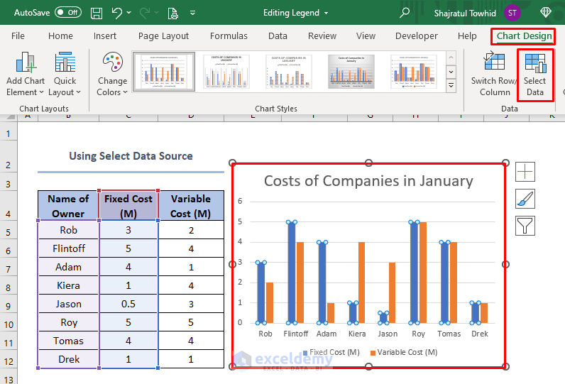
- Firstly, we have to click the chart in any place.
- After doing that, the Chart Design button will appear on the top right corner of Excel.
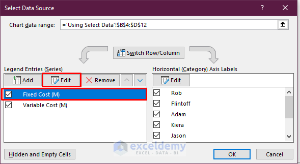
- Then, we need to select the Chart Design. Here, we should select the Select Data tab.
A box will appear like this.
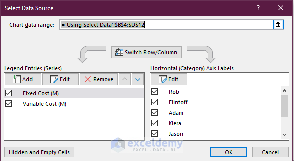
- After this, we should select the series Fixed Cost (M) which we want to change and click on the Edit.
- After that, we need to change the name of the legend by writing our required name in the box.
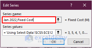 Here, Jan 2022, Fixed Cost is the new legend that we have changed.
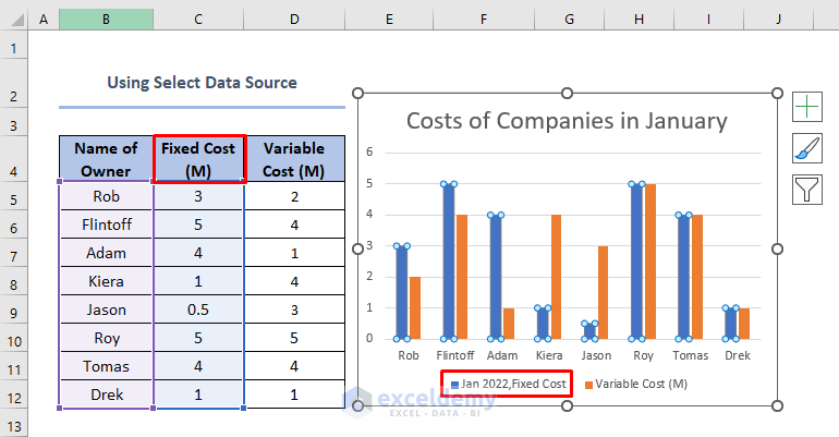
- Finally, we will see that the title is unchanged as Fixed Cost(M), and the legend is changed to Jan 2022, Fixed Cost.
Read More: How to Add a Legend in Excel
2. Editing Legend in Excel Data
When we need to change the title as well as the legend of the chart in Excel, we should follow this method.
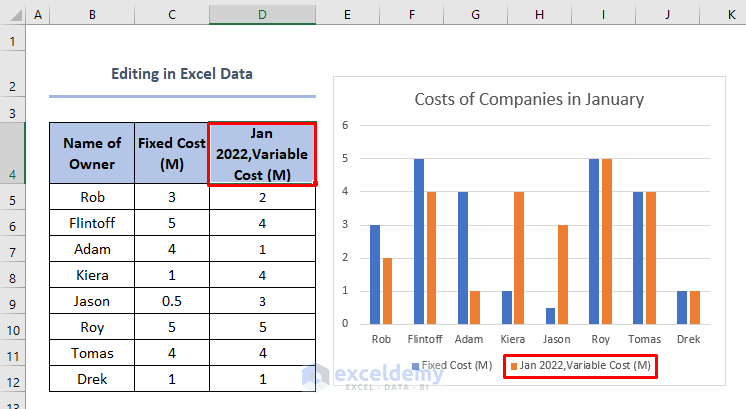
- First, we should select the cell which we want to change.
- Then, we should change the title in the cell as per our requirement and we will see that the legend will also change according to the title like this.

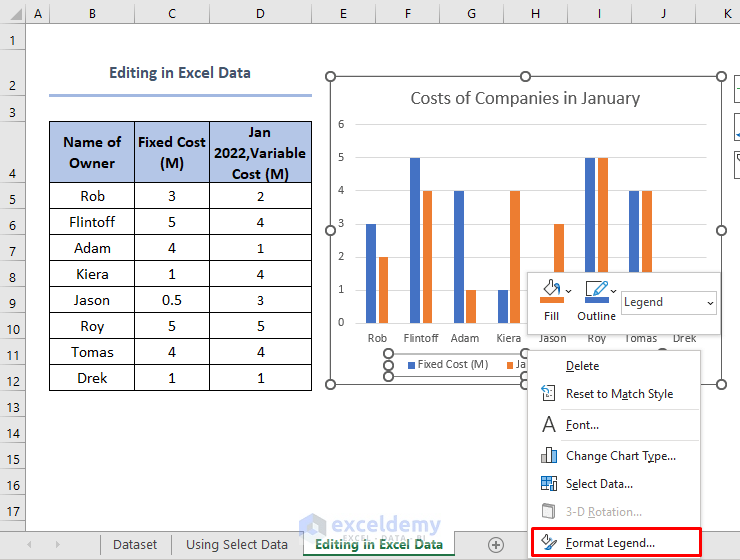
Here, we have changed the title from Variable Cost (M) to Jan 2022, Variable Cost(M). We will see the changed legend which is also Jan 2022, Variable Cost (M).
Read More: How to Create a Legend in Excel Without a Chart
How to Change Legend Format
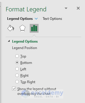
Sometimes, we might need to change the format of the legend. In order to change the legend format, we need to right-click on the legend and then click Format Legend.
The Format Legend dialogue box will appear. There are several options where we can change the legend position, fill, border color, border styles, and other formatting options.
Read More: How to Rename Legend in Excel
Things to Remember
- If we change anything in the title that is not connected with the chart, we will see legend as unchanged. Because editing legend in Excel data must require connection between the cell which we have selected and the chart.
- Editing legend by using Select Data source is handy to use when we use various types of big data base and need to change them according to different conditions and requirements.
Download Practice Workbook
Conclusion
Legend is a very basic component of charts which we use in Excel to represent data graphically. By studying this article, we can understand the system of editing and formatting of any legend that we will use in Excel.
Related Articles
- What Is a Chart Legend in Excel?
- How to Change Legend Title in Excel
- How to Change Legend Colors in Excel
- How to Reorder Legend Without Changing Chart in Excel
- How to Show Legend with Only Values in Excel Chart
- Excel Charts with Dynamic Title and Legend Labels
- How to Ignore Blank Series in Legend of Excel Chart
<< Go Back To Legend in Excel Chart | Excel Chart Elements | Excel Charts | Learn Excel
Get FREE Advanced Excel Exercises with Solutions!
