In a Gantt chart he Horizontal Axis (Value Axis) represents the total time span of the project. Each Bar in the Gantt Chart represents the duration of a task.
This is an overview:
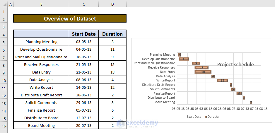
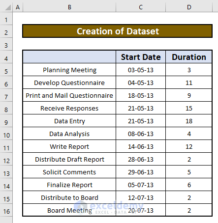
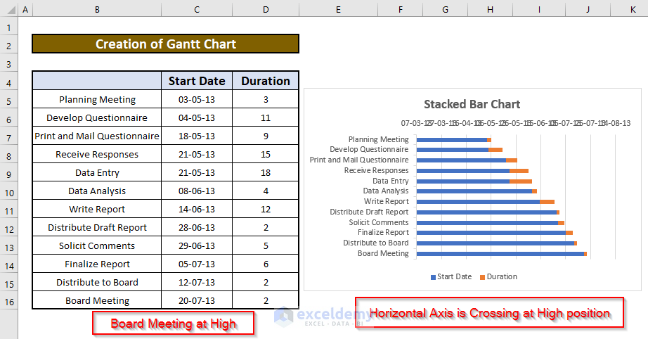
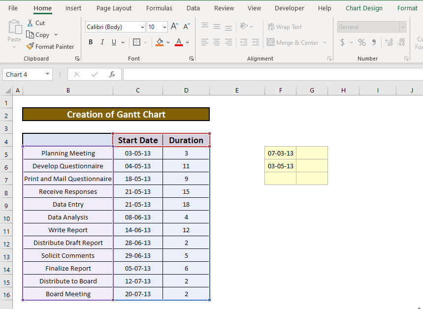
Step 1 – Create a Dataset
This is the sample dataset:
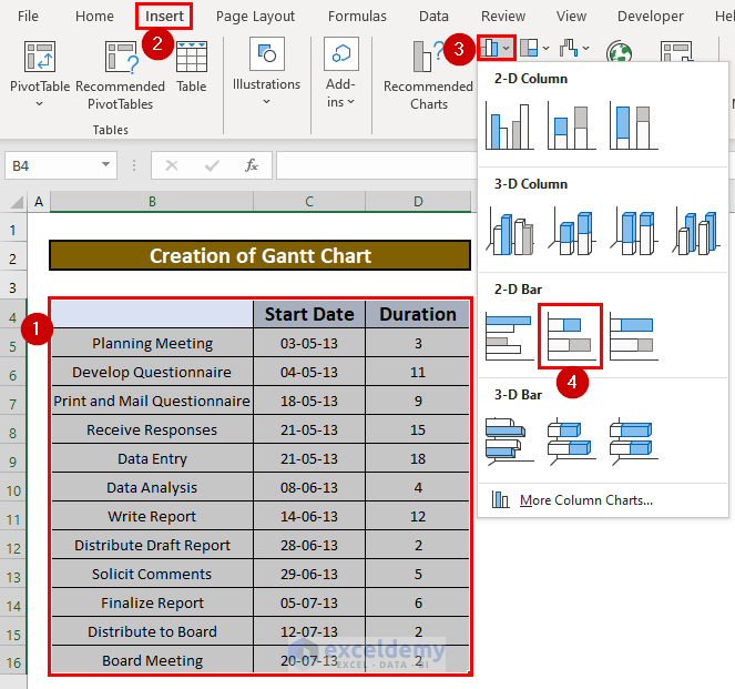
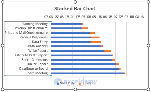
Step 2 – Create a Stacked Bar Chart
- Select B4:D16.
- In the Insert tab, go to:
Insert → Charts → Insert Bar Chart → 2-D Bar → Stacked Bar
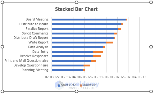
By default, the following chart is created.
Step 3 – Reversing the Order of the Category Axis
- Double click Category Axis.
- In Axis Options, select Categories in reverse order.
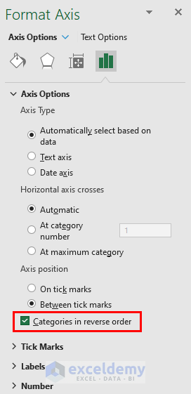
This is the output.
Step 4 – Changing the Labels Position in the Horizontal Axis
- Click Category Axis in Format Axis.
- In Axis Options tab, select Labels.
- Choose High in Label Position.
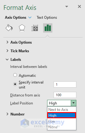
This is the output.
The Horizontal axis starts on 07/03/2013 (the date is selected by default).
You can set a different value.
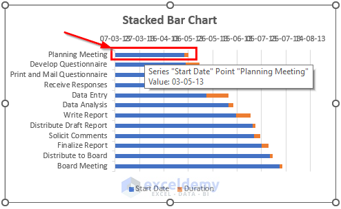
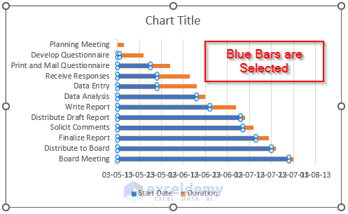
Move the cursor over a Bar (Blue or Red) to see:
- The Data Series name. Here, Start Date.
- The Data Point name. Here, Planning Meeting.
- The Value of the Data Series. Here, 03/05/2013.
Step 5 – Finding Days Between Two Dates
To find how many days are between 07/03/2013 and 03/05/2013:
- Enter a date into a cell.
- Change the cell format to General.
This is the output.
Observe the GIF:
For the Board Meeting data point, the blue bar is represents number 57 and the Red bar number 3.
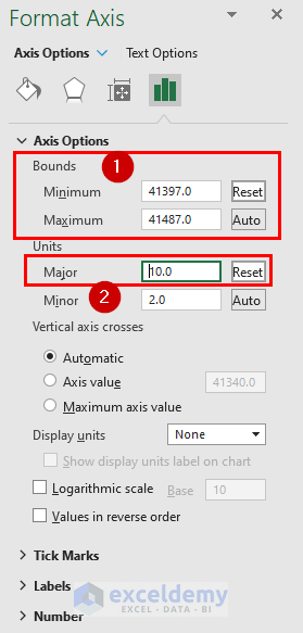
Step 6 – Change the Minimum, Maximum and Major Values in the Horizontal Axis
- Double-click the horizontal axis.
- In Format axis, select Axis options.
The minimum value is 41340 (representing 07-03-2013).
- Set the minimum value to 41397 (representing 03-05-2013)
The maximum value is automatically set.
- Change it to 41480.
- Change major units to 10.
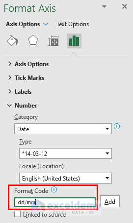
Step 7 – Change the Date Format in the Gantt Chart
- Enter dd/mm in Format Code (Number tab).
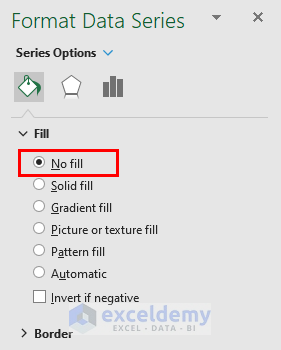
Step 8 – Use No Fill to make Blue Bars Invisible
- Select the Blue bars.
- In Format Data Series, select Fill.
- Choose No Fill. You can also use Fill Color in the Home tab.
This is the output.
Step 9 – Formatting the Gantt Chart
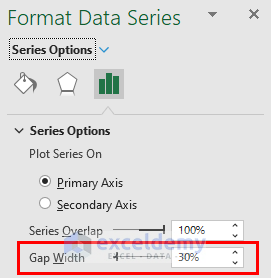
- Click the Duration data series (select a Red Bar).
- In Format Data Series, select Series Options.
- Change the Gap Width to 30% to decrease the Gap in the Category Axis.
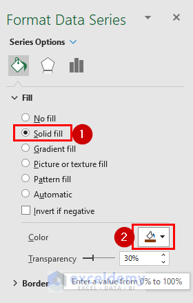
- Go to: Format Data Series → Fill & Line → Fill → Solid Fill → Choose a color for the Data Series.
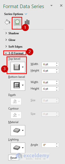
- Go to: Format Data Series →Effects → 3-D Format → Top Bevel → Select the Angle type level.
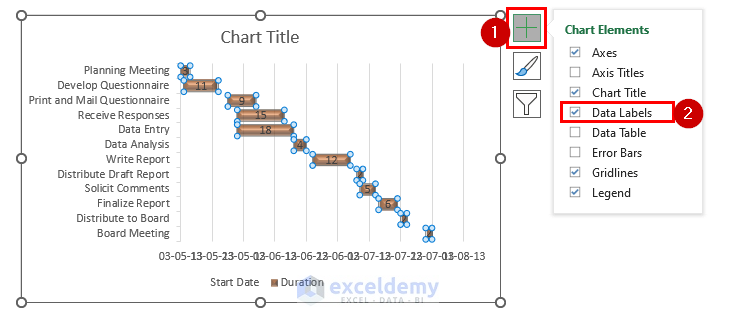
- Click Chart Elements.
- Select Data Labels.
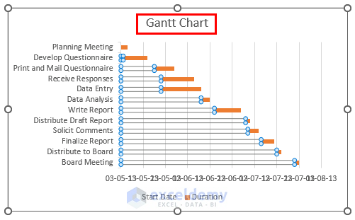
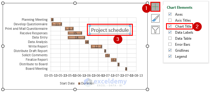
- Change the Chart Title to Project Schedule and increase its size.
To show the Horizontal gridlines:
- Go to Chart Elements.
- Click the Gridlines, and click the right arrow.
- Select Primary Major Horizontal.
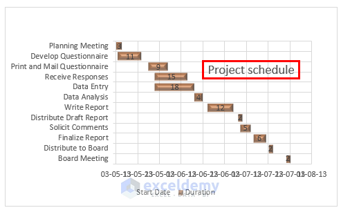
This is the output.
Download Practice Workbook
Related Articles
- How to Use Excel Gantt Chart
- How to Create Gantt Chart for Multiple Projects in Excel
- Excel Gantt Chart with Conditional Formatting
- How to Create Excel Gantt Chart with Multiple Start and End Dates
- How to Add Milestones to Gantt Chart in Excel
- How to Show Dependencies in Excel Gantt Chart
<< Go Back to Gantt Chart Excel | Excel Charts | Learn Excel
Get FREE Advanced Excel Exercises with Solutions!
