Types of Bar Graphs in Excel
There are two types of bar graphs: Horizontal (2-D/ 3-D bars) and Vertical (2-D/ 3-D Columns).
Bar graphs can be Clustered Bar, Stacked Bar, and 100% Stacked Bar.
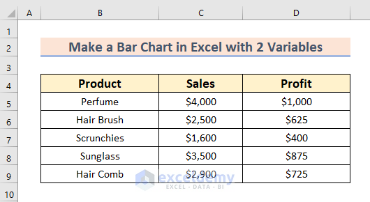
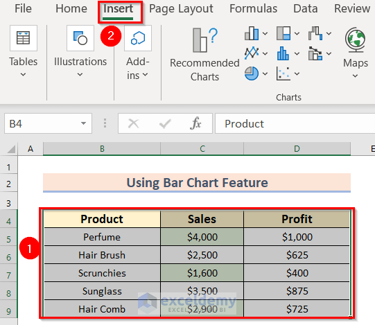
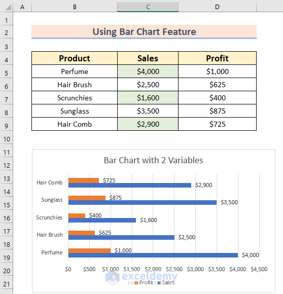
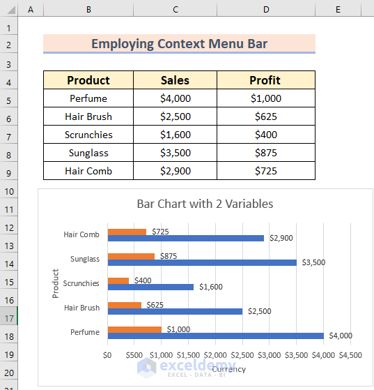
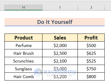
The sample dataset showcases Product, Sales, and Profit.
Method 1 – Using the Bar Chart Feature to Create a Bar Graph with 2 Variables
Steps:
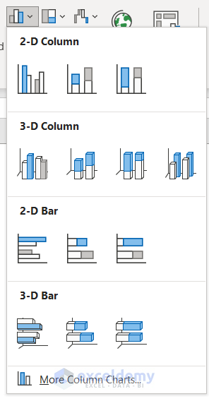
- In Charts, select Insert Column or Bar Chart.
- Here, 2-D Bar >> Clustered Bar.
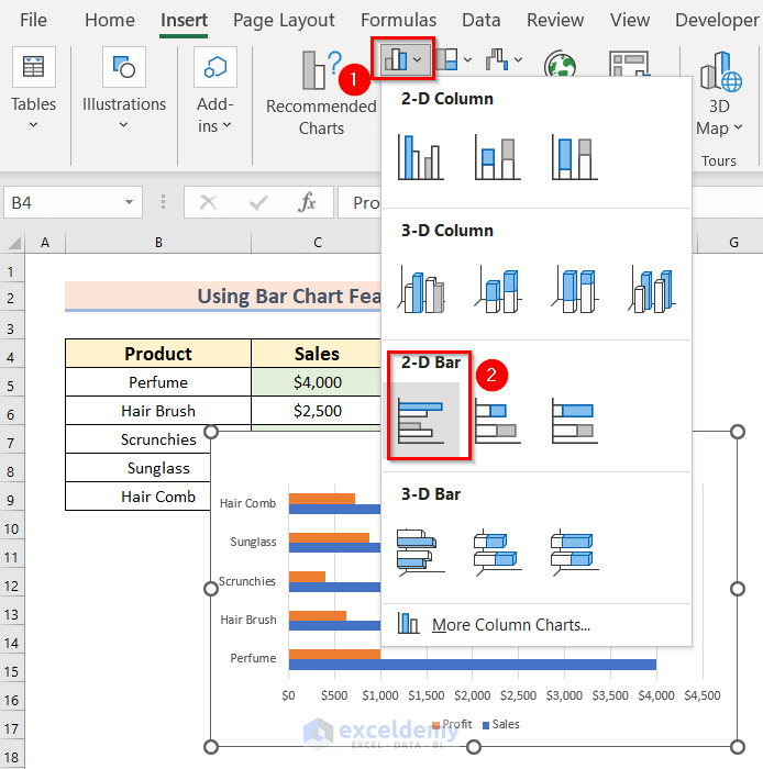
- Click 2-D Clustered Bar to see the output.
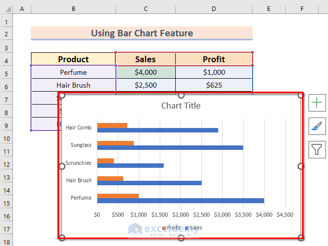
Add Data Labels in Chart Elements or change the Chart Title.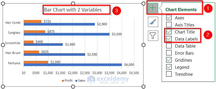
A bar graph with 2 variables is displayed.
Read More: How to Make a Bar Graph with Multiple Variables in Excel
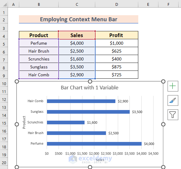
Method 2 – Using the Context Menu Bar to Add a New Variable in a Bar Graph
Steps:
- Select B4:C9 to create the bar chart with 1 variable.
- Follow the steps in Method 1.
To add a new bar with the data in Profit.
- Right-Click the chart.
- Choose Select Data.
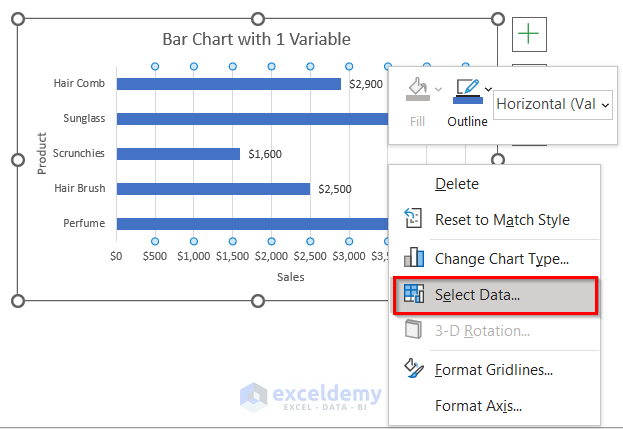
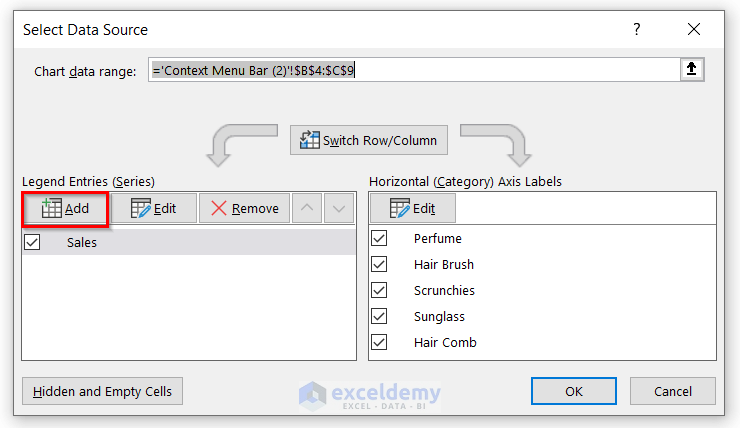
- In the Select Data Source dialog box, choose Add.
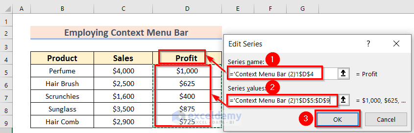
The Edit Series dialog box will open.
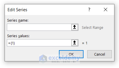
- Select the Series name. Here, Profit in D4.
- Enter the Series values. Here, D5:D9.
- Click OK.
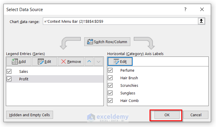
In the Select Data Source dialog box:
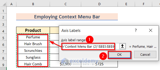
- Click Edit to change the Axis Labels.
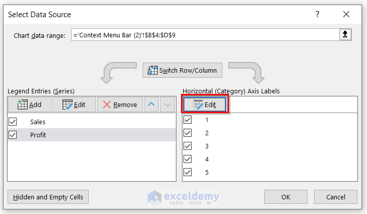
- Select the Axis label range. Here, B5:B9.
- Click OK.
- Click OK in the Select Data Source box.
The bar chart with 1 variable is displayed.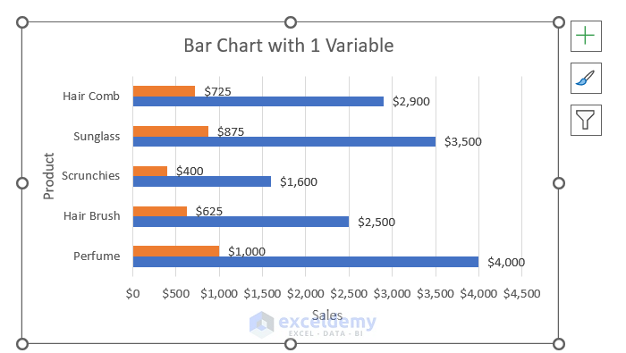
- Change the Chart Title by clicking it. You can also change the Axis Title.
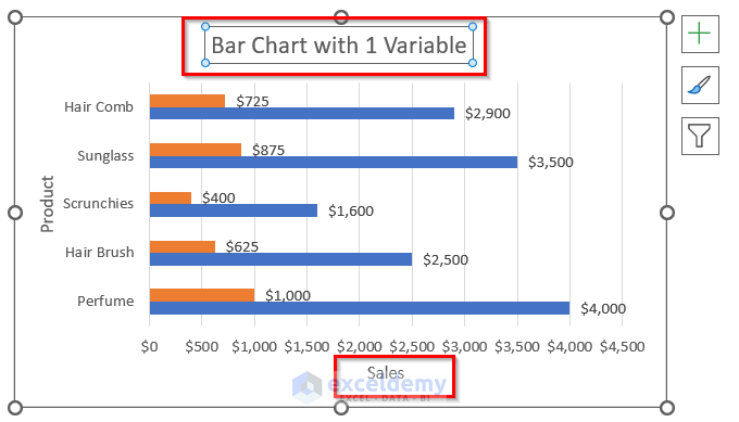
This is the output.
Read More: How to Make a Bar Graph in Excel with 3 Variables
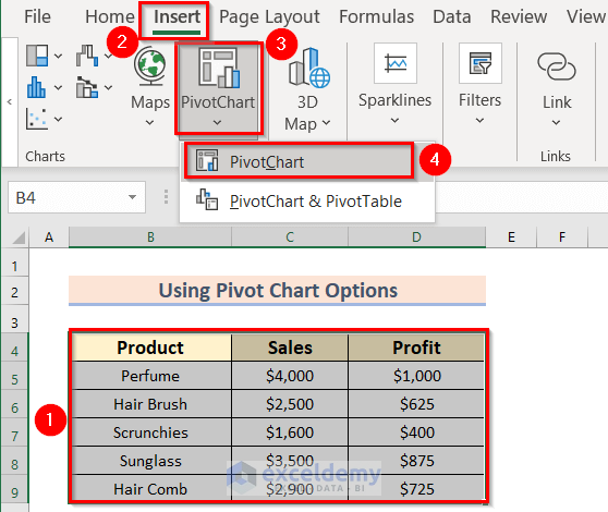
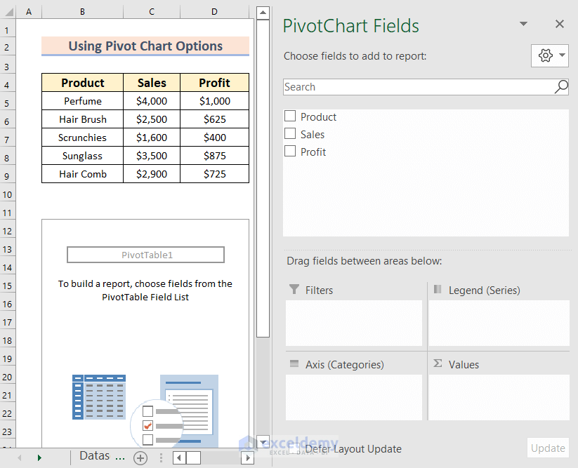
Method 3 – Using the Excel Pivot Chart Options to Create a Bar Graph with 2 Variables
Steps:
- Select the data range. Here, B4:D9.
- Go to the Insert tab.
- In PivotChart >> choose PivotChart.
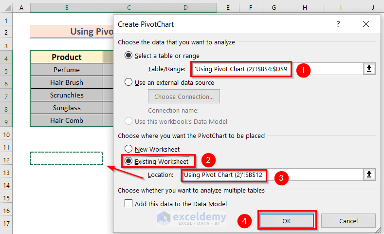
In the Create PivotChart dialog box:
- Select Table/Range.
- Click Existing Worksheet in Choose where you want the PivotChart to be placed.
- Choose a Location. Here, B12.
- Click OK.
This is the output.
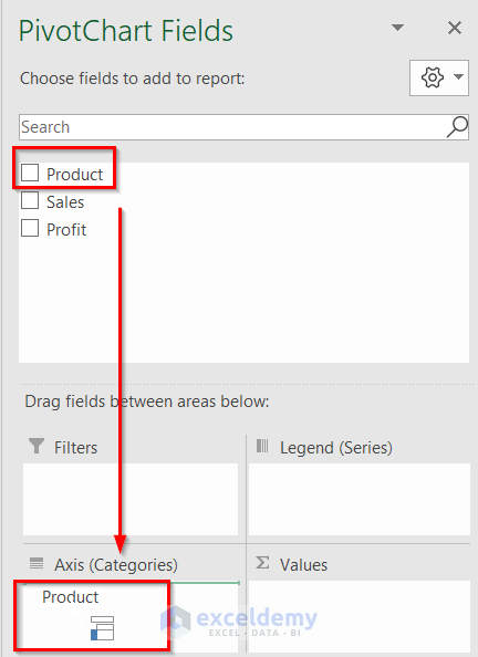
- In PivotChart Fields, drag Product to Axis (Categories).
- Drag Sales and Profit to Values.
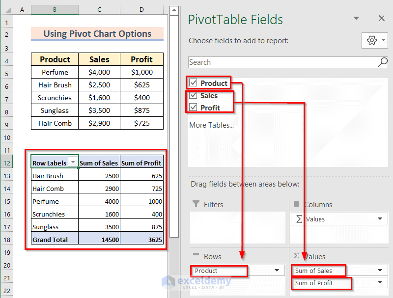
This is the output.
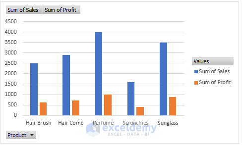
- Right-Click the PivotChart to change the chart style.
- In the Context Menu Bar >> select Change Chart Type.
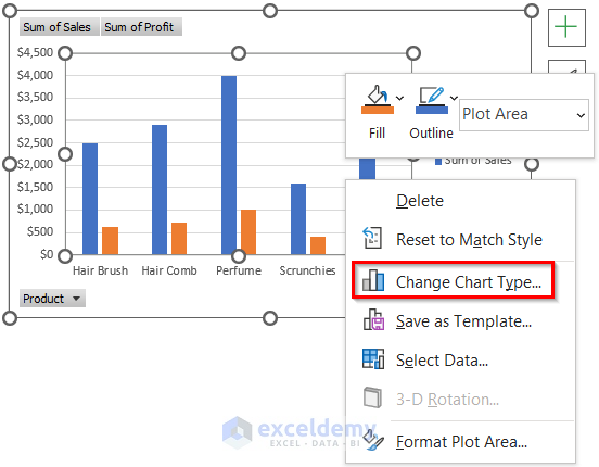
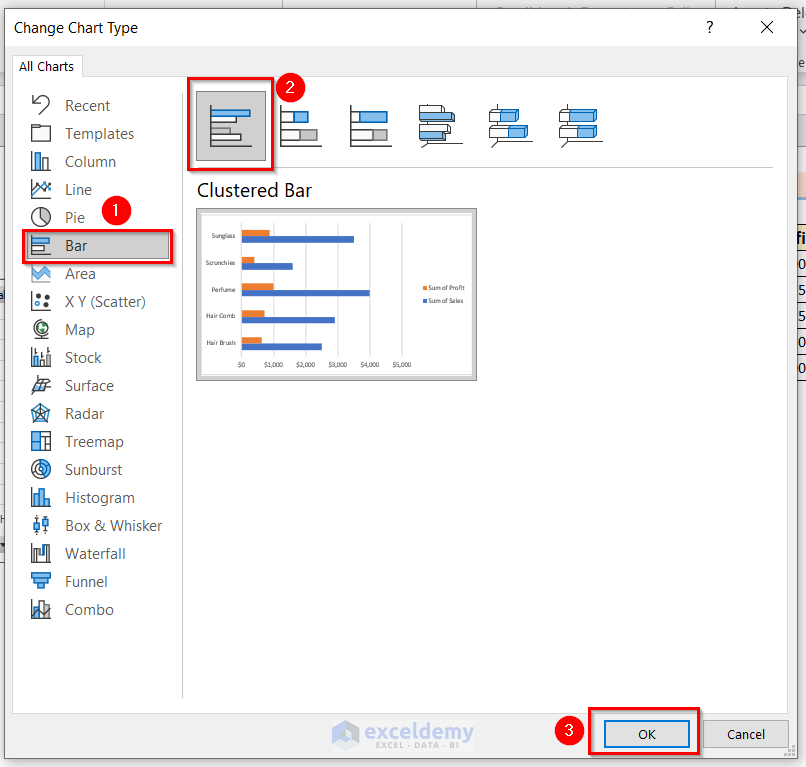
In the Change Chart Type dialog box:
- In Bar >> select Clustered Bar.
- Click OK.
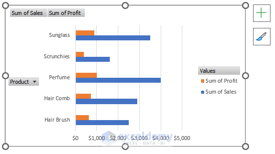
This is the output.
Read More: How to Make a Bar Graph in Excel with 4 Variables
Practice Section
Practice here.
Download Practice Workbook
Download the practice workbook here:
Related Articles
- How to Make a Bar Graph Comparing Two Sets of Data in Excel
- How to Make a Percentage Bar Graph in Excel
- How to Show Number and Percentage in Excel Bar Chart
- How to Show Difference Between Two Series in Excel Bar Chart
- Excel Bar Chart Side by Side with Secondary Axis
- How to Sort Bar Chart Without Sorting Data in Excel
- How to Change Bar Chart Width Based on Data in Excel
<< Go Back to Excel Bar Chart | Excel Charts | Learn Excel
Get FREE Advanced Excel Exercises with Solutions!
