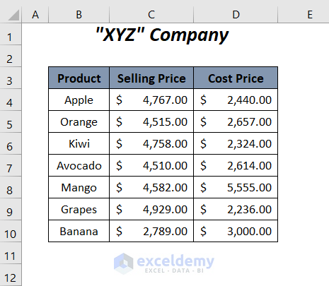
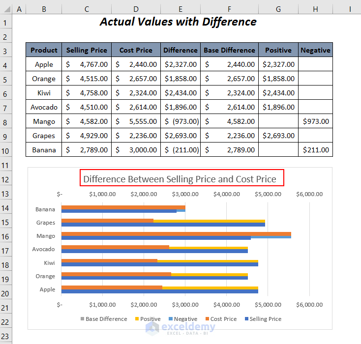
The sample dataset below contains a list of products including their selling prices with the cost prices of a company. For the two different series of selling prices and cost prices, we will show their differences with the help of a bar chart.
Method 1 – Show Difference with Actual Values Between Two Series in Excel Bar Chart
Step 1: Using Formulas to Calculate Some Values for Bar Chart
➤ Add the following formula in cell E4.
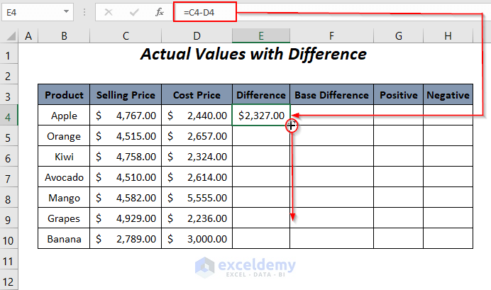
=C4-D4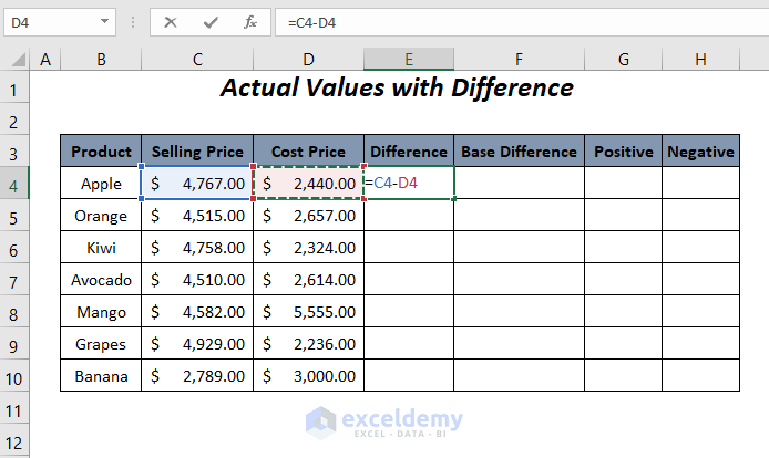
➤ Press ENTER and drag down the Fill Handle tool.
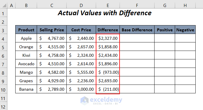
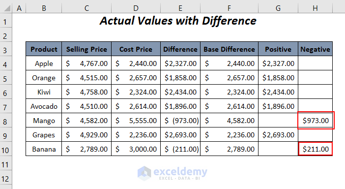
Result shows the differences between the selling prices and cost prices; the values within the brackets represent the negative values.
➤ For determining the minimum value between the selling price and the cost price to get the base difference between them, insert the following formula.
=MIN(C4,D4)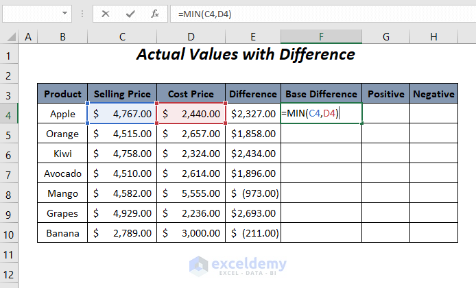
➤ Use the AutoFill feature.
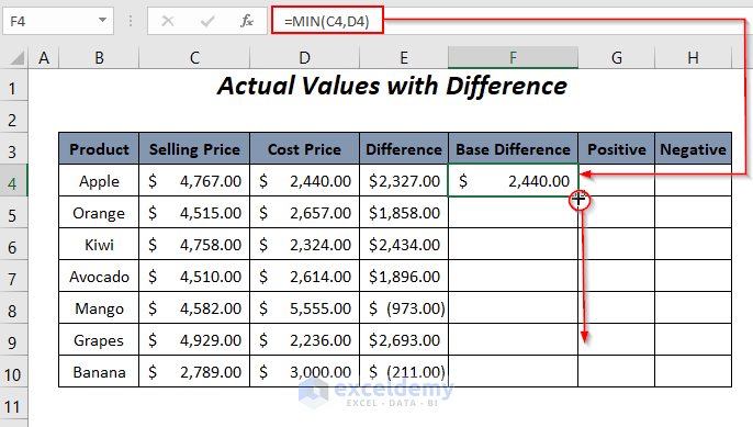
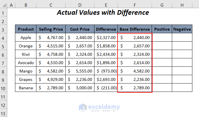
We will get the base differences between the selling prices and the cost prices.
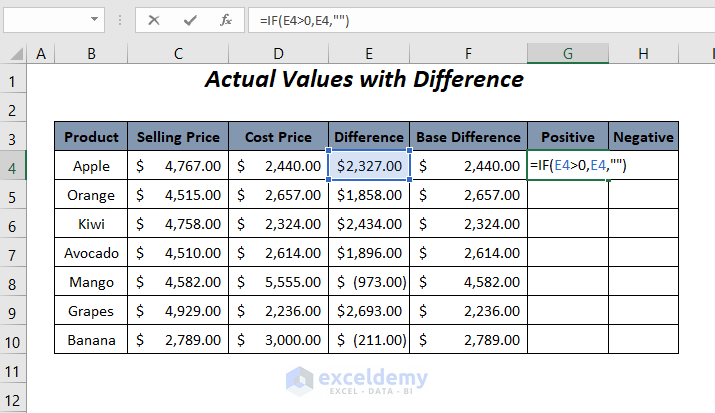
To separate the differences between the two prices according to their positive values and negative values.
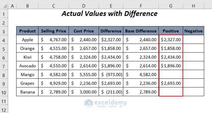
➤ For extracting the positive values use the following formula in cell G4.
=IF(E4>0,E4,"")When the value in cell E4 is positive, the IF function will return this positive value. If value is negative, the output cell will be blank.
➤ Press ENTER and drag down the Fill Handle tool.
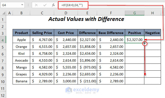
This will result in the positive differences in the Positive column.
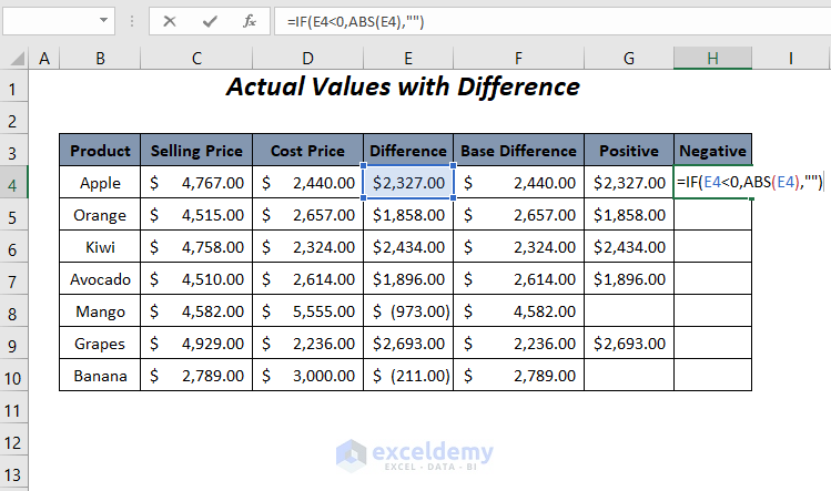
➤ For extracting the negative values use the following formula in cell H4.
=IF(E4<0,ABS(E4),"")E4 is the difference between the prices.
- ABS(E4) → The ABS function will return the absolute value of the number in cell E4 neglecting its sign.
- Output → 2327
- IF(E4<0,ABS(E4),””) → becomes
- IF(E4<0,2327,””) → IF will return 2327 when E4<0, otherwise a blank.
- Output → Blank
➤ Apply AutoFill.
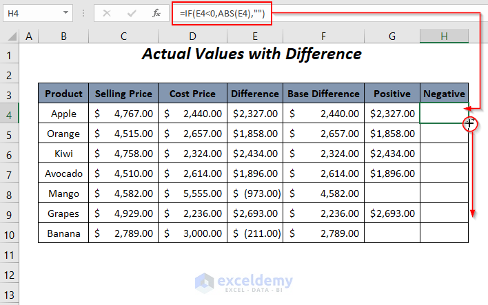
This results in the two negative values without their symbols in the Negative column.
Step 2 – Plotting Differences in Bar Chart
We will now plot the differences between the prices with their actual values.
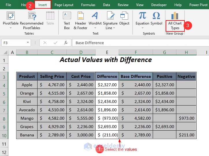
➤ Select the columns Product, Selling Price and Cost Price first and then for the rest of the non-adjacent columns Base Difference, Positive and Negative select by pressing CTRL.
➤ Go to the Insert Tab >> All Chart Types Option.
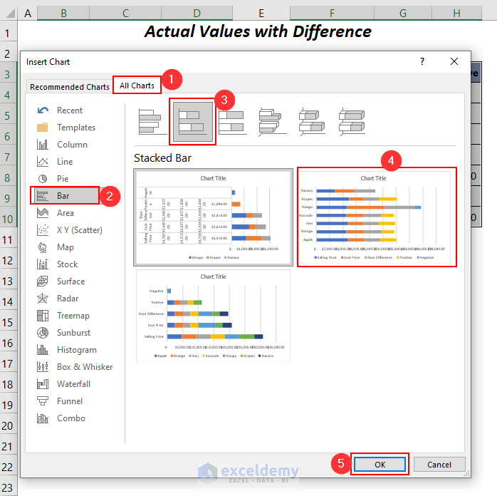
The Insert Chart dialog box will pop up.
➤ Go to the All Charts Tab >> Bar >> Stacked Bar >> select your desired type of Stacked Bar chart >> press OK.
The bar chart will pop up.
➤ Select any series from the combination of the series of the stacked bar chart and then Right-Click.
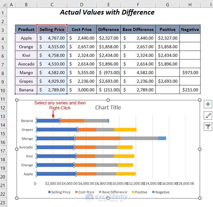
➤ Choose the option Change Series Chart Type.
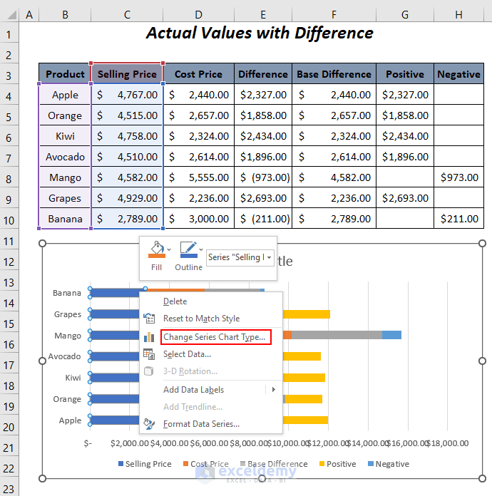
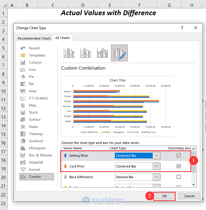
The Change Chart Type wizard will open up.
➤ Change the Chart Type from Stacked Bar to Clustered Bar and check on the Secondary Axis option for the two series Selling Price and Cost Price.
➤ Press OK.
This results appears as shown in the bar chart.
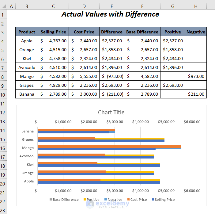
Rename the chart title as Difference Between Selling Price and Cost Price.
Read More: How to Make a Bar Graph Comparing Two Sets of Data in Excel
Method 2: – Show Difference Between Two Series with Percentage in Excel Bar Chart
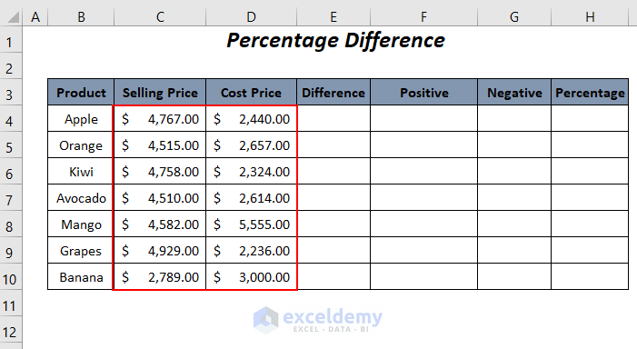
Step 1 – Using Formulas to Calculate Some Values for Bar Chart
➤ Add the following formula in cell E4.
=C4-D4➤ Apply AutoFill.
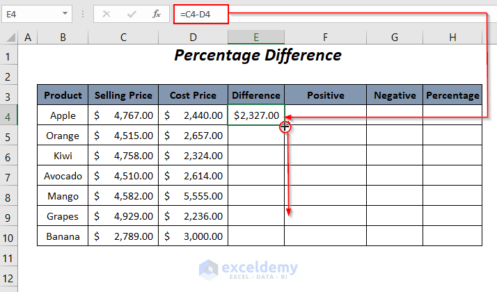
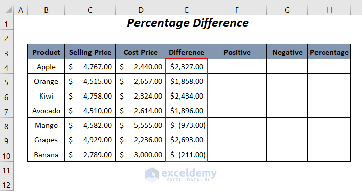
This results in the differences between the Selling Price values and Cost Price values.
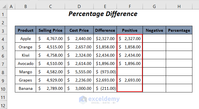
➤ For extracting the positive values use the following formula in cell F4.
=IF(E4>0,E4,"")➤ Drag down the Fill Handle tool.
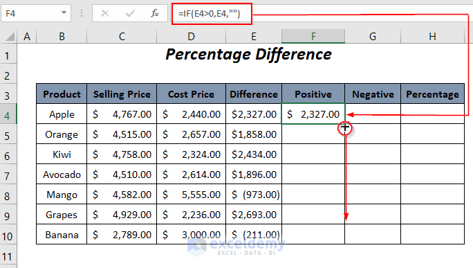
This results in the positive differences in the positive column.
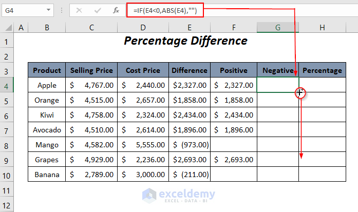
➤ For extracting the negative values use the following formula in cell G4.
=IF(E4<0,ABS(E4),"")- ABS(E4) → Here, the ABS function will return the absolute value of the number in cell E4 neglecting its sign.
- Output → 2327
- IF(E4<0,ABS(E4),””) → becomes
- IF(E4<0,2327,””) → IF will return 2327, when E4<0 otherwise a blank.
- Output → Blank
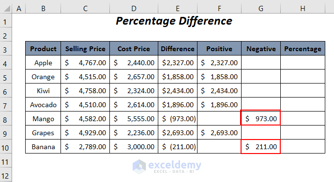
➤ Drag down the Fill Handle tool.
This results in the two negative values without their symbols in the Negative column.
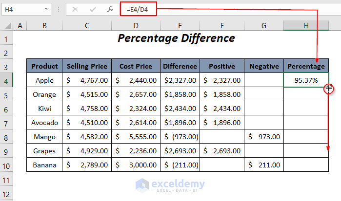
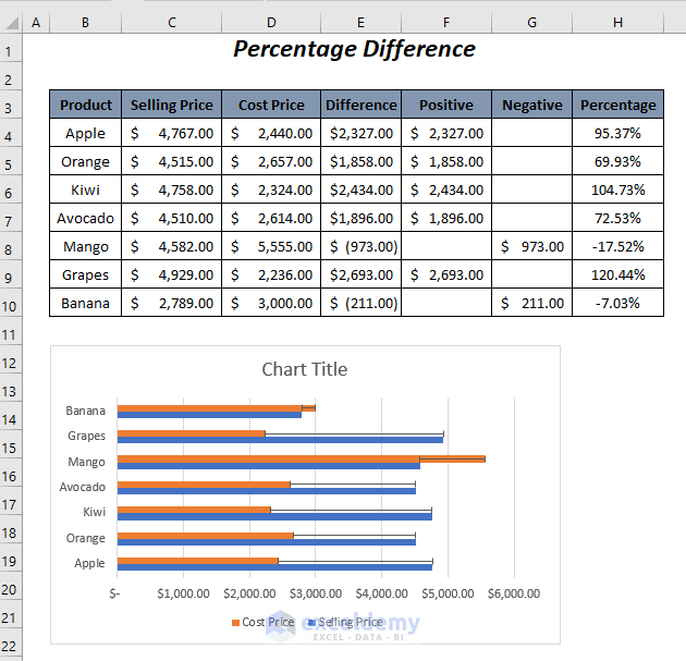
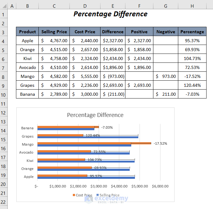
➤ To gain the percentages of the differences with respect to the cost prices of the products apply the following formula in cell H4.
=E4/D4➤ To gain the percentages for the rest cells use the AutoFill feature of Excel.
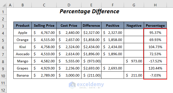
This results in the percentage differences of the prices with respect to the cost prices.
Step 2 – Mapping Values with Error Bars in Bar Chart
➤ Select the columns Product, Selling Price, and Cost Price and then go to the Insert Tab >> All Chart Types Option.
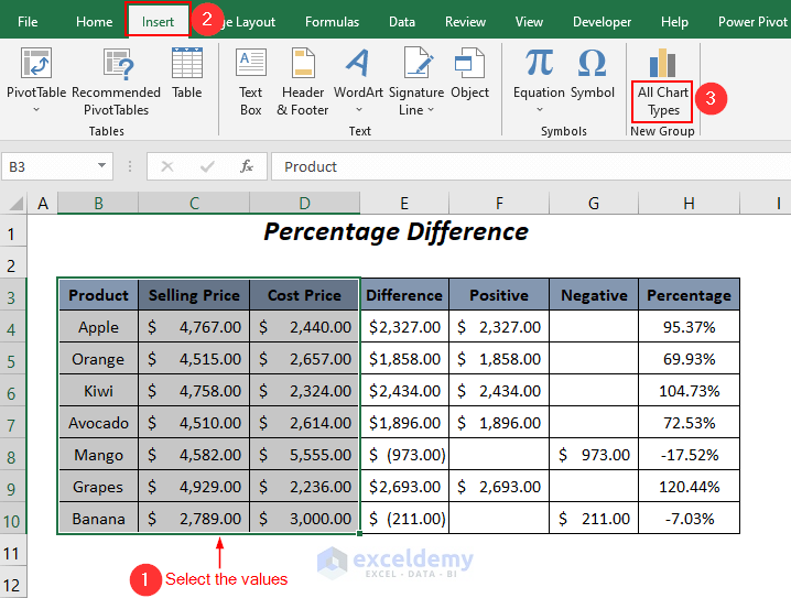
The Insert Chart dialog box will pop up.
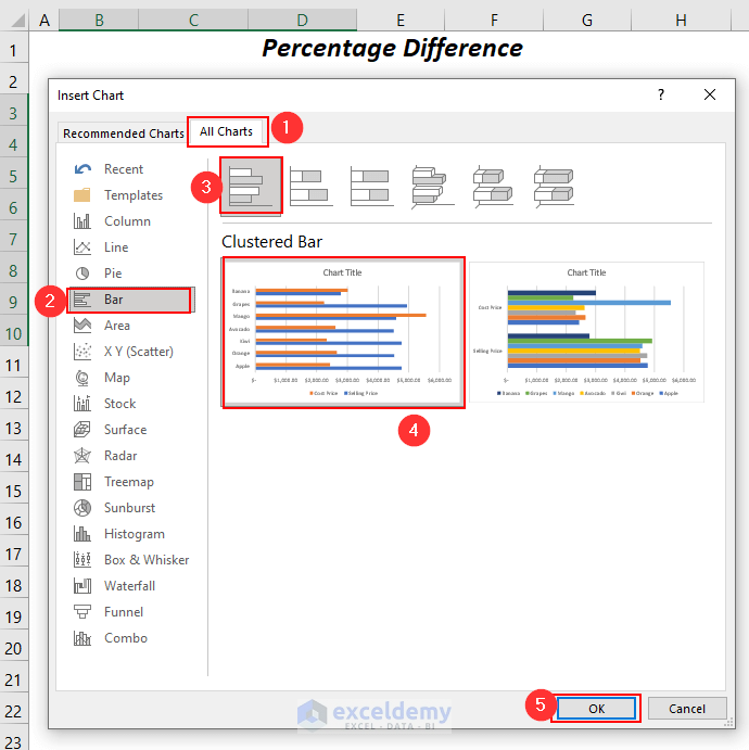
➤ Go to the All Charts Tab >> Bar >> Clustered Bar >> select your desired type of Clustered Bar chart >> press OK.
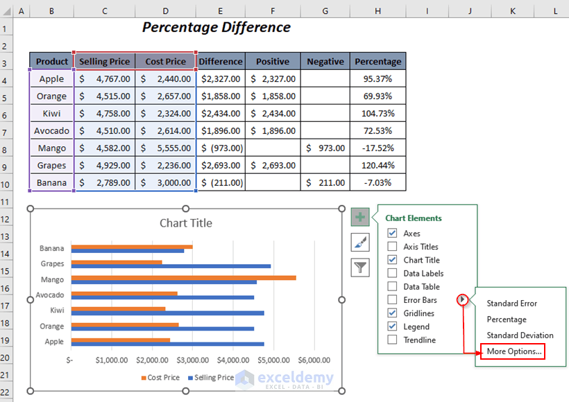
➤ Choose the Cost Price series of the chart and then click on the Chart Elements icon.
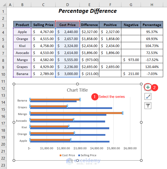
The different options will appear.
➤ Click on the arrow symbol beside the Error Bars option and choose the option More Options.
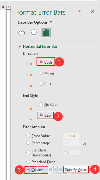
On the right pane, the Format Error Bars wizard will open up.
➤ Under the Horizontal Error Bar options, choose the Both option from Direction, and the Cap option from End Style.
➤ Click on the Custom option and then select the Specify Value option.
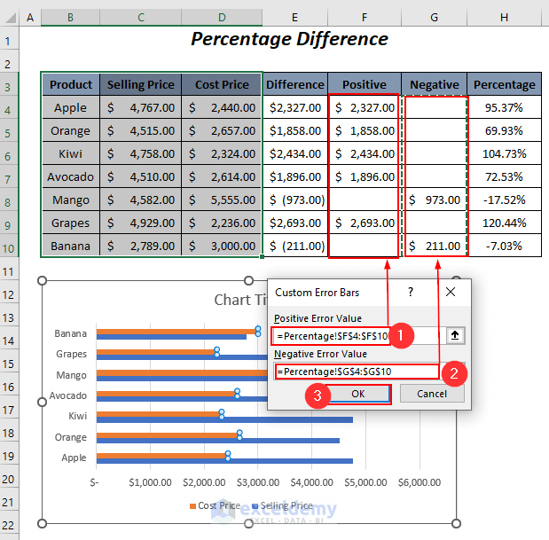
The Custom Error Bars dialog box will pop up.
➤ Select the positive differences in the Positive Error Value box and then the negative differences in the Negative Error Value box.
➤ Press OK.
This results in the error bars in the series of the cost prices.
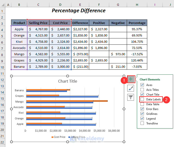
Step 3 – Modifying Data Labels
➤ Click on the Chart Elements option and then check the Data Labels option.
➤ Select the data labels of the Cost Price series and then choose the Format Data Labels option.
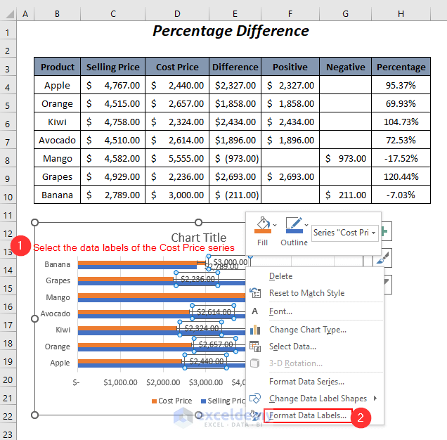
The Format Data Labels dialog box in the right pane opens up.
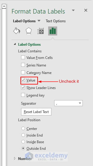
➤ Within the Label Options choose the Outside End option as the Label Position, check on the Show Leader Lines option, and the Value From Cells option.
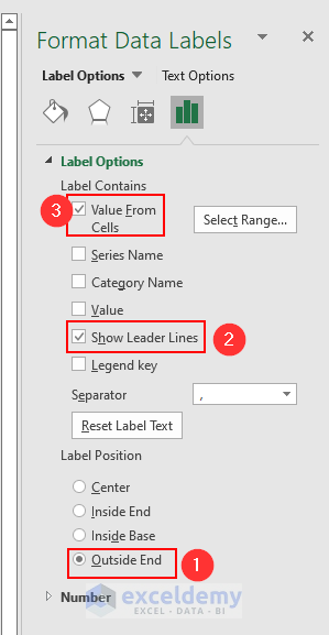
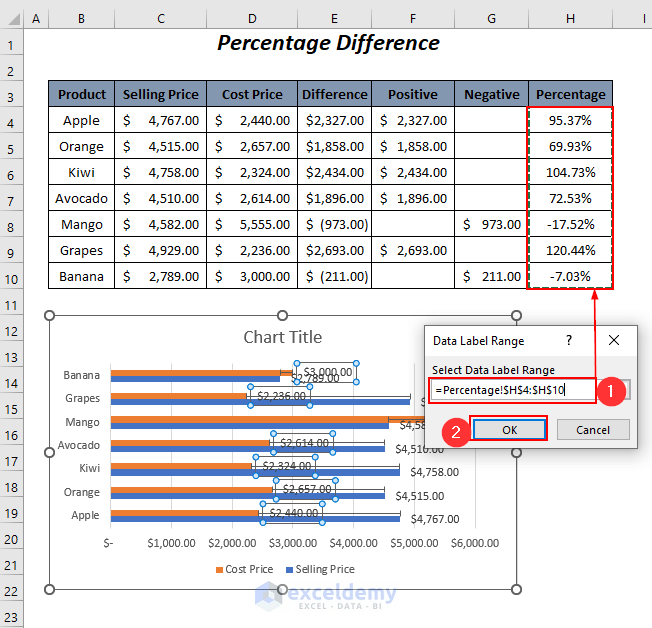
The Data Label Range dialog box will pop up.
➤ Choose the range of the percentages in the Select Data Label Range box and press OK.
Select the data labels of the selling price series.
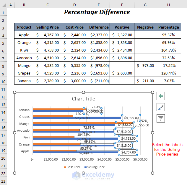
➤ Uncheck the Value option.
This results in the bar chart with the percentage differences between the prices.
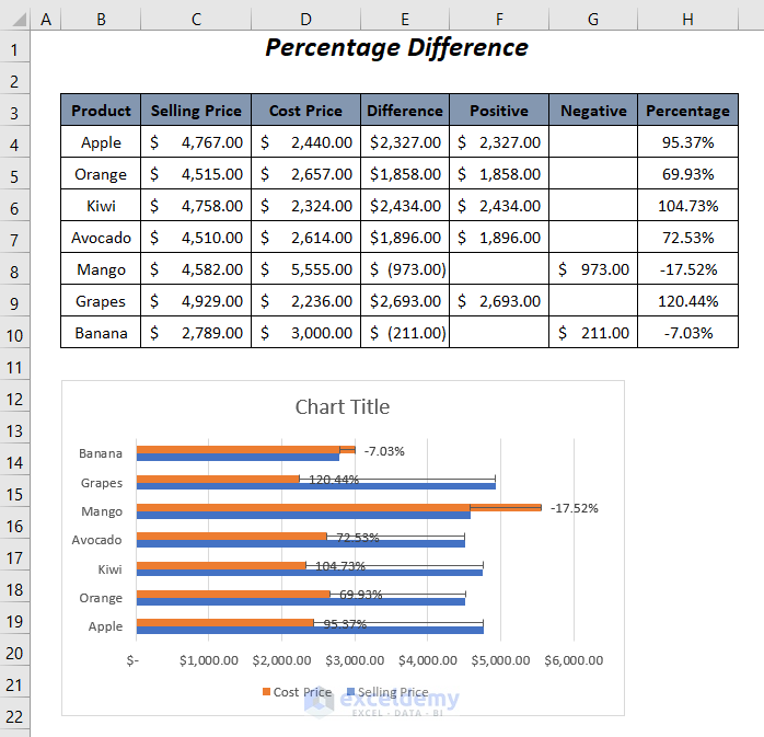
Name the chart title as Percentage Difference.
Read More: How to Show Number and Percentage in Excel Bar Chart
Download Practice Workbook
Related Articles
- How to Make a Bar Graph with Multiple Variables in Excel
- How to Make a Bar Graph in Excel with 2 Variables
- How to Make a Bar Graph in Excel with 3 Variables
- How to Make a Bar Graph in Excel with 4 Variables
- How to Make a Percentage Bar Graph in Excel
- Excel Bar Chart Side by Side with Secondary Axis
- How to Sort Bar Chart Without Sorting Data in Excel
- How to Change Bar Chart Width Based on Data in Excel
<< Go Back to Excel Bar Chart | Excel Charts | Learn Excel
Get FREE Advanced Excel Exercises with Solutions!
