In this article, we will describe how to make a simple Bar graph in Excel. We will describe the step-by-step procedure to insert a simple Bar graph ...
The following table has the Date and Sales columns. We will use these columns to insert a Column Chart. Since the Date column has dates in it, which ...
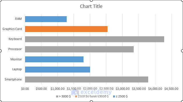
In the dataset, we have sales and profit information about some products. Here, the negative profit of a product refers to the loss in sales of that ...
This article demonstrates the features of a Column Chart vs Bar Chart in Excel. Without any doubt, Excel charts are an excellent tool. It's suitable ...
Dataset Overview
Suppose you have a dataset containing the sales quantity of two products over six months, and you want to create a bar chart based ...
Dataset Overview
Suppose we have a math exam mark list for some students, with their names in column B and their scores in column C. Our goal is to ...