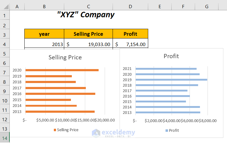
For a company, we have some Selling Prices and Profits for different years, which we have represented in two different bar graphs. Using the following methods, we will combine these two different graphs into one.
Method 1 – Copying the Data Source for the Second Graph to Combine Two Bar Graphs in Excel
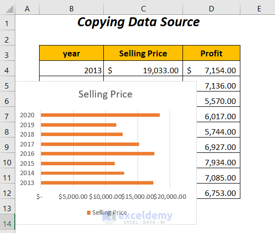
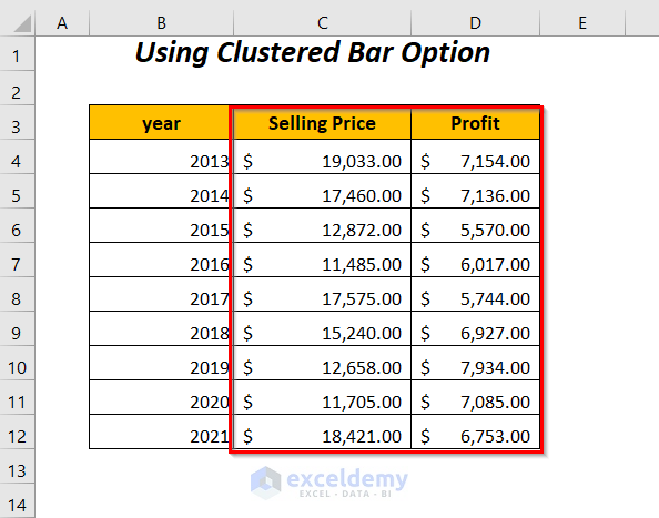
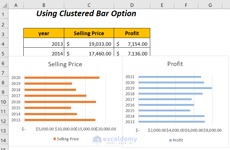
Here, we have the following dataset containing Selling Prices and Profits,
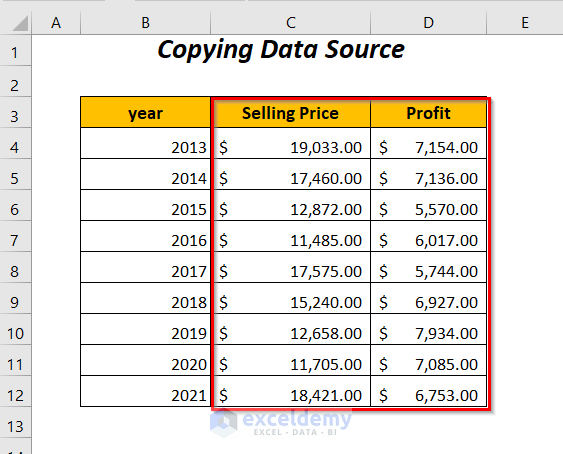
and using them, we have created two different bar graphs. We will now combine them by copying and pasting any one data source.
Steps:
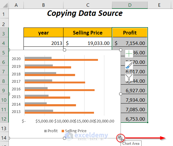
➤ Select any graph (here, we are selecting the Profit graph) and press the DELETE key.
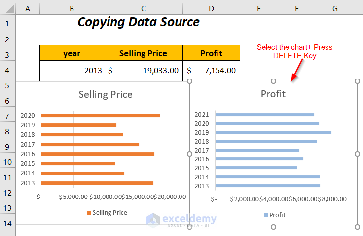
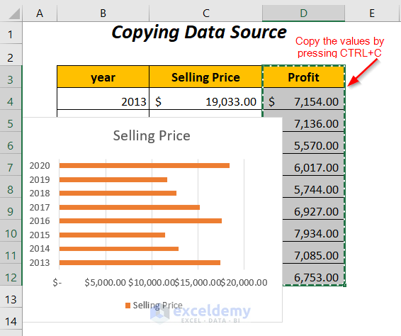
We have only one bar graph for Selling Price, and the next task is to copy the data source of the Profit column and paste it here.
➤ Select the Profit column and press CTRL+C.
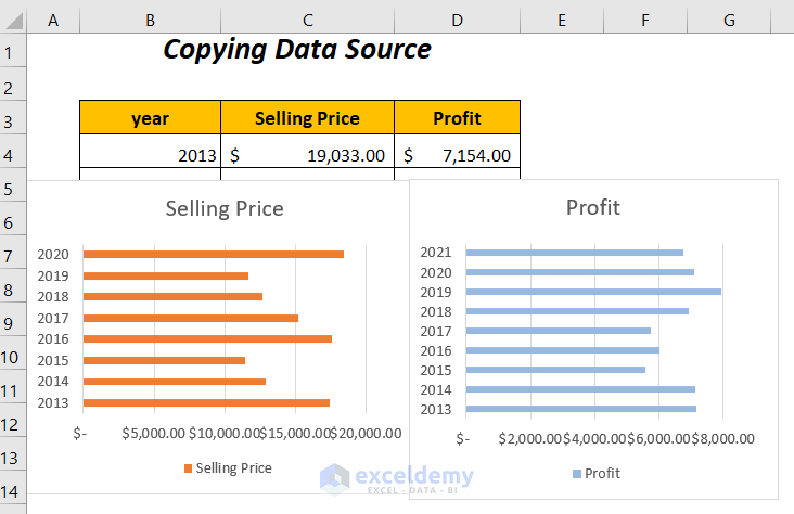
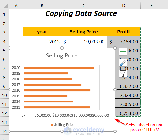
➤ Select the graph and press CTRL+V.
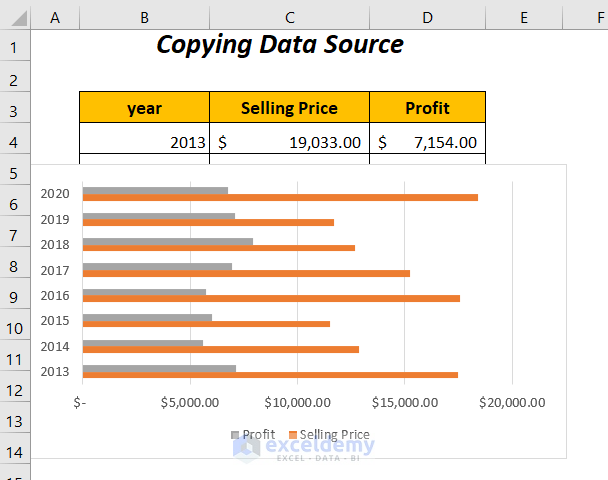
You will be able to combine those two graphs into one.
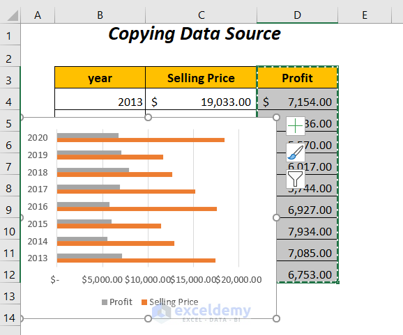
You can extend the chart area by dragging the bottom corner to the right.
This is the final look of our combined bar graphs for Selling Prices and Profits with respect to the Years.
Read More: How to Combine Two Graphs in Excel (2 Methods)
Method 2 – Using a Clustered Bar Option to Combine Two Bar Graphs
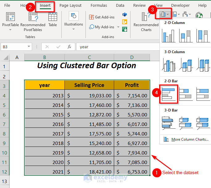
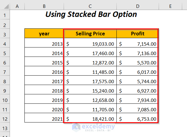
The following dataset contains the data of the Selling Prices and Profits,
which are plotted in two different bar graphs. To combine them here, we will use the Clustered Bar option.
Steps:
➤ To plot a new graph, you can delete the separated two charts.
➤ Select the whole dataset and go to the Insert Tab >> Charts Group >> Insert Column or Bar Chart Dropdown >> Clustered Bar Option.
After we have the chart, we will modify it to remove the bar for the year column data and use this range as a horizontal axis label.
➤ Select the chart, place your mouse icon on the chart, and then Right-click.
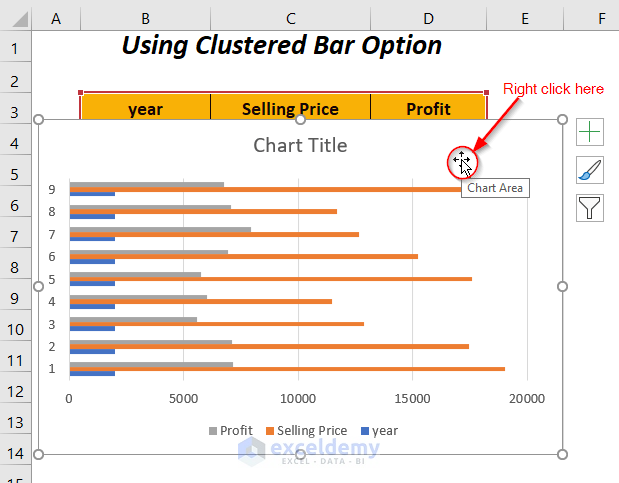
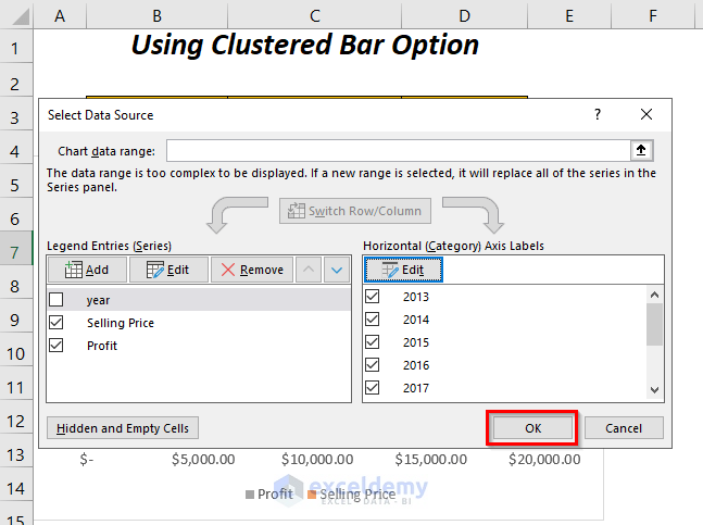
➤ Choose the option Select Data.
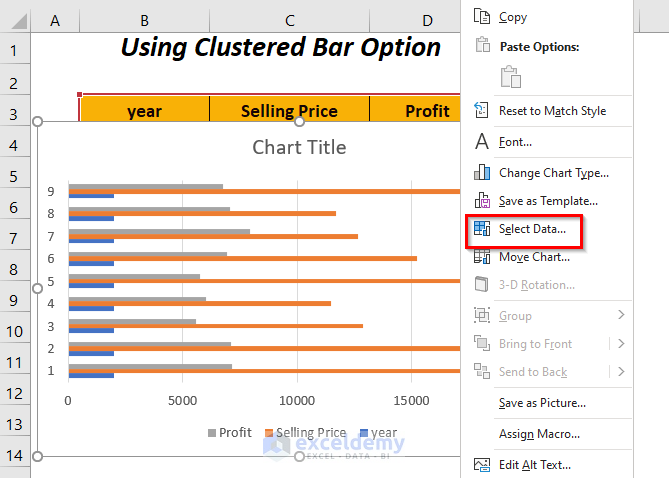
The Select Data Source dialog box will appear.
➤ Uncheck the year box from the options of the Legend Entries.
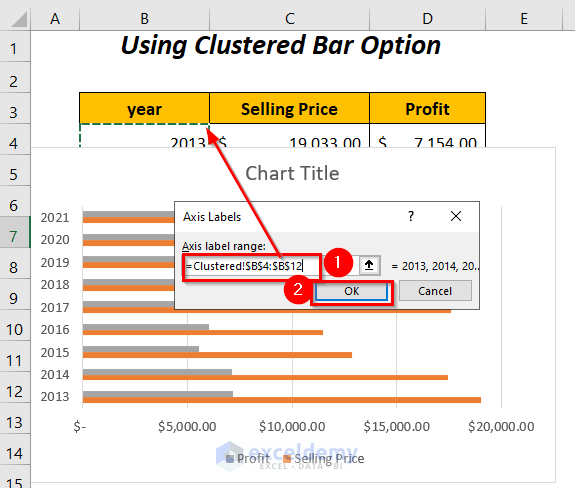
➤ Click the Edit option from the Horizontal Axis Labels group on the right side.
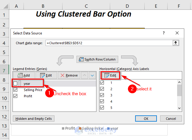
You will get the Axis Labels dialog box.
➤ Select the range of the year column in the Axis label range box and press OK.
Press OK in the Select Data Source dialog box.
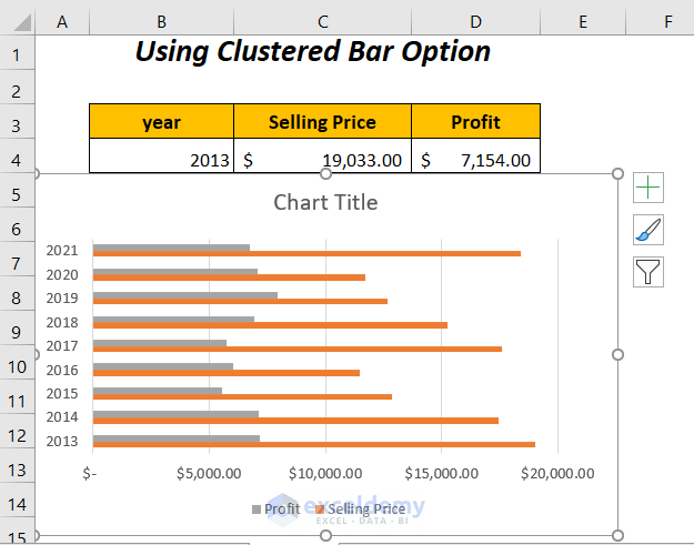
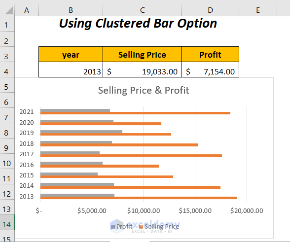
We will have the following bar graph.
➤ Change the Chart Title to Selling Price & Profit by selecting it and typing this name.
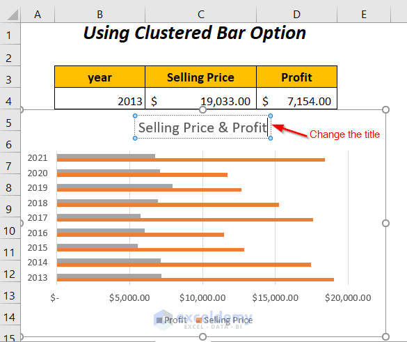
We will have the following combined bar graph for the Selling Prices and the Profits with respect to the years.
Read More: How to Combine Graphs in Excel (Step-by-Step Guideline)
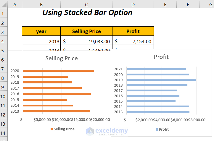
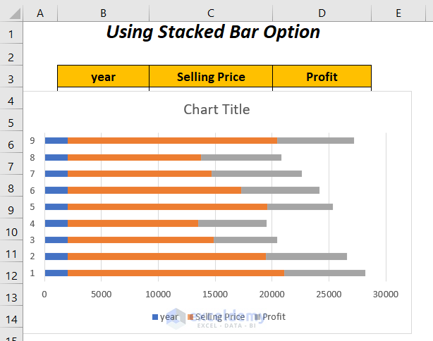
Method 3 – Using the Stacked Bar Option to Combine Two Bar Graphs in Excel
Here, we will use the Stacked Bar option to plot a chart for the Selling Prices and Profits to the years,
instead of plotting them separately.
Steps:
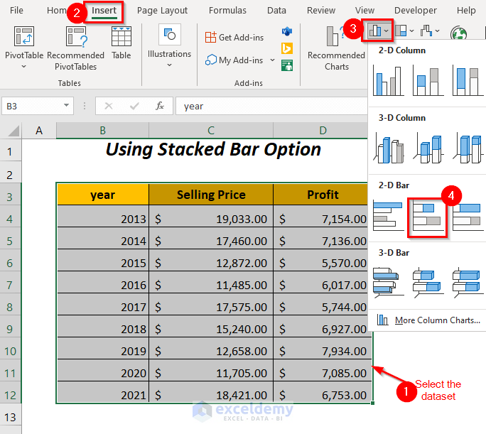
➤ To plot a new graph, delete the previous two charts.
➤ Select the whole dataset and go to the Insert Tab >> Charts Group >> Insert Column or Bar Chart Dropdown >> Stacked Bar Option.
The following chart will appear.
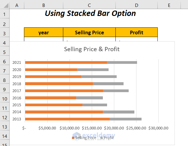
To modify this chart to show the bars for only the Selling Prices and the Profits concerning the years, you can follow Step 02 of Method 2.
We will have the combined stacked bar graph, where instead of showing different portions like Selling Price and Profit side by side, we will have different parts to the whole comparison over the years.
Read More: How to Combine Two Line Graphs in Excel (3 Methods)
Similar Readings
- How to Combine Data from Multiple Sheets in Excel
- How to Combine Two Scatter Plots in Excel (Step by Step Analysis)
- Excel VBA: Combine Date and Time (3 Methods)
- How to Combine Name and Date in Excel (7 Methods)
- Combine Multiple Excel Files into One Workbook with Separate Sheets
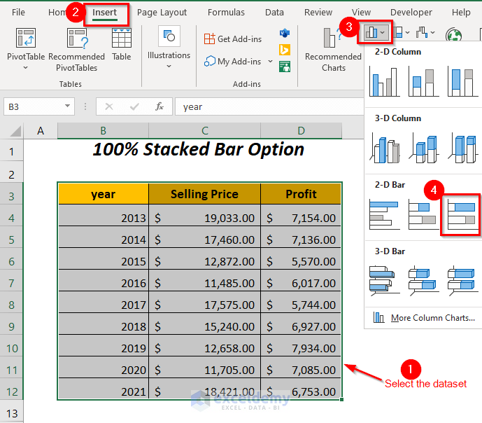
Method 4 – Using the 100% Stacked Bar Option to Combine Two Bar Graphs
The following dataset contains the data of the Selling Prices and Profits,
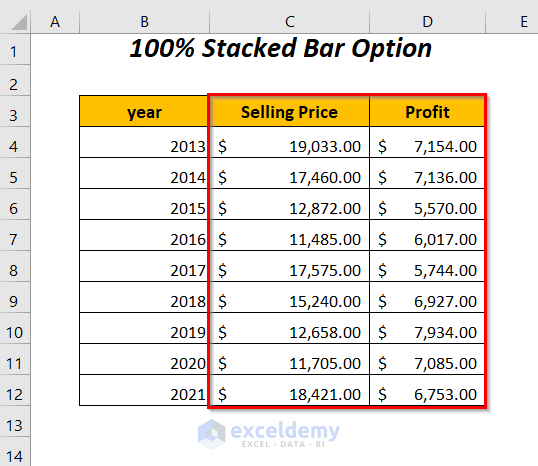
which are plotted in two different bar graphs. To combine them here, we will use the 100% Stacked Bar option.
Steps:
➤ To plot a new graph, delete the previous two charts.
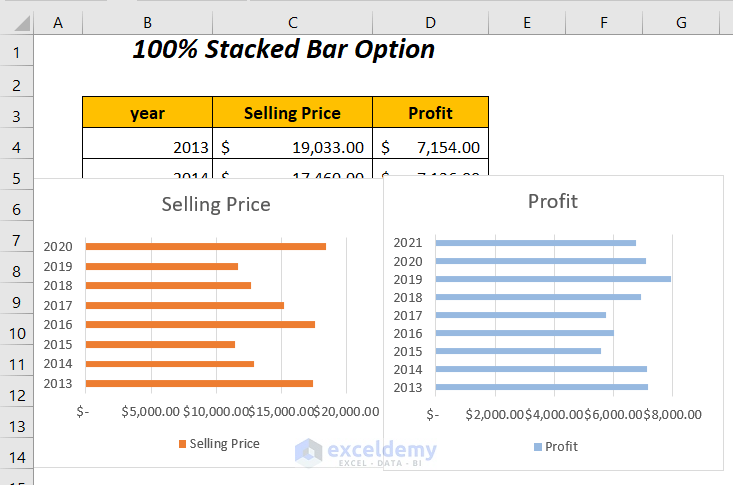
➤ Select the whole dataset and go to the Insert Tab >> Charts Group >> Insert Column or Bar Chart Dropdown >> 100% Stacked Bar Option.
The following chart will appear.
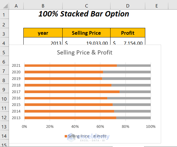
To improve this chart to show the bars for only the Selling Prices and the Profits over the years, you can follow Step-02 of Method-2.
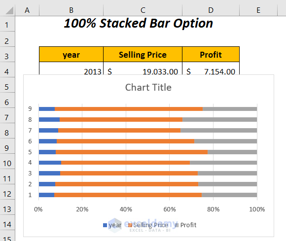
We will have the combined stacked bar graph, where we can compare the Selling Prices and Profits over the years by noticing their percentages among the whole percentage 100%.
Read More: How to Combine Graphs with Different X Axis in Excel
Method 5 – Using VBA Code to Combine Two Bar Graphs in Excel
In this section, we will use a VBA code to plot a chart for the Selling Prices and Profits for the years,
instead of plotting them separately.
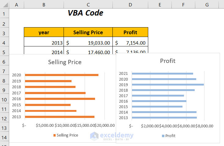
Steps:
➤ Go to the Developer Tab >> Visual Basic Option.
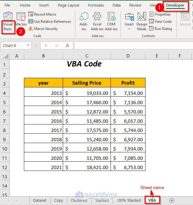
The Visual Basic Editor will open up.
➤ Go to the Insert Tab >> Module Option.
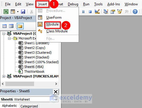
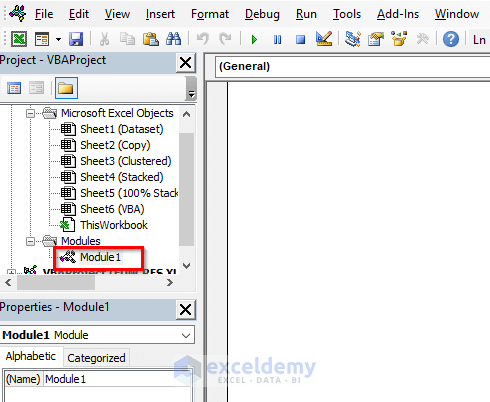
A Module will be created.
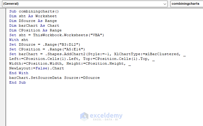
➤ Enter the following code:
Sub combiningcharts()
Dim sht As Worksheet
Dim DSource As Range
Dim barChart As Chart
Dim CPosition As Range
Set sht = ThisWorkbook.Worksheets("VBA")
With sht
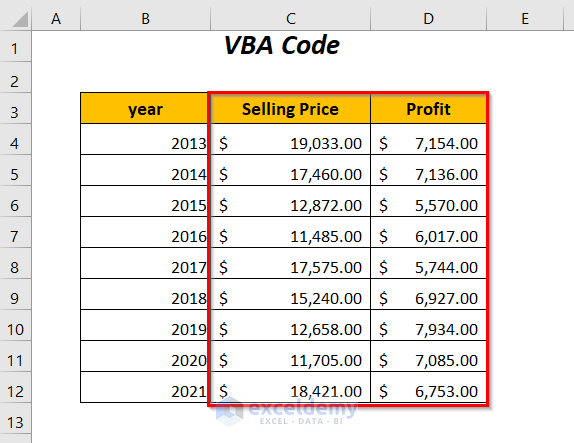
Set DSource = .Range("B3:D12")
Set CPosition = .Range("A5:E14")
Set barChart = .Shapes.AddChart2(Style:=-1, XlChartType:=xlBarClustered, _
Left:=CPosition.Cells(1).Left, Top:=CPosition.Cells(1).Top, _
Width:=CPosition.Width, Height:=CPosition.Height, _
NewLayout:=False).Chart
End With
barChart.SetSourceData Source:=DSource
End SubHere, we have declared sht as Worksheet, DSource, CPosition as Range, barChart as Chart and VBA is the worksheet name which is assigned to the sht. We have assigned the data source range “B3:D12” to the DSource and the range of the area in which we want to plot the chart, “A5:E14”, to the CPosition.
barChart will give our desired chart where XlChartType:=xlBarClustered is used for Clustered type graph but you can use XlChartType:=xlBarStacked for Stacked type graph.
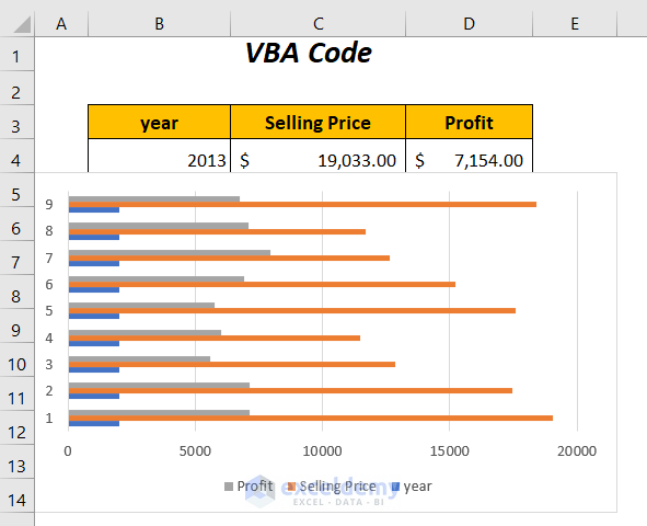
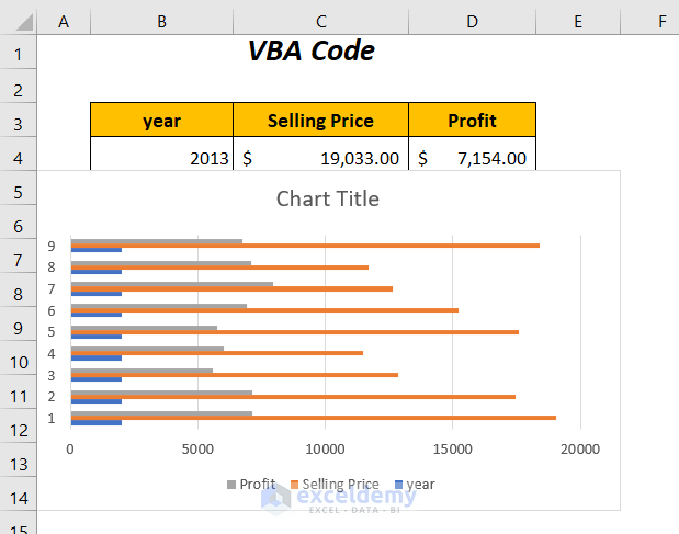
➤ Press F5.
You will get the following bar graph.
As the Chart Title is not visible, we will bring it here first.
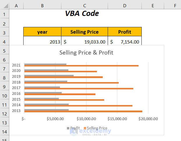
➤ Select the chart and click the Plus (+) icon beside the chart.
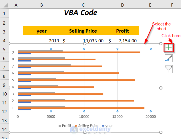
➤ Check the box for the Chart Title option from the Chart Elements option.
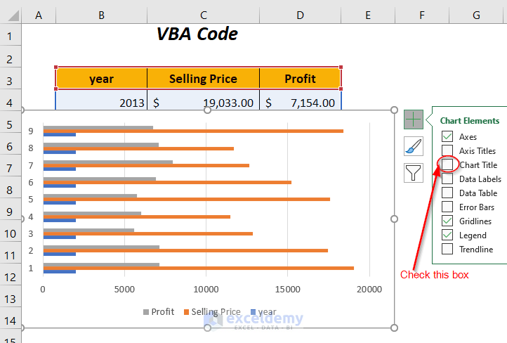
We have the Chart Title on the top of our bar graph.
To modify this chart to show the bars for only the Selling Prices and the Profits with respect to the years, you can follow Step-02 of Method-2. The final chart will be like the one below.
Practice Section
We have provided a Practice section.
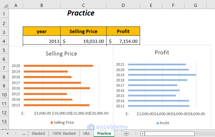
Download the Workbook
Related Articles
- How to Merge Multiple Excel Files into One Sheet (4 Methods)
- Combine Sheets in Excel (6 Easiest Ways)
- How to Combine Rows in Excel (6 Methods)
- Combine Columns into One List in Excel (4 Easy Ways)
- How to Merge Columns in Excel (4 Ways)

