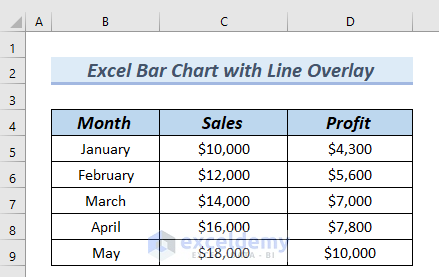
The following table contains the Month, Sales, and Profit.
Create an Excel bar chart with a line overlay:
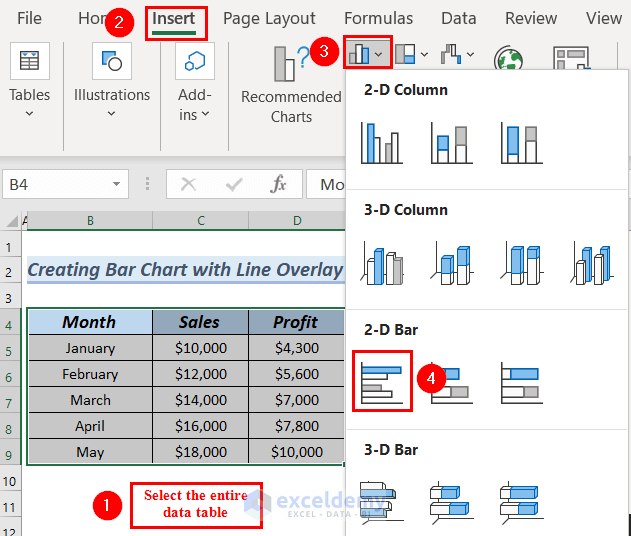
Step 1- Inserting the Bar Chart
- Select the entire data table.
- Go to the Insert tab.
- In Insert Column or Bar Chart >> select 2D Clustered Bar chart.
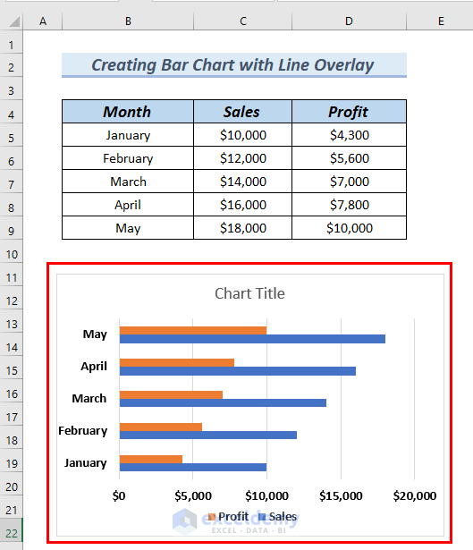
You can see the Bar chart.
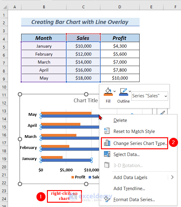
Step 2 – Adding a Line Overlay
- Right-click the Bar chart.
- Select Change Series Chart Type in the Context Menu.
- Go to All Charts >> select Combo.
- Click Clustered Column-Line.
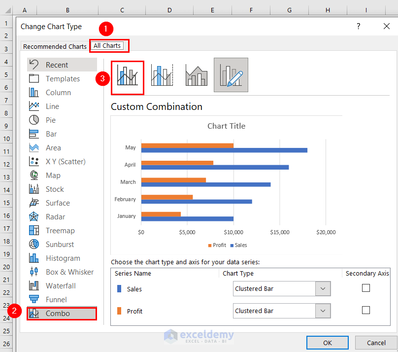
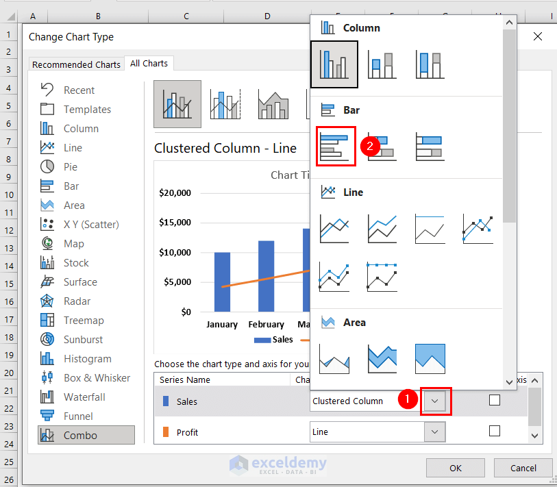
- Click the drop-down arrow of the Sales Clustered Bar.
- In Bar, select Clustered Bar.
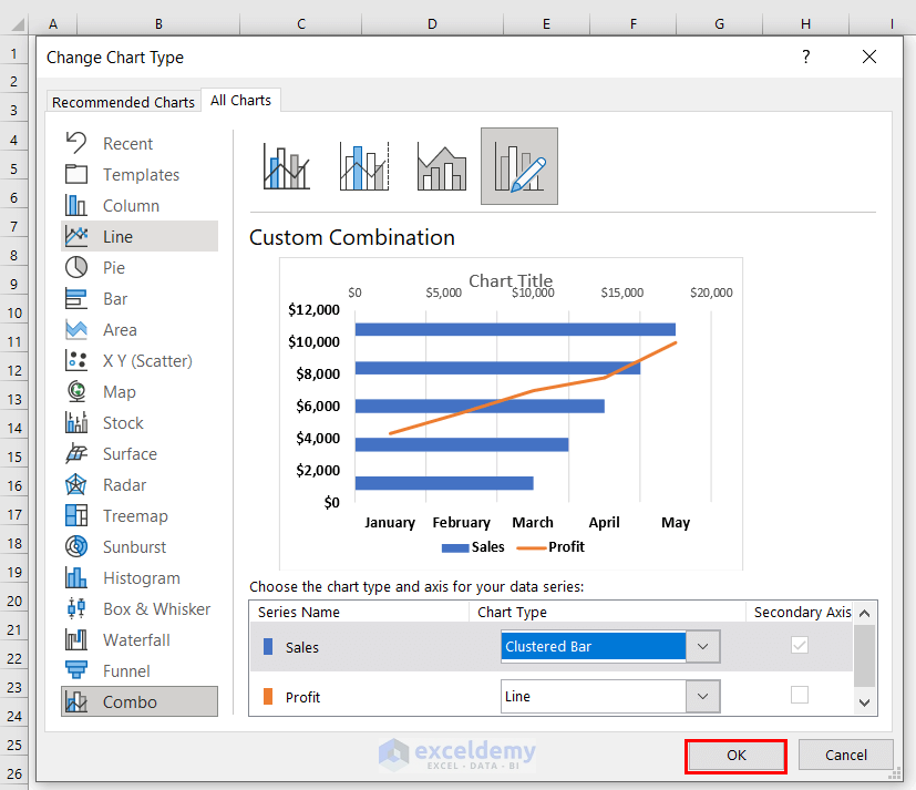
You can see the Custom Combination chart.
- Click OK.
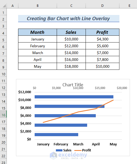
The bar chart with a line overlay is created.
Step 3 – Formatting the Chart
- Click the Chart Title and name the title.
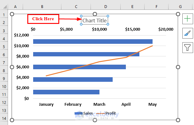
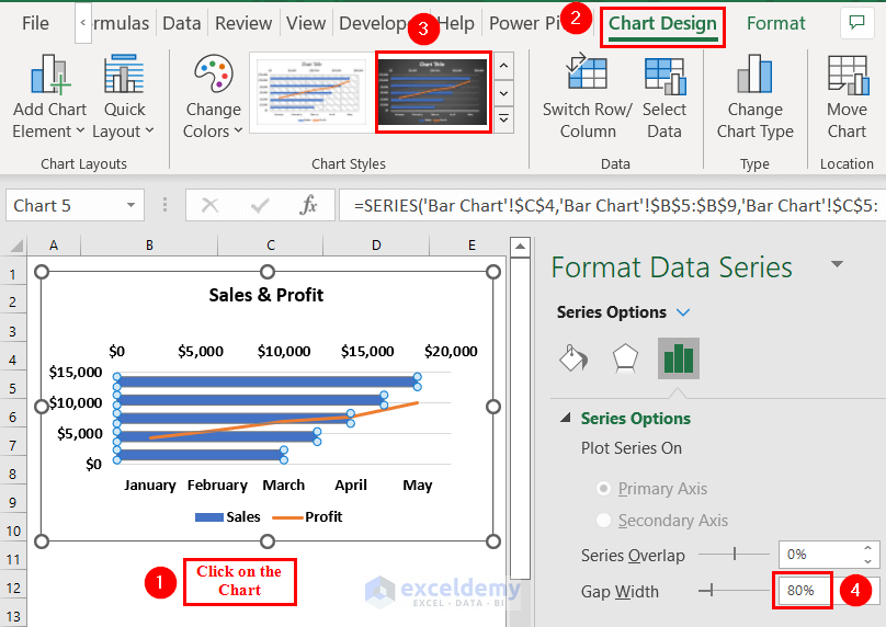
- Click the chart >> go to Chart Design.
- Selected a design type as shown below.
- In Format Data Series, change the Gap Width to 80%.
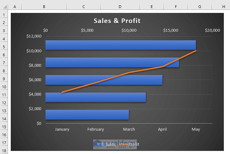
The Bar chart with a line overlay is customized.
Read More: Excel Add Line to Bar Chart
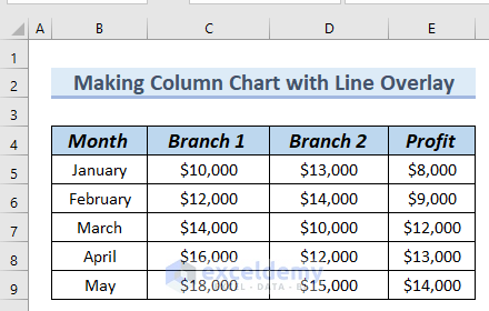
Creating a Column Chart with Line a Overlay in Excel
Use the following table.
Steps:
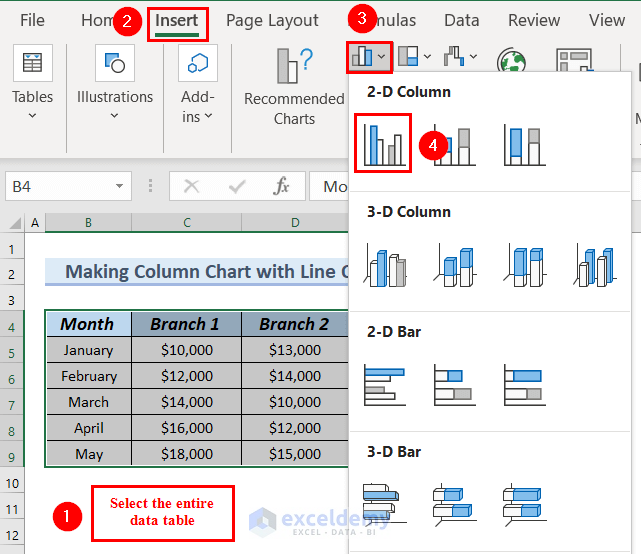
- Select the entire data table.
- Go to the Insert tab.
- In Insert Column or Bar Chart >> select 2D Clustered Column chart.
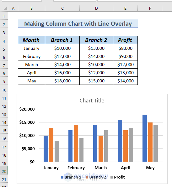
You can see the Column chart.
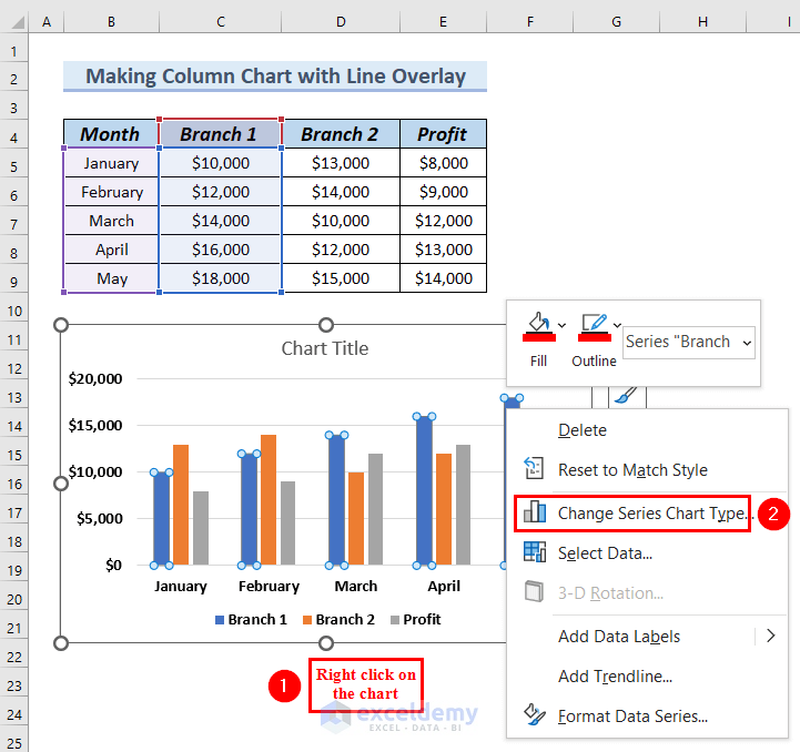
- Add a line overlay to the Column chart.
- Right-click the Column chart.
- Select Change Series Chart Type in the Context Menu.
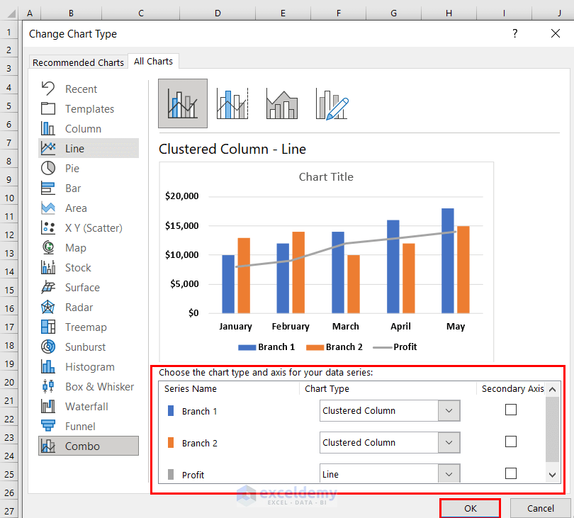
- Go to All Charts >> select Combo.
- Click Clustered Column-Line.
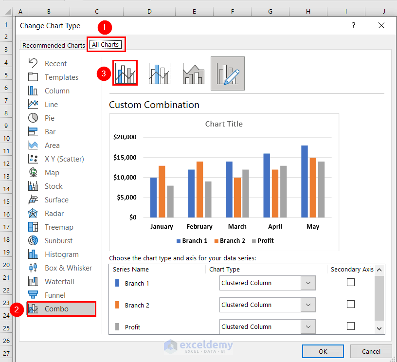
- In Chart Type, choose Branch 1 and Branch 2 as Clustered Columns.
- Select Profit as Line.
- Click OK.
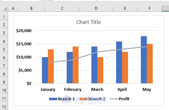
You can see the column chart with line overlay.
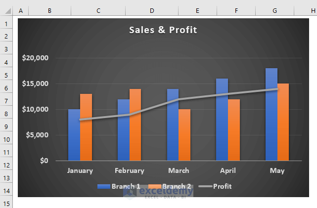
Customize the Column chart with line overlay:
- Follow step 3.
This is the output.
Read More: How to Create Bar Chart with Target Line in Excel
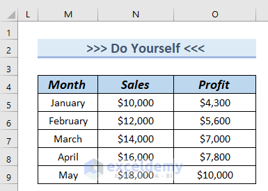
Practice Section
Download the Excel file and practice.
Download Practice Workbook
Related Articles
- How to Add Grand Total to Bar Chart in Excel
- How to Create Bar Chart with Error Bars in Excel
- How to Sort Bar Chart in Descending Order in Excel
- How to Change Bar Chart Color Based on Category in Excel
- How to Color Bar Chart by Category in Excel
- Excel Bar Graph Color with Conditional Formatting
- How to Add Horizontal Line to Bar Chart in Excel
- How to Add Vertical Line to Excel Bar Chart
<< Go Back to Excel Bar Chart | Excel Charts | Learn Excel
Get FREE Advanced Excel Exercises with Solutions!
