Excel charts are a familiar figure to all of us. Among them, the Bar chart is a pretty common one. In our regular life, we use it to show the data pattern change according to our desire. Sometimes, we need to add a vertical line in our graphs to get the attention of our users or authority. In the article, we will demonstrate to you three easy approaches, to how to add a vertical line to an Excel Bar chart. If you are curious about it, download our practice workbook and follow us.
Add Vertical Line to Excel Bar Chart: 3 Easy Methods
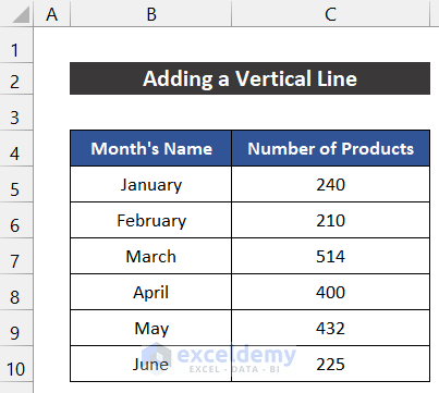
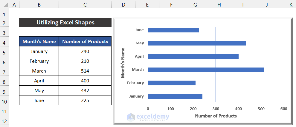
To demonstrate the approaches, we consider a dataset of the production amount of an industry for the first 6 months of a year. The name of the months is in the range of cells B5:B10, and the number of products is in the range of cells C5:C10.
1. Utilizing Excel Shapes
In this approach, we will add the vertical line from built-in Excel Shapes. We are going to use the Line shape. The steps of this method are given below:
📌 Steps:
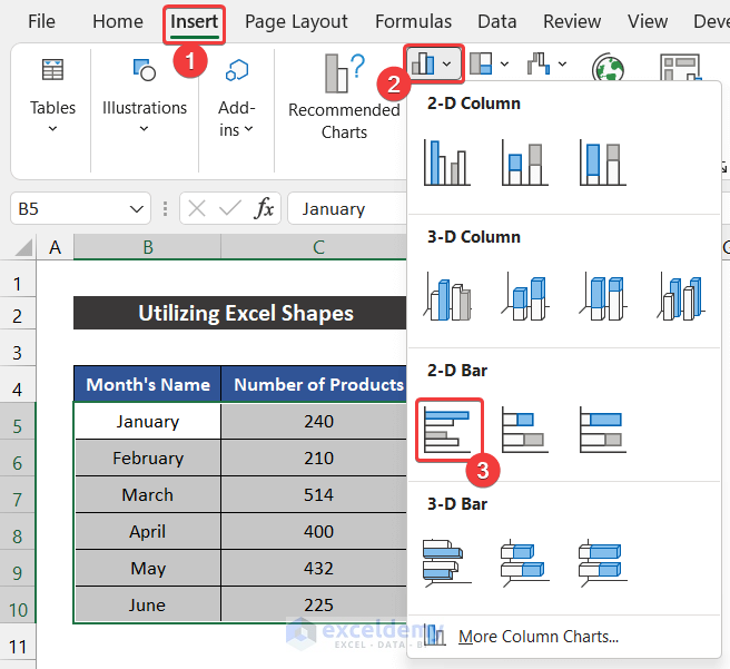
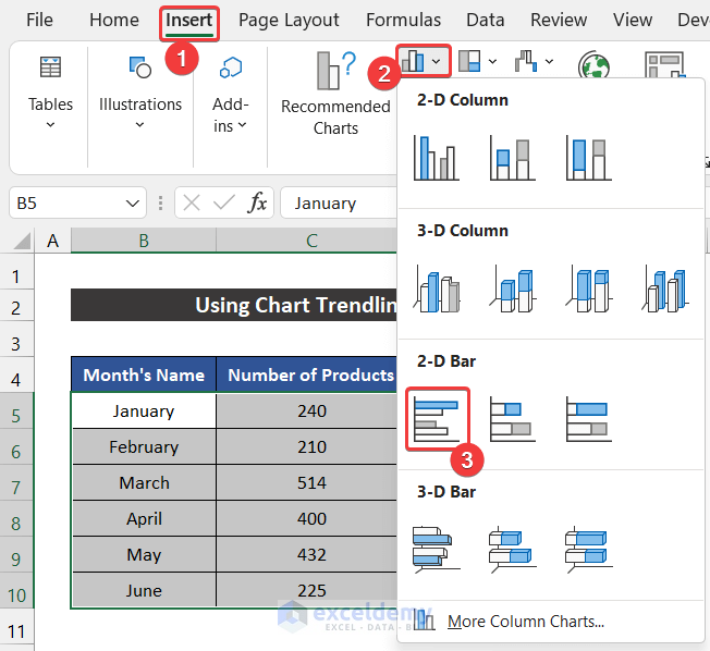
- First of all, select the range of cells B5:C10.
- Now, in the Insert tab, click on the drop-down arrow of the Insert Column or Bar Chart option from the Charts group.
- After that, choose the Clustered Bar from the 2-D Bar section.
- The chart will appear in front of you.
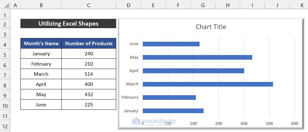
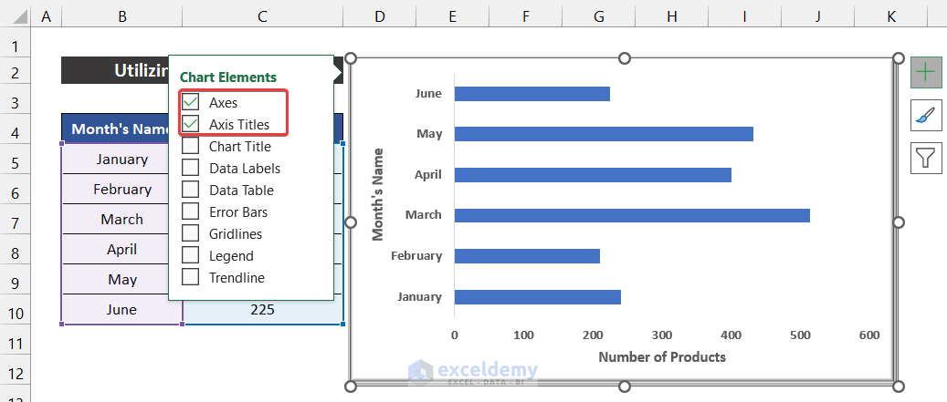
- You can modify the chart according to your desire from the Chart Design and Format ribbons and keep the required elements from the Chart Elements icon. In our chart, we kept the default style.
- Moreover, we add only the Axes and Axis Title elements in our graph.
- Our graph insertion task is finished.
- Again, in the Insert tab, click on the drop-down arrow of the Illustration > Shapes option.
- Now, choose the Line shape.
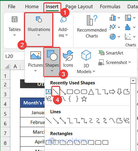
- You will see that your mouse cursor will be changed.
- Then, click close to the point where you want to insert the line. In our case, we add the line at the position of value 300.
- Wild press the Shift button on your keyboard to keep the line straight.
- The line will appear on your graph.
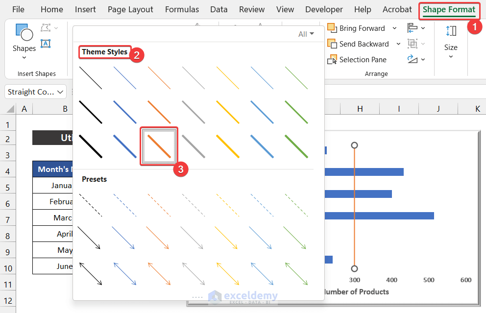
- After that, in the Shape Format tab, click on the drop-down arrow of the Theme Style option from the Shape Style group.
- Choose any color according to your desire to make the line easily distinguishable. We chose Intense Line: Accent 2 for our vertical line.
- You will get the vertical line in your graph.
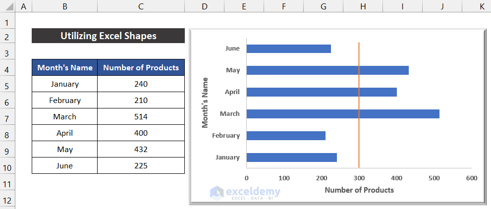
Thus, we can say that our method worked perfectly, and we were able to add a vertical line to an Excel bar chart.
Read More: Excel Add Line to Bar Chart
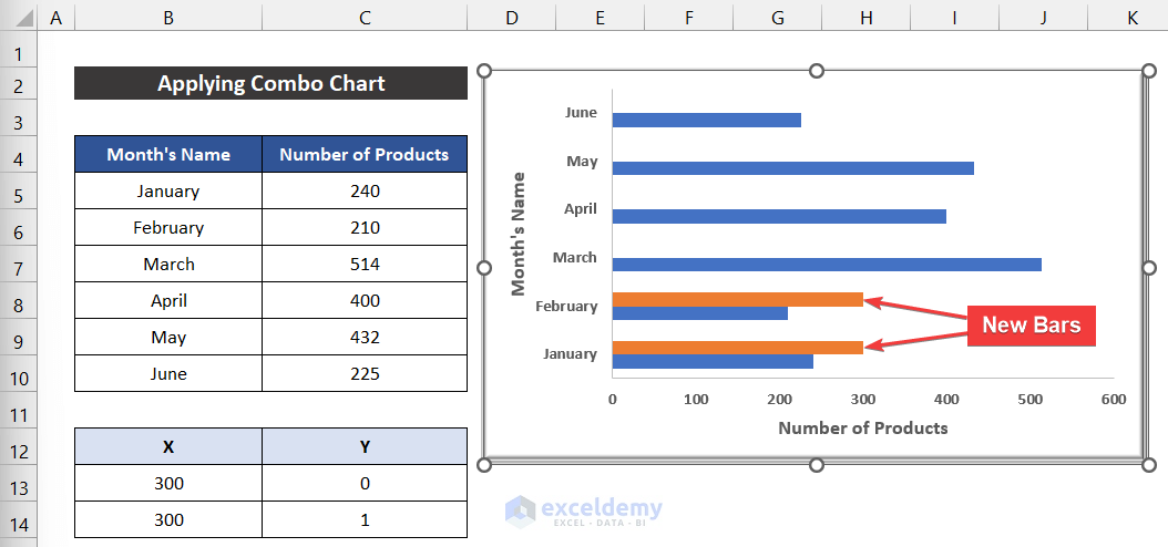
2. Applying Combo Chart
In this process, we will use the combo chat feature of the Excel chart to add a vertical line to the bar chart. For that, we need an additional dataset that is in the range of cells B13:C14. The steps of this procedure are given below:
📌 Steps:
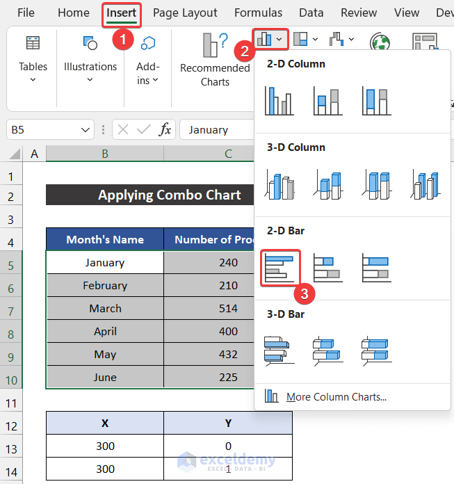
- First, select the range of cells B5:C10.
- Now, in the Insert tab, click on the drop-down arrow of the Insert Column or Bar Chart option from the Charts group.
- Then, choose the Clustered Bar from the 2-D Bar section.
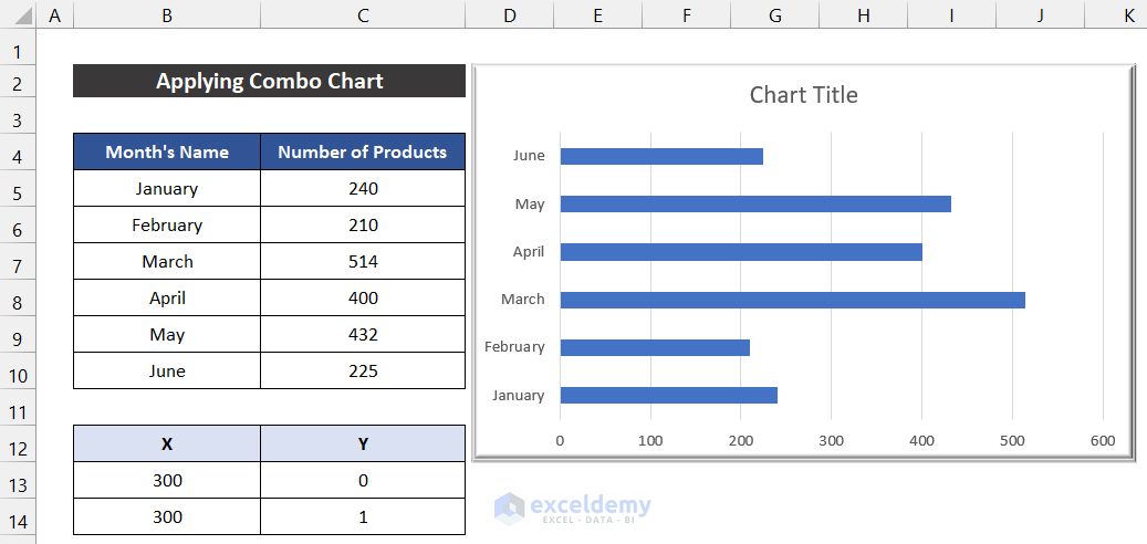
- The chart will appear in front of you.
- You can modify the chart according to your desire from the Chart Design and Format ribbons and keep the required elements from the Chart Elements icon. In our chart, we kept the default style.
- Besides this, we add only the Axes and Axis Title elements in our graph.

- Our graph insertion is finished.
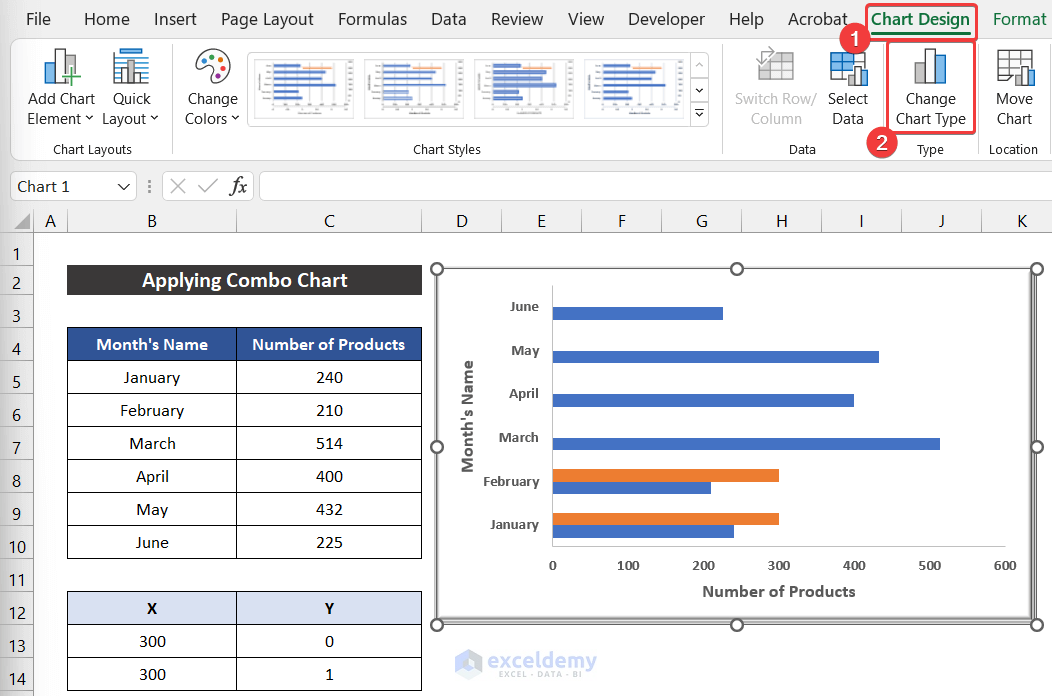
- Now, in the Chart Design tab, select the Select Data option from the Data group.
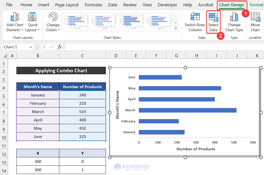
- As a result, a small dialog box called Select Data Source will appear.
- Click on the Add option.
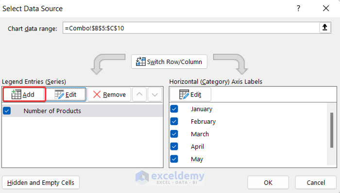
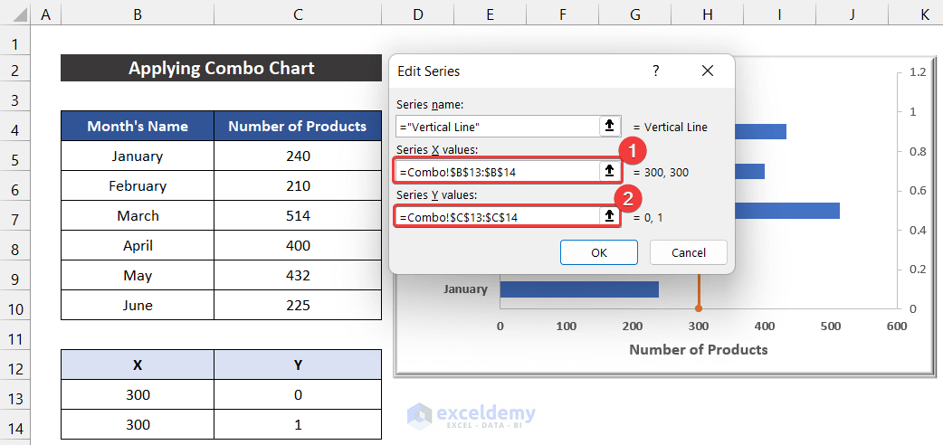
- Another dialog box titled Edit Series will appear.
- Write down a suitable name for the series. For our series, we write down Vertical Line.
- Then, in the Series Values option, select the range of cells B13:B14 and click OK.

- Again, click OK to close the Select Data Source dialog box.
- You will see that 2 new bars will be added to our existing chart.
- Now, in the Chart Design tab, select the Change Chart Type option.
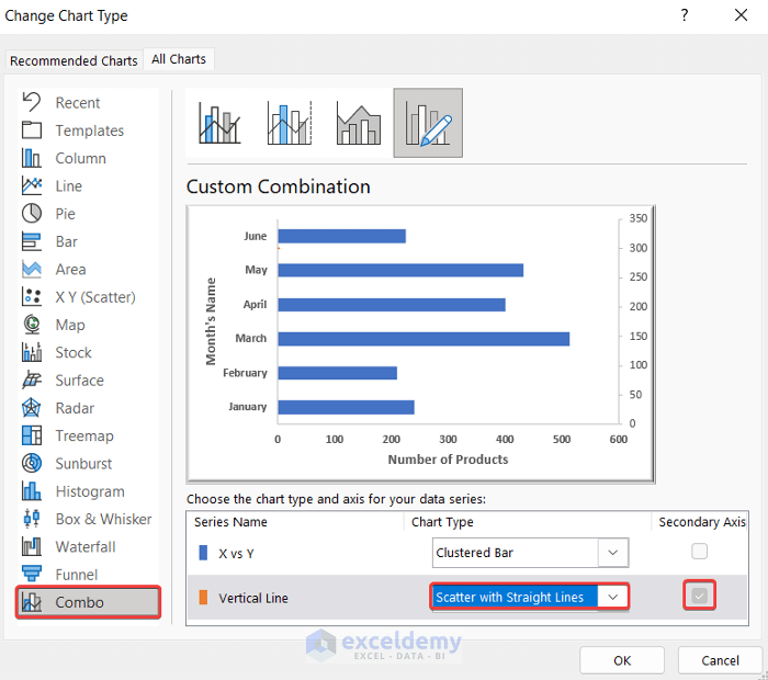
- As a result, the Change Chart Type dialog box will appear.
- After that, check the Secondary Axis option for the Vertical Line series.
- Moreover, change the Chart Type option from Clustered Bar to Scatter with Stright Line.
- Finally, click OK.
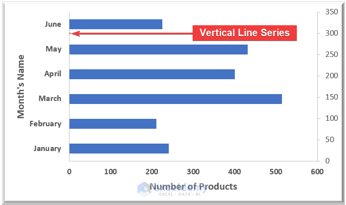
- You may see a little dot below the bar entitled June.
- Again, click on the Select Data option from the Data group.
- The Select Data Source dialog box will appear.
- Now, select the Vertical Line series and click the Edit option.

- As a result, the Edit Series dialog box will appear.
- Then, to input the Series X values, select the range of cells Combo!$B$13:$B$14.
- After that, to input the Series Y values, select the range of cells Combo!$C$13:$C$14.
- At last, click OK.
- Again, click OK to close the Select Data Source dialog box.
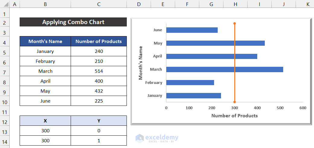
- At last, double-click on the secondary axis on the right side of the chart.
- As a result, a side window called Format Axis will appear.
- In the drop-down of the Axis Options, select the Axis Options tab and change the Maximum Bounds value from 1.2 to 1.

- Finally, select the axis and press Detele to hide it from the chart.
- You will get the vertical line on the bar chart.
At last, we can say that our method worked successfully, and we were able to add a vertical line to an Excel bar chart.
Read More: How to Add Horizontal Line to Bar Chart in Excel
3. Using Chart Trendline
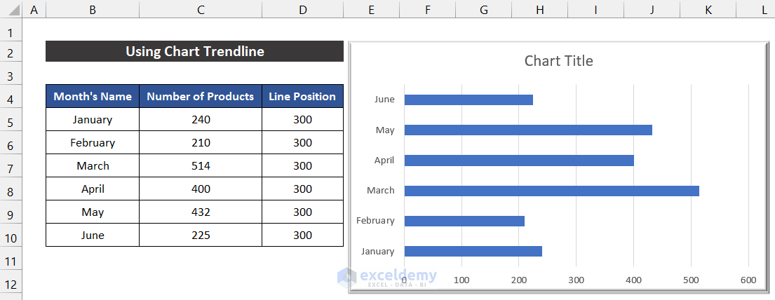
In the following method, we are going to use the trendline option of the Excel chart. For that, we need to declare the position of our vertical line, and the position of the vertical line is in the range of cells D5:D10. The procedure of this method is given as follows:
📌 Steps:
- At first, select the range of cells B5:C10.
- Now, in the Insert tab, click on the drop-down arrow of the Insert Column or Bar Chart option from the Charts group.
- After that, choose the Clustered Bar from the 2-D Bar section.
- The chart will appear in front of you.
- You can modify the chart according to your desire from the Chart Design and Format ribbons and keep the required elements from the Chart Elements icon. In our chart, we kept the default style.
- Moreover, we add only the Axes and Axis Title elements in our graph.

- Our graph insertion is finished.
- Now, select the range of cells D4:D10 and press ‘Ctrl+C’ to copy.
- Then, select the chart, and in the Home tab, click on the drop-down arrow of the Paste option from the Clipboard group.
- Select the Paste Special option.
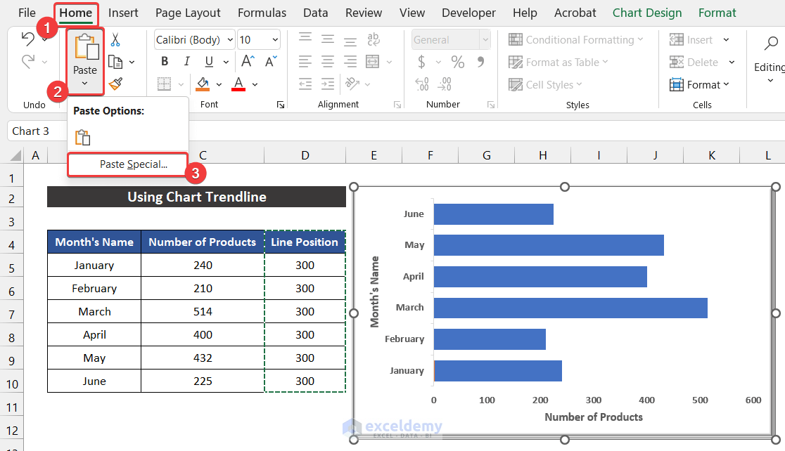
- As a result, a small dialog box called Paste Special will appear.
- After that, check the Series Names in First Row option and click OK.

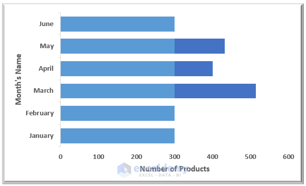
- You will get the new series overimposed on our existing chart.
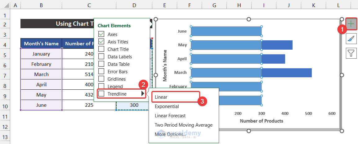
- Now, select the new bar series and click on the Chart Elements icon.
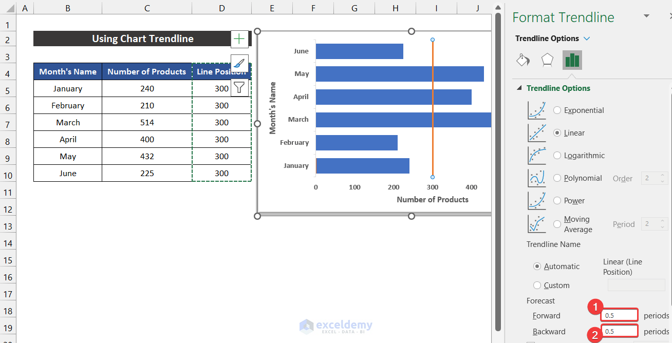
- Click on the Trendline option and select the Linear option.
- After that, double-click on the new series.
- As a result, a side window called Format Data Series will appear.
- Then, in the Fill & Line tab, change the Fill option from Automatic to No fill.

- Now, you can visualize the dotted vertical trendline.
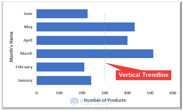
- Click the trendline and change the Dash type from Round Dot to Solid.
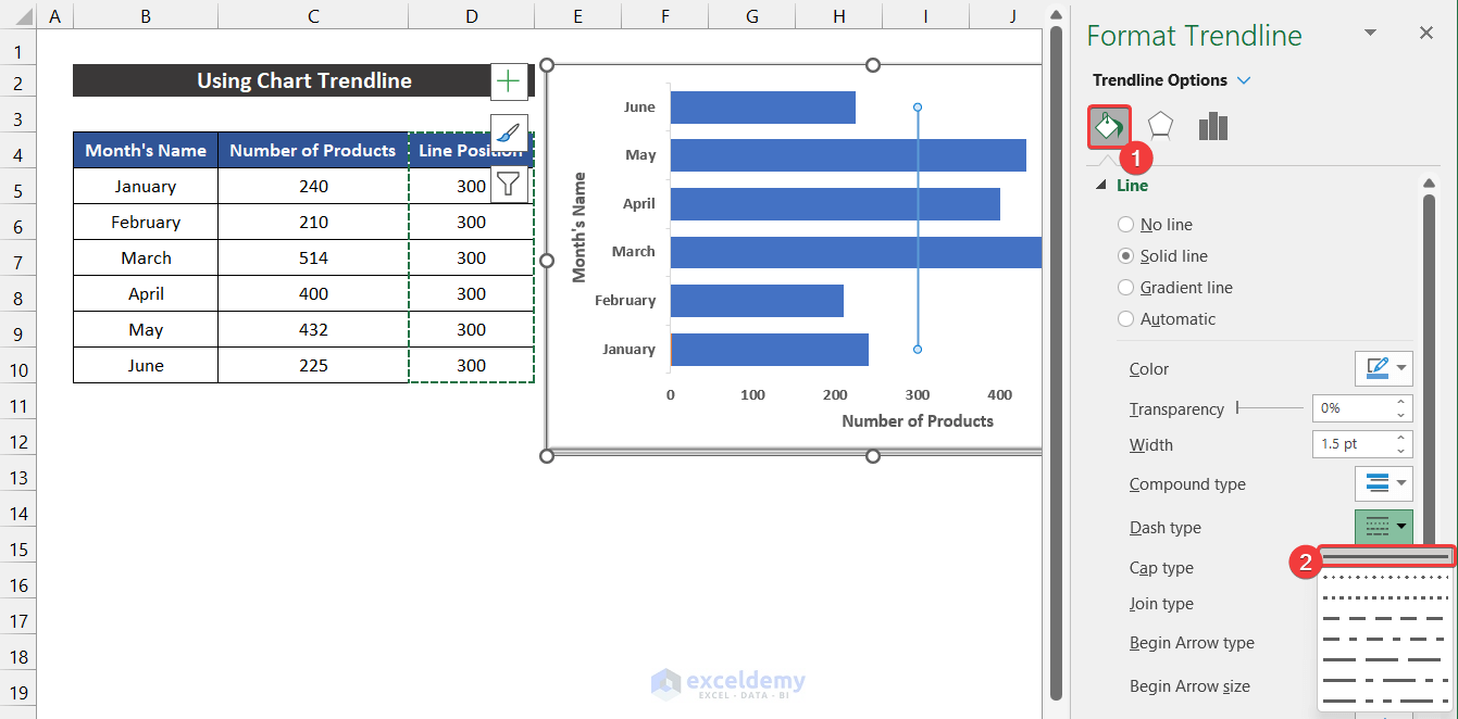
- Moreover, change the Color and Width to make the line easily distinguishable.

- Finally, go to the Trendline Options tab and change the value of the Forecast options (Forward and Backword) from 0 to 0.5.
- Our task is finished, and you will get the vertical line on the bar chart.
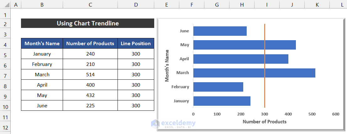
Finally, we can say that our method worked precisely, and we were able to add a vertical line to an Excel bar chart.
Read More: How to Create Bar Chart with Target Line in Excel
Download Practice Workbook
Download this practice workbook for practice while you are reading this article.
Conclusion
That’s the end of this article. I hope that this article will be helpful for you and you will be able to add a vertical line to the Excel bar chart. Please share any further queries or recommendations with us in the comments section below if you have any further questions or recommendations. Keep learning new methods and keep growing!
Related Articles
- Reverse Legend Order of Stacked Bar Chart in Excel
- How to Add Grand Total to Bar Chart in Excel
- How to Create Bar Chart with Error Bars in Excel
- How to Sort Bar Chart in Descending Order in Excel
- How to Change Bar Chart Color Based on Category in Excel
- How to Color Bar Chart by Category in Excel
- Excel Bar Graph Color with Conditional Formatting
- Excel Bar Chart with Line Overlay
<< Go Back to How to Edit Bar Graph in Excel | Excel Bar Chart | Excel Charts | Learn Excel
Get FREE Advanced Excel Exercises with Solutions!
