Adding a Bar Chart
To add a line to the bar chart, we will prepare a dataset with a bar chart first.
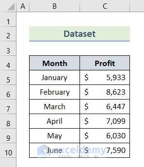
- Insert months and profit amount in columns B and C respectively.
- Select the whole dataset.
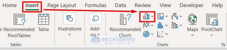
- Go to Column Charts from the Charts section in the Insert tab.
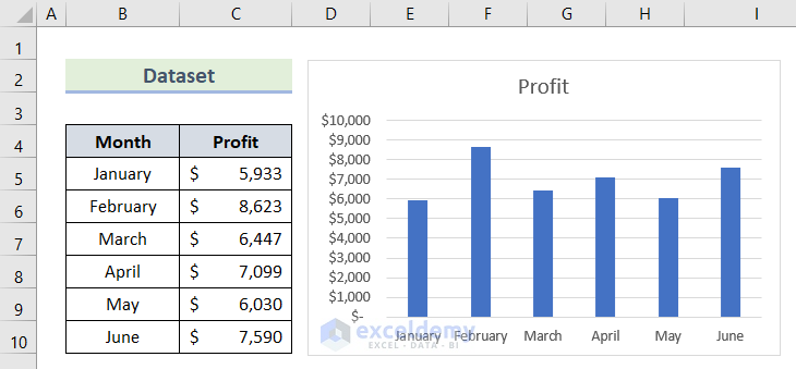
- Select any type of bar chart you want in your datasheet.
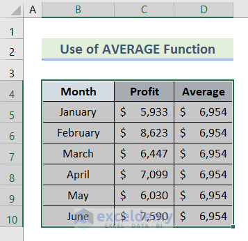
Example 1 – Add a Line to Bar Chart with the AVERAGE Function
- Insert the AVERAGE function below inside cell D5 and copy that to the cell range D6:D10.
=AVERAGE($C$5:$C$10)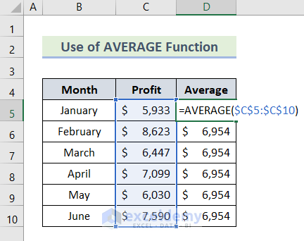
- Select the whole dataset including the average amount.
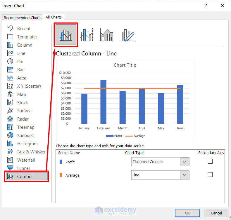
- Select Recommended Chart from the Charts section in the Insert tab.
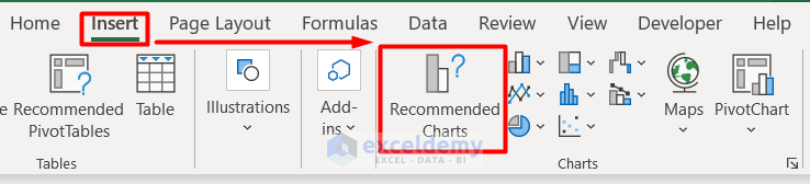
- This will open an Insert Chart window.
- Go to Combo from the All Charts section, select Clustered Column- Line, and press OK.

- You can see that a line is shown in the bar chart defining the average amount of profit.

Read More: How to Add Horizontal Line to Bar Chart in Excel
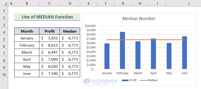
Example 2 – Use the Excel MEDIAN Function to Add a Line
- Insert the MEDIAN function below in cell D5 and copy it to the cell range D6:D10.
=MEDIAN($C$5:$C$10)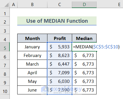
- Insert a Clustered Column- Line and press OK.
- You can see a line in the bar chart representing the Median Number.
Read More: Excel Bar Chart with Line Overlay
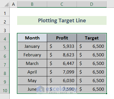
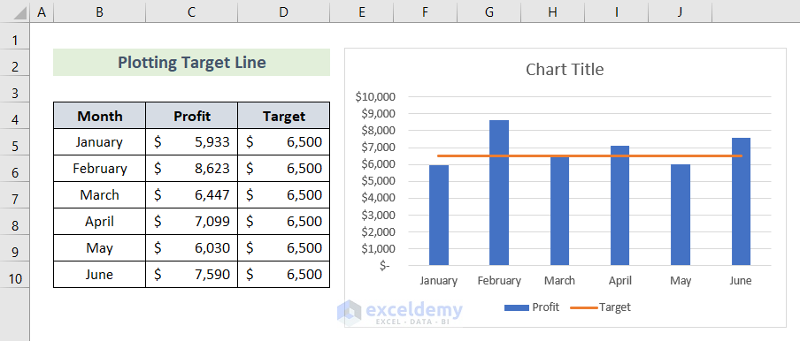
Example 3 – Add a Line to a Bar Chart as the Target Line
- Set up a number as the target value in the dataset and select the whole dataset.
- Create a bar chart.
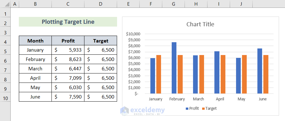
- Right-click on the chart and select Change Chart Type.
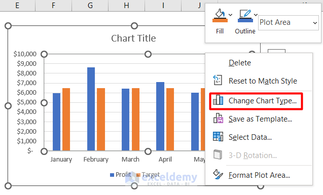
- In the new window, go to Combo from the All Charts section and select Custom Combination.
- Press OK.
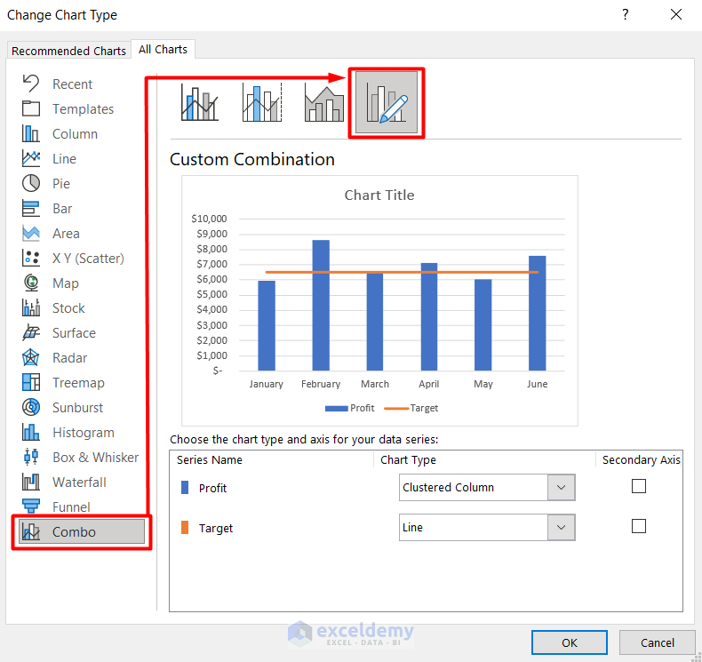
- You can see a line in the bar chart as the target line.
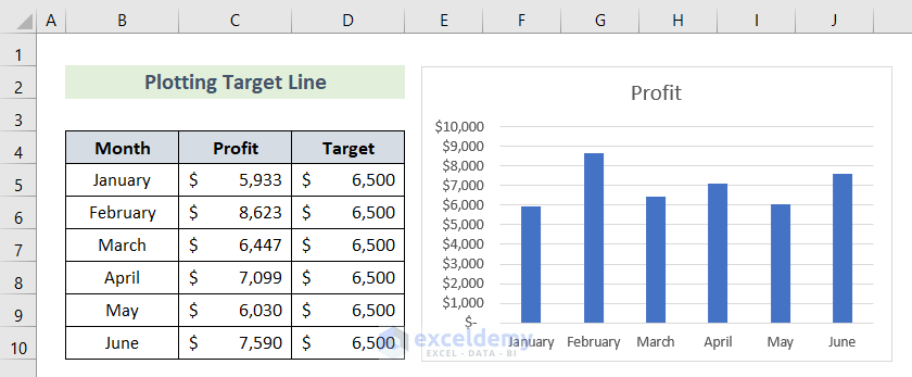
Another process to add a line to a bar chart as a target line is illustrated below:
- Create a bar chart with the initial dataset, except for the target amount.
- Right-click on the chart and press on Select Data.
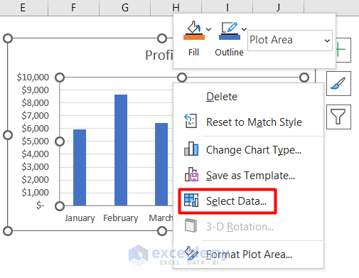
- Select Add from the Legend Entries (Series) section.
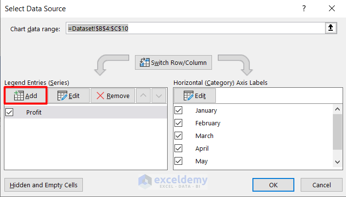
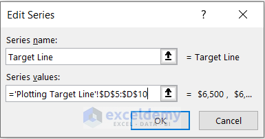
- In the Edit Series window, insert the series name as Target Line and insert the series value in cell range D5:D10 from the dataset except for the header.
- Press OK twice.
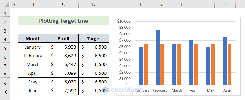
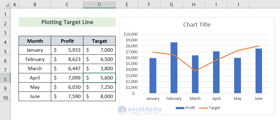
- Repeat the process discussed initially in this example and you will successfully add a line to the bar chart as the target line.
- You can also add a target line with different values.
Read More: How to Create Bar Chart with Target Line in Excel
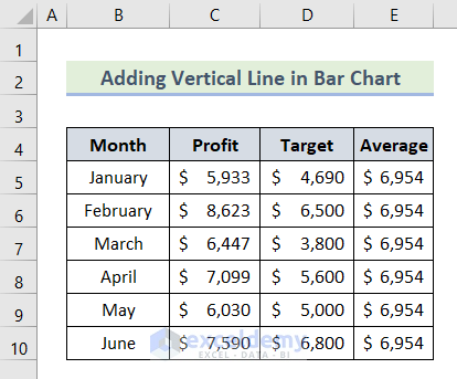
Example 4 – Add a Vertical Line to a Bar Chart
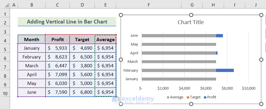
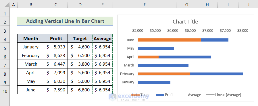
- Create a dataset with the information on profit, target, and average for the first half months of a year.
- Create a horizontal bar chart with the dataset of cell range B4:D10.
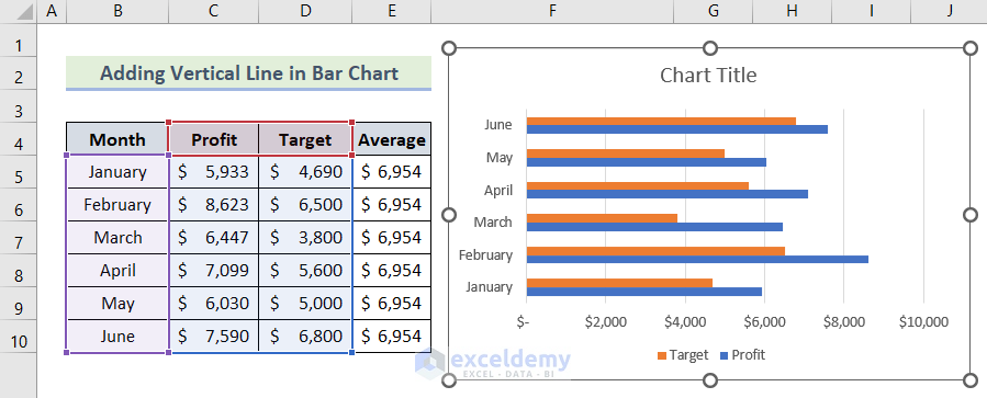
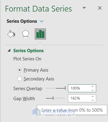
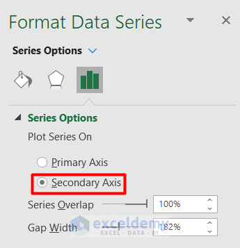
- Click on the chart and make the Series Overlap value 100% from the Format Data Series.
- Select cell range E4:E10, press Ctrl + 1, and select the outer line of the chart like this:
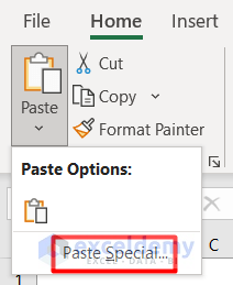
- Go to the Home tab and select Paste Special from the Clipboard section.
- Mark the options in the Paste Special window just like this:
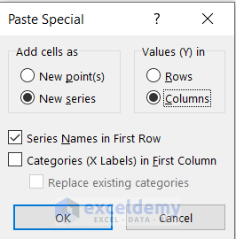
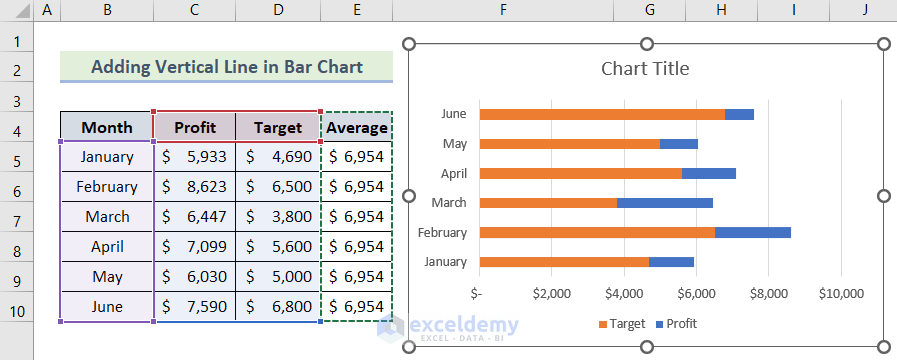
- Press OK. The bar chart now looks like this.
- Click on the average bar and put it in the Secondary Axis from the editing panel.
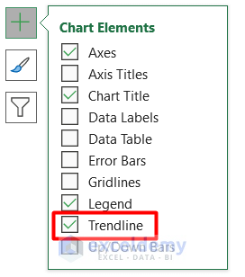
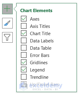
- Select Trendline from the Chart Elements section.
- We have our vertical line in the bar chart.
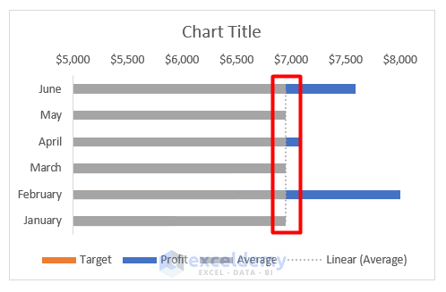
- After some customization, it looks like this.
Read More: How to Add Vertical Line to Excel Bar Chart
How to Customize the Added Line in Excel Bar Chart
- Select the chart and press Ctrl + 1. It will open a new Format Chat Area panel on the right side.
- In this section, you will get numerous options to edit the line along with the chart.
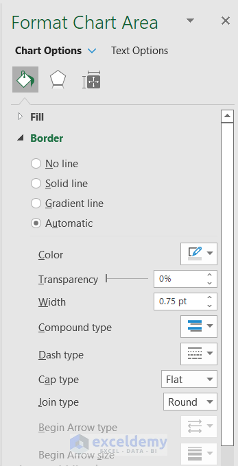
- You can change the size, color, or type of the line. You can add texts if you need them.
- You can also format the bar chart from its right-side options.
Download the Practice Workbook
Related Articles
- How to Add Grand Total to Bar Chart in Excel
- How to Create Bar Chart with Error Bars in Excel
- How to Sort Bar Chart in Descending Order in Excel
- How to Change Bar Chart Color Based on Category in Excel
- How to Color Bar Chart by Category in Excel
- Excel Bar Graph Color with Conditional Formatting
<< Go Back to Excel Bar Chart | Excel Charts | Learn Excel
Get FREE Advanced Excel Exercises with Solutions!
