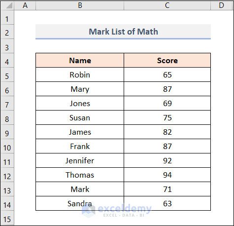
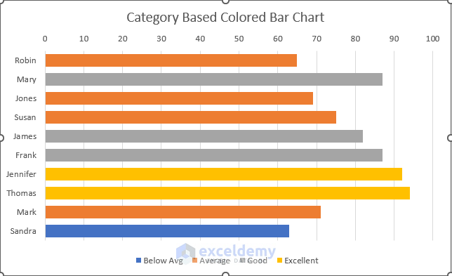
Dataset Overview
Suppose we have a math exam mark list for some students, with their names in column B and their scores in column C. Our goal is to classify these scores into specific categories (0-64, 65-79, 80-89, and 90-100) and create a bar chart with colored bars representing these categories. Let’s explore two methods to achieve this:
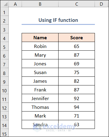
Method 1 – Using the IF Function
- Prepare Your Data:
- Copy the dataset and paste it into an Excel worksheet.
-
- In cell B16, define the lower and upper limits for each category (e.g., 0-64, 65-79, etc.).
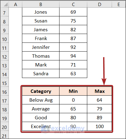
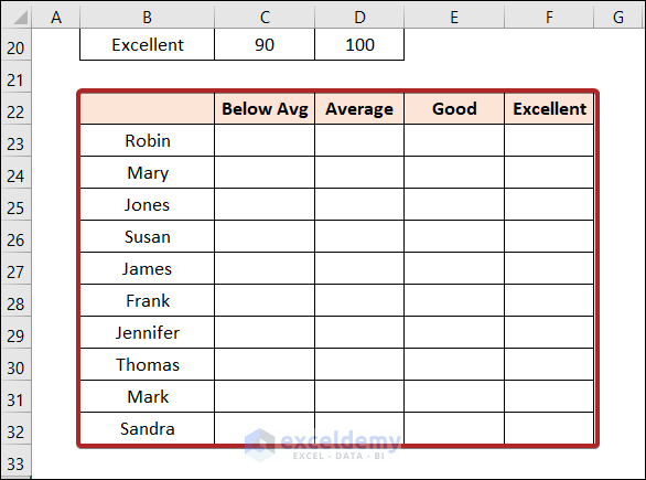
- Create a Category Table:
- Set up a table in the range B22:F32.
- Distribute the scores into their respective categories (Below Average, Average, Good, and Excellent).
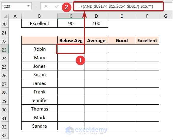
- Apply the IF Function:
- In cell C23, enter the following formula:
=IF(AND($C$17<=$C5,$C5<=$D$17),$C5,"")
-
-
- Here, C5 represents Robin’s score, while C17 and D17 define the min and max values for the Below Avg category.
- The formula checks if Robin’s score falls within the specified range. If so, it displays the score; otherwise, it shows a blank cell.
-
-
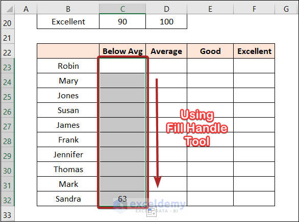
- Drag the formula down to fill the remaining cells (e.g., C32 for Sandra’s score).
-
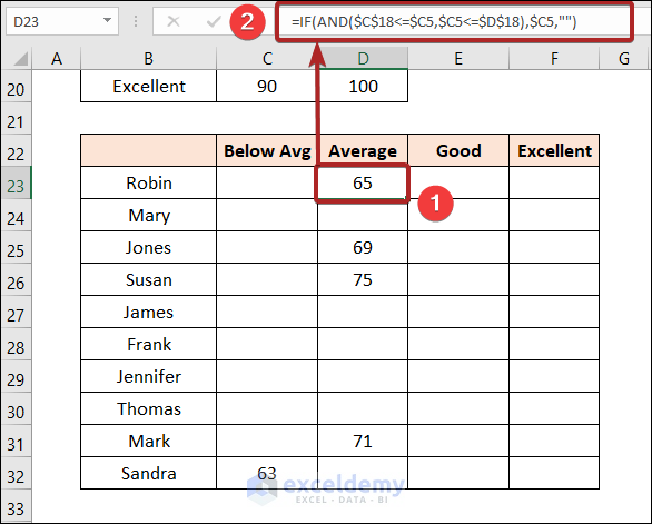
- Select cell D23 and enter the formula below.
=IF(AND($C$18<=$C5,$C5<=$D$18),$C5,"")
-
-
- This formula is similar to the formula of our previous step. The difference is that here we used the cell reference of the Min and Max value of the Average category.
-
-
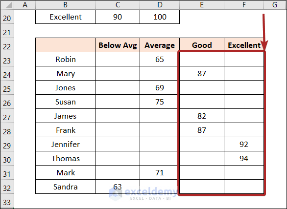
- Press the ENTER.
- Drag the formula down to fill the remaining cells in columns E and F.
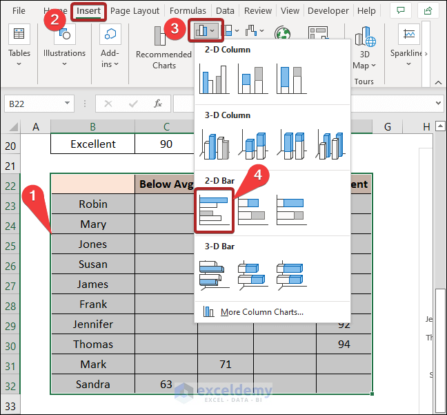
- Create the Bar Chart:
- Select the entire table (B22:F32).
- Go to the Insert tab and choose 2-D Clustered Bar Chart.
- The chart will now be colored based on the categories.
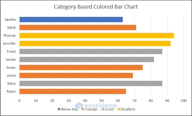
- Reverse the Y-Axis:
- By default, Robin appears at the bottom of the Y-axis, which doesn’t match the data table.
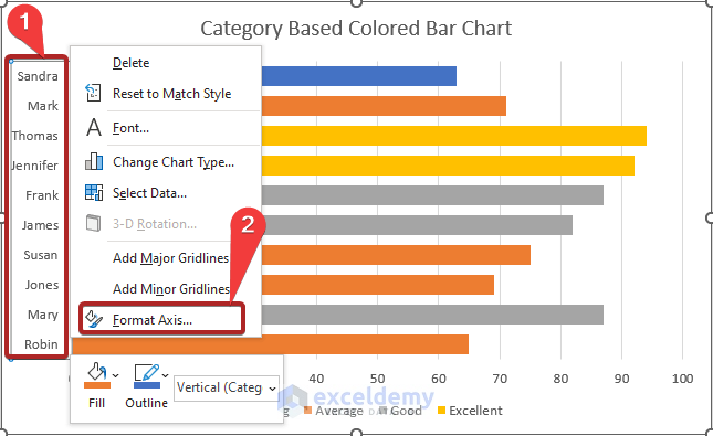
- Right-click on the Y-axis and select Format Axis.
-
- In the Format Axis task pane, click on Axis Options.
- Check the box for Categories in reverse order.
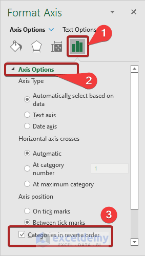
- Now your chart will match the order of the data table.
Read More: How to Change Bar Chart Color Based on Category in Excel
Method 2 – Manually Coloring Bars Using Format Options
In this method, we’ll customize the colors of individual bars based on their categories.
Steps:
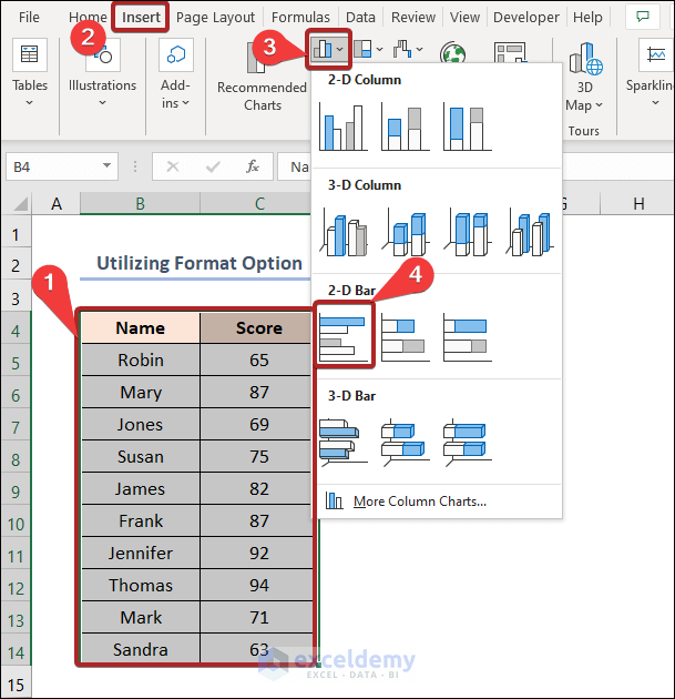
- Select Your Data Table:
- Highlight the entire data table in the B4:C14 range.
- Create the Bar Chart:
- Go to the Insert tab.
- Choose 2-D Clustered Bar under Column or Bar Chart.
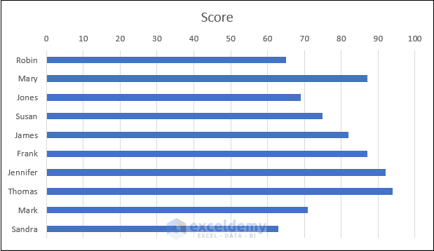
-
- This will create the bar chart, with all bars initially having the same color.
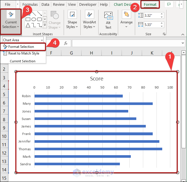
- Color Individual Bars:
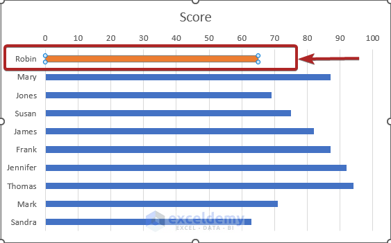
- Select any bar in the chart.
- Go to the Format tab.
- Access Format Options:
- In the Current Selection group, click on Format Selection.
- The Format Data Point task pane will appear.
- Choose a Fill Color:
- Click on the Fill & Line icon.
- From the Fill Color list, select your preferred color.
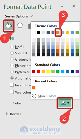
-
- The selected bar will now be colored accordingly.
- Repeat for Other Bars:
- Repeat the process for each bar, assigning colors based on the categories defined in Method 1.
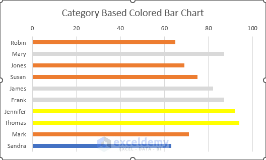
Note: While this method works well for smaller datasets, manually coloring bars becomes impractical for larger datasets (e.g., 100 rows).
Read More: Excel Bar Graph Color with Conditional Formatting
Download Practice Workbook
You can download the practice workbook from here:
Related Articles
- How to Add Grand Total to Bar Chart in Excel
- How to Create Bar Chart with Error Bars in Excel
- How to Sort Bar Chart in Descending Order in Excel
- Excel Add Line to Bar Chart
- How to Add Horizontal Line to Bar Chart in Excel
- How to Add Vertical Line to Excel Bar Chart
- How to Create Bar Chart with Target Line in Excel
- Excel Bar Chart with Line Overlay
<< Go Back to Excel Bar Chart | Excel Charts | Learn Excel
Get FREE Advanced Excel Exercises with Solutions!
