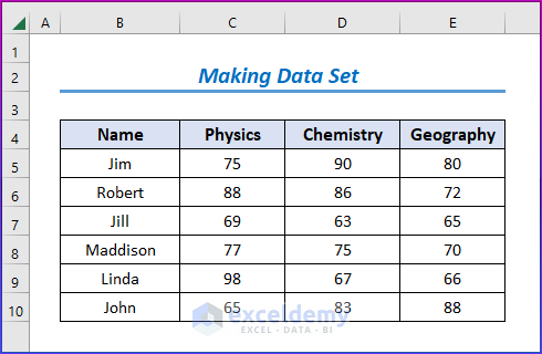
Method 1 – Making Data Set with Proper Parameters
- Create a data set first.
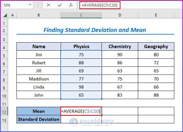
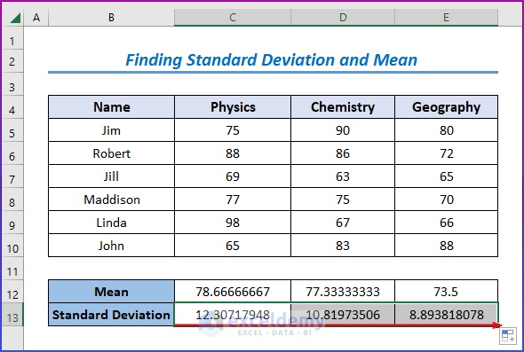
Method 2 – Finding Standard Deviation and Mean
- Select cell C12.
- Enter the following formula.
=AVERAGE(C5:C10)
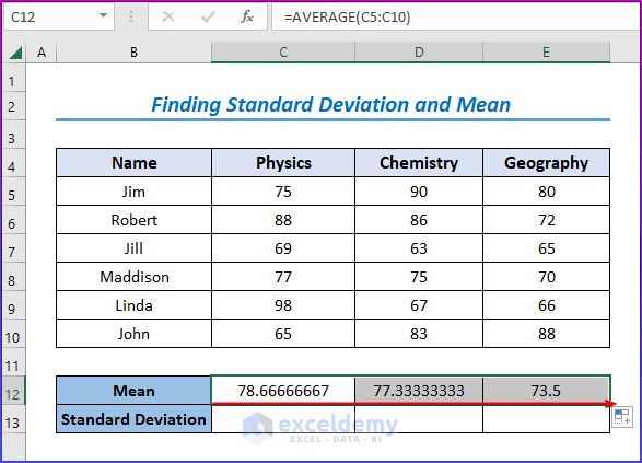
- Hit Enter and drag down the Fill Handle icon to see the results.
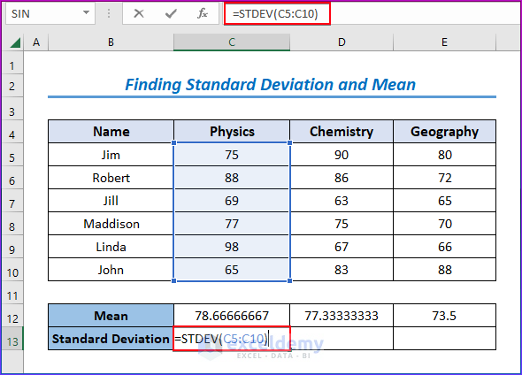
- Select cell C13.
- Enter the following formula.
=STDEV(C5:C10)
- Ht Enter and drag down the Fill Handle icon to see the results.
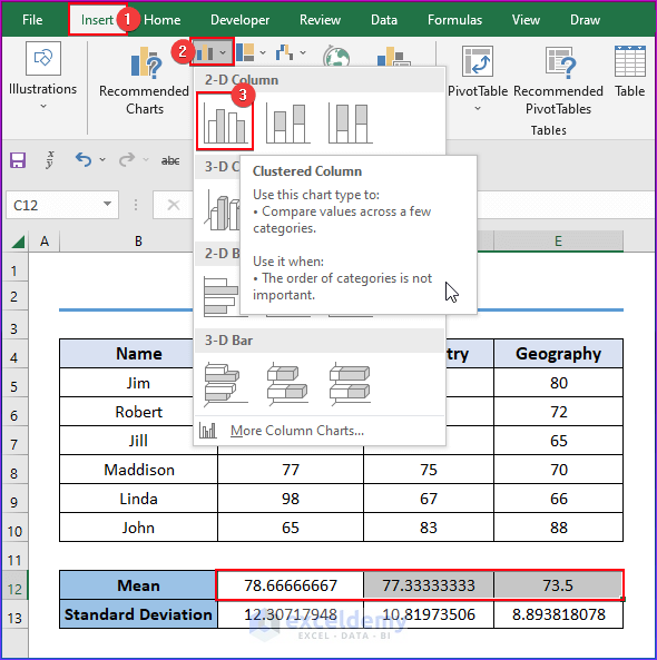
Method 3 – Utilizing Charts Group
- Go to the Insert tab after selecting the data range from the given data set.
- Choose the Insert Column or Bar Chart from the Charts group.
- Select the Clustered Column option from the 2-D Column group.
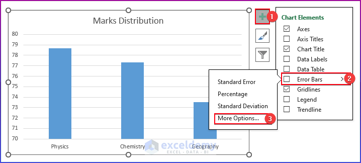
- Our bar chart with the mean value. Organize this bar chart with standard deviation.
- Choose the Error Bars option from the Chart Element group.
- Select More Options.
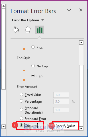
- A Format Error Bars panel will appear to you.
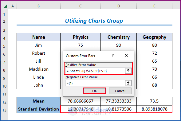
- Tick the Custom option and click on the Specify Value.
- See the Custom Error Bars dialog box in the below image.
- Select the Standard Deviation value from the data set and then click OK.
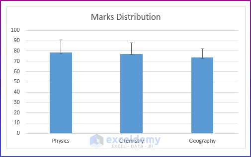
Method 4 – Showing Excel Bar Chart with Standard Deviation
- See a bar chart with standard deviation in the below image.
Download Practice Workbook
You may download the following Excel workbook for better understanding and practice it by yourself.
.Related Articles
- How to Create Overlapping Bar Chart in Excel
- How to Create a Radial Bar Chart in Excel
- How to Create Construction Bar Chart in Excel
- How to Create a 3D Bar Chart in Excel
- How to Create Butterfly Chart in Excel
<< Go Back to Excel Bar Chart | Excel Charts | Learn Excel
Get FREE Advanced Excel Exercises with Solutions!
