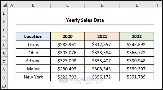
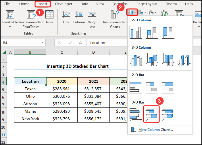
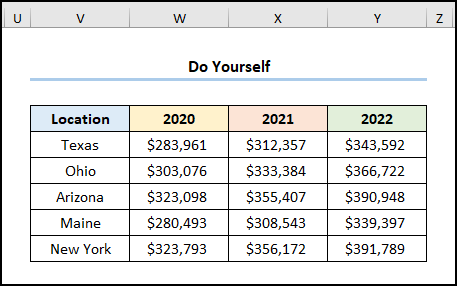
Consider the Yearly Sales Data dataset, containing “Location”, and “Years 2020”, “2021” and “2022” .
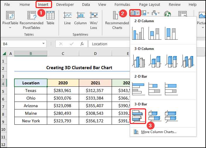
Example 1 – Creating a 3D Clustered Bar Chart
Steps:
- Go to the Insert tab >> click Insert Column or Bar Chart >> select 3D Clustered Bar.
- Uncheck “Location” >> click Series 1 >> click Edit.
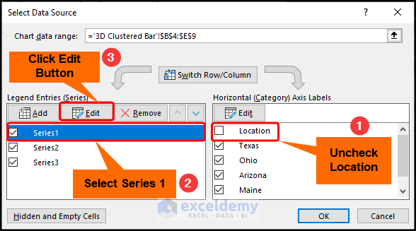
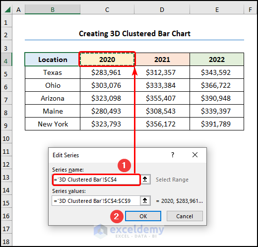
- Enter the Series name by choosing the C4 cell reference >> click OK.
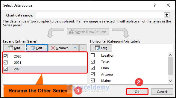
- Rename Series 2 and Series 3 >> click OK to close the Select Data Source dialog box.
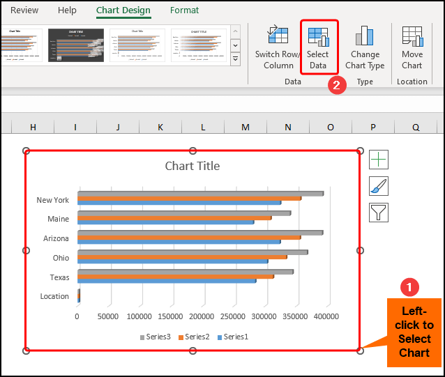
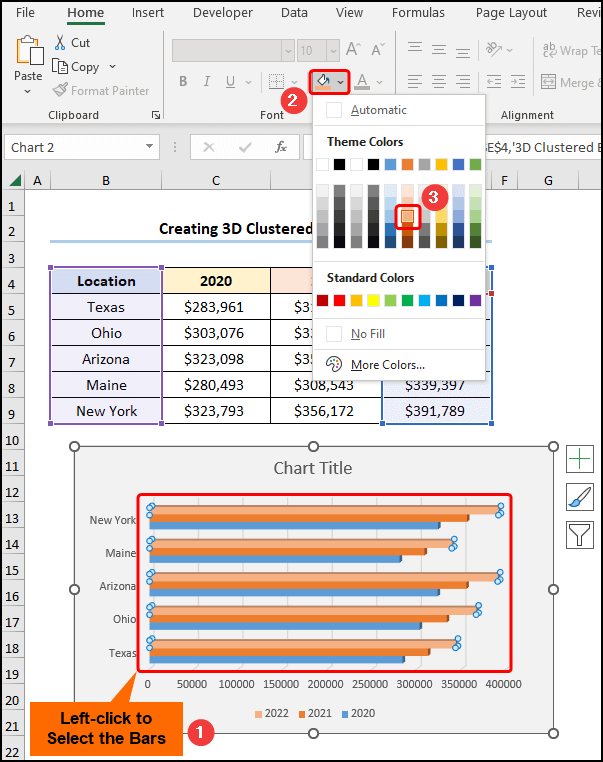
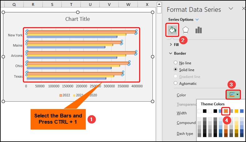
- Select the chart and right-click to open the Context Menu >> choose a Fill color, here “White, Background 1, Darker 5%”.
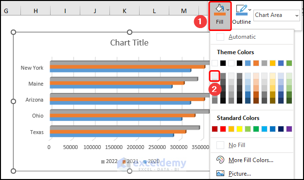
- Click the bars >> select a Fill color, here “Orange, Accent 2, Lighter 40%” >> repeat the same process for the other two series.
- Left-click the bars >> press CTRL + 1 >> choose a Border color for the bars, here, “Orange, Accent 2” >> follow the same procedure for the two series.
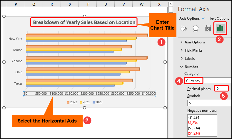
- Enter a title, here, “Breakdown of Yearly Sales Based on Location” >> select the horizontal axis >> format the axis labels as Currency.
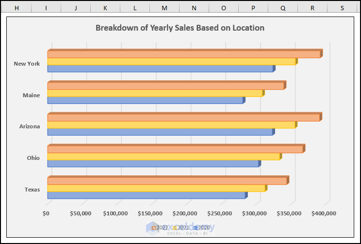
This is the final output.
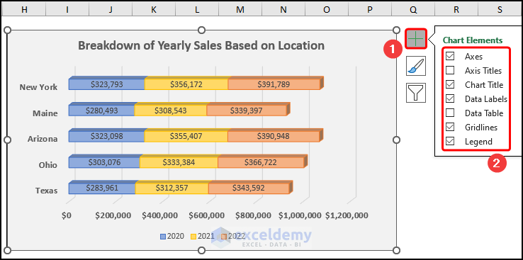
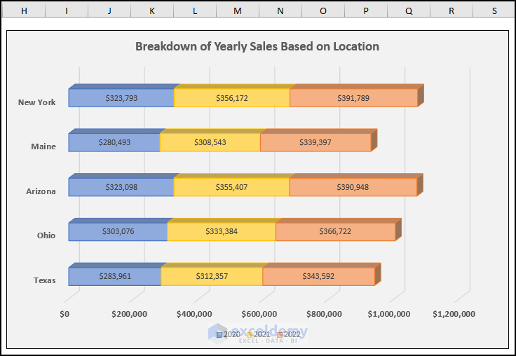
Example 2 – Inserting a 3D Stacked Bar Chart
Steps:
- Go to the Insert tab >> in Insert Column or Bar Chart, choose 3D Stacked Bar.
- Follow the previously described steps to format the chart >> click Chart Elements >> check the options shown below.
This is the output.
Read More: How to Create Clustered Stacked Bar Chart in Excel
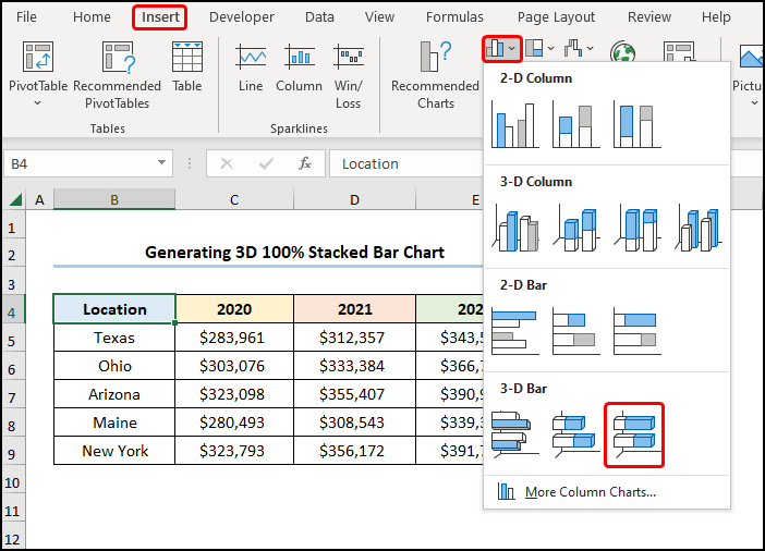
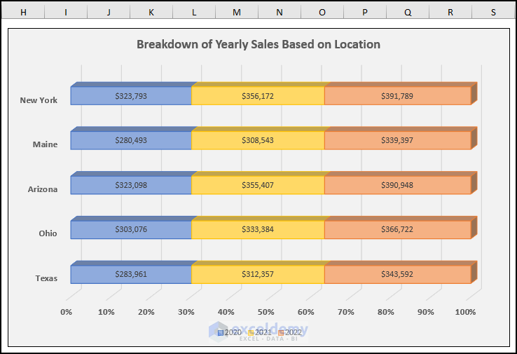
Method 3 – Generating a 3D 100% Stacked Bar Chart
The 3D 100% Stacked Bar Chart shows values as a percentage.
Steps:
- Go to the Insert tab >> select 3D 100% Stacked Bar.
- Follow the previously described steps to format the chart.
This is the output.
Read More: How to Make a 100 Percent Stacked Bar Chart in Excel
How to Make a 3D Column Chart in Excel
Steps:
- Go to the Insert tab >> select 3D Column.
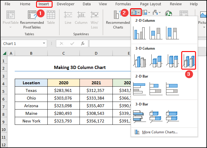
- Follow the previously described steps to format the chart.
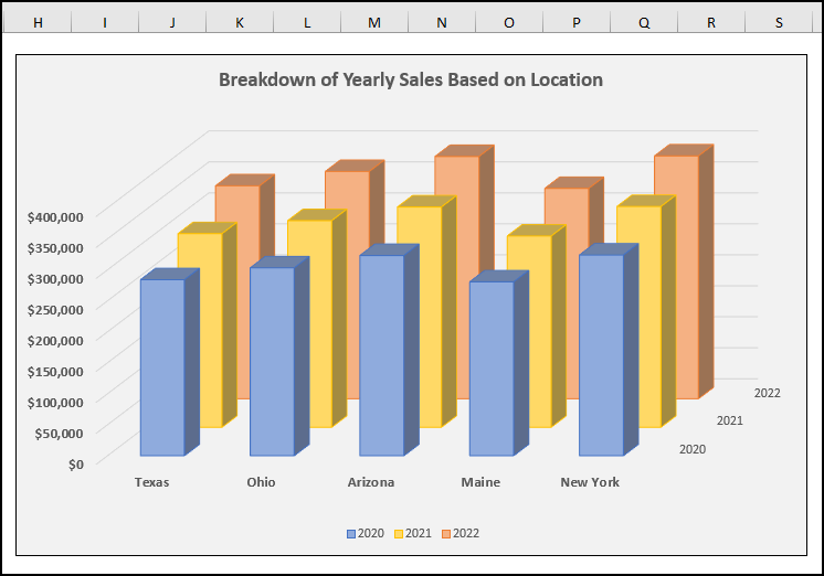
This is the output.
Read More: How to Flip Bar Chart in Excel
Practice Section
Practice here.
Download Practice Workbook
Related Articles
- How to Show Variance in Excel Bar Chart
- How to Create a Bar Chart with Standard Deviation in Excel
- How to Create Overlapping Bar Chart in Excel
- How to Create a Radial Bar Chart in Excel
- How to Create Construction Bar Chart in Excel
- How to Create Butterfly Chart in Excel
<< Go Back to Create a Bar Chart in Excel | Excel Bar Chart | Excel Charts | Learn Excel
Get FREE Advanced Excel Exercises with Solutions!
