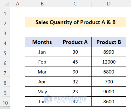
Dataset Overview
Suppose you have a dataset containing the sales quantity of two products over six months, and you want to create a bar chart based on this data.
Scenario
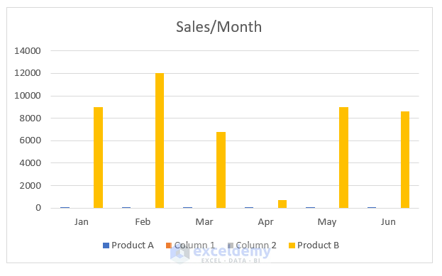
After creating a simple 2D column bar chart, you notice that the sales of product B are significantly higher than those of product A. Consequently, the heights of the product A columns appear very small in the chart. To address this, we need to add a secondary axis.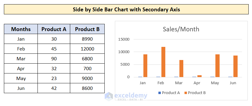
Follow these steps to create a bar chart with a side-by-side secondary axis in Excel (Windows operating system):
Step 1- Insert 2 New Columns
- To achieve a secondary axis in a bar chart with side-by-side columns, we’ll need to use a workaround since Excel doesn’t provide a direct option for this.
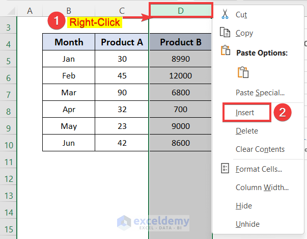
- Insert two new columns between the existing product columns. Right-click on column D and select Insert.
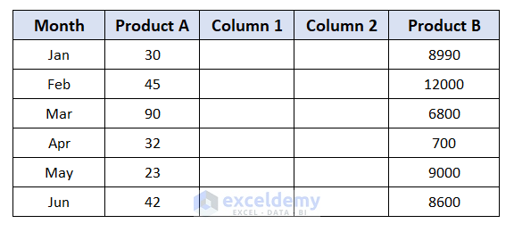
- Rename the newly inserted columns as Column 1 and Column 2.
Step 2 – Create the Bar Chart
- Select the entire data table and create a bar chart.
- We now have a basic bar chart.
Read More: How to Sort Bar Chart in Descending Order in Excel
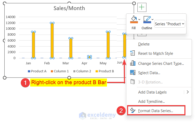
Step 3 – Apply the Secondary Axis
- Right-click on any of the bar groups in the chart.
- Choose Format Data Series.
- A new window will appear on the right side of the worksheet.
- Select the Secondary Axis option.
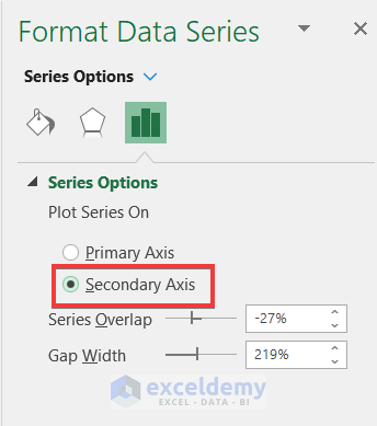
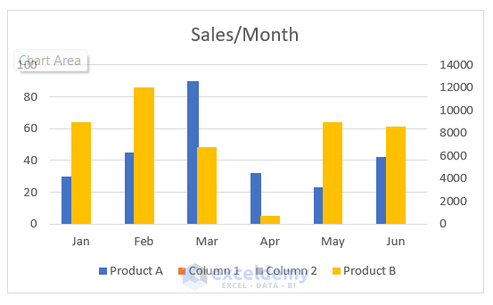
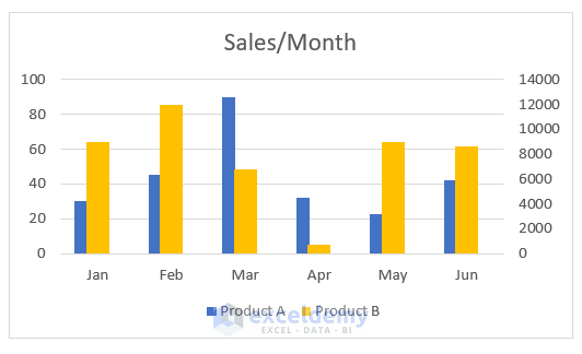
- As a result, a new secondary vertical axis will appear on the right side of the chart, representing the values for product B, while the left side axis represents the values for product A.
Read More: How to Change Bar Chart Color Based on Category in Excel
Step 4 – Remove Extra Columns
- We can now remove the additional columns to achieve the desired side-by-side secondary axis effect.
- Right-click on the legend in the chart.
- Select Delete.
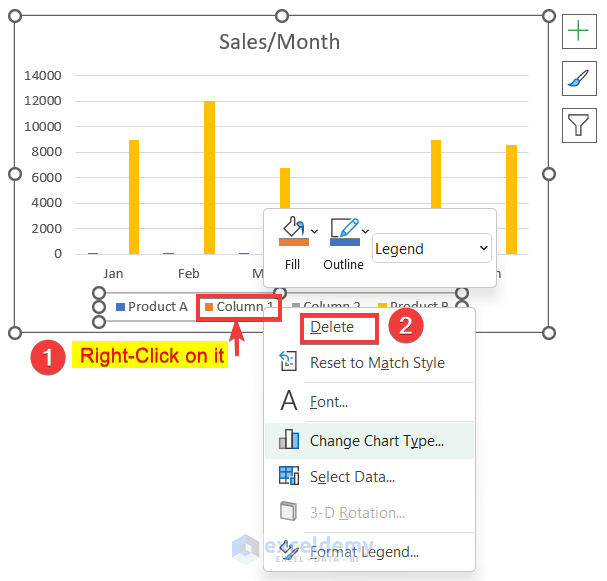
- We have a bar chart with a secondary axis displayed side by side.
Read More: How to Color Bar Chart by Category in Excel
Download Practice Workbook
You can download the practice workbook from here:
Related Articles
- How to Make a Bar Graph with Multiple Variables in Excel
- How to Make a Bar Graph in Excel with 2 Variables
- How to Make a Bar Graph in Excel with 3 Variables
- How to Make a Bar Graph in Excel with 4 Variables
- How to Make a Percentage Bar Graph in Excel
- How to Make a Bar Graph Comparing Two Sets of Data in Excel
- How to Show Number and Percentage in Excel Bar Chart
- How to Show Difference Between Two Series in Excel Bar Chart
- How to Sort Bar Chart Without Sorting Data in Excel
- How to Change Bar Chart Width Based on Data in Excel
<< Go Back to Excel Bar Chart | Excel Charts | Learn Excel
Get FREE Advanced Excel Exercises with Solutions!

Many thanks for this – brilliant way to leverage Excel graphing – appreciated!
Hello Hugh Richards,
Thanks for your appreciation.
Regards
ExcelDemy