Method 1 – Using Combo Chart
Steps:
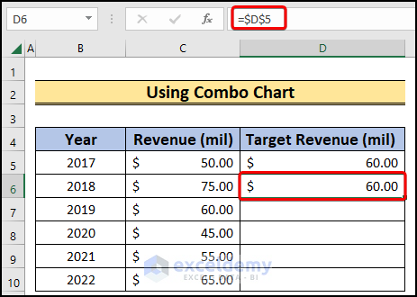
- Choose the D6 cell and enter,
=$D$5- Press Enter.
- The cell will have the value in the D5 cell.
- Lower the cursor down to Autofill the rest of the cells.
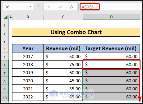
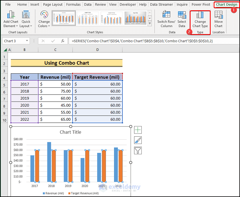
- Select the B4:D10 cell range.
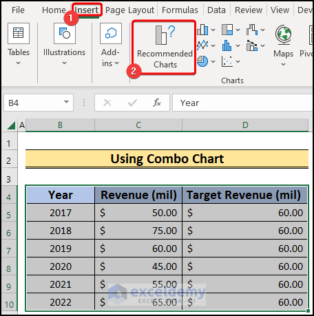
- Go to Insert.
- Select the Recommended Charts option.
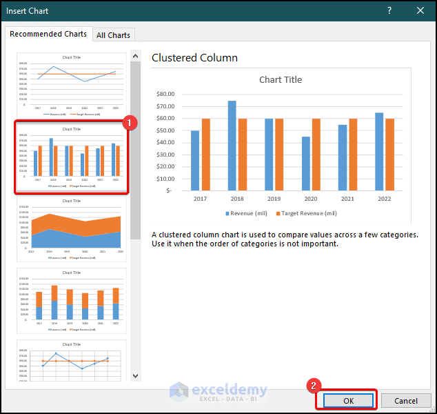
- A prompt will be on the screen.
- Choose the Clustered Column option.
- Press OK.
- The chart will be plotted.
- Choose the Target Revenue data series bar.
- Go to the Chart Design tab.
- Choose Change Chart Type.
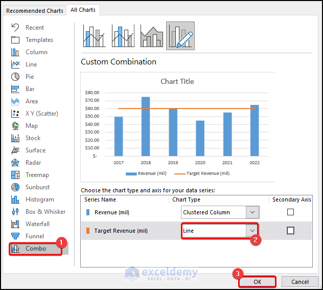
- A prompt will be on the screen.
- From the prompt, first, select Combo.
- Change the Target Revenue chart type to Line.
- Click OK.
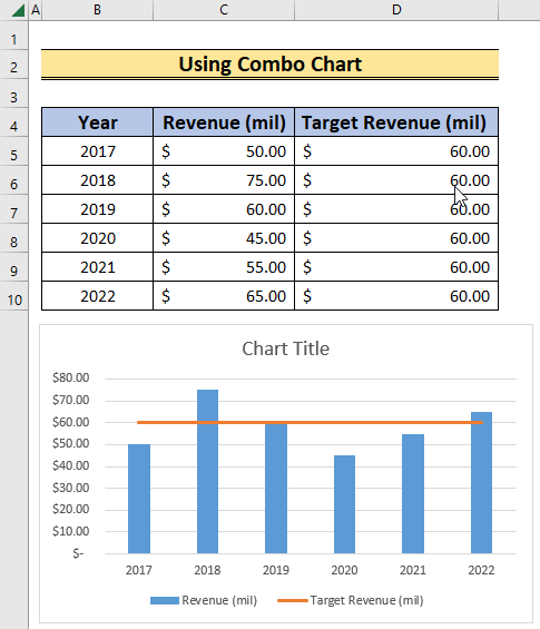
- Get a bar chart with a target line.
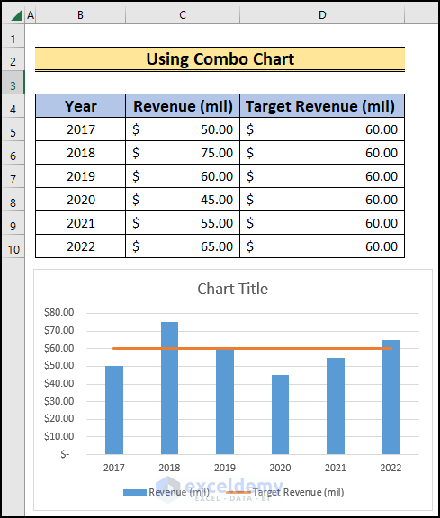
- Change the target value; the target line will be changed accordingly.
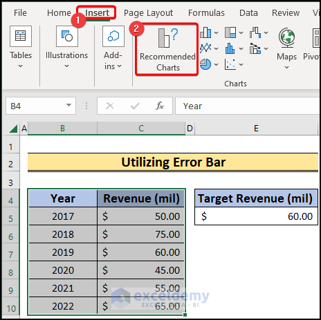
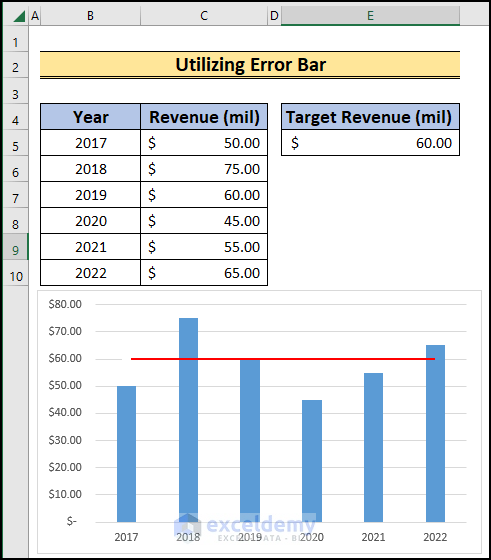
Method 2 – Utilizing Error Bar to Add Target Line in Excel Bar Chart
Steps:
- Select the B4:C10 range.
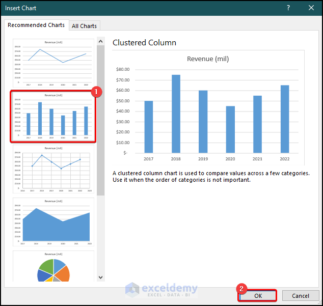
- Go to Insert >> Recommended Charts.
- A prompt will be on the screen.
- Select the Clustered Column chart and press OK.
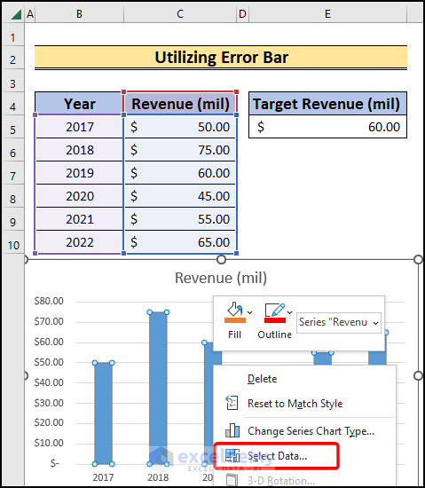
- We will have the chart plotted in the sheet.
- Right-click on the chart series and select Select Data from the available options.
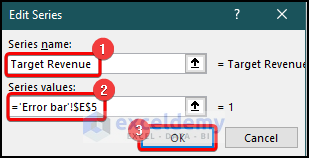
- In the Select Data Source, choose Add.
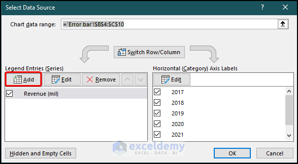
- Set the Series name as “Target Revenue”.
- Select the E5 cell as the Series values.
- Choose OK.
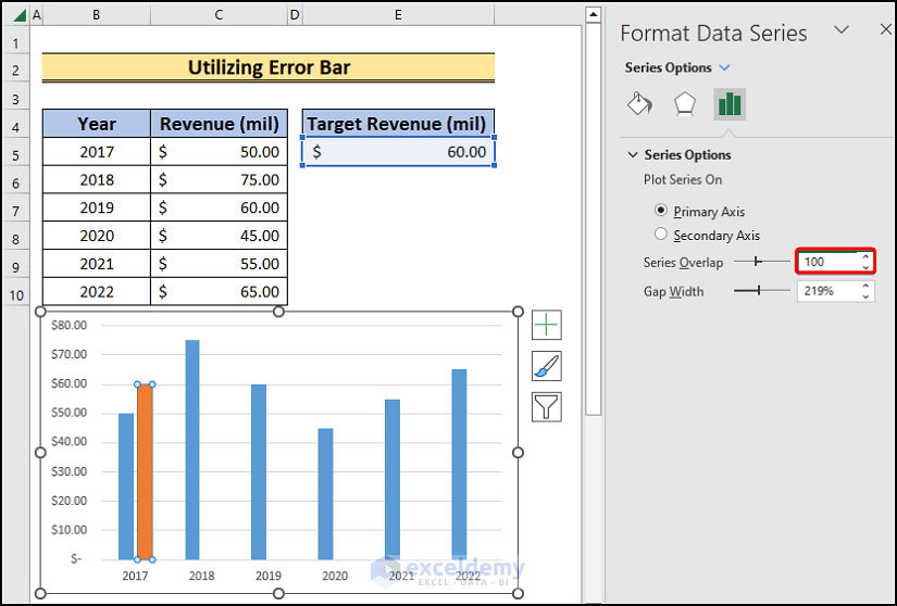
- A new bar chart will be plotted inside the previous chart.
- Select the Target Revenue bar and increase the Series Overlap to 100% from the Series Options.
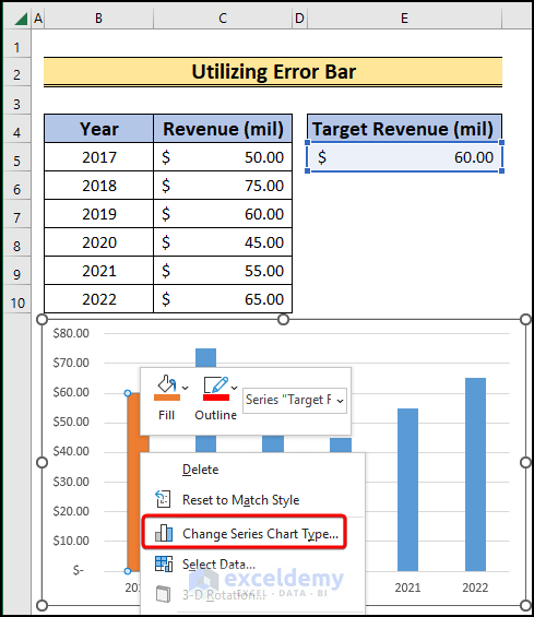
- Right-click on the overlapped series, and from the available options, choose Change Series Chart Type.
- We will have a prompt on the screen.
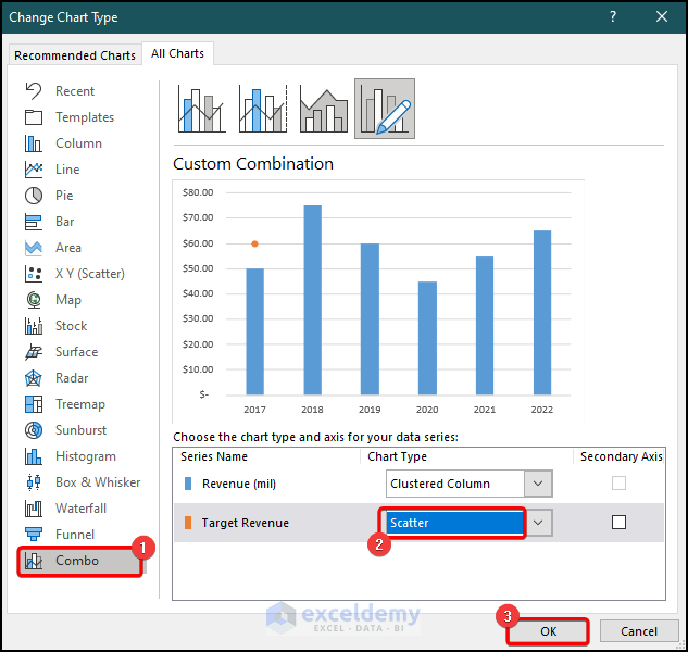
- Choose the Combo option.
- Change the Target Revenue chart type to Scatter.
- Select OK.
- The Target Revenue data plotted as the Scatter chart.
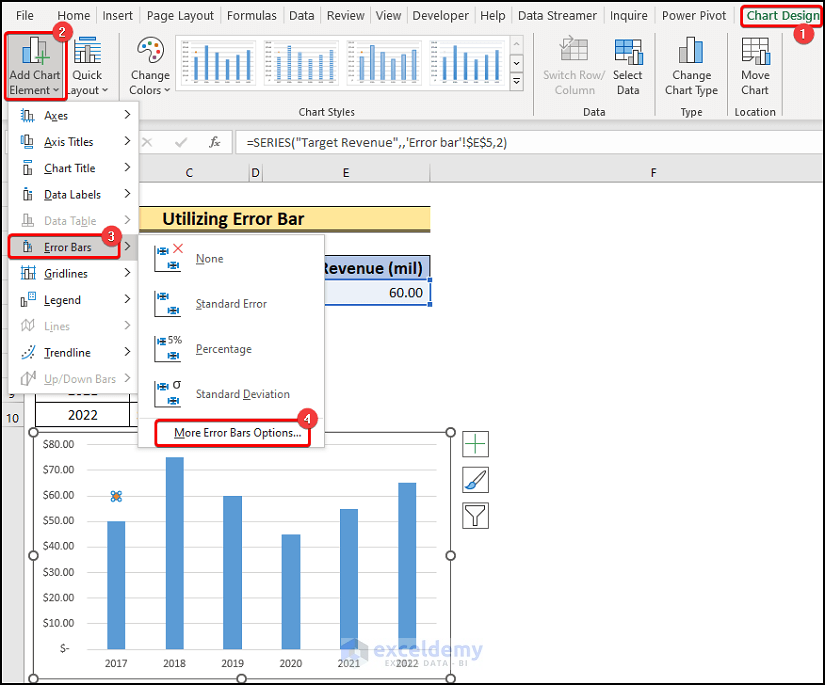
- Click on the Target Revenue series plot.
- Go to Chart Design >> Add Chart Element >> Error Bars >> More Error Bar Options.
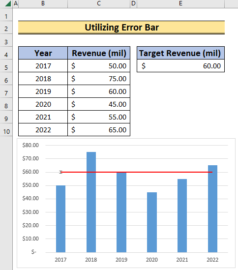
- An Error Bar will be on the chart.
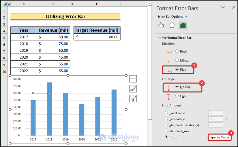
- Click on the horizontal portion of the Error Bar.
- Choose Plus as a Direction under the Error Bar Options.
- Choose No Cap as the End Style.
- Choose Specify Value beside the Custom option.
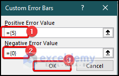
- A prompt will appear on the screen.
- Write 5 under the Positive Error Value option.
- Set the Negative Error Value to 0.
- Click OK.
- The Error Bar will touch each bar.
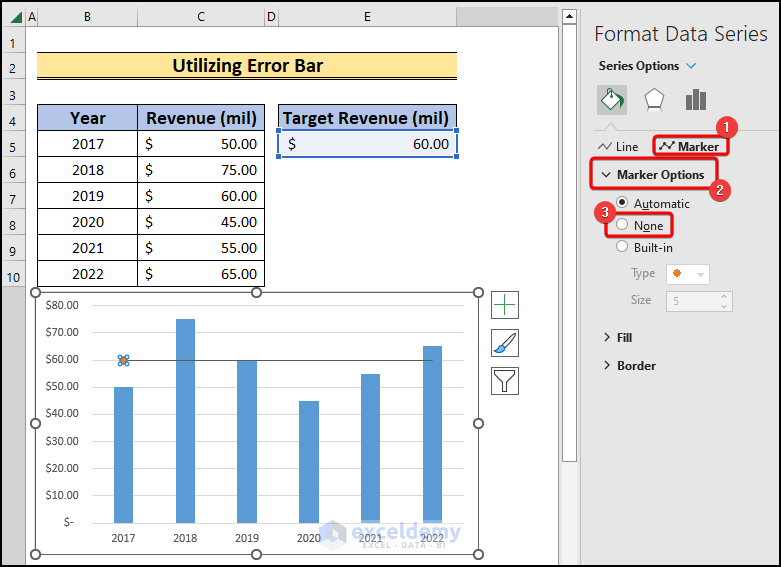
- Click on the dot in the chart.
- Select Series Options >> Marker >> Marker Options >> None.
- A target line in the bar chart.
- Change the color and the width of the line to make it more presentable.
- If you change the value of the Target Revenue, the target line will adjust accordingly.
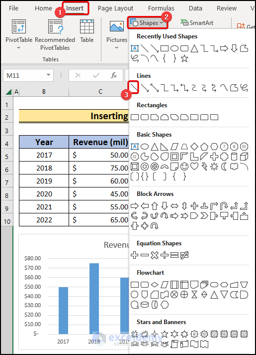
Method 3 – Inserting Line Shape Manually on a Bar Chart
Steps:
- Go to the Insert tab.
- Choose Shapes.
- Select the Line shape.
- Draw a line along the $60 million mark horizontally to set it as the target line.
- Double-click on the line and change the color and width of the line.
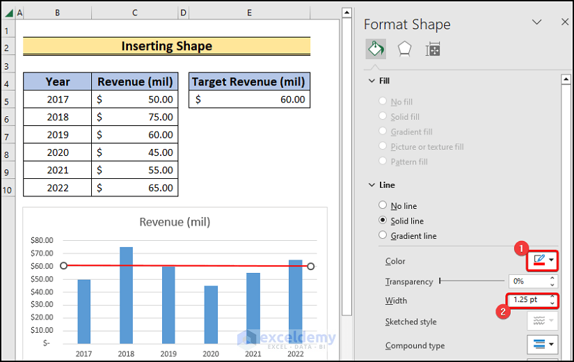
- We will have a bar chart with a target line.
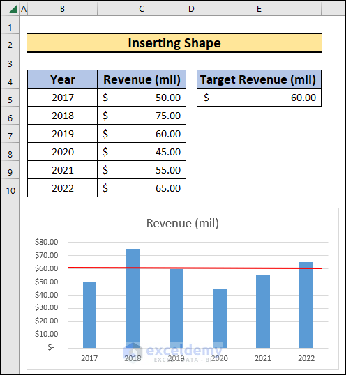
The line will not change position if you change the Target Revenue. This process has limitations, but it’s pretty simple.
Download Practice Workbook
You can download the practice workbook here.
Related Articles
- How to Add Grand Total to Bar Chart in Excel
- How to Sort Bar Chart in Descending Order in Excel
- How to Change Bar Chart Color Based on Category in Excel
- How to Color Bar Chart by Category in Excel
- Excel Bar Graph Color with Conditional Formatting
- How to Add Vertical Line to Excel Bar Chart
- Excel Bar Chart with Line Overlay
<< Go Back to Excel Bar Chart | Excel Charts | Learn Excel
Get FREE Advanced Excel Exercises with Solutions!
