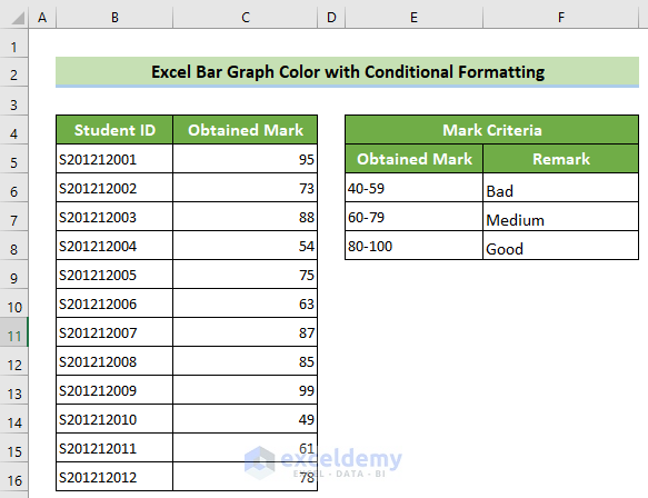
This is the sample dataset that you want to convert to a bar graph.
Example 1. Changing the Excel Bar Graph Color by Applying a Set of Conditions
Steps:
- Create 3 columns named Bad, Medium, and Good to insert the marks.
- Select D5 and enter the following formula.
- Press Enter.
=IF(C5<60,C5,"")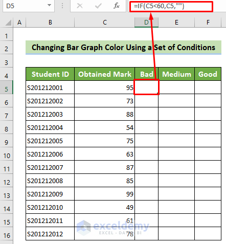
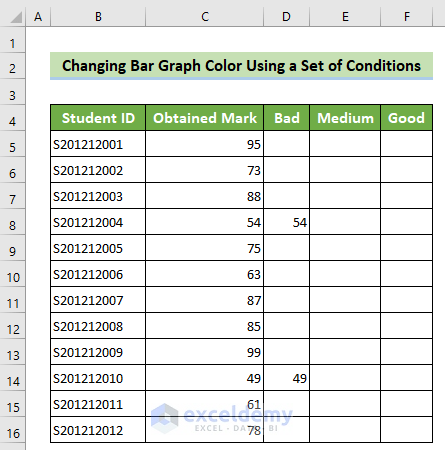
- Place your cursor at the bottom right corner of your cell and drag down the fill handle.
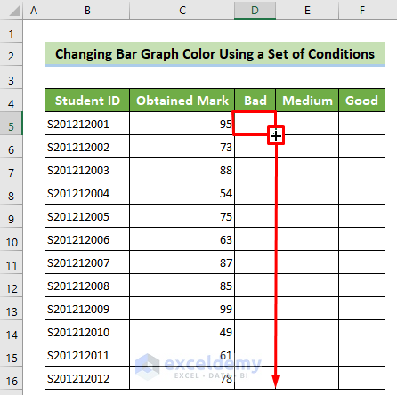
The formula will be copied to all the cells below, and marks lower than 60 will be shown in this column.
- Select E5 and enter the following formula.
- Press Enter.
=IF(AND(C5>=60,C5<80),C5,"")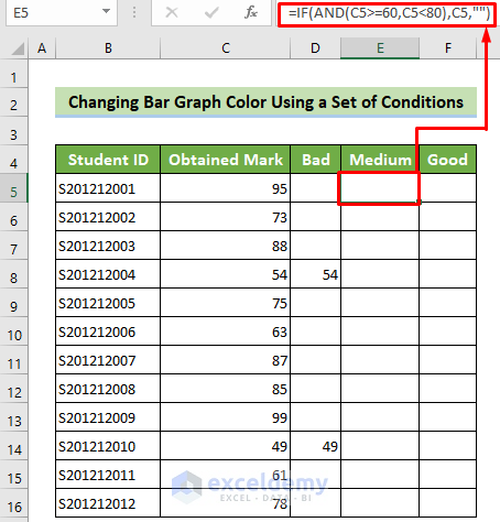
Formula Breakdown:
=IF(AND(C5>=60,C5<80),C5,””) checks if the value of C5 is less than 80, but greater than or equal to 60. If the test is true, it returns the value of C5. Otherwise, it returns blank. Result: Blank Cell
- Place your cursor at the bottom right corner of the cell. Drag down the fill handle to copy the formula.
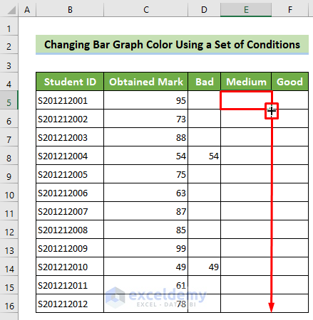
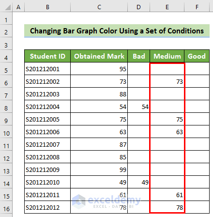
All the marks between 60 and 80 will be displayed in this column.
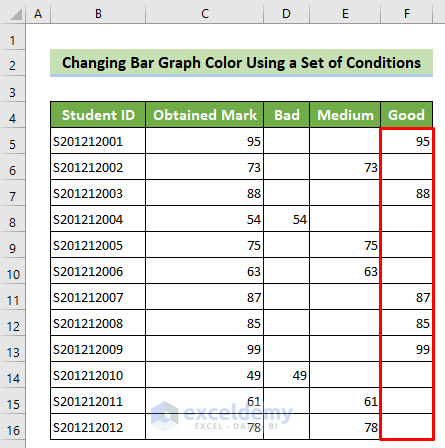
- To find the good criteria, click F5 and enter the formula below.
- Press Enter.
=IF(C5>=80,C5,"")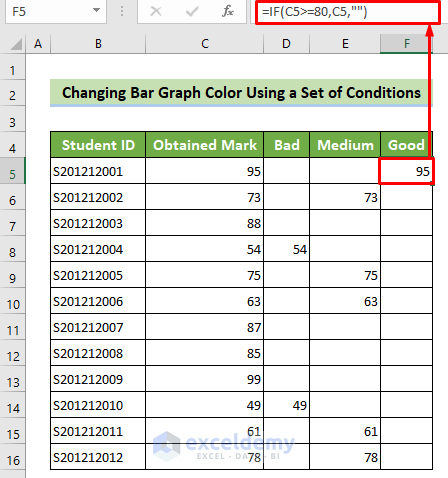
- Place your cursor at the bottom right corner of the cell and drag down the fill handle.
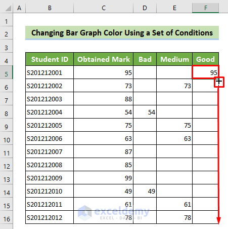
All the good marks will be displayed in this column.
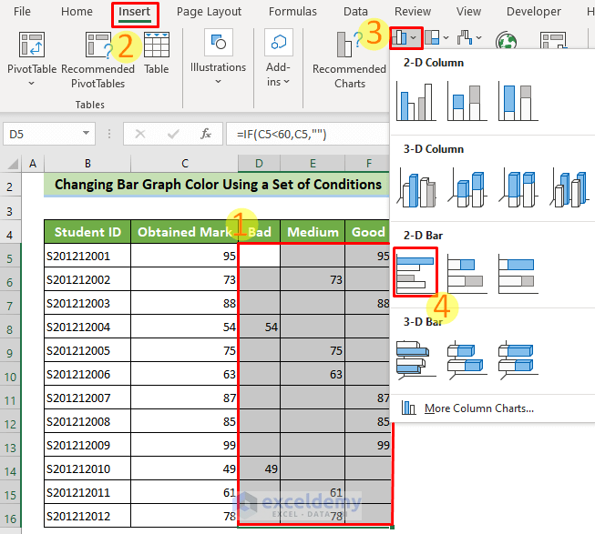
- Select D5:F16 >> go to the Insert tab >> Insert Column or Bar Chart >> Clustered Bar.
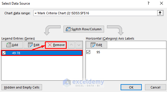
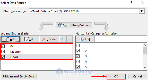
- A bar chart is displayed. To format it, right-click the chart and choose Select Data… .
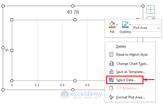
- In the Select Data Source window, check 49 78 and click Remove.
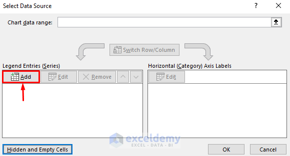
- Click Add.
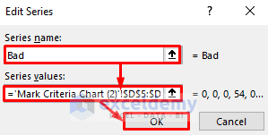
- In the Edit Series window, enter Bad in Series name:
- In Series values enter D5:D16.
- Click OK.
The Bad column is added as a Bar graph.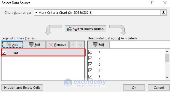
- Add two other legend entries. One for the Medium column and the other one for the Good column. Click OK.
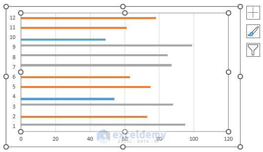
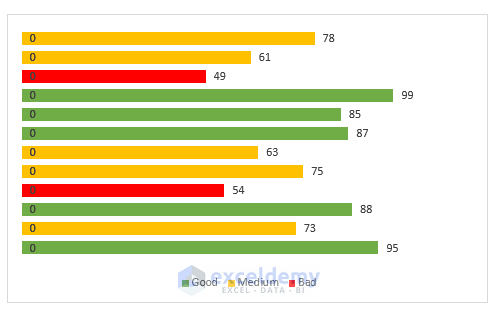
A bar graph with three different colors is displayed.
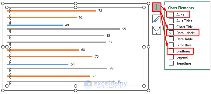
- Select Chart Elements.
- Untick Axes and Gridlines.
- Tick Data Labels.
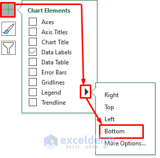
- Click Chart Elements >> In the Legend option, choose rightward arrow>> Select Bottom.
- Select any of the Good column bars and right-click it.
- Choose Format Data Series…
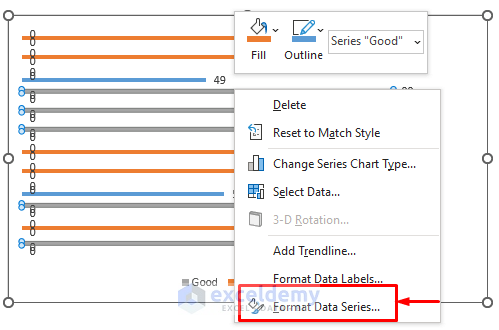
- The Format Data Series ribbon will open.
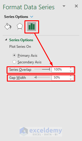
- Go to Series Options and choose 100% as Series Overlap, and 50% as Gap Width.
- Go to the Fill & Line group on the ribbon and choose a color for the Good column. Here, Green, Accent 6.
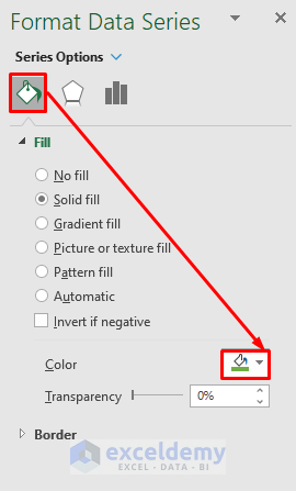
- Choose a color for the Medium column bars. Here, Orange.
- Choose a color for the Bad column bars. Here, Red.
Students’ marks are in colored bars.
Read More: How to Change Bar Chart Color Based on Category in Excel
Example 2. Customizing the Bar Graph Color with Conditional Formatting to Display Deviation of Data
Steps:
- To calculate the average mark, merge D5:D16.
- Click the cell and enter the formula below.
- Press Enter.
=ROUND(AVERAGE(C5:C16),0)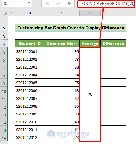
Formula Breakdown:
=ROUND(AVERAGE(C5:C16),0) returns the average of C5:C16 and rounds it to zero decimal place. Result: 76
- To calculate the difference between each student’s mark and the average mark, select E5 cell and enter the following formula.
- Press Enter.
=C5-$D$5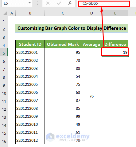
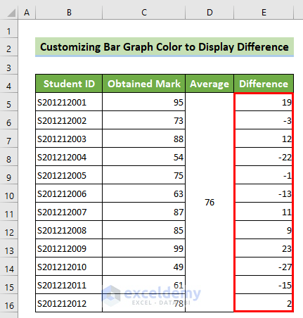
- Place your cursor at the bottom right corner of the cell and drag down the fill handle.
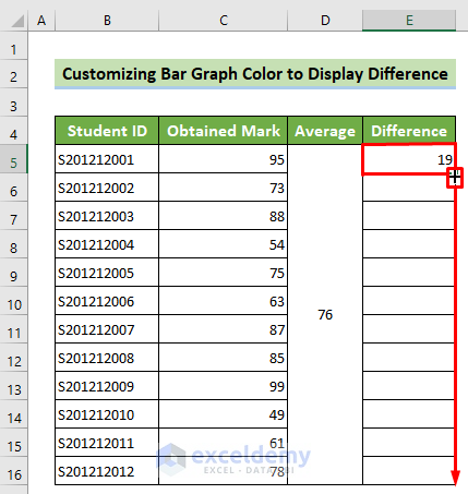
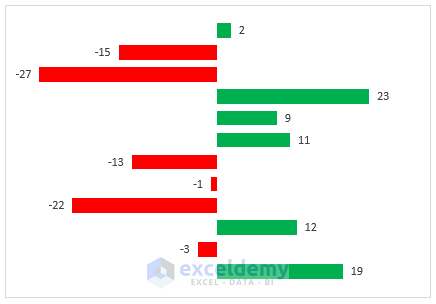
Deviations from the average mark will be showcased.
- Select E5:E16 >> go to the Insert tab >> Insert Column or Bar Chart >> Clustered Bar.
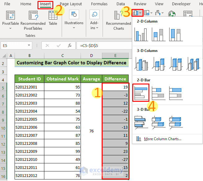
The bar graph will be displayed.
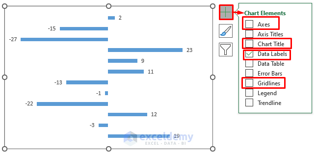
- Click Chart Elements and untick all options except Data Labels.
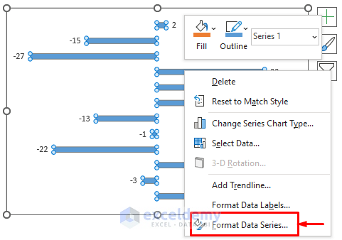
- Right-click any of the bars.
- Choose Format Data Series…
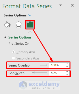
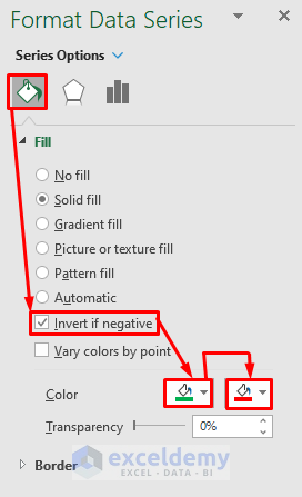
- On the Format Data Series ribbon, go to the Series Options group.
- Choose 100% in Series Overlap and 50% in Gap Width.
- In Fill & Line, tick Invert if negative.
- Choose Green as the first Fill Color (for a positive difference) and Red as the second Fill Color (for a negative difference).
This is the output.
Read More: How to Color Bar Chart by Category in Excel
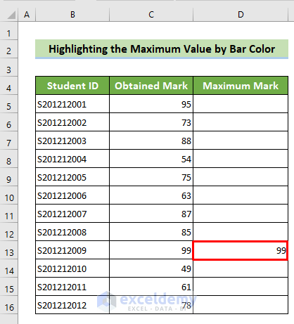
Method 3 – Highlighting a Maximum Value in a Bar Graph Using Excel Conditional Formatting
Steps:
- To find the maximum mark, click D5 cell and enter the following formula.
- Press Enter.
=IF(C5=MAX($C$5:$C$16),C5,"")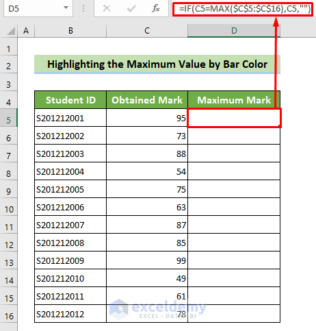
Formula Breakdown:
=IF(C5=MAX($C$5:$C$16),C5,””) checks if the C5 value is the maximum in the range C5:C16. If it is true, it will return the C5 value. Otherwise, it will return blank. Result: Blank Cell
- Place your cursor at the bottom right corner of your cell. Drag down the fill handle to copy the formula.
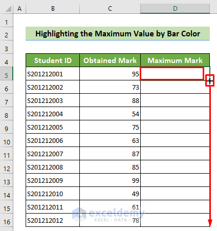
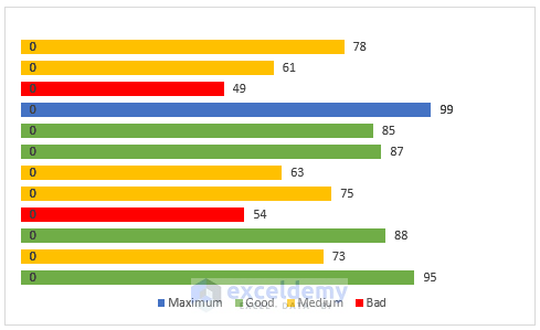
The maximum mark (99) is displayed in D13.
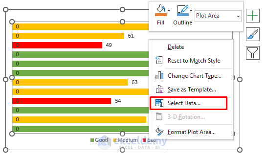
- Insert a bar graph (see Example1).
- Right-click the bar graph and choose Select Data…
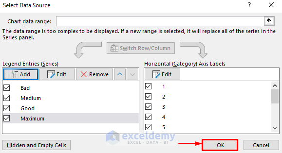
- In the Select Data Source window, click Add.
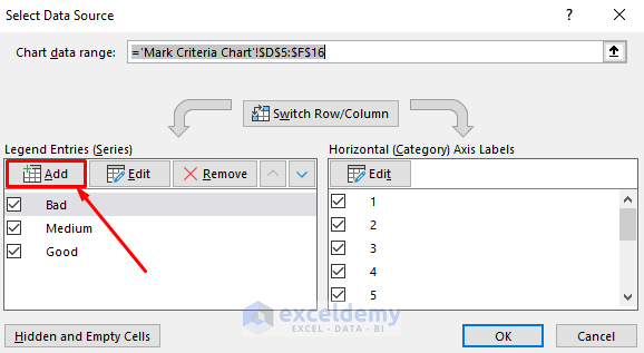
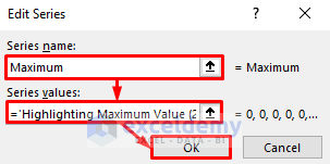
- Go to Edit Series. In Series name:,enter Maximum.
- In Series values:, refer to D5:D16.
- Click Ok.
- In the Select Data Source window, click OK.
- Right-click the maximum mark bar and choose Format Data Series…
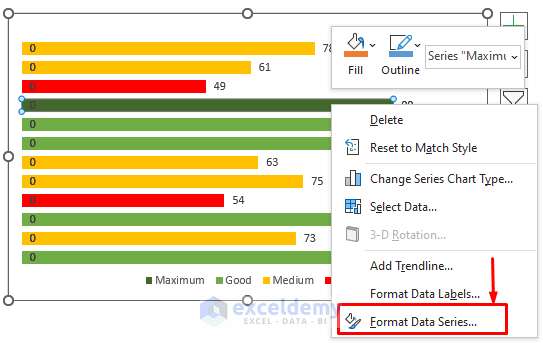
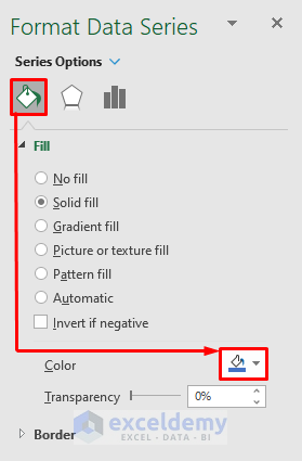
- On the Format Data Series ribbon, go to Fill & Line.
- Choose a color for the maximum mark in Fill Color. Here, Blue, Accent 5.
Conditional formatting was applied to customize the bar graph color.
Read More: How to Sort Bar Chart in Descending Order in Excel
Download Practice Workbook
You can download the practice workbook here for free!
Related Articles
- How to Add Grand Total to Bar Chart in Excel
- How to Create Bar Chart with Error Bars in Excel
- Excel Add Line to Bar Chart
- How to Add Horizontal Line to Bar Chart in Excel
- How to Add Vertical Line to Excel Bar Chart
- How to Create Bar Chart with Target Line in Excel
- Excel Bar Chart with Line Overlay
<< Go Back to Excel Bar Chart | Excel Charts | Learn Excel
Get FREE Advanced Excel Exercises with Solutions!
