Sometimes, we feel the necessity of adding a horizontal line to visualize the difference more clearly in a bar chart. The horizontal line could be a forecasting value, an average value, or a median value. In this article, I am going to explain 3 easy ways to add a horizontal line to an Excel Bar chart.
1. Adding Forecasting Horizontal Line to Excel Bar Chart
We can create a horizontal line based on our forecasted data in the Bar Chart quite easily. For this, we just have to follow the following procedures.
Steps:
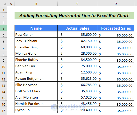
- Firstly, create a dataset with the actual value and forecasted value. In this article, I have created a dataset with employee’s Name, Actual Sales, and Forecasted Sales.
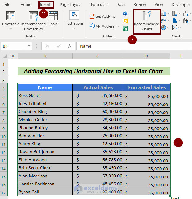
- Then, select the entire table.
- Go to the Insert tab.
- Next, click on Recommended Charts from the ribbon.
An Insert Chart wizard will appear.
- Click on the All Charts tab.
- Sequentially, select the Combo option.
- Be careful on selecting the Forecasted Sales as a Line.
- Finally, click on OK to finish the process.

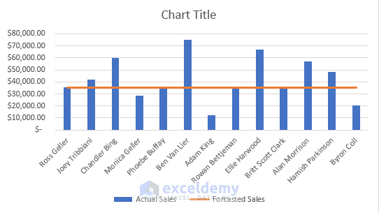
Thus, we can have a horizontal line in the Bar Chart.
Read More: Excel Add Line to Bar Chart
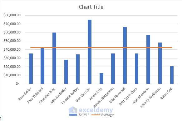
2. Adding Average Horizontal Line to Excel Bar Chart
Another easy and simple way to add a horizontal line to an Excel bar chart is to create an average line on the Bar Chart. The steps are explained in the following section.
Steps:
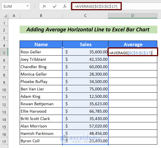
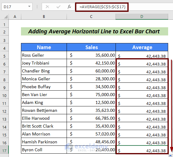
- Input the following formula to calculate the average.
=AVERAGE($C$5:$C$17)Here, the AVERAGE function is used to calculate the average in cells C5:C17.
- Press ENTER to have the average result.

- Use Fill Handle to AutoFill the rest cells.
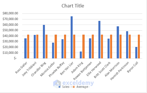
- Next, select all the data in the table.
- Go to the Insert tab.
- From the ribbon, click on the Insert Column or Bar Chart option.
- Select a column pattern from the 2-D Column according to your choice.

We will have a chart based on our given instructions.
- Now, Right-click on the chart.
- Pick the Change Chart Type… option.
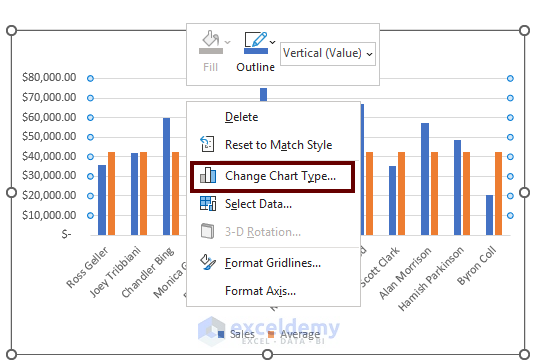
A Change Chart Type wizard will come forward.
- Firstly, choose the All Charts
- Then, pick the Combo
- Followingly, check the Average as
- Finally, hit the OK button.
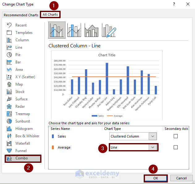
Thus, we can add the added horizontal line to the Bar Chart.
Read More: How to Add Vertical Line to Excel Bar Chart
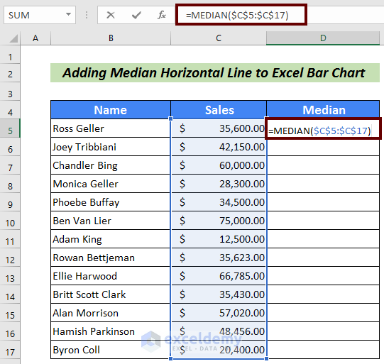
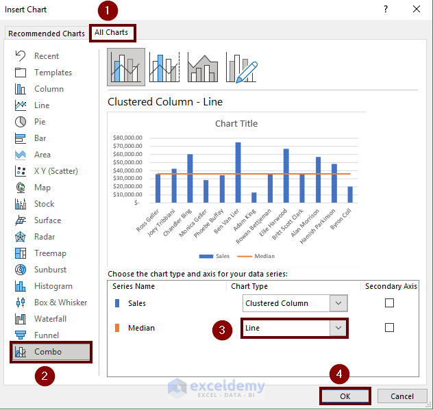
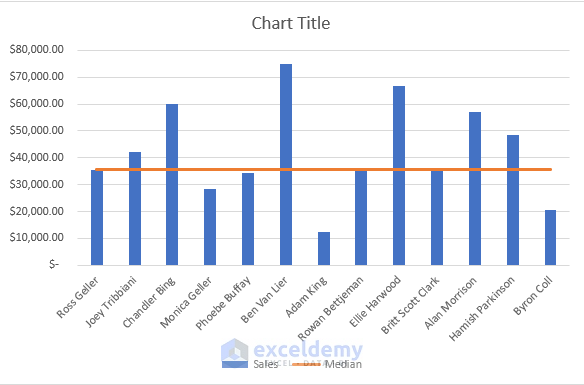
3. Adding Median Horizontal Line to Excel Bar Chart
Calculating the Median and using it as a reference line is another way to add the horizontal line to a Bar Chart.
Steps:
- Use the following formula to calculate the median value:
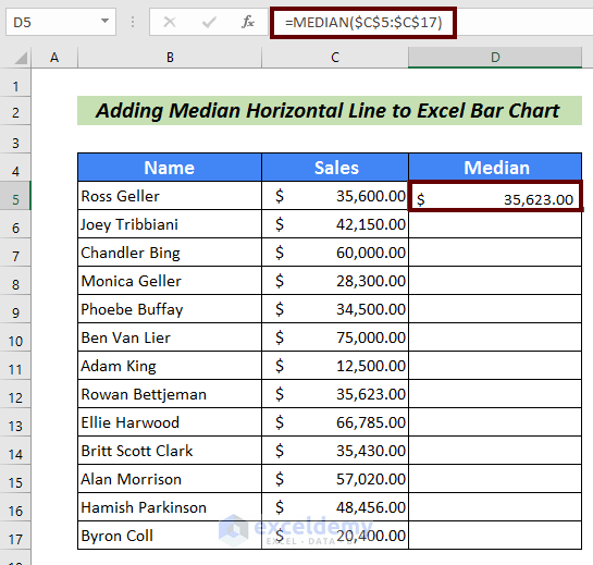
=MEDIAN($C$5:$C$17)Here, the MEDIAN function calculates the median value considering the values in cells C5:C17.
- Now, press ENTER to have the median value.
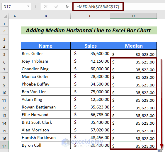
- Next, use Fill Handle to AutoFill the rest cells.
- Followingly, select the entire table.
- Then, Go to the Insert tab.
- Next, click on Recommended Charts from the ribbon.

We will have an Insert Chart wizard.
- Sequentially, click on the All Charts
- Then, select the Combo
- Be careful on selecting the Forecasted Sales as a Line.
- Finally, click on OK to finish the process.
This is another way of adding a horizontal line to a Bar Chart.
Read More: How to Create Bar Chart with Target Line in Excel
Practice Section
For more expertise, you can practice here.

Download Practice Workbook
Conclusion
That’s all for the article. In this article, I have tried to explain 3 easy ways to add a horizontal line to an Excel Bar Chart. It will be a matter of great pleasure for me if this article could help any Excel user even a little. For any further queries, comment below.
Related Articles
- Reverse Legend Order of Stacked Bar Chart in Excel
- How to Add Grand Total to Bar Chart in Excel
- How to Create Bar Chart with Error Bars in Excel
- How to Sort Bar Chart in Descending Order in Excel
- How to Change Bar Chart Color Based on Category in Excel
- How to Color Bar Chart by Category in Excel
- Excel Bar Graph Color with Conditional Formatting
- Excel Bar Chart with Line Overlay
<< Go Back to How to Edit Bar Graph in Excel | Excel Bar Chart | Excel Charts | Learn Excel
Get FREE Advanced Excel Exercises with Solutions!
