How to Combine Two Line Graphs in Excel
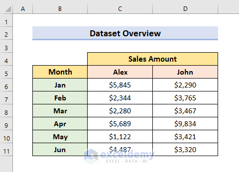
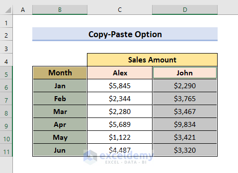
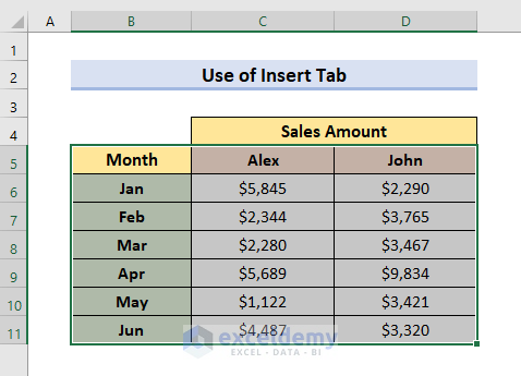
This is the sample dataset. To show Alex and John’s sales over the six months:
Method 1 – Use the Copy-Paste Option to Combine Two Line Graphs in Excel
STEPS:
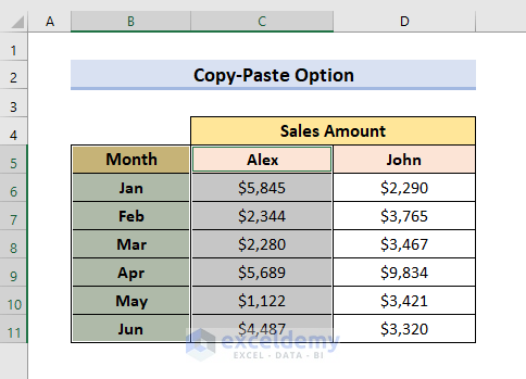
- Select B5:B11.
- Press Ctrl and select C5:C11.
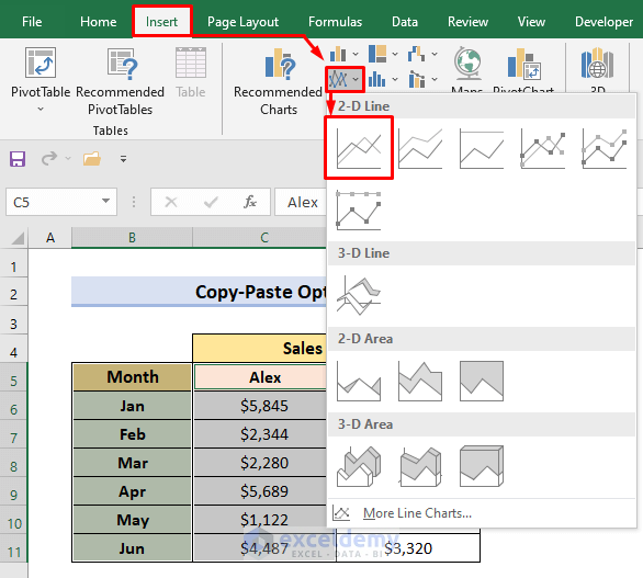
- Go to the Insert tab and select Insert Line or Area Chart.
- Select Line.
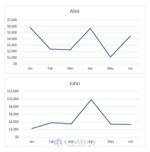
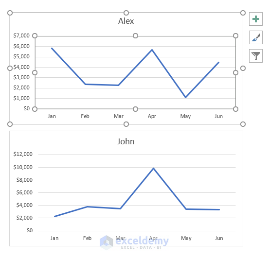
A line graph will be displayed.
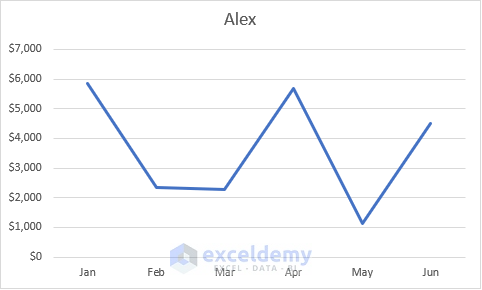
The graph shows the Sales Amount of Alex in the Y-axis and the Months in the X-axis.
- Select the months again: B5:B11.
- Press Ctrl and select John’s sales amount. Here, D5:D11.
- Follow the previous steps to show John’s line graph.

There are two separate line graphs in the datasheet.
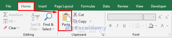
- To combine the two graphs, right-click a graph. Here, John’s.
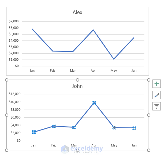
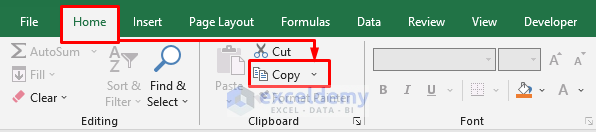
- Go to the Home tab and select Copy.
- Select the first graph.
- Go to the Home tab again and select Paste.
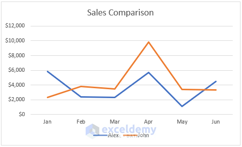
The two combined line graphs will be displayed.
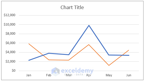
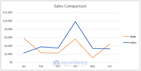
- You can change the Chart Title and add Legends.
Method 2 – Combine Two Line Graphs in Excel Using the Insert Tab
STEPS:
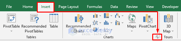
- Select the cells that you want to represent in the line graphs. Here, B5:D11.
- Go to the Insert tab and select Charts to open the Insert Chart window.
- Select All Charts and choose Combo.
- In Chart Type, choose Line.
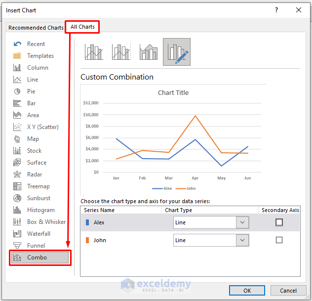
- Click OK to see the result.
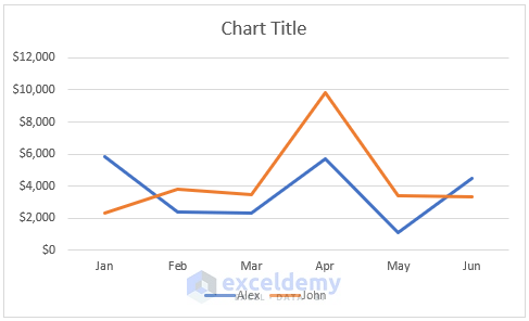
- To change the title, click the Chart Title and rename it.
Read More: How to Make a Double Line Graph in Excel
Method 3 – Combine a Line and an Existing Line Graph in Excel
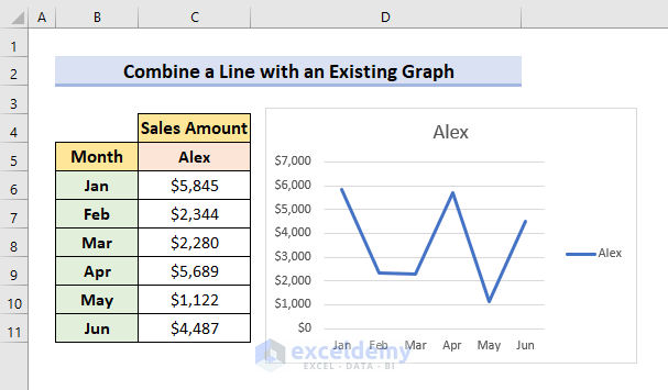
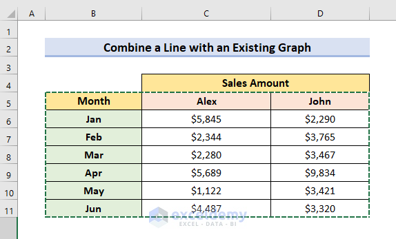
The dataset contains a table and a graph with information about Alex’s Sales Amount over the first six months. Add John’s Sales Amount to this dataset and combine the two line graphs.
STEPS:
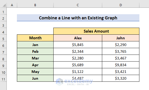
- Enter the data (John’s Sales Amount).
- Go to the existing line graph and right-click it.
- Click ‘Select Data’.
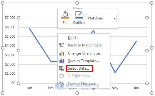
- The ‘Select Data Source’ window will be displayed.
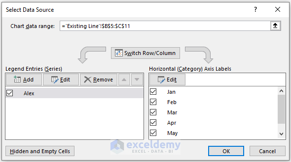
- Select all cells in your dataset including John’s Sales Amount.
John will be displayed in Legend Entries.
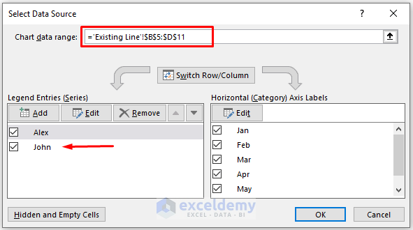
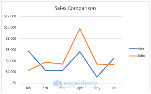
- Click OK to see the result.
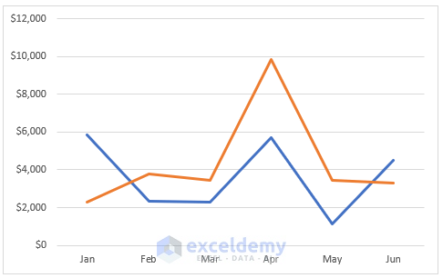
- Select the graph and click the plus icon. You can change or add different items to the graph.
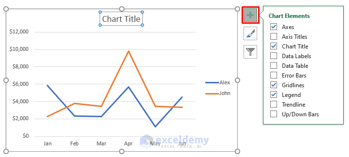
The title was changed and legends were added.
Read More: How to Combine Bar and Line Graph in Excel
Download Practice Book
Download the practice workbook here.
Related Articles
- How to Plot Multiple Lines in One Graph in Excel
- How to Edit a Line Graph in Excel
- How to Combine Two Bar Graphs in Excel
- How to Overlay Line Graphs in Excel
- Line Graph in Excel Not Working
<< Go Back To Line Graph in Excel | Excel Charts | Learn Excel
Get FREE Advanced Excel Exercises with Solutions!
