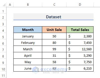
To combine bar and line graphs, we are going to use the following dataset. It contains some months, as well as total unit sales and the total amount of sales in those months.
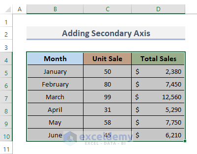
Method 1 – Add Secondary Axis to Combine Bar and Line Graph in Excel
STEPS:
- Select the data range to use for the graph. In our case, we select the whole data range B5:D10.
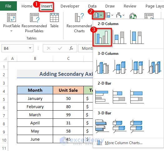
- Go to the Insert tab from the ribbon.
- Click on the Insert Column or Bar Chart drop-down menu, under the Charts category.
- Select the Clustered Column under the 2-D Column. We’ll use the Clustered Column since the order of categories is not important.
Note: It really doesn’t matter what form a chart begins with, but if you are dealing with several sets of data, we recommend choosing the type of chart that corresponds to the bulk of the information because it will save time later.
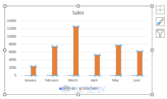
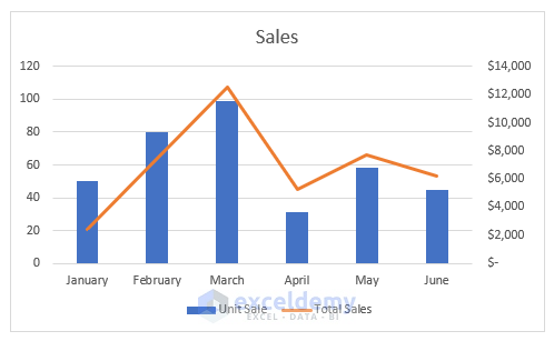
- This shows a graph of two datasets. One is Unit Sales, the other is Total Sales, and both graphs use the same chart type.
- Click the graph’s Total Sales data column. Avoid clicking the legend’s description of Total Sales. Instead, click one of the chart’s orange bars (see picture).
- Go to the Chart Design from the ribbon. The Chart Design will appear.
- In the Type group, click on Change Chart Type. This will display the Change Chart Type dialog box.
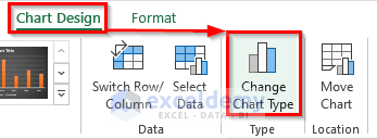
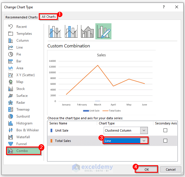
- Go to the All Chart menu.
- Choose Combo, which is the last chart type in the list.
- In the Choose the chart type and axis for your data series, change the Total Sales chart type.
- Click on the drop-down menu and select Line.
- Click on the OK button to close the Change Chart Type dialog box.
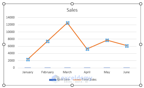
- You will now be able to see the Total Sales line graph but the Unit Sale bars are barely visible. To show the Unit Sale column in a Bar graph, we need to add a secondary axis.
- Click on the line graph. The Format Data Series window will display on the right side of the Excel sheet.
- Click on the Series Option and select Secondary Axis.
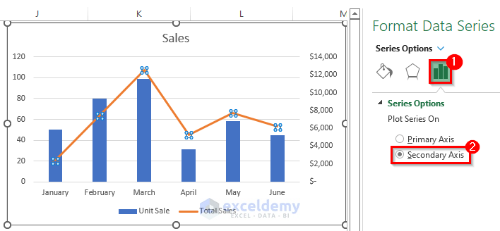
- This recalculates both axes, allowing the charts to display more evenly.
Read More: How to Combine Two Line Graphs in Excel
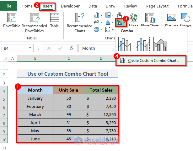
Method 2 – Use Custom Combo Bar Chart Tool to Combine Excel Graphs
STEPS:
- Select the whole dataset.
- Go to the Insert tab from the ribbon.
- In the Chart group, click on the Insert Combo Chart drop-down menu.
- Select Create Custom Combo Chart. This will open the Insert Chart dialog box.
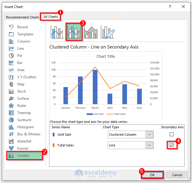
- Go to the All Charts option and select the Combo option from the list.
- Choose any combination of charts (we used the second option).
- This automatically converts the Total Sales column into a Line graph.
- Check the Secondary Axis checkbox for it.
- Click on the OK button.
- The bar and the line graph are combined into one single chart.

Read More: How to Overlay Line Graphs in Excel
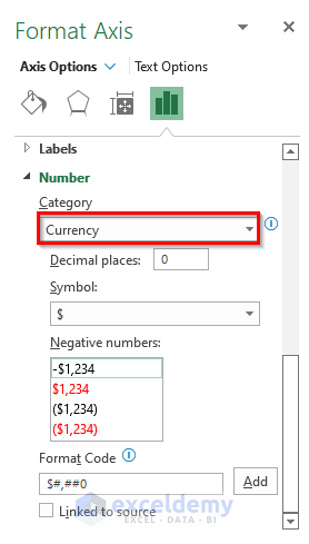
Things to Keep in Mind – Currency Formatting
While using an amount in a chart, we have to change the format for the particular column. For this,
- Select the amount series.
- Right-click and select Format Axis.
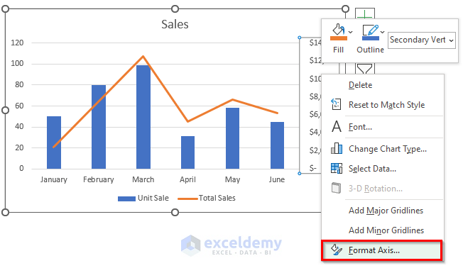
- This will display the Format Axis window on the right side of the Excel sheet.
- From Axis Options, select Currency under the Category drop-down option of the Number menu.
Download Practice Workbook
You can download the workbook and practice with them.
Related Articles
- How to Make a Double Line Graph in Excel
- How to Plot Multiple Lines in One Graph in Excel
- How to Edit a Line Graph in Excel
- How to Combine Two Bar Graphs in Excel
- Line Graph in Excel Not Working
<< Go Back To Line Graph in Excel | Excel Charts | Learn Excel


I want to draw a horizontal bar chart with a line combo. How do i do it ?
Hello Raj,
To create a horizontal bar chart with a line combo in Excel,
1. First Insert a regular Bar chart by selecting your data.
2. Then, right-click on the data series you want to change to a line and choose Change Series Chart Type.
3. Select the Combo option, and then choose Line for the desired series.
4. Adjust the chart layout and format as needed.
Regards
ExcelDemy