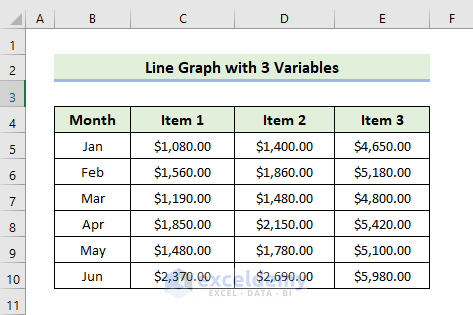
Step 1 – Making Dataset for Line Graph with 3 Variables in Excel
Prepare your dataset. Our sample dataset contains monthly item sales as shown below. Variables on the X-axis are represented by row headers, while variables on the Y-axis are represented by column headers.
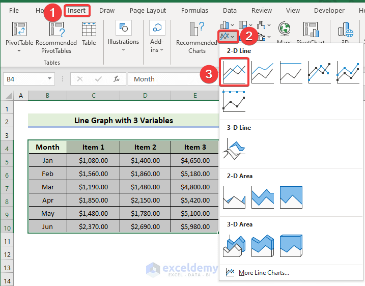
Step 2: Inserting Line Graph
- Select the range of the cells and go to the Insert tab. Choose Insert Line or Area Chart and select 2-D Line.
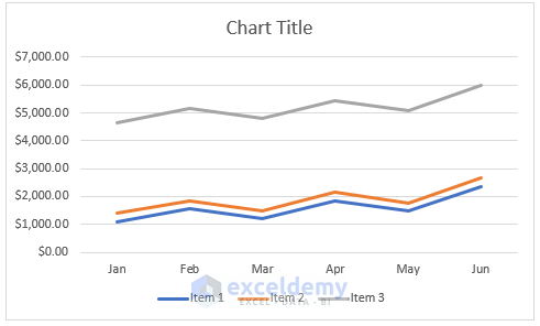
- It will insert the following line graph.
Step 3 – Switching Row/Column of Excel Graph
- Right-click on the line graph and choose Select Data.
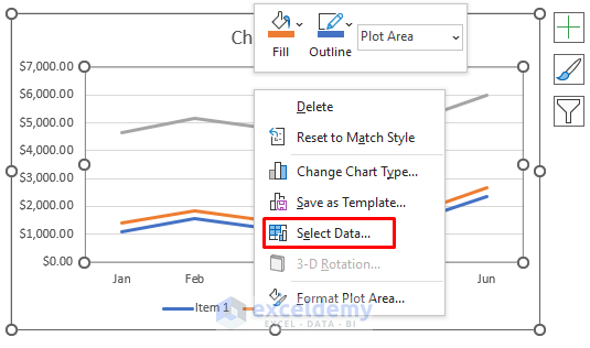
- Select Switch Row/Column and click on OK.
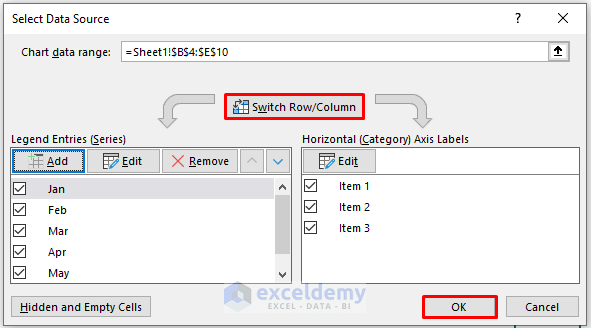
- You will get the following line graph.
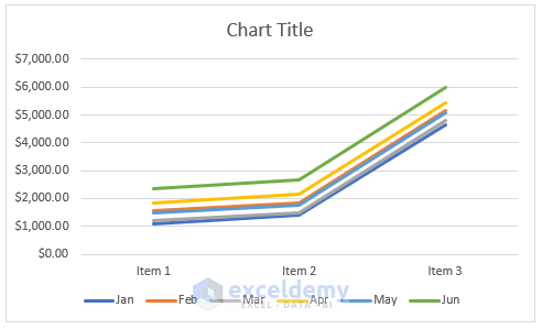
Skip this step if you don’t need to organize your line graph.
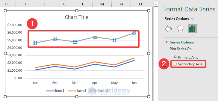
Step 4 – Adding a Secondary Axis to the Graph
- Double-click on the line graph for Item 3. The Format Data Series pane will appear on the right. You can also do that by right-clicking on the data series.
- Click on the Secondary Axis as shown below.
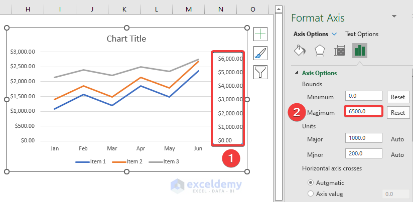
- Double-click on the secondary axis and change the Maximum value to adjust the data series.
- You will get the following line graph.
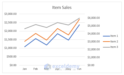
Step 5 – Adding Chart Elements
- After clicking on the Add Chart Element, you will see a list of elements.
- Click on them one by one to add, remove, or edit.
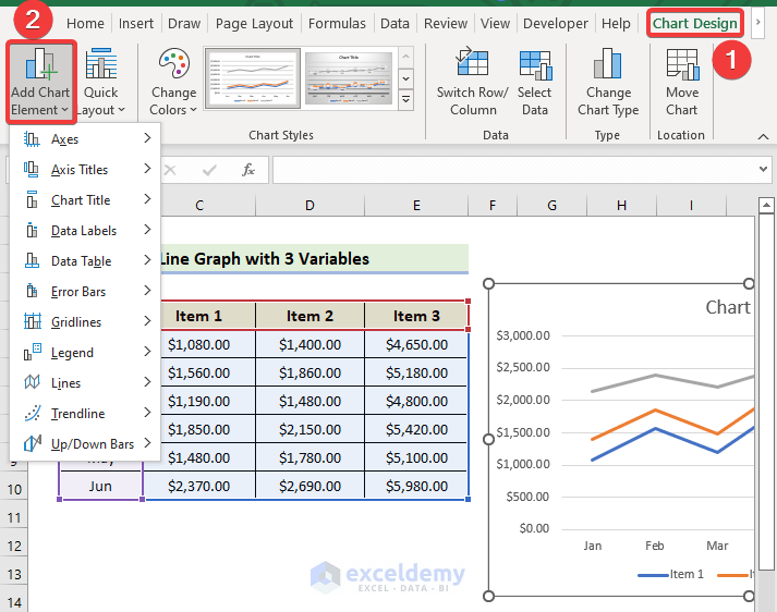
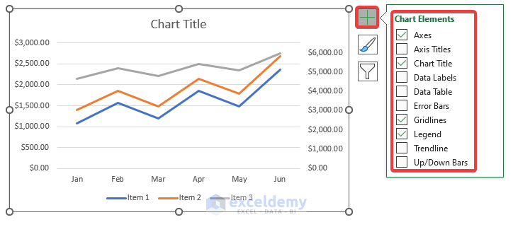
- Alternatively, you can find the list of chart elements by clicking the Plus (+) button on the right corner of the chart.
- Check the elements to add and uncheck the elements to remove.
- You will find an arrow on the element, where you will find other options to edit the elements.
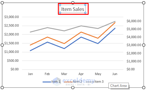
- Click on the chart title to rename it as required.
- Click on the Chart Elements icon and align the Legend to the right.
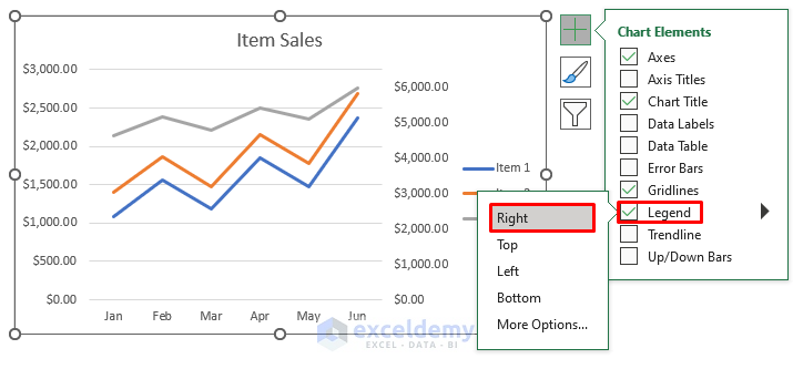
- You will get the following line graph.
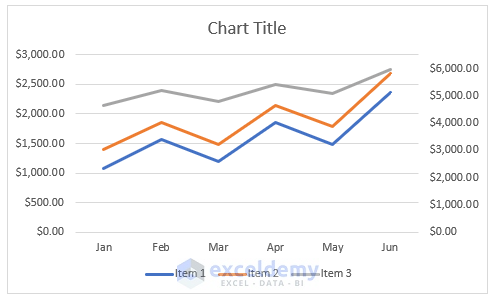
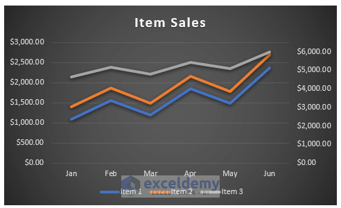
Step 6 – Finalizing Line Graph with 3 Variables
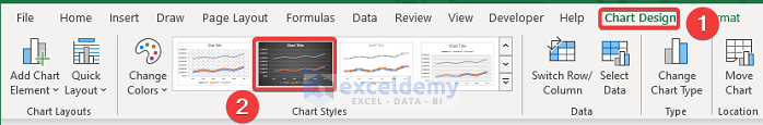
- To modify the chart style, select Chart Design, and select your desired Style 7 option from the Chart Styles group.
- You will get the following line graph.
Read More: How to Make Line Graph in Excel with 2 Variables
Things to Remember
✎ Before you insert a line graph, make sure you’ve clicked anywhere within the data. Otherwise, you’ll need to manually add rows and columns later.
✎ Avoid using line graphs when working with a large dataset as they can become cluttered and hard to read.
✎ Before switching rows and columns, make sure they are all selected.
Download Practice Workbook
Related Articles
- How to Make a Line Graph in Excel with Two Sets of Data
- How to Make a Percentage Line Graph in Excel
<< Go Back To Line Graph in Excel | Excel Charts | Learn Excel
Get FREE Advanced Excel Exercises with Solutions!

can you explain this 3 variable graph. what does it say
Dear Deezballs,
Greetings. Usually, it refers to having three sets of data that you want to plot on the same graph when making a line graph in Excel with three variables. In general, using three variables when making a line graph in Excel means you want to see how three different sets of data relate to one another over time or across a range of values.
This was very helpful. Thank you.
Dear Laurie,
You are most welcome.
Regards
ExcelDemy