Method 1 – Making a Simple Percentage Line Graph
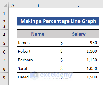
We will utilize the following dataset.
Steps:
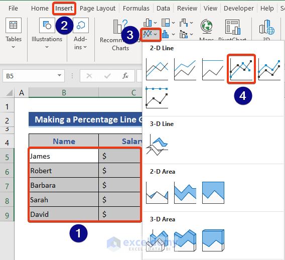
- Select B5:C9.
- Go to the Insert tab.
- Choose the Line with Markers option from the chart list.
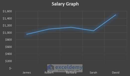
- Here’s the default graph. The values are not shown as percentages.
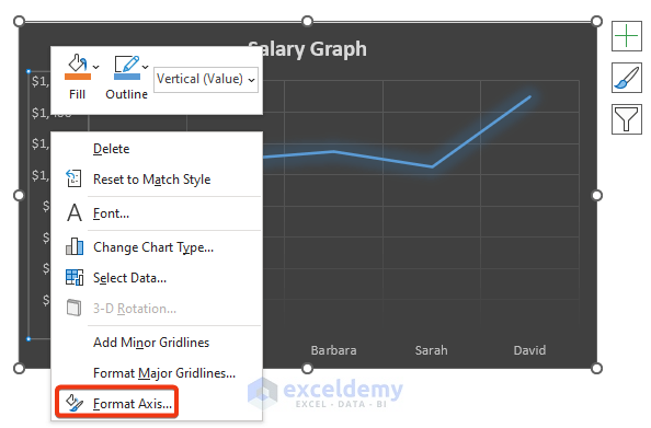
- Select the Vertical Axis and right-click on it.
- Choose the Format Axis option from the Context Menu.
- You’ll get the Format Axis window on the side.
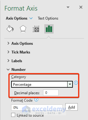
- Go to the Axis Options field and click on the Number drop-down.
- Choose Percentage as Category.
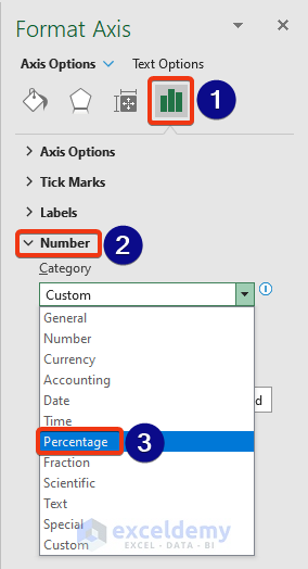
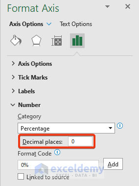
- Put 0 on the Decimal places box.
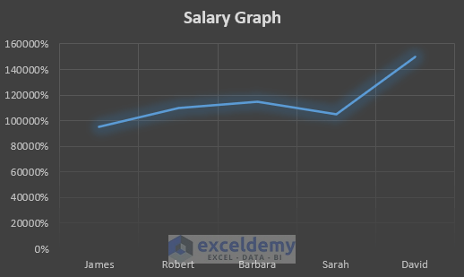
- We can see values are showing in the percentage form in the Vertical Axis.
Read More: How to Make a Single Line Graph in Excel
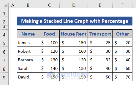
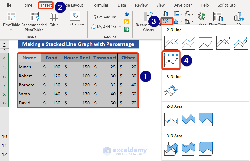
Method 2 – Making a Stacked Line Graph with Percentages
We will consider the following dataset, which expresses the monthly cost.
Steps:
- Select the whole dataset.
- Choose the 100% Stacked Line with Markers option from the Chart list.
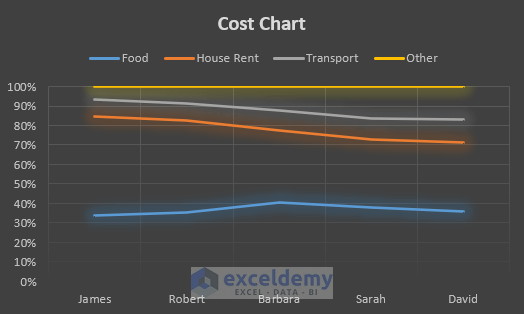
- The percentage value is shown in the vertical axis.
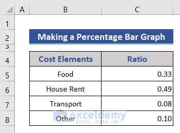
How to Make a Percentage Bar Graph in Excel
Let’s consider the ratio of different types of costs and present them in percentages with a bar graph in Excel.
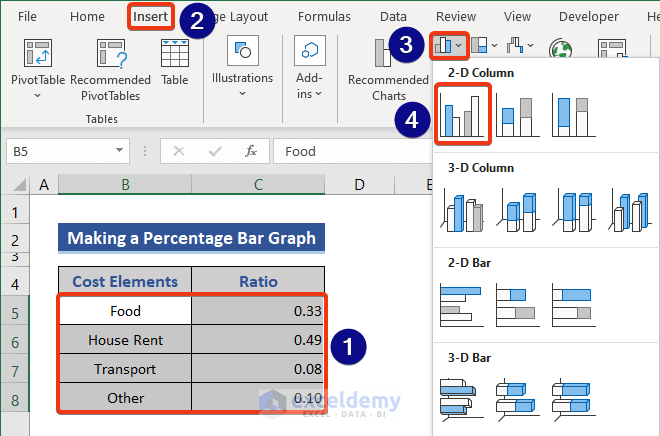
Steps:
- Select B5:C8.
- Choose the Clustered Column as the chart type.
- The following graph will be generated.

- Right-click on the vertical axis.
- Choose the Format Axis option from the Context Menu.
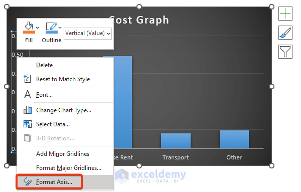
- You’ll get the Format Axis window on the left side.
- Set Percentage for Category and insert the desired number of Decimal places.
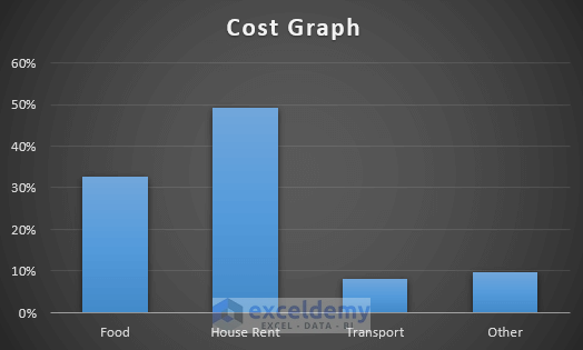
- Here’s the updated graph.
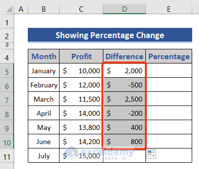
How to Show the Percentage Change in an Excel Graph
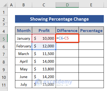
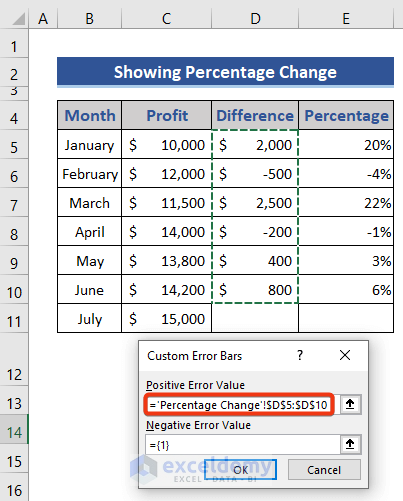
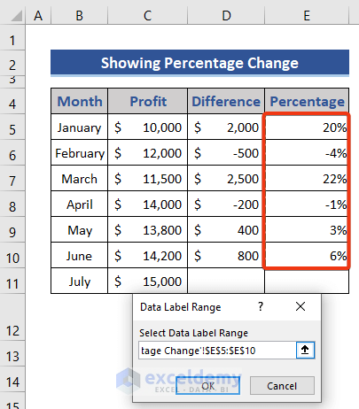
We will compare the profit between months, then show the percentage difference.
Steps:
- Go to cell D5 and insert the following formula.
=C6-C5
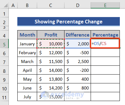
- Press the Enter button and drag down the Fill Handle icon.
- Put the following formula in cell E5.
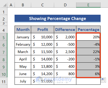
=D5/C5
- Press the Enter button and pull the Fill Handle icon down.
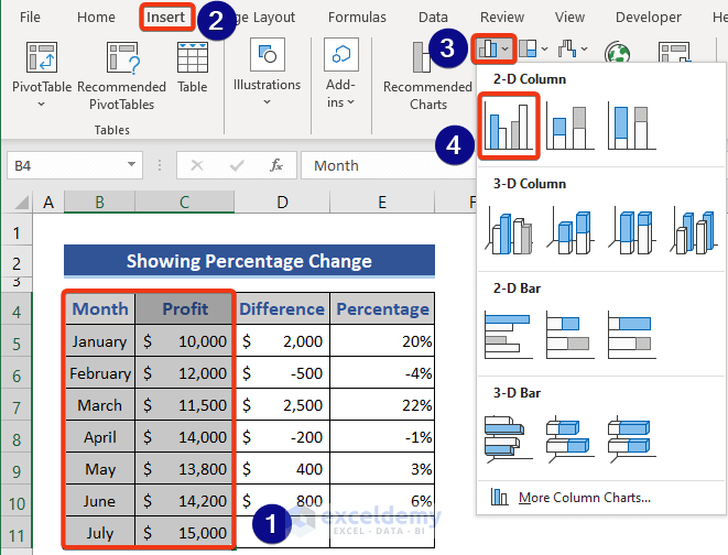
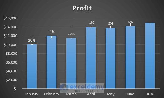
- Select B4:C11.
- Select the Cluster Column option from Chart.
- Right-click on the vertical axis.
- Choose More Options from the Error Bars drop-down.
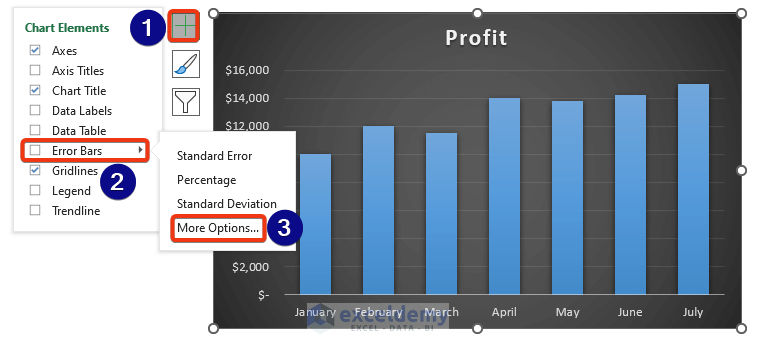
- Check the options shown in the marked section. Choose Specify Value from the Custom section.
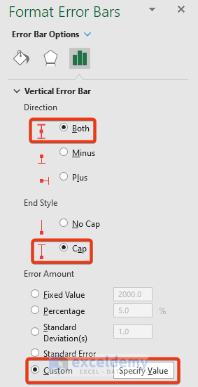
- Select the difference range from the dataset.
- Here’s the updated graph with border lines.

- Click on the border and click on the plus button.
- Select the More Options from the Data Labels drop-down.
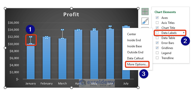
- Mark the Value From Cells option.
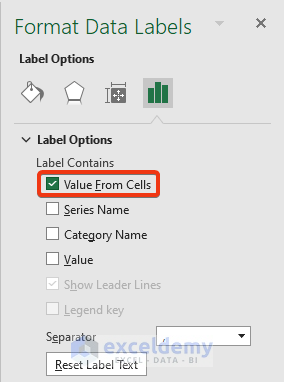
- Choose the Percentage range.
- We can see the percentage value shown in the graph.
Download the Practice Workbook
Related Articles
- How to Make a Line Graph in Excel with Two Sets of Data
- How to Make Line Graph in Excel with 2 Variables
- How to Make Line Graph with 3 Variables in Excel
<< Go Back To Line Graph in Excel | Excel Charts | Learn Excel
Get FREE Advanced Excel Exercises with Solutions!
