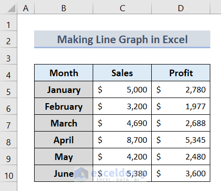
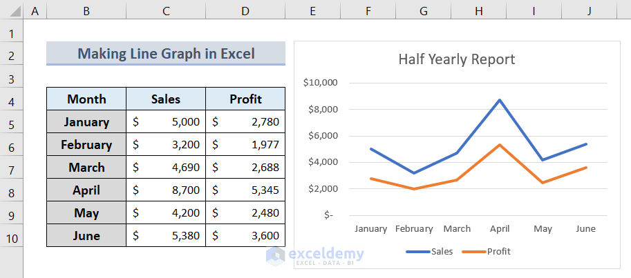
Method 1 – Prepare Dataset
- Insert the time period on column B as it is the independent data that are fixed.
- In columns C and D, place the data that is variable.
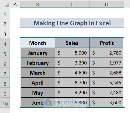
Method 2 – Select Data to Make Line Graph
- At this step select the whole dataset you want to include in the line graph.
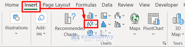
Method 3 – Create Line Graph in Excel
- Go to the Insert tab from the ribbon in Excel.
- Click Line Chart from the Charts section.
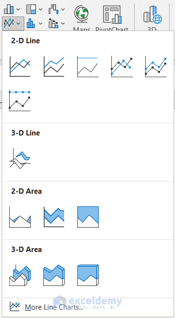
- You will see a drop-down section with multiple options of line graphs to choose from. Select any one of your preferences.
- We completed our task of making a Line Graph in Excel with 2 variables.
- Name your line graph after this.
Customize Line Graph in Excel
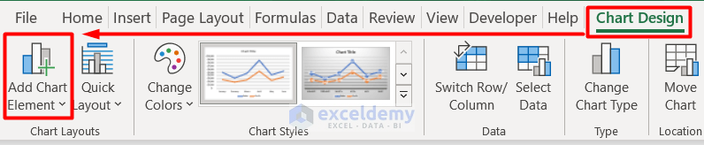
Method 1 – Add Chart Element
Chart Element helps to define the Line Graph more accurately with gridlines, bars, axes, etc. Let’s see how to use this component.
- Select the line graph and it will result in opening a new Chart Design tab.
- Click on the Add Chart Element.
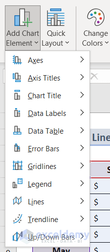
- Select any of the options from the drop-down section.
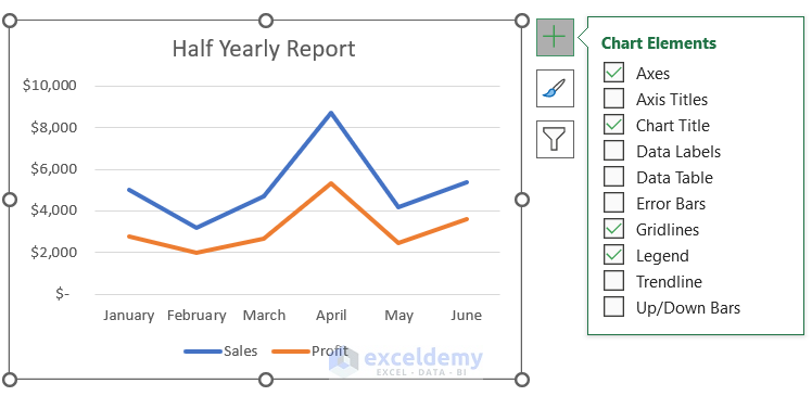
- Click on the Chart Element icon beside the Line Graph to select any chart element.
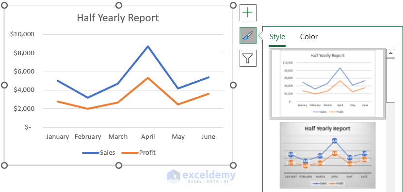
Method 2 – Change Style and Color
You can decorate the Line Graph with various colors and chart styles from this section.
- From the Chart Design tab, you can change the color and line graph style from the Chart Styles section.
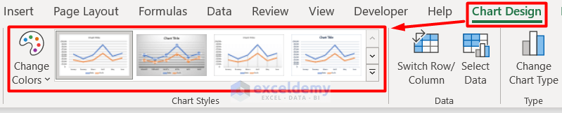
- You can also find the same feature on the right side of the graph.
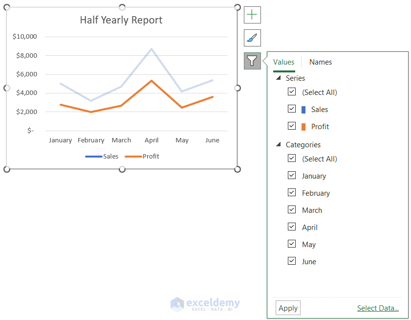
Method 3 – Edit Data in Line Graph
- Click on Select Data from the Chart Design tab.
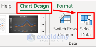
- Open a new window called Select Data Source.
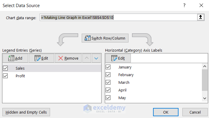
- Edit data however it is required.
- Select the filter icon on the right side of the line graph and edit it the way you need.
- Apart from the above features, there are endless options to customize your dataset.
Advantages of Line Graph in Excel
- Line Graph is a clean and neat tool to represent your dataset.
- It makes it easier to visualize multiple sets of data at the same time.
- It makes relevant information compact and clear to its viewers.
Things to Remember
- It is better to avoid the Line Graph if you are working on a large dataset because it will create confusing graph formation.
- A line graph is not suitable for data with percentages. Instead of that, you can use Chart.
- Make your dataset without any blanks. Otherwise, Excel will not create any Line Graph for missing data.
Download Workbook
Get the sample workbook here for practice.
Related Articles
- How to Make a Line Graph in Excel with Two Sets of Data
- How to Make a Percentage Line Graph in Excel
<< Go Back To Line Graph in Excel | Excel Charts | Learn Excel
Get FREE Advanced Excel Exercises with Solutions!
