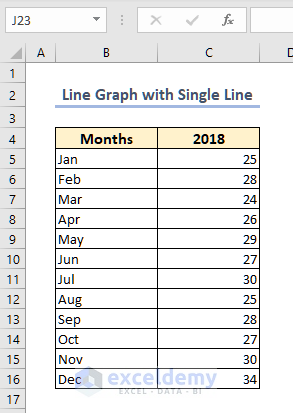
How to Plot Line Graph with Single Line in Excel
The sample dataset contains Sales by a company for the year 2018.
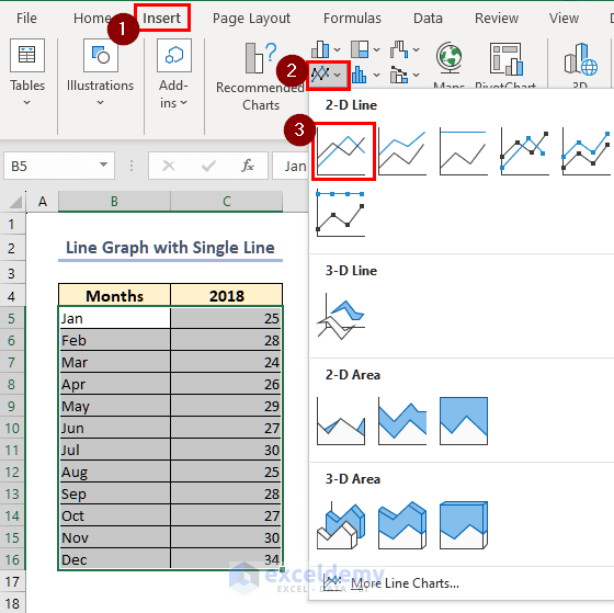
- Select the data range B5:C16.
- From the Insert tab click on the Insert Line or Area Chart option.
- Select the Line chart.
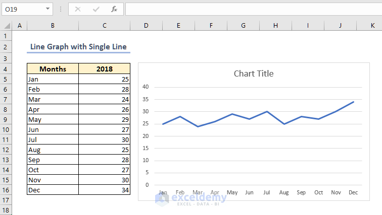
- A single-line graph is returned as shown in the following image.
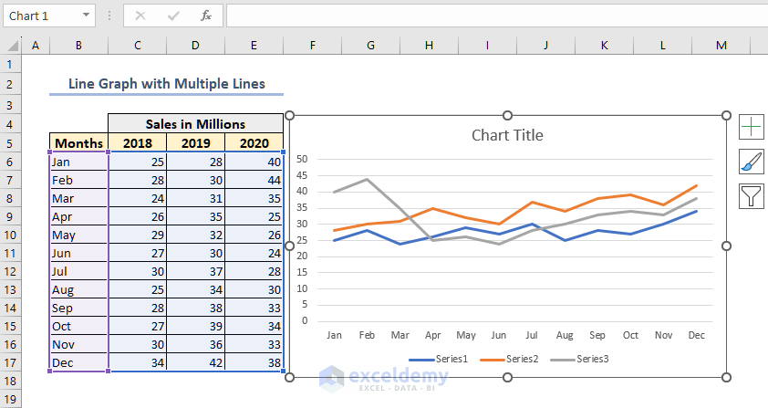
How to Make a Line Graph with Multiple Lines in Excel
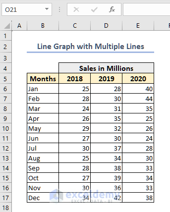
- Two more data columns for sales from 2019 and 2020 are added to the sample.
- Select the data range B6:E17.
- Go to Insert >> Insert Line or Area Chart and select the Line chart.
- A graph with multiple lines is returned as shown in the following image.
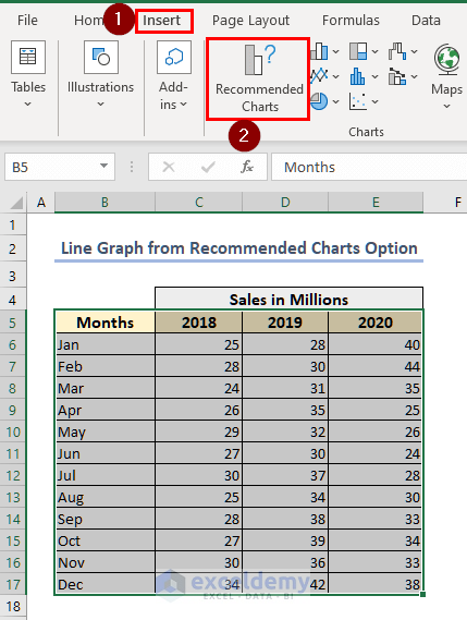
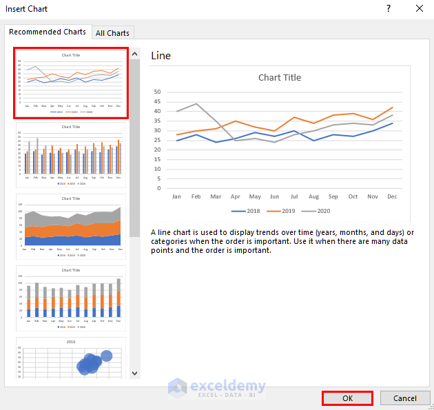
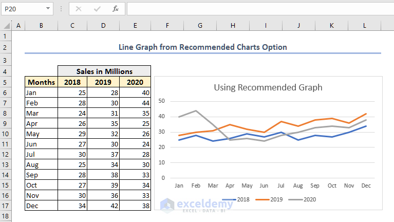
Insert Line Graph from Recommended Charts
- Select the data range B5:E17 (including the table heading).
- Click on the Recommended Charts option on the Insert tab.
- Select the preferred line chart option and press OK.
Read More: How to Make a Single Line Graph in Excel
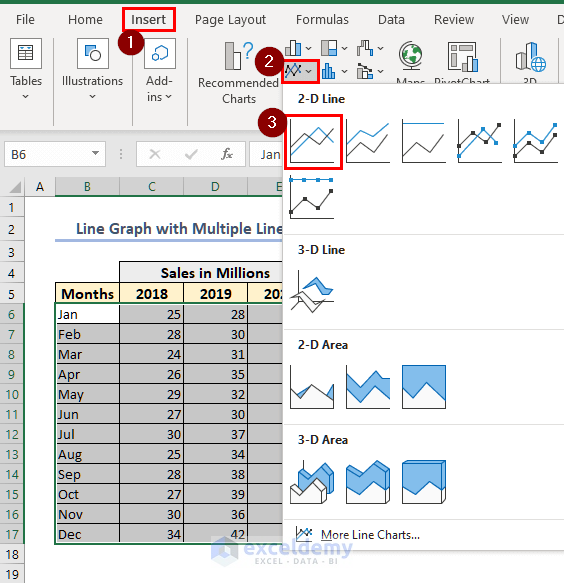
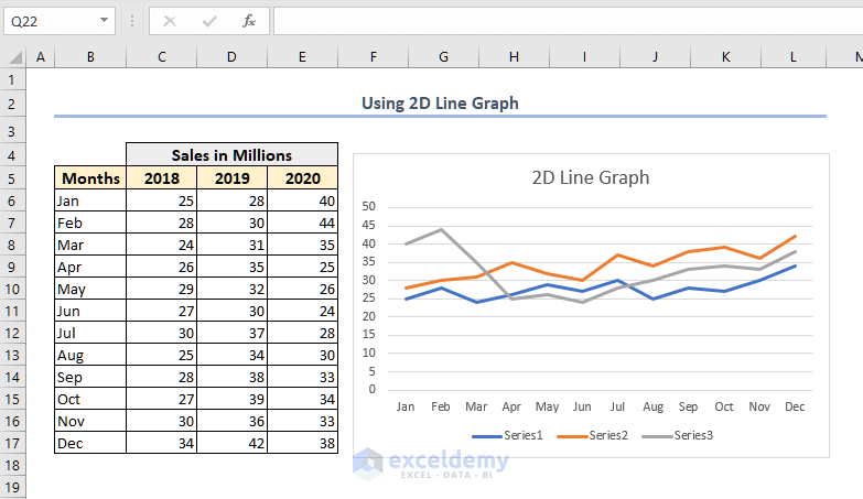
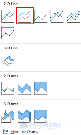
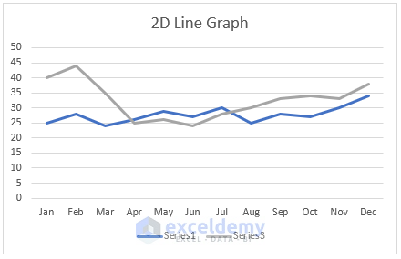
Insert Line Chart Using 2D Line Graph Option
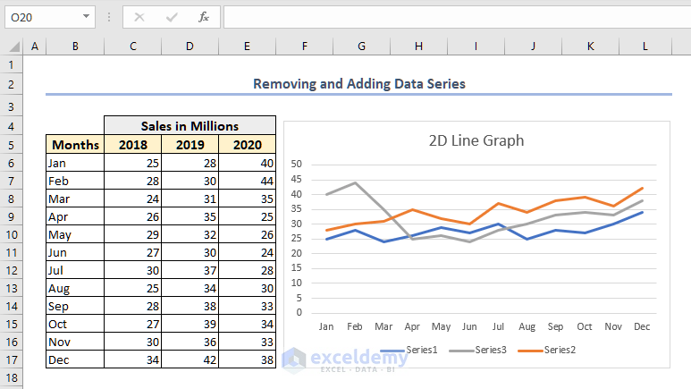
- Select the data range B6:E17.
- From the Insert tab, select the Line chart.
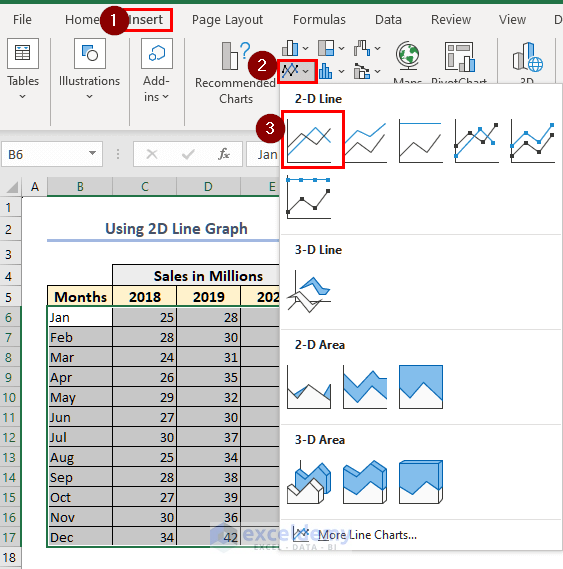
- This will return a 2D Line graph as shown in the following image.
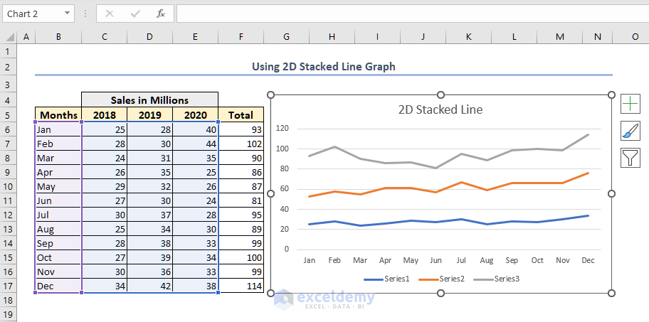
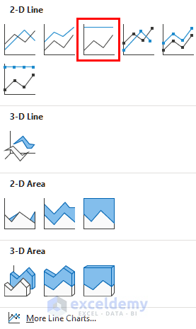
Create Line Graph with Stacked Line
The Stacked line stacks different data series on top of each other. This type of graph is useful to show each data series’ contribution to the total amount. We are using the same data table for this procedure.
- Select the data range B6:E17.
- Select the Stacked Line chart from the Insert tab.
- A Stacked Line Graph with multiple lines is returned as shown in the following image.
- The total sale value is also included so that the user has a better understanding of the stacked chart.
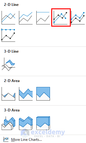
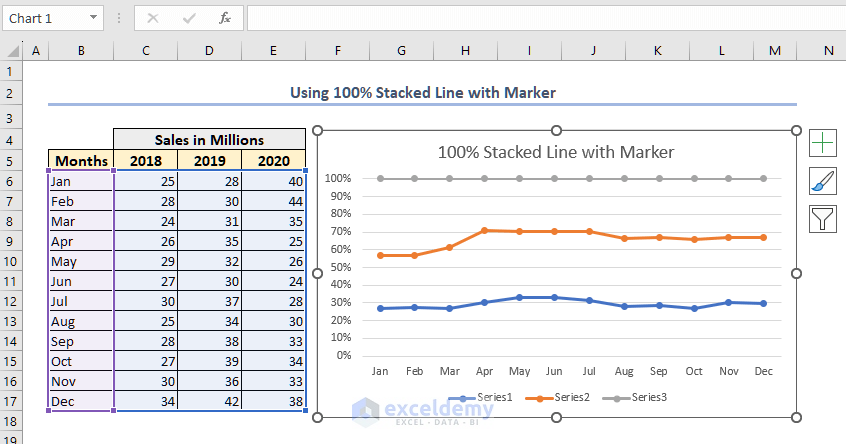
Make Line Graph with 100% Stacked Line
The 100% Stacked Line graph is quite similar to the Staked Line graph but stacks all data series by percentages.
- Select the data range.
- Select the 100% Stacked Line from the Insert tab.
- A 100% Stacked Line Graph with multiple lines is returned as shown in the following image.
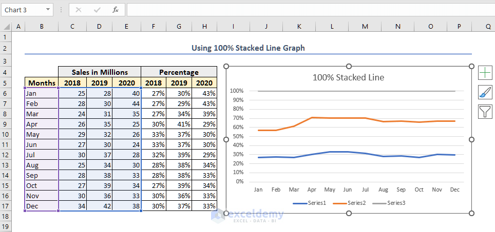
Read More: How to Make a Percentage Line Graph in Excel
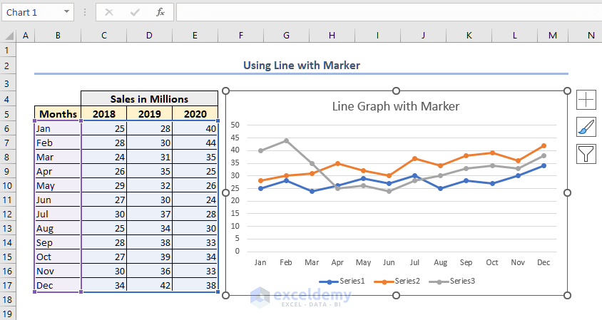
Create Line Graph with Marker
- Select the data range and go to the Insert tab.
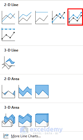
- Select the Line with Markers chart.
- A Line Graph with Markers is returned as shown in the following image.
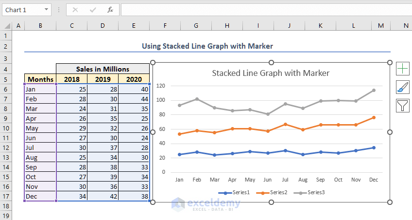
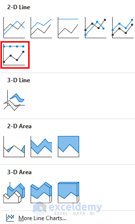
- The process is the same for Stacked Line with Markers and 100% Stacked Line with Markers graphs.
- This will give a stacked line chart with markers as shown in the following image.
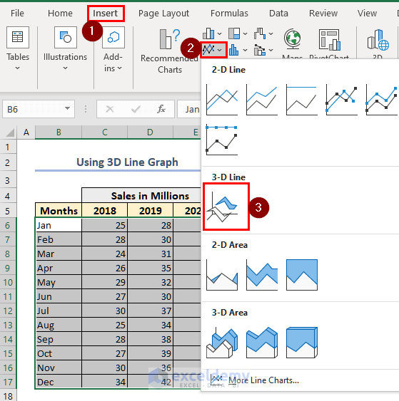
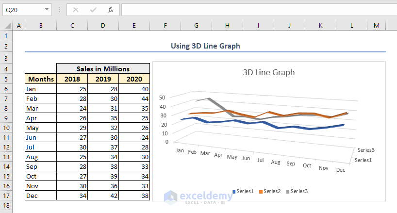
3D Line Graph in Excel
The 3D line chart will give you a line graph in three dimensions.
- Select the data range.
- Go to the Insert tab and select the 3D Line chart as shown in the following image.
- A 3D Line Graph with multiple lines is returned as shown in the following image.
How to Customize Line Graph in Excel
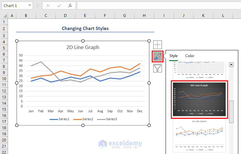
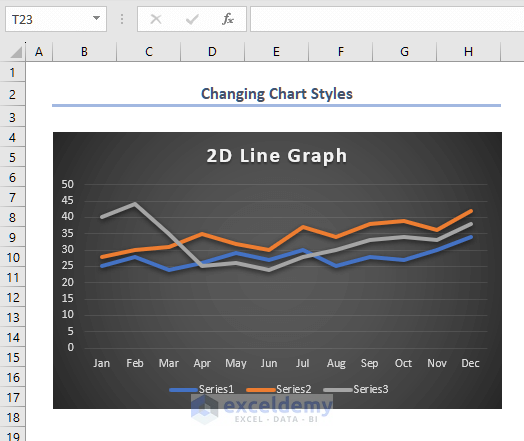
Change Chart Styles
- Click on the chart area.
- Click on the Chart Styles button.
- Select the preferred chart styles in the Style box.
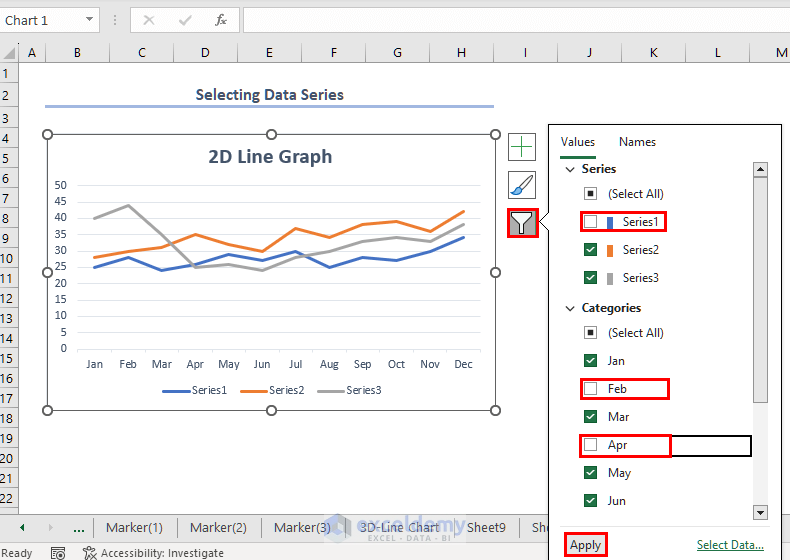
Select Data Series from Chart Filters
- Click on the Chart Filters button.
- By default all of the active data series are marked.
- Unmark those that are not needed.
- In this example Series1 and the months Feb and Apr are unselected.
- Click the Apply button.
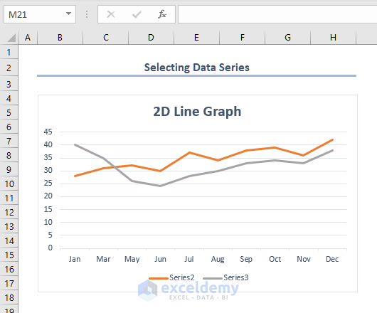
- The revised graph as 2 series lines instead of 3 and the data points for the month Feb and Apr have been hidden.
Remove or Add Data Series
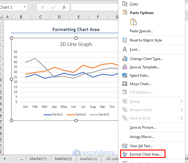
- Right-click on the chart area.
- Click on the Select Data option from the menu.
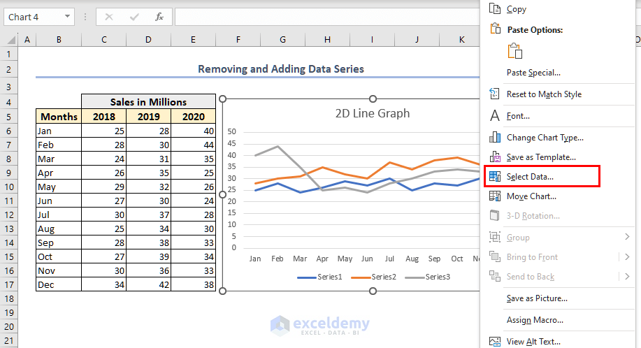
- Select a relevant data series (Series 2).
- Click the Remove button.
- Click OK.
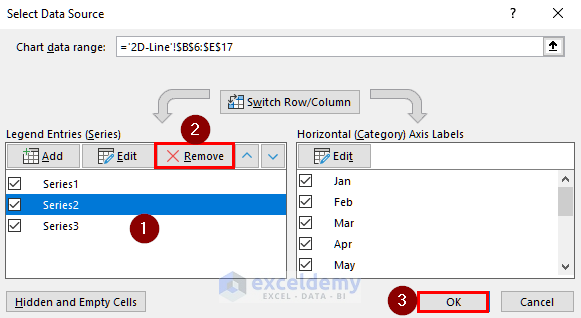
- The Series2 data has been removed.
- To add the Series2 data series, go to the data source and click on the Add button.
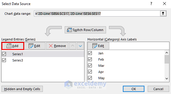
- A new window named Edit Series will appear.
- Give the series a suitable name (Series 2).
- In the Series values box, insert the new data series (D6:D17) and click OK.
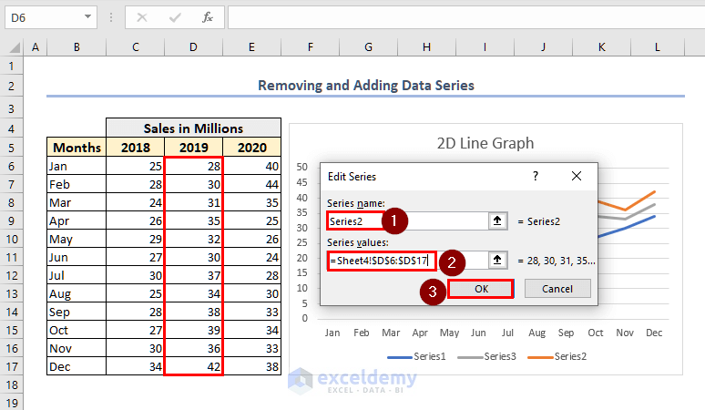
- The new data series has been added to the existing line graph.
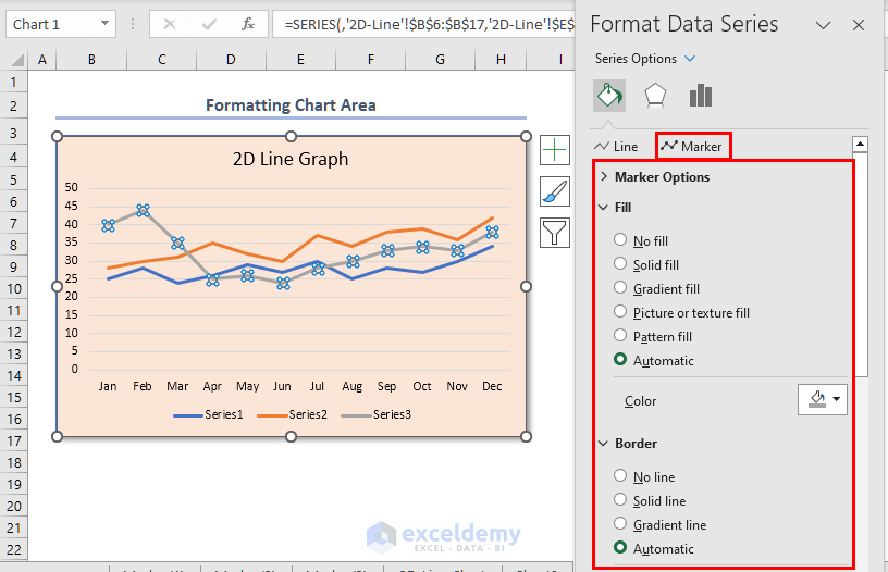
Format Chart Area
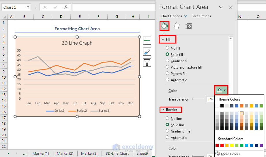
- Right-click on the chart area and select Format Chart Area.
- The Format Chart Area window will open.
- The user can choose different Fill colors and add a Border to your line chart.
- Click on any data series.
- From the Fill section, the series color, width, etc. can be edited.
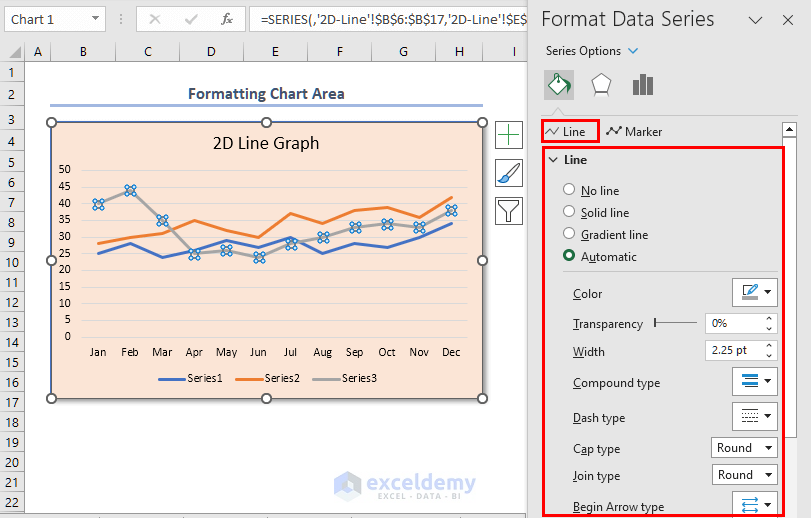
- A Marker can be added to the data series.
Read More: How to Edit a Line Graph in Excel
Frequently Asked Questions
1. How Can I Add Data Labels to My Line Graph in Excel?
Right-click on the line graph. From the Context menu select Add Data Labels option.
2. Can I Change the Color or Style of the Lines in My Line Graph?
Select the line graph and change the chart style from the Chart Design tab.
3. How Do I Add A Trendline to My Line Graph in Excel?
First, select the line graph. Navigate to the Context menu and select the Add Trendline option. The trendline can also be customized in the Format Trendline section.
Download Practice Workbook
You can download and practice this workbook.
Line Graph in Excel: Knowledge Hub
<< Go Back To Excel Charts | Learn Excel
Get FREE Advanced Excel Exercises with Solutions!
