Types of Line Graphs in Excel
Here’s an overview of line graph options for Excel.
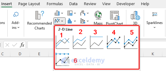
- Line: Shows trends over time for large datasets.
- Stacked Line: This graph will show how parts of the whole dataset change over time. Here, the points will not intersect and it makes cumulative points for each row.
- 100% Stacked Line: Shows the proportion of the contribution to the trends and it scales the line so that the total becomes 100%. So, it will make a straight line at the top.
- Line with Markers: Shows trends over time, but it marks the data points.
- Stacked Line with Markers: Same as the stacked line chart, but it marks the data points in it.
- 100% Stacked Line with Markers: Same as the 100% stacked line but also shows the data points in it.
How to Make a Basic Line Graph in Excel
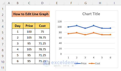
- Select the data columns that you want to add to the chart.
- Go to the Insert tab in the top ribbon.
- Click on the Line Chart option from the Chart group and select any of the types that you need.
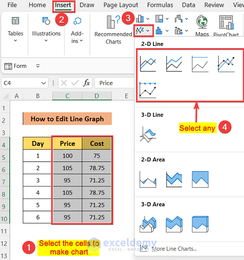
- You can resize and move the chart with the mouse.
How to Edit a Line Graph in Excel
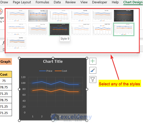
Method 1 – Select the Line Chart Style in Excel
- Double-click on the graph and you will get a tab in the ribbon named Chart style.
- In the Chart Style tab, click on the down arrow to open more styles.
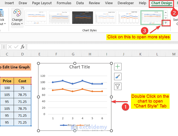
- Select any option.
- When you hover over a style, you can see the preview.
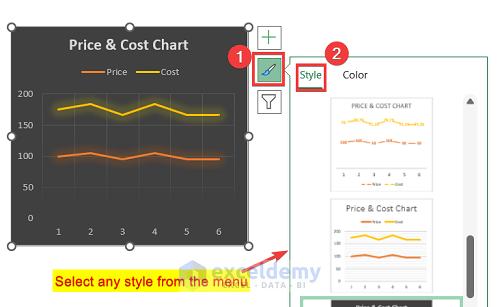
Alternatively:
- Click on the chart.
- Click on the Brush icon on the top-right.
- You’ll get a settings box on the right. Click on the Style tab.
- Scroll down and select any style from the list to apply it.
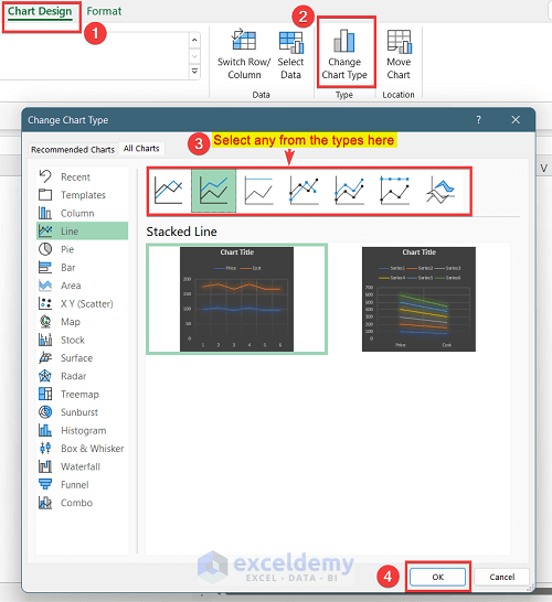
Method 2 – Change the Line Graph Type
- Double-click on the chart and go to Chart Design.
- Go to the Change Chart Type option.
- You will see the types again. Select the type that you want to implement.
- Press OK.
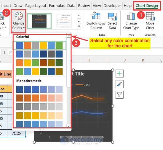
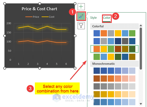
Method 3 – Change Graph Colors
- Go to Chart Design and click on the Change Colors option.
- You’ll see a list of color combinations.
- Place the mouse cursor on the choice to Preview their effect on the chart.
- Select an option.
Alternatively, you can change colors by using these steps:
- Click on the chart, then click on the Brush button on the top-right corner.
- Go to the Colors tab.
- Scroll down to select the best colors for the chart.
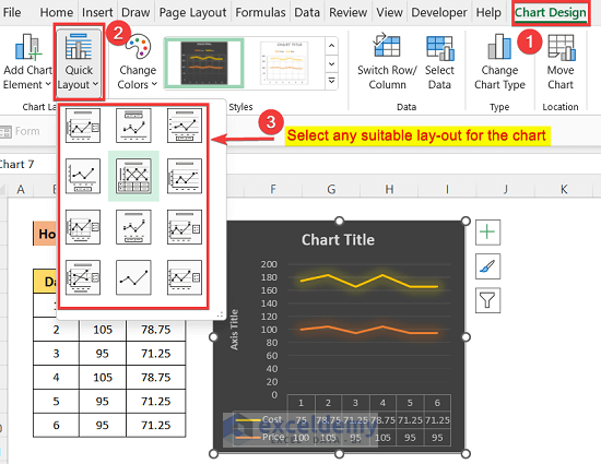
Method 4 – Edit the Graph Layout
- In the Chart Design tab, click on the Quick Layout option.
- You will see a list of layouts.
- Preview them and apply one to your graph.
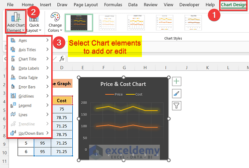
Method 5 – Add Graph Elements
- After clicking on the Add Chart Element, you will see a list of elements.
- Click on them one by one to add, remove, or edit.
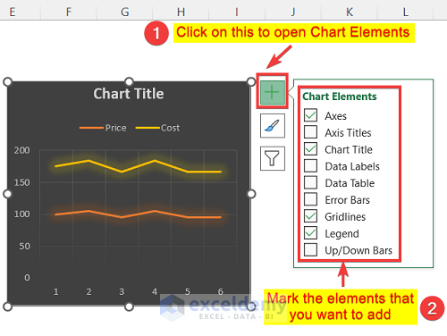
Alternatively, you can find the list of chart elements by clicking the Plus(+) button from the top right corner of the chart.
- Mark the elements to add them and unmark the elements to remove them.
- You will find an arrow on the element, where you will find other options to edit the elements.
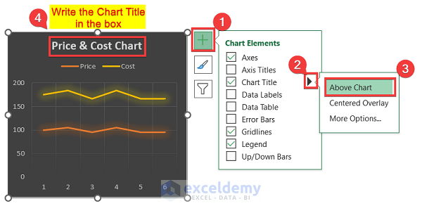
Add Title in the Line Graph:
After adding a chart, you will see a box written “Chart Title” by default.
- To remove the title, unmark the box of Chart Title or keep marked to stay with the title.
- Click on the arrow to see the options.
- Select the position where you want to place the title. Generally, we use the Above Chart option, so the title is placed at the top of the chart.
- Click on the title box and write a suitable name for the chart.
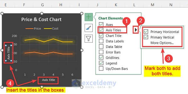
Add Axis Titles in Line Graph:
- Go to the Chart Elements and mark the Axis Titles option to add the axes titles.
- Click on the arrow and you will find two more options.
- Mark both boxes if you want titles for both axes and unmark them if you want to remove any of them.
- You can edit the titles simply by clicking on them and entering the text.
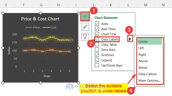
Add Data Labels:
- Go to the Chart Elements and mark the Data Labels option to show the labels of the points.
- Click on the arrow to open the position panel.
- Select a suitable position where the label will be placed with the point.
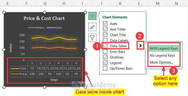
Add Data Table Inside the Chart:
- Mark the Data Table option in the Chart Elements list.
- Click on the arrow and select With Legend Keys option.
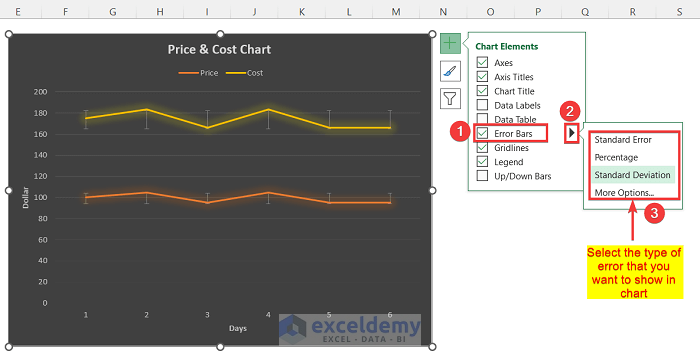
Add Error Bars:
- Mark the Error Bars option to show errors in the graph.
- Click on the arrow to select the type of error to show.
- You can see bars for each data point, which is showing the error values.
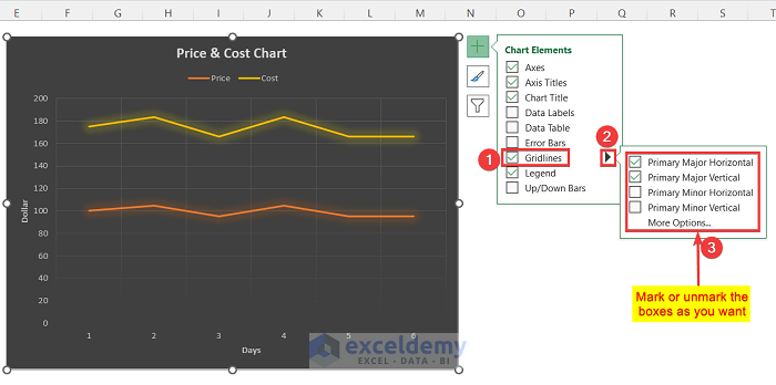
Add or Remove Gridlines:
- Go to the Chart Elements.
- Mark the Gridlines option to show them and unmark it to hide them.
- After clicking the arrow, you will find the list of the lines.
- Mark or unmark the lines as you want to see.
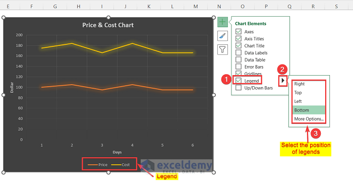
Add a Legend in a Line Graph:
- Mark the Legend option in the Chart Elements menu to show the legend and unmark to remove them.
- Click on the arrow to select the position where the legend will be placed.
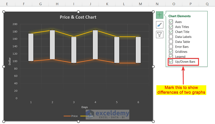
Up/Down Bars in a Line Graph:
- Mark the Up-Down Bars option in the Chart Element list.
- You can see bars for each point which show the differences between the two points of each graph.
Method 6 – Format a Line Chart Manually in Excel
- When you click on a graph, you will get a window on the right side of the workbook named Format Chart Area.
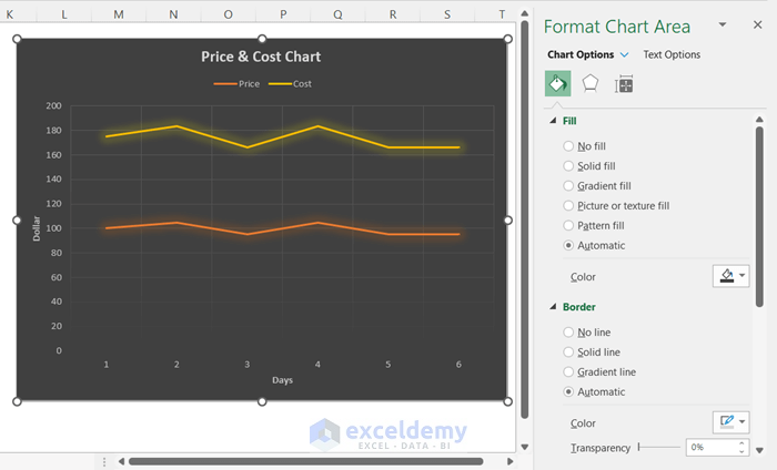
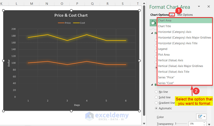
- To format each thing of the chart individually, click on the arrow beside the Chart Options.
- This will open a drop-down menu.
- Select each option one by one to format them.
Method 7 – Edit the Background of Chart
- Go to Chart Elements.
- Choose any Fill options.
- Choose a color by clicking on it.

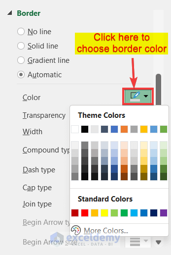
Method 8 – Edit the Border Line
- In the Format menu, go to Border.
- Edit the options as you want to see the graph.
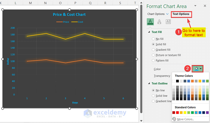
Method 9 – Edit the Text Format of a Line Graph
- Go to the Text options.
- You can change the color of the text here.
- Also, you can change the Fill type and change the transparency.
How to Avoid Clicking on the Wrong Part of the Graph
When you want to select the entire graph, click on the top-left or the top-right corner of the graph. If you have made any mistakes, use Ctrl + Z to undo.
Download the Practice Workbook
Related Articles
- How to Make a Double Line Graph in Excel
- How to Plot Multiple Lines in One Graph in Excel
- How to Combine Two Line Graphs in Excel
- How to Combine Two Bar Graphs in Excel
- How to Combine Bar and Line Graph in Excel
- How to Overlay Line Graphs in Excel
- Line Graph in Excel Not Working
<< Go Back To Line Graph in Excel | Excel Charts | Learn Excel
Get FREE Advanced Excel Exercises with Solutions!
