Method 1 – Use the Insert Tab to Make a Double Line Graph in Excel
Steps:
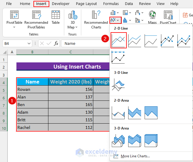
- Select the cell range B4:D10.
- From the Insert tab, choose Insert Line or Area Chart.
- Select Line inside the 2-D Line section.
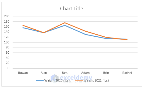
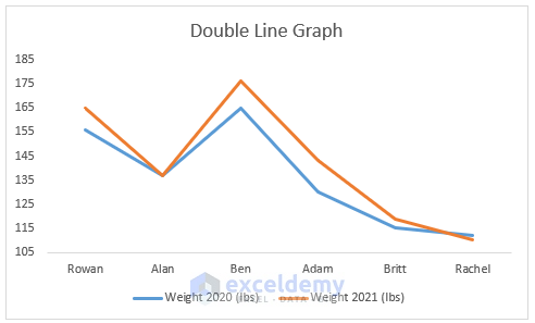
- This will provide a basic double-line graph.
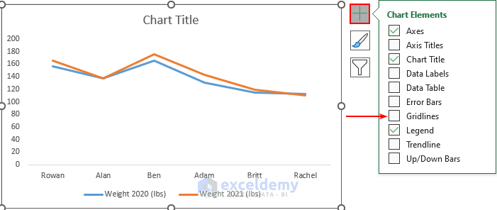
- Select the Line Chart, and from the Chart Elements, deselect Gridlines.
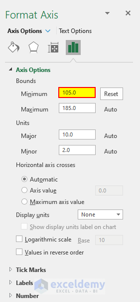
- Double-click on the Vertical Axis of the Chart.
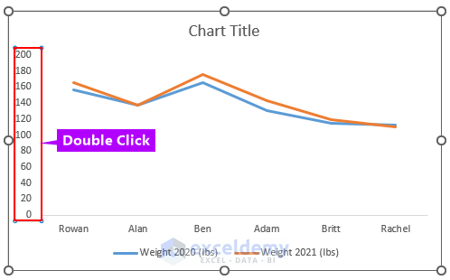
- Open the Format Axis box.
- Set the Minimum Bounds to 105 under the Axis Options section.
- Here’s the modified graph.
Method 2 – Adding a Second Line Graph to an Existing Chart to Make a Double Line Graph
Steps:
- Select a single-line graph.
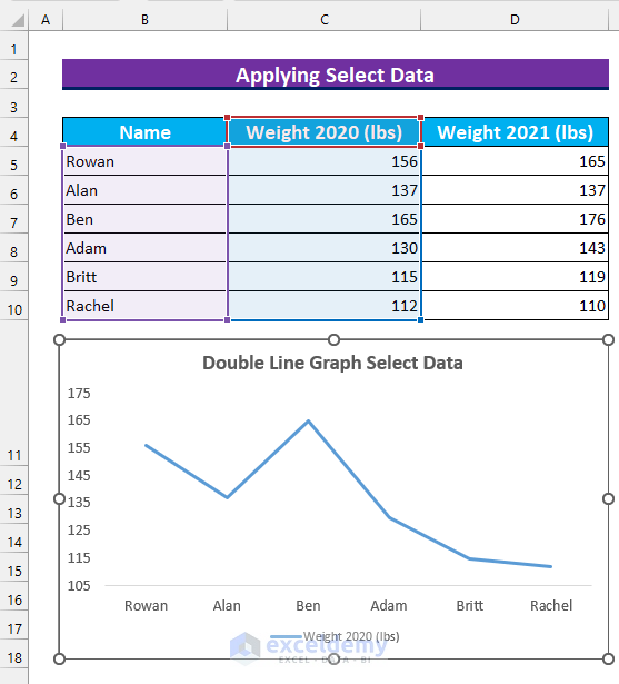
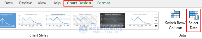
- From the Chart Design tab, click on “Select Data”.
- The Select Data Source dialog box will open.
- Press Add.
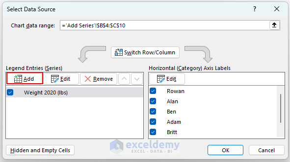
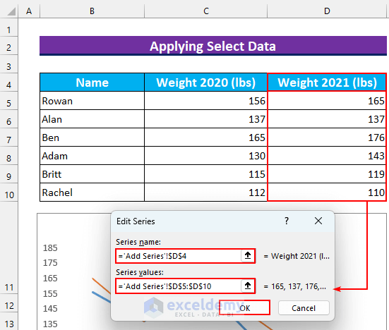
- Select cell D4 as the “Series name”.
- Select the cell range D5:D10 as the “Series values”.
- Press OK.
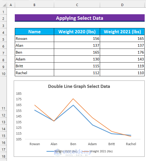
- Insert another line graph into the original graph and the output graph will be similar to this.
Method 3 – Applying VBA Code to Make a Double Line Graph in Excel
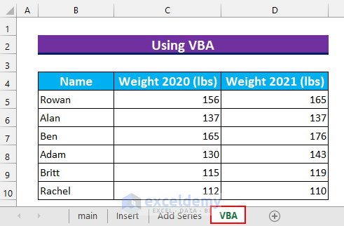
Our dataset is in the “VBA” Worksheet.
Steps:
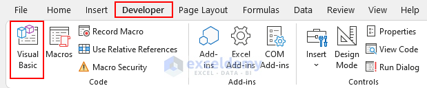
- Press Alt + F11 to bring up the VBA window, or select Visual Basic from the Developer tab.
- From Insert, select Module.
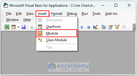
- Insert the following code in the module.
Sub Make_Double_Line_Graph()
Application.ScreenUpdating = False
ActiveSheet.Shapes.AddChart.Select
With ActiveChart
    .SetSourceData Source:=Range("'VBA'!$B$4:$D$10")
    .ChartType = xlLine
    .Axes(xlValue).MinimumScale = 105
    .HasTitle = True
    .ChartTitle.Text = "VBA Double Line Graph"
    .SetElement (msoElementPrimaryValueGridLinesNone)
    .SetElement (msoElementLegendBottom)
End With
Application.ScreenUpdating = True
End Sub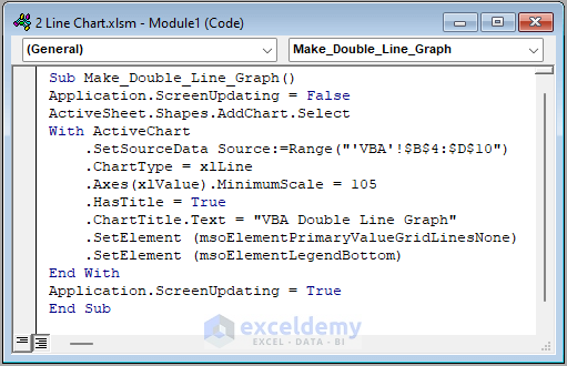
VBA Code Breakdown
- We are calling our Sub procedure Make_Double_Line_Graph.
- We insert a Chart in the Active Sheet.
- We use the VBA With statement to set the properties of the Chart.
- We make the Gridlines from the graph disappear and move Legend at the bottom.
- This code works to create a double-line graph.
- Save the Module.
- Put the cursor inside the first Sub procedure and press Run.
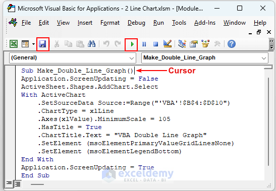
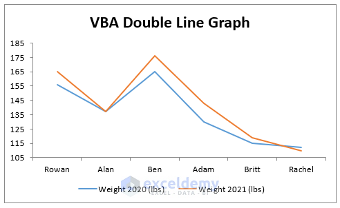
- Our code will execute, and it will create a double line graph.
Download the Practice Workbook
Related Articles
- How to Combine Two Line Graphs in Excel
- How to Combine Two Bar Graphs in Excel
- How to Combine Bar and Line Graph in Excel
- How to Edit a Line Graph in Excel
- How to Overlay Line Graphs in Excel
- Line Graph in Excel Not Working
<< Go Back To Line Graph in Excel | Excel Charts | Learn Excel
Get FREE Advanced Excel Exercises with Solutions!
