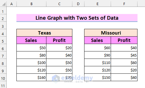
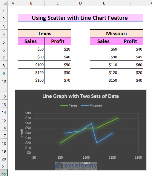
We have two datasets. One set contains Sales and Profit for Texas and the other one contains Sales and Profit for Missouri. We will be making a Profit vs. Sales graph for these two datasets.
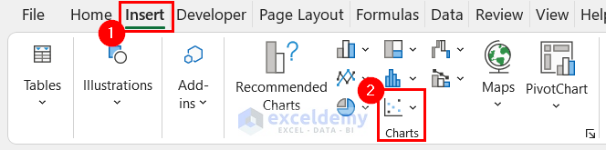
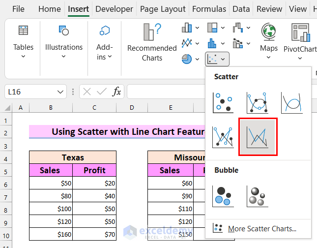
Step 1 – Inserting a Chart to Make a Line Graph with Two Sets of Data
- Go to the Insert tab.
- Click on Insert Scatter or Bubble Chart from the Charts option.
- Select Scatter with Straight Lines.
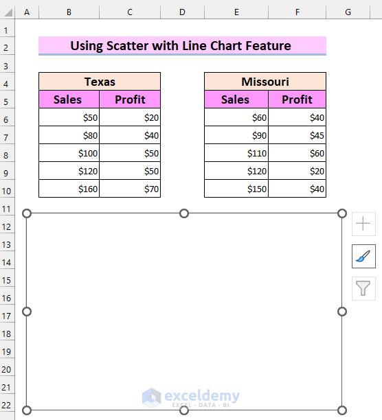
- This has inserted a chart into the worksheet.
Read More: How to Make a Single Line Graph in Excel
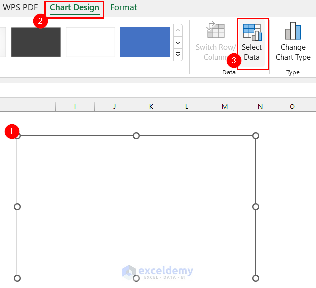
Step 2 – Adding Two Sets of Data in a Line Graph
- Select the Chart.
- Go to the Chart Design tab.
- Select the Select Data option.
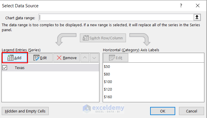
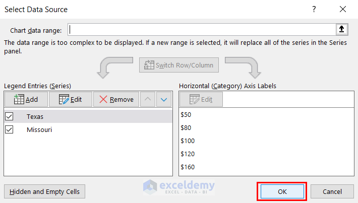
A dialog box named Select Data Source will appear on the screen.
- Select Add.
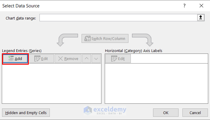
You will get a new dialog box to add your data to the chart.
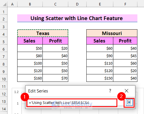
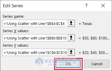
- Select the arrow button to add the Series name.
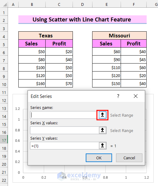
- Select the range for your Series name.
- Click on the selection button to add this to your Edit Series.
- Add Series X values.
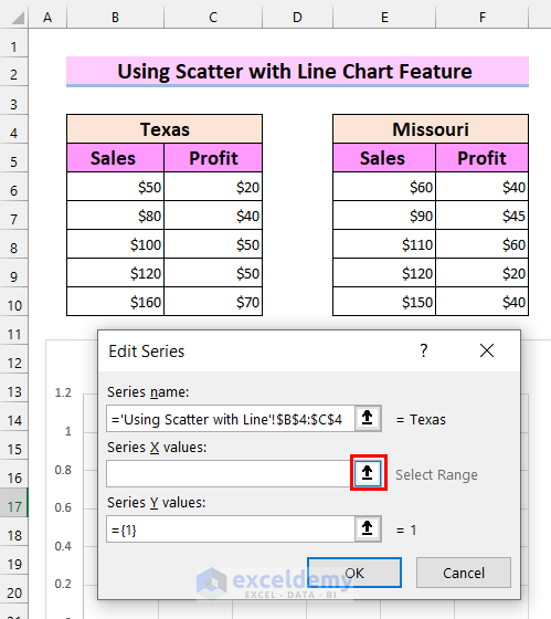
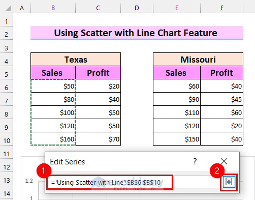
- Select the range for Series X values.
- Select the selection button to add the value to your Edit Series.
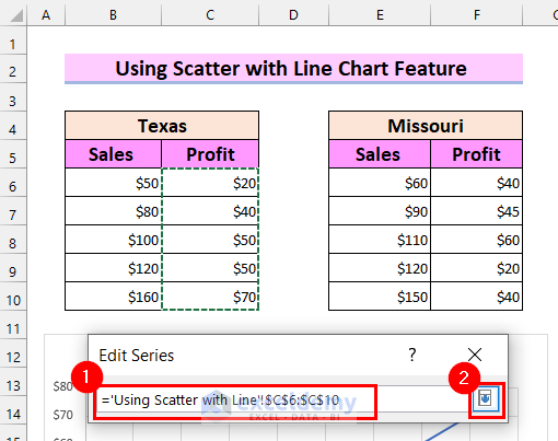
- Add Series Y values.
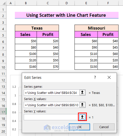
- Select the range for Series Y values.
- Press the selection button and your Series Y values will be added to your Edit Series.
- Select OK.
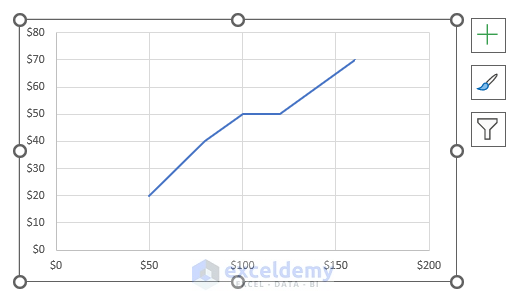
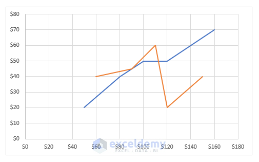
- The line graph for your first set of data is showing.
- Select Add from the Select Data Source dialog box.
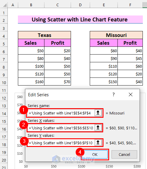
- Select the range for the Series name.
- Select the range for Series X values.
- Select the range for Series Y values.
- Select OK.
- Select OK on the Select Data Source dialog box to get your line graph.
- We get a second line in the graph.
Read More: How to Make Line Graph in Excel with 2 Variables
Step 3 – Formatting a Line Graph with Two Sets of Data
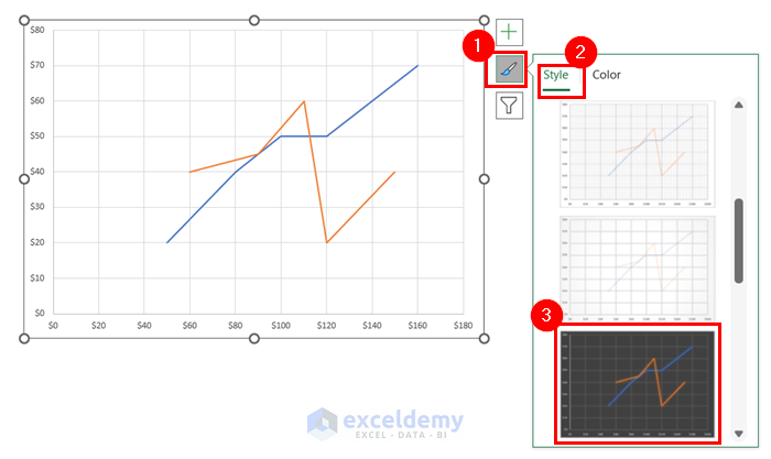
- Go to Chart Styles.
- Select Styles.
- You can select any chart format from there.
- Go to the Chart Styles option.
- Select Color.
- Select the color you like.
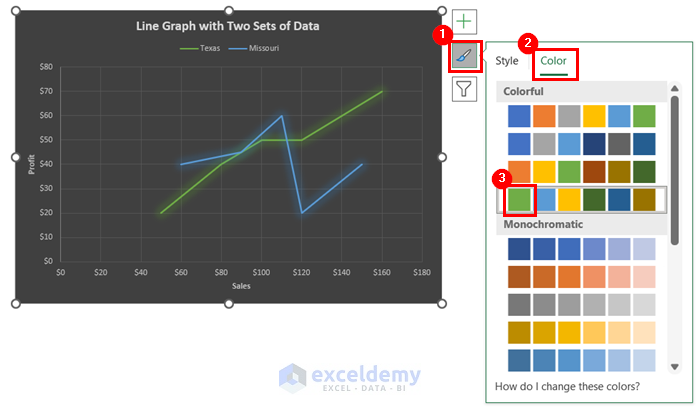
- Go to Chart Elements.
- Select the elements that you want in your line graph. We selected the Axis Titles, Chart Titles, and Legend.
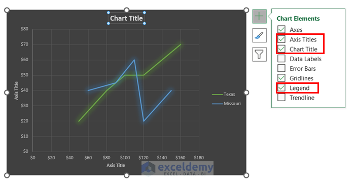
- You can edit the Axis Titles and Chart Titles according to your dataset.
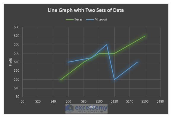
- You will see the desired line graph in Excel with two sets of data.
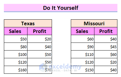
Practice Section
We’re providing the sample dataset so you can use it to create a line graph.
Download the Practice Workbook
Related Articles
<< Go Back To Line Graph in Excel | Excel Charts | Learn Excel
Get FREE Advanced Excel Exercises with Solutions!
