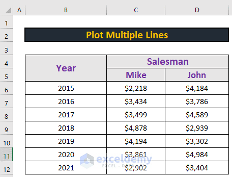
This is the sample dataset:
Step 1 – Plot a Chart using the Insert Tab
- Go to the Insert tab.
- Select Scatter.
- Choose a type of scatter chart.
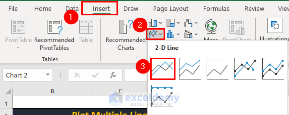
Excel will create a blank chart.

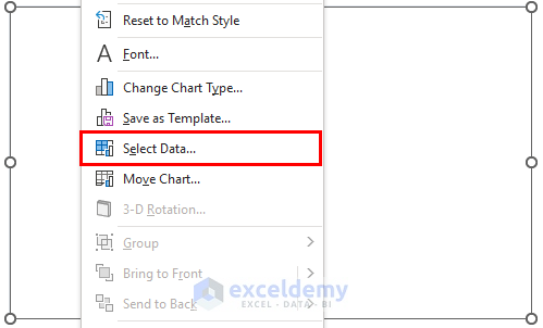
Step 2 – Insert Multiple Graphs
- Right-click.
- Click Select Data.
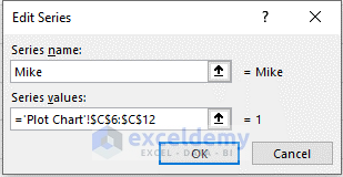
- In the Select Data Source window, click Add.
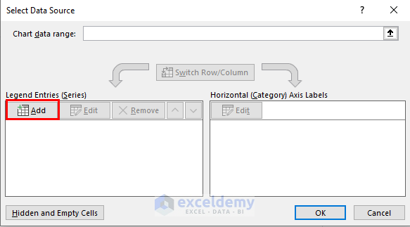
- Enter a series name.
- Select C6:C12 as series values.
- Click OK.
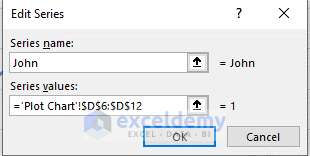
- Select Add to plot another line.
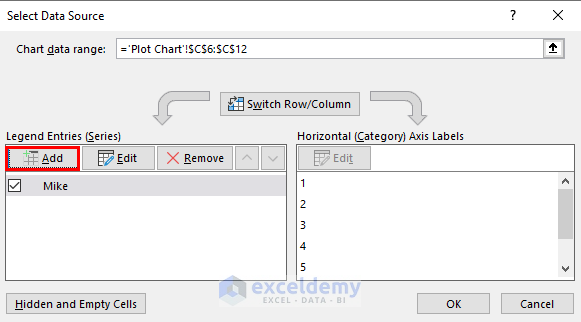
- Enter the new series a name.
- Select D6:D12.
- Click OK.
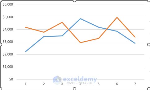
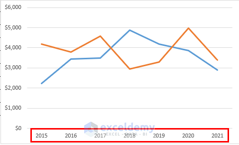
Excel will plot 2 lines.
Read More: How to Make a Double Line Graph in Excel
Step 3 – Add Values to the Horizontal Axis
- Go to the Select Data Source dialog box.
- Select Edit in Horizontal (Category) Axis Labels.
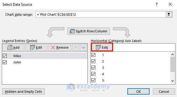
- Select B6:B12 as range.
- Click OK.
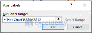
Excel will modify the horizontal axis.
Download Practice Workbook
Download the workbook and practice.
Related Articles
- How to Combine Two Line Graphs in Excel
- How to Combine Bar and Line Graph in Excel
- How to Combine Two Bar Graphs in Excel
- How to Edit a Line Graph in Excel
- How to Overlay Line Graphs in Excel
- Line Graph in Excel Not Working
<< Go Back To Line Graph in Excel | Excel Charts | Learn Excel
Get FREE Advanced Excel Exercises with Solutions!
