To combine bar and line graphs, we are going to use the following dataset. It contains some months, as well as total unit sales and the total amount ...
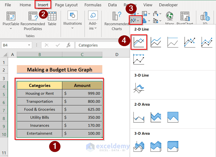
This article illustrates how to make a line graph in Excel with multiple variables. A line graph connects different data points to show the trend and ...
What Is a Single Line Graph in Excel?
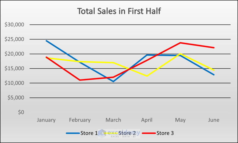
We have data on sales of any particular store of different products. If we want to visualize this data or the ...