What Is a Single Line Graph in Excel?
We have data on sales of any particular store of different products. If we want to visualize this data or the price of different products, we can simply plot the data and connect the line. This line is the single line graph in Excel.

Types of Lines for a Single Line Graph in Excel
- Smooth Line Graph with Marker: In this type, we will get a rounded edge smooth line with small circles on the line pointing to the data that we have given in making the single line graph.
- Smooth Line Graph without Marker: This type of line is the same as the smooth line as the previous one, but it does not contain circular dots.
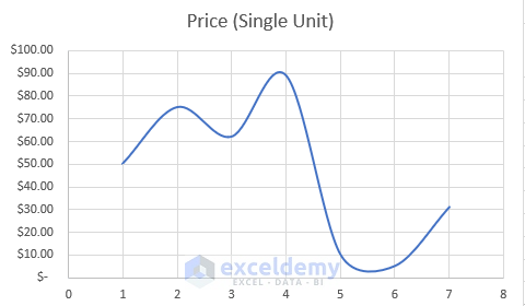
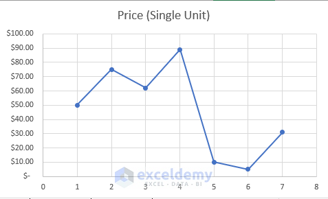
- Straight Line Graph: This type of line graph is a combination of small straight lines between two points. This type of line also contains 2 choices: with a marker and without a marker. Below is an image of a straight-line graph with markers.
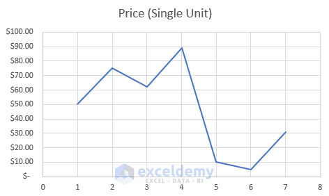
Here’s an example of a straight-line graph without markers.
How to Make a Single Line Graph in Excel
Step 1 – Prepare the Dataset
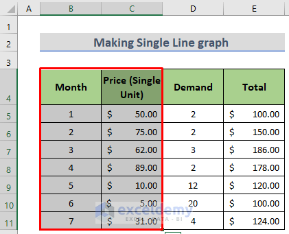
- Select the columns to use for a single-line graph. We will use the Month and Price columns.
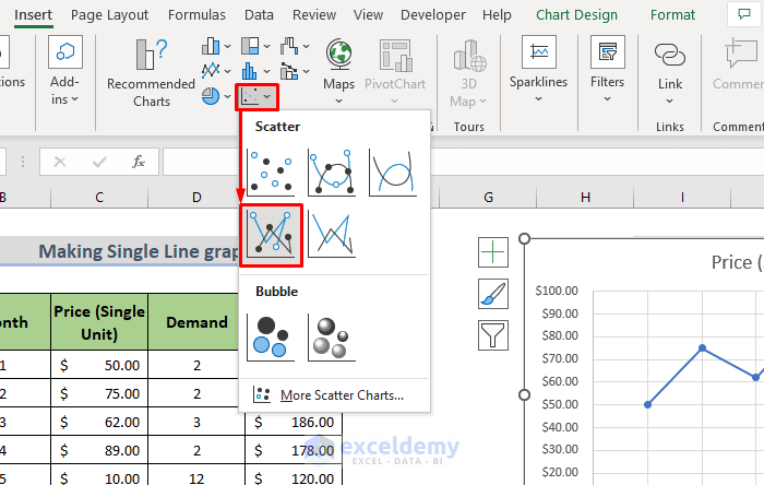
Step 2 – Select a Suitable Line Graph from the Charts Group
- Go to the Insert tab in the Ribbon.
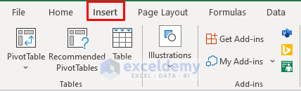
- Select any of the Scatter Plots in the Chart section.
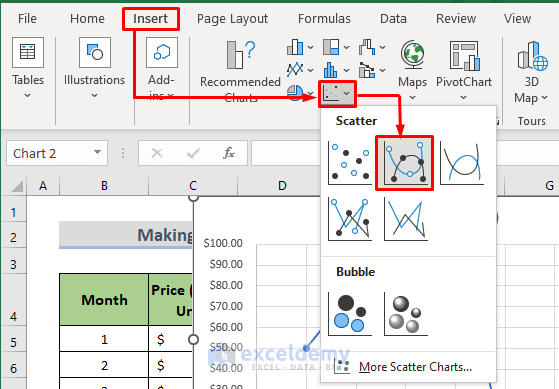
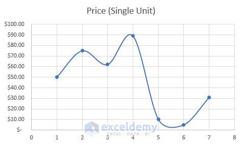
This will give us a single-line graph like the image below.
Read More: How to Make a Line Graph in Excel with Two Sets of Data
How to Format a Single Line Graph in Excel
Case 1 – Adding or Deleting Lines
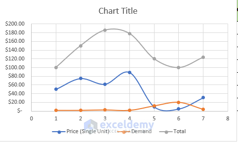
- To add more lines, select more data columns and plot them.
- To delete a line, select any line in the plot and then press Delete on the keyboard or right-click on it and then select Delete.
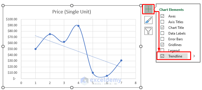
Case 2 – Adding a Trendline
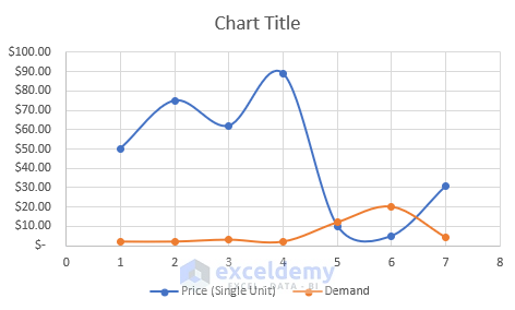
We have this single-line graph that shows different products and their demand.
We can forecast the demand for the product based on the given data and demand.
- Click on the (+) button beside the graph and tick the Trendline option. It will instantly add a linear trendline to our existing single-line graph.
Case 3 – Changing the Line Type
We want to change the line type.
- Select the graph, go to Insert tab and, in the Chart area, select Scatter plot, then choose a different line type.
How to Make a Single Line Graph in Excel with 3 Variables
For 3 different variables, we will get 3 different lines. Select the independent data column and 3 additional columns and follow the plotting process above.
Read More: How to Make Line Graph with 3 Variables in Excel
Thing to Remember
- While selecting the columns for a single line graph, we need to be careful about the data type of those cells. If the independent value is not numeric, we will not be able to plot a single-line diagram.
- The amount of data in each column should be the same, otherwise the missing data will not be shown, and Excel will automatically adjust the graph based on the previous and next data.
- If your columns have headers, Excel will automatically detect them and place them in the axis name.
Download the Excel Workbook
Related Articles
<< Go Back To Line Graph in Excel | Excel Charts | Learn Excel
Get FREE Advanced Excel Exercises with Solutions!
