This tutorial will demonstrate how to make a budget line graph in Excel. A line graph is a statistical graphic to highlights the numerical proportions of a dataset. A budget line graph illustrates the proportion of expenses of each budget category compared to the total budget. This will help you reduce your unnecessary expenses and save the money for a better future or use the money to do more important things. Have a quick look through the article to learn how to make a budget line graph in Excel and have a better future.
Types of Line Graphs In Excel
In Excel, while making line graphs, you will find some types of options. Here, I am describing each type of them.
- Line: You will use this type to show trends over time for large datasets.
- Stacked Line: This graph will show how parts of the whole dataset change over time. Here, the points will not intersect and it makes cumulative points for each row.
- 100% Stacked Line: It shows the proportion of the contribution to the trends and it scales the line so that the total becomes 100%. So, it will make a straight line at the top.
- Line with Markers: It also shows trends over time but it marks the data points.
- Stacked Line with Markers: It is the same as the stacked line chart but it marks the data points in it.
- 100% Stacked Line with Markers: It is also the same as the 100% stacked line but in addition, it shows the data points in it.
How to Make a Budget Line Graph in Excel: Step-by-Step Procedures
We’ll use a sample dataset overview as an example in Excel to understand easily. If you follow the steps correctly, you should learn how to make a budget line graph in Excel on your own. The steps for making a budget line graph are as follows:
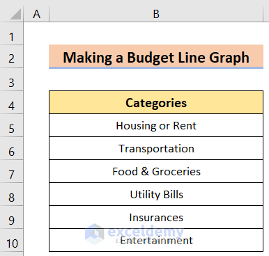
Step 1: Setting Budget Categories
In this case, our goal is to arrange a dataset with proper budget categories. For instance, we have a dataset of different cost options named the Categories in Column B. We’ll use a sample dataset overview as an example in Excel to understand easily. The steps are as follows.
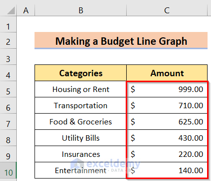
Step 2: Inserting Budget Amounts
Now, we want to enter the budget amounts in Excel to make the line graph chart. In this case, we have the Amount in Column C. Without the amounts, the graph won’t be that effective. So, we have to insert the proper budget amounts to get a proper graphical line. The steps are as follows.
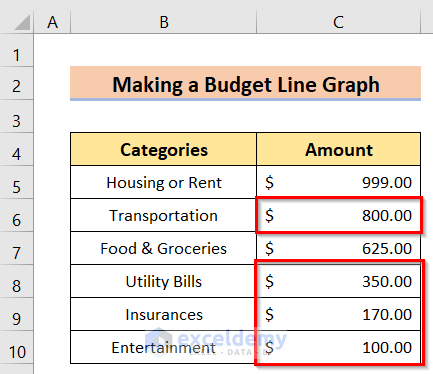
Step 3: Formatting Budget Table
After inserting the budget categories with amounts, the table can be easily formatted if needed. While making a line graph it is very common to need formatting. We have to manually click on the cell in Column B or Column C, you want to change and then insert the new value in it. We have made changes in the cells C6, C8, C9, and C10 in the following image.
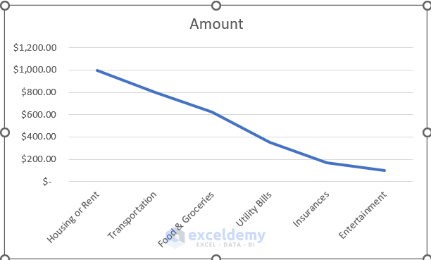
Step 4: Inserting Budget Line Graph
Our main goal of this article is to insert a budget line graph in Excel. This budget line graph will show you in which categories you are using the most money. This will help you to understand whether you need to pay that amount of money or reduce it for a better good. After having a proper dataset, we will insert the budget line graph by following the below steps.
- Firstly, go to select the table > Insert > Insert Line or Area Chart > 2-D Line options.

- After that, the following result will come on the display screen.
Read More: How to Make a Single Line Graph in Excel
Step 5: Editing Budget Line Graph
Now, if we need any changes in the budget line graph, we can edit the graph anytime by following the below steps.
- First, select the chart > go to Chart Design options and select the desired chart accordingly.

- Next, the following result will come on the display screen.

- After that, select the Data Labels option from the Chart Elements options.
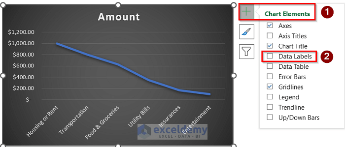
- Now, the following result will come on the display screen.

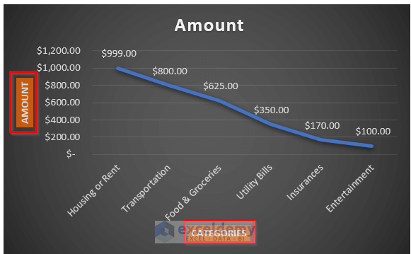
- Moreover, go to the Chart Elements > Axis Titles > Primary Horizontal and Primary Vertical options.

- Finally, the following result will come on the display screen with proper axes titles.
Read More: How to Edit a Line Graph in Excel
Things to Remember
- In the case of making a budget line graph, the most important factor is to categorize the cost sections and insert the amount properly. That’s why formatting before or after creating a chart is very useful in this case.
- When inserting a budget line graph, make sure to select the line graph option properly. You can anytime format the line graph by going to the Format Cells option.
- The Data Labels and Axis Titles options play a very significant role in this case. Otherwise, the graph becomes hard to understand.
Download Practice Workbook
You can download the practice workbook from here.
Conclusion
Henceforth, follow the above-described methods. Hopefully, these methods will help you to make a budget line graph in Excel. We will be glad to know if you can execute the task in any other way. Please feel free to add comments, suggestions, or questions in the section below if you have any confusion or face any problems. We will try our best to solve the problem or work with your suggestions.
Related Articles
- How to Make a Line Graph in Excel with Two Sets of Data
- How to Make a Line Graph in Excel with Multiple Variables
- How to Make Line Graph in Excel with 2 Variables
- How to Make Line Graph with 3 Variables in Excel
- How to Make a Percentage Line Graph in Excel
<< Go Back To Line Graph in Excel | Excel Charts | Learn Excel
Get FREE Advanced Excel Exercises with Solutions!
