This article illustrates how to make a line graph in Excel with multiple variables. A line graph connects different data points to show the trend and make them easily understandable. You can make a line graph in Excel to portray the change in multiple data variables in relation to a particular one. Follow the article to learn how to do that easily.
Make a Line Graph in Excel with Multiple Variables: Step-by-Step
Follow the steps below to make a line graph in Excel with multiple variables.
📌 Step 1: Organize Data
- Assume you have prepared the following dataset containing monthly product sales. The row headers represent the X-axis variables and the column headers represent the Y-axis variables.

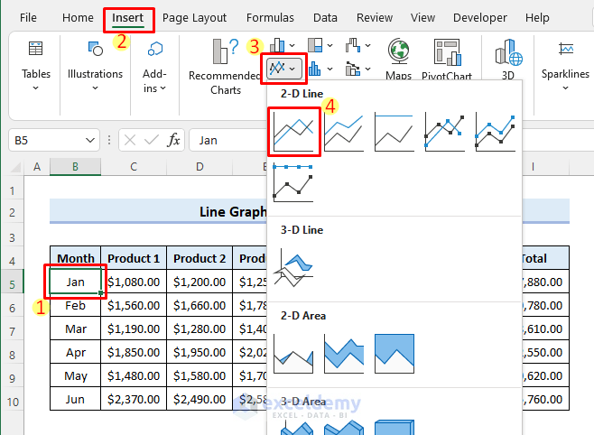
📌 Step 2: Insert Line Graph
- Now, select anywhere in the dataset. Then choose Insert >> Line or Area Chart >> 2-D Line >> Line from the Insert tab.
- After that, the Line Graph will be inserted as follows.

Read More: How to Make Line Graph with 3 Variables in Excel
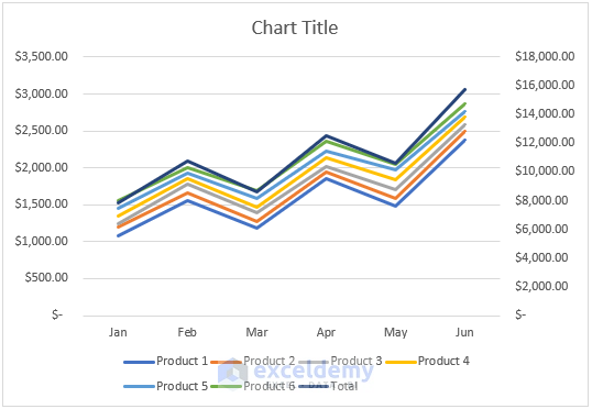
📌 Step 3: Switch Row/Column of the Graph
- If the Line Graph shows the columns as rows and rows as columns, you need to switch the rows in the line graph to columns and the columns to rows.
- Now, right-click on the line graph and choose Select Data to do that.

- Then, select Switch Row/Column and press OK.

- After that, the line graph will look as follows.

📌 Step 4: Add Secondary Axis to Line Graph
- Now you need to add a secondary axis for the Total sales to make the line graph more presentable.
- Now double-click on the line graph for the Total sales. Then the Format Data Series pane will appear on the right. You can also do that by right-clicking on the data series. Next, mark the radio button for the Secondary Axis.

- After that, the line graph will look as follows.
- Next, double-click on the secondary axis and change the Maximum value to adjust the data series properly.

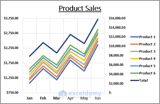
📌 Step 5: Change Chart Title and Legends
- Now, click on the chart title to rename it as required.

- Then, click the Chart Elements icon and align the Legend to the right.

Read More: How to Edit a Line Graph in Excel
📌 Step 6: Finalize the Line Graph
- Finally, apply some text and outline formatting. After that, you will get the following result.
Things to Remember
- You must select anywhere in the dataset before inserting the Line Graph. Otherwise, you will need to add the rows and columns manually.
- Please make sure all rows and columns are selected before switching them.
Download Practice Workbook
You can download the practice workbook from the download button below.
Conclusion
Now you know how to make a line graph in Excel with multiple variables. Do you have any further queries or suggestions? Please let us know using the comment section below. Stay with us and keep learning.
Related Articles
- How to Make a Single Line Graph in Excel
- How to Make a Line Graph in Excel with Two Sets of Data
- How to Make Line Graph in Excel with 2 Variables
- How to Make a Percentage Line Graph in Excel
- How to Make a Budget Line Graph in Excel
<< Go Back To Line Graph in Excel | Excel Charts | Learn Excel
Get FREE Advanced Excel Exercises with Solutions!
