Dataset Introduction
The following dataset represents the Salesman, Net Sales, and Target of a company. Our first graph will be based on Salesman and Target. The second graph will use Salesman and Net Sales.

How to Combine Two Graphs in Excel: 2 Methods
Method 1 – Insert a Combo Chart for Combining Two Graphs in Excel
Case 1.1 – Create Two Graphs
- Select the ranges B5:B10 and D5:D10 simultaneously (hold Ctrl and drag through the respective columns).

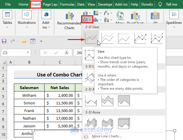
- Select the 2-D Line graph from the Charts group under the Insert tab.
- You can select any other graph type from the Charts group.

- You’ll get your first graph.

- Select the ranges B5:B10 and C5:C10.

- Under the Insert tab and from the Charts group, select a 2-D Line graph or any other type you like.
- You’ll get your second graph.

Read More: How to Create a Combination Chart in Excel
Case 1.2 – Principal Axis for Merging
- Select all the data ranges (B5:D10).

- From the Insert tab, select the Drop-down icon in the Charts group.

- The Insert Chart dialog box will pop out.
- Select Combo which you’ll find in the All Charts tab.
- Select Line as the Chart Type for both Series1 and Series2.
- Press OK.
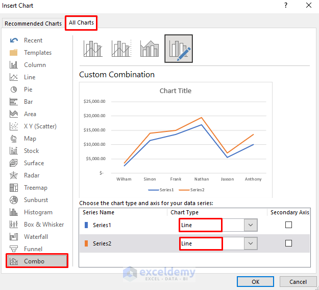
- You’ll get the combined graph.
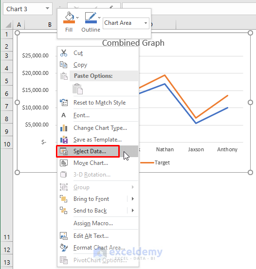
- Select the graph and right-click on the mouse to set the series names.
- Click Select Data.
- A dialog box will pop out.
- Select Series1 and press Edit.
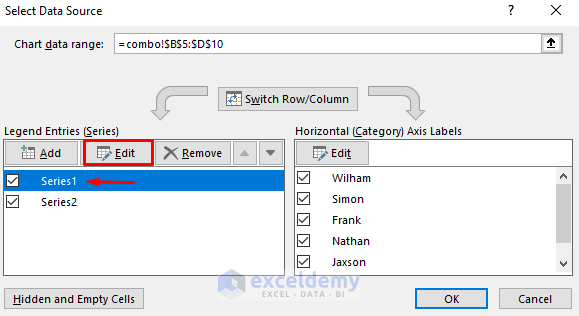
- A new dialog box will pop out. Type Net Sales in the Series name and press OK.

NOTE: The Series values are C5:C10, so this is the Net Sales series.
- Select Series2 and press Edit.
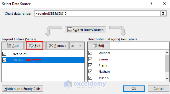
- Type Target in the Series name and press OK.
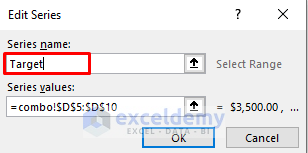
NOTE: The Series values are D5:D10, so this is the Target series.
- Press OK for the Select Data Source dialog box.
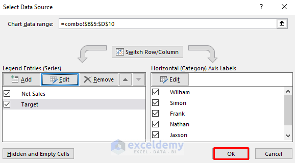
- It’ll return the Combined Graph.

Read More: How to Draw Target Line in Excel Graph
Case 1.3 – Secondary Axis
- When making a Combo graph, check the box Secondary Axis for the Target series and press OK.
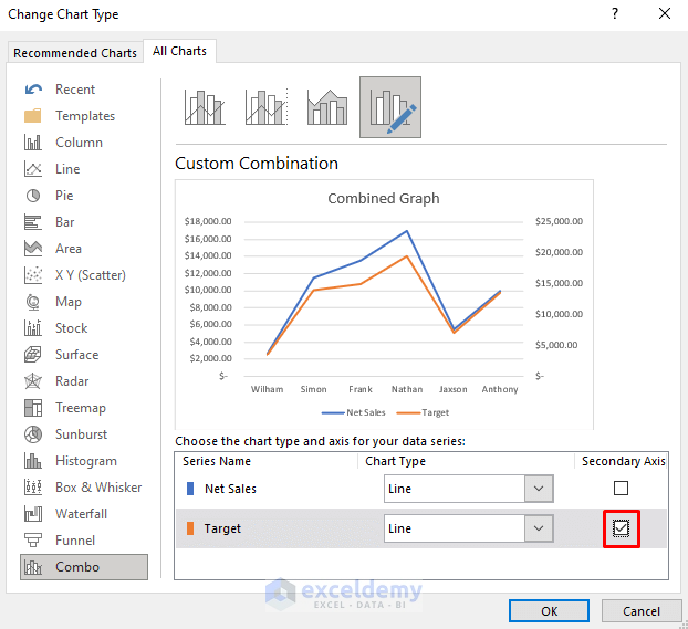
- You’ll get the combined graph on both axes.

- This is particularly helpful when the number formats are different or the ranges differ greatly from each other.
Read More: How to Create Column and Line Chart Combo in Excel
Method 2 – Combine Two Graphs in Excel with Copy and Paste Operations
- Select any graph and right-click on it.
- Select the Copy option.
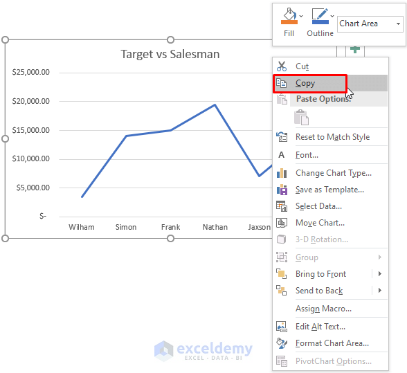
- Select the second graph and right-click on it.
- Select the Paste option.

- You’ll get the combined graph.
- Select the title.
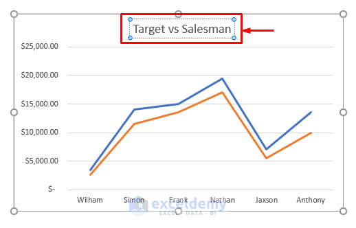
- Type Combined Graph.
- You’ll get your desired graph.

Download the Practice Workbook
Related Articles
- How to Draw a Horizontal Line in Excel Graph
- How to Add a Marker Line in Excel Graph
- How to Shade Area Between Two Lines in a Chart in Excel
- How to Make a Forest Plot in Excel
<< Go Back To Excel Combo Chart | Excel Charts | Learn Excel
Get FREE Advanced Excel Exercises with Solutions!

Hi,
I really would like to merge to different graphs, as I have 2 combo graphs to merge.
I tried this solution, with Copy and Paste, that would be perfect for me, but didn’t work.
The pasted graph is replacing the first one.
I am using Office 365 on Windows 11.
Any suggestion on how to make it work?
Thanks,
Peppe
Hello Pepe,
Thanks for your feedback. It’s a matter of upset that the Copy and Paste solution is not working in your Excel file. Whereas our method is working smoothly. You have to copy a chart and then paste it on another chart and your work will be done. As per your comment, the method doesn’t work. So, we have attached some steps to do that in an alternative way. Follow the below step.
1. Select the first chart, then right-click and choose “Copy“.
2. Click on the second chart to activate it.
3. Right-click on the chart area and choose “Paste” from the context menu.
4. You should now have two chart objects overlapping each other. You can resize and reposition them as desired.
5. Select the first chart, then right-click and choose “Format Chart Area” from the context menu.
6. In the Format Chart Area pane, under the Fill & Line tab, choose “No fill” and “No line“.
7. Repeat step 5 and 6 for the second chart.
Now you should have two charts merged into one.
If the above method fails then you can use the below method also.
1. Select the data range for both series.
2. Click on the “Insert” tab and choose “Recommended Charts“.
3. Scroll down to the “Combo” charts section and choose a chart type that suits your needs.
4. Click “OK” to create the chart.
5. Right-click on the chart and choose “Select Data” from the context menu.
6. In the “Select Data Source” dialog box, click the “Add” button to add a new series.
7. Select the data range for the second series and click “OK“.
You should now have a single chart with both series displayed.
Hope the above methods will work. If this doesn’t work then please send your excel file to [email protected]
Have a good day!
Regards
Fahim Shahriyar Dipto
Excel and VBA Content Developer.