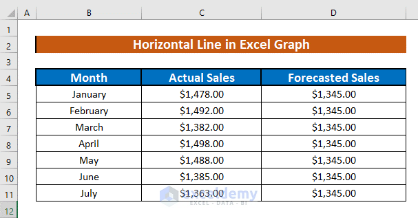
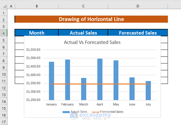
The following dataset has the monthly sales amount and forecasted sales. Using the forecasted sales, we will draw a horizontal line.
Method 1 – Drawing a Horizontal Line in the Graph Using the Recommended Charts Option in Excel
Steps:
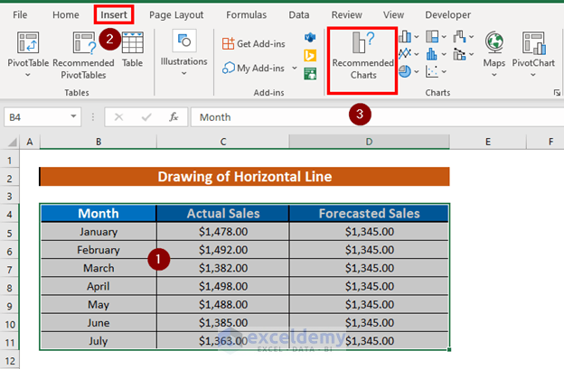
- Select the range B4:D11.
- Go to the Insert tab >> select Recommended Charts.
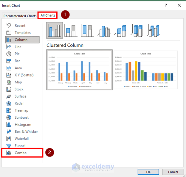
- Insert Chart box will appear.
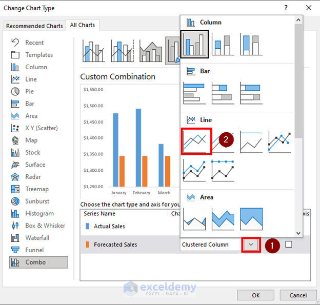
- Go to All Charts >> Select Combo.
- Excel will see the options available for charts. Since we will draw the horizontal line with forecasted sales, we will keep the Chart Type for Forecasted Sales as the Line.
- Click OK.
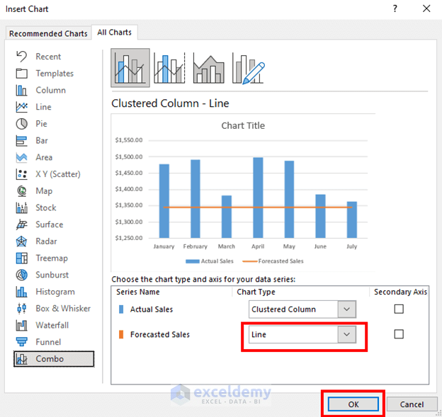
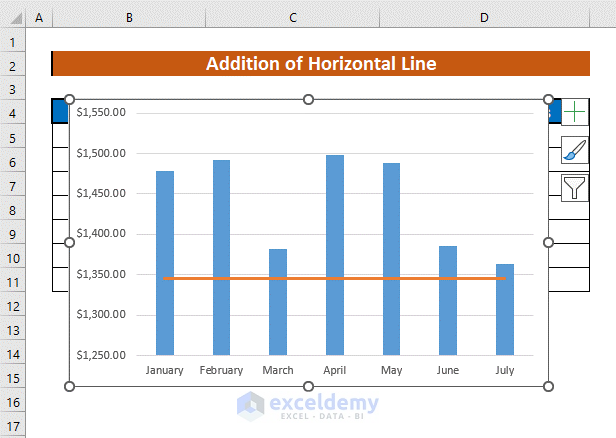
- Excel will draw a horizontal line.
Read More: How to Draw Target Line in Excel Graph
Method 2 – Adding a Horizontal Line to an Existing Excel Graph
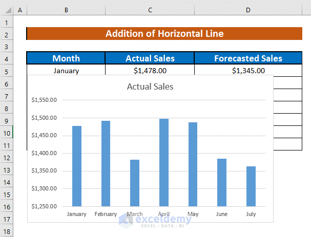
Look at the image below. Here, we have a graph of actual sales and the corresponding months. I will add a horizontal line with the forecasted sales to this existing graph.
Steps:
- Select the chart.
- Right-click to open the menu.
- Select Select Data.
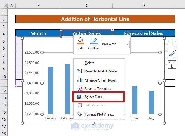
- The Data Source box will appear.
- Select Add.
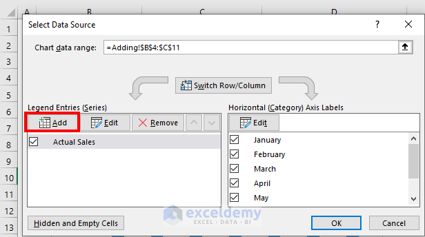
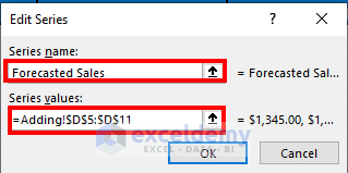
- The Edit Series box will pop up. Give the new series a name and put the values. In my case, the name is Forecasted Sales, and the values are D5:D11.
- Click OK.
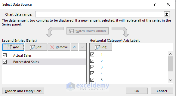
- Excel will add a new series.
- Click OK.
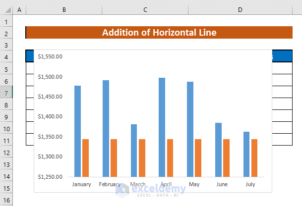
- You will see a new cluster of columns. These columns represent the forecasted sales. Our task is to convert these columns to a horizontal line.
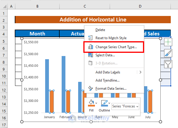
- Select the new columns.
- Right-click to open the menu.
- Select Change Series Chart Type.
- Change Chart Type window will appear.
- Select the type of Forecasted Sales as Line from the drop-down.
- Click OK.
- Excel will convert the columns into a horizontal line.
Read More: How to Add a Marker Line in Excel Graph
Things to Remember
- You can add horizontal lines to other types of graphs and charts, too.
Download the Practice Workbook
Download this workbook and practice.
Related Articles
- How to Shade Area Between Two Lines in a Chart in Excel
- How to Make a Forest Plot in Excel
- How to Create a Combination Chart in Excel
- How to Combine Two Graphs in Excel
- How to Create Column and Line Chart Combo in Excel
<< Go Back to Excel Combo Chart | Excel Charts | Learn Excel
Get FREE Advanced Excel Exercises with Solutions!
