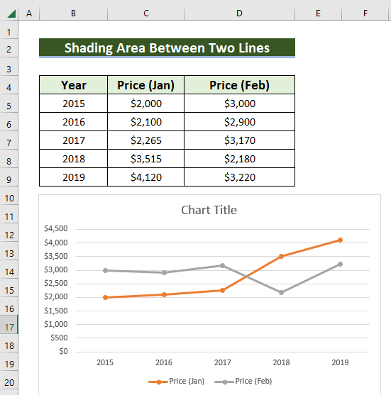
We will use the sample dataset below for illustration.
Step 1: Using Some Simple Formulas to Set Things Up
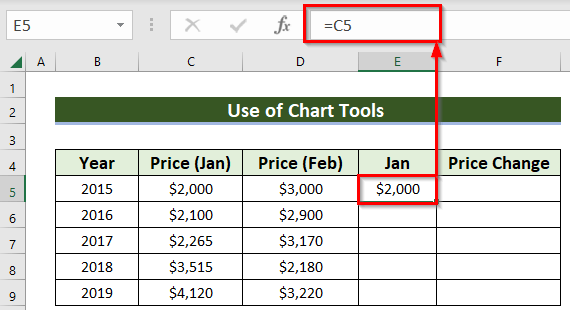
- In a new column, copy the Y-values of the first line, Price (Jan) column.
- Use this formula in the E5 cell.
=C5- Hit ENTER to get the result.
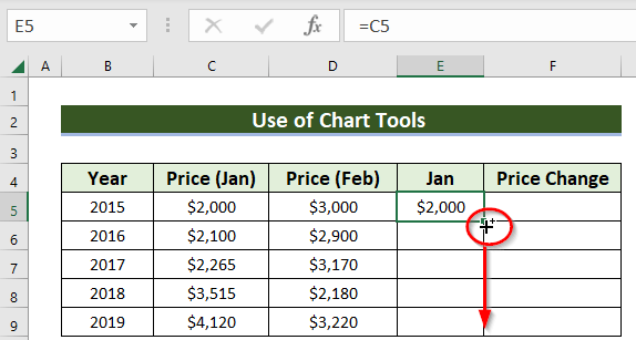
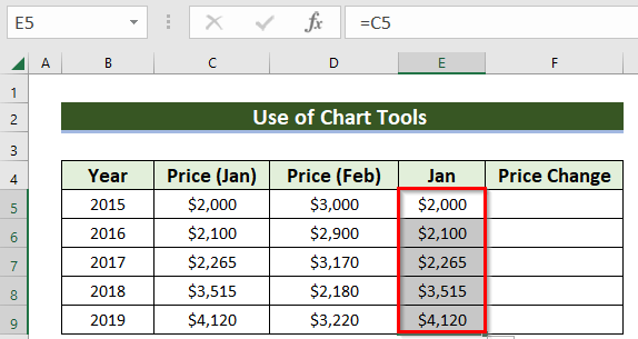
- Drag the Fill Handle to paste the formula to the other cells in the column.
It will generate all the values of Price (Jan) in the column named Jan.
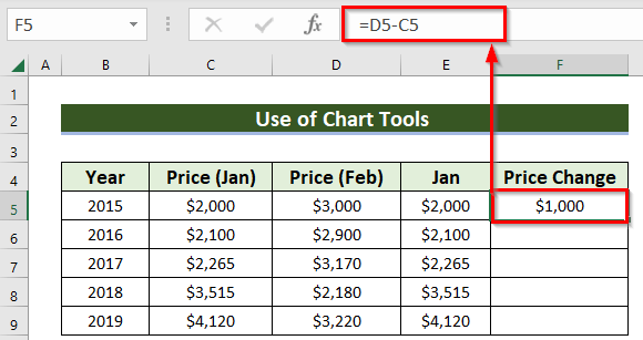
Now, we need to find the difference between the Y-values of the two lines.
- Use following formula in cell F5.
=D5-C5
- Hit ENTER to get the result.
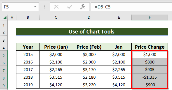
- Drag the Fill Handle to extend the formula to the other cells in the column. It will show all the price changes.
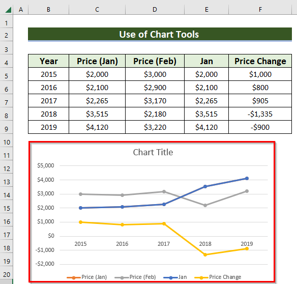
Step 2: Use of Context Menu Bar to Add More Lines in a Chart in Excel
- Right-click on the chart and choose Select Data from the context menu. Alternatively, you can find this option in the Chart Design tab if your chart is selected.
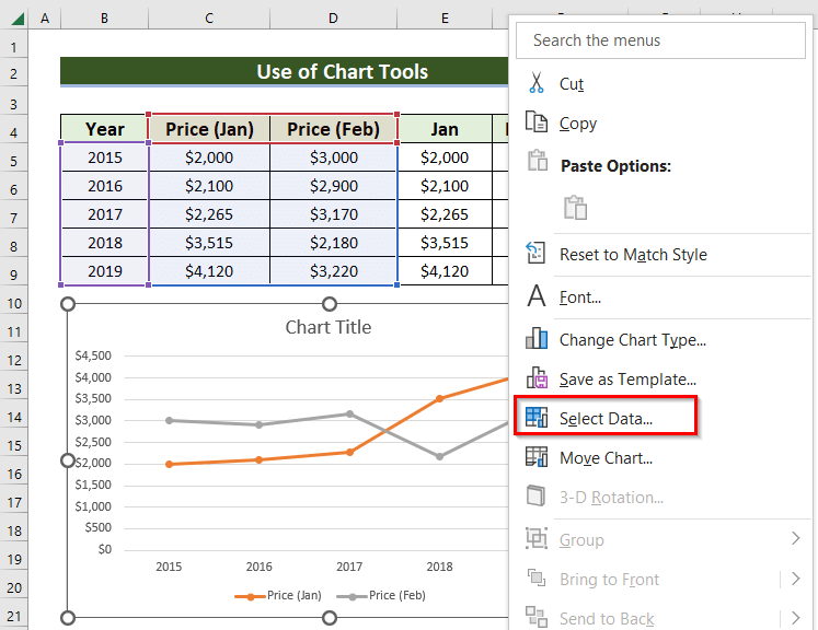
A dialog box named Select Data Source will pop up.
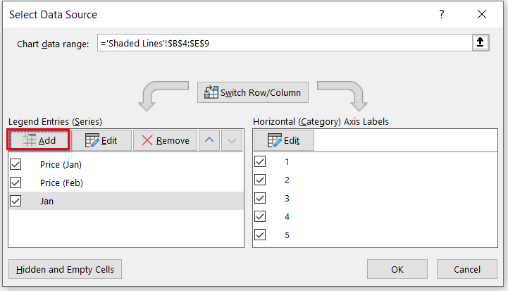
- In Select Data Source, choose the Add feature.
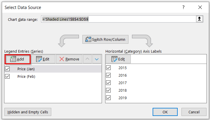
Another dialog box named Edit Series will pop up.
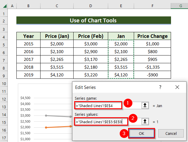
- Enter or select the Series name in that dialog box. In the example, we have selected the Series name as E4 cell.
- Enter the Series values. E.g. range E5:E9.
- Press OK.
- Again, select Add.
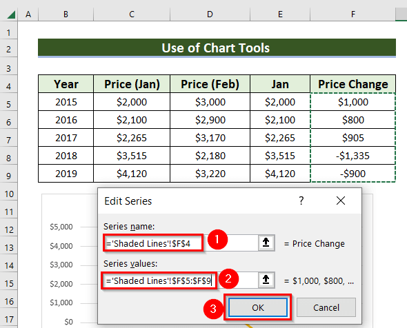
- In the Edit Series dialogue box, enter the required cell in Series name (e.g. F4 cell).
- Include the Series values. Here, I have used the range F5:F9.
- Press OK.
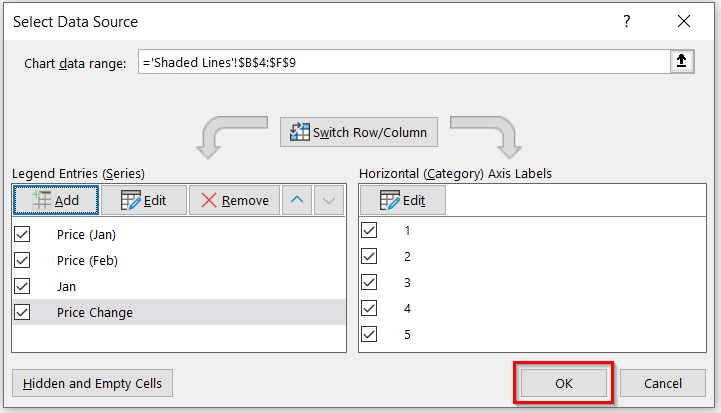
- Press OK on the Select Data Source box.
You will see the following lines.
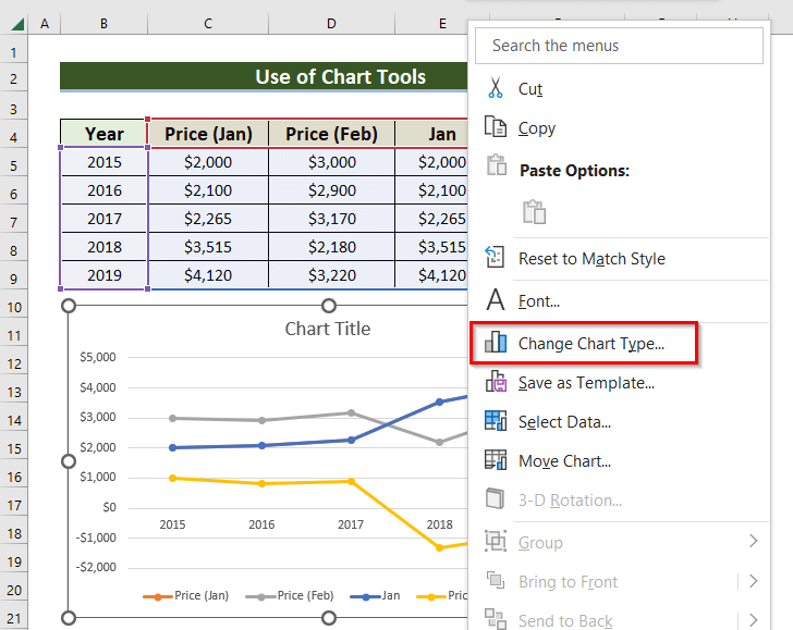
Step 3: Utilizing Change Chart Type Feature to Shade Area Between Two Lines in a Chart
- Right-click on the chart and select Change Chart Type.
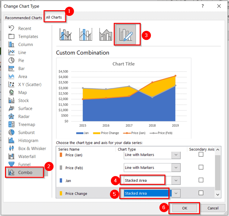
- In the Change Chart Type window, go to All Charts >> Combo chart >> select Custom Combination.
- Change the chart type for both the Jan and Price Change lines to Stacked Area.
- Press OK.
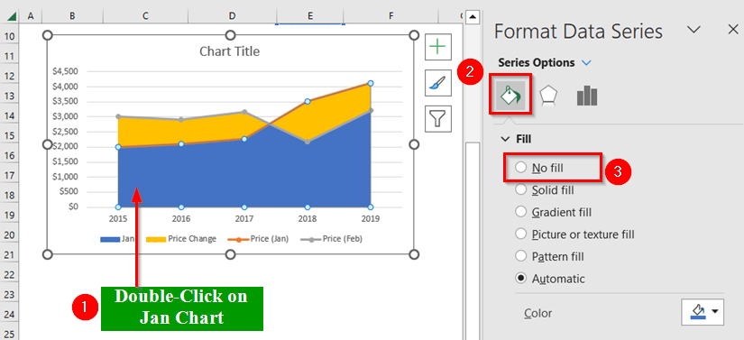
- Double-click on the Jan line to open the Format Data Series window.
- From the Series options >> go to the Fill & Line menu.
- From the Fill options >> select No fill.
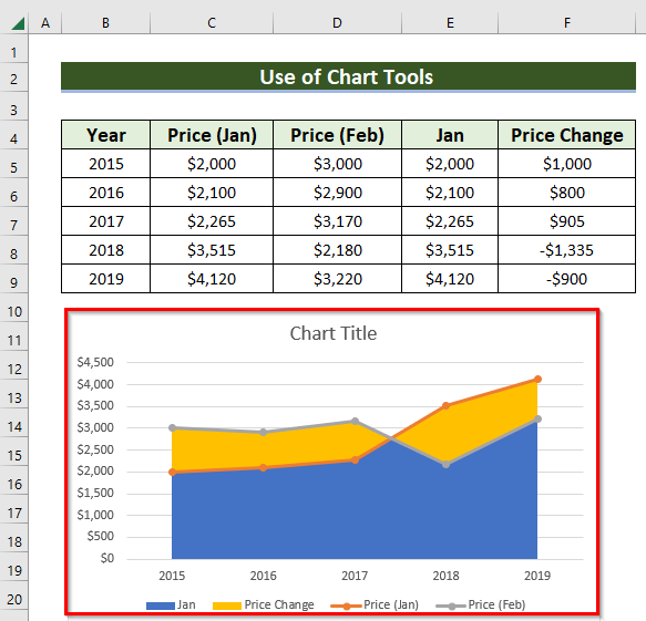
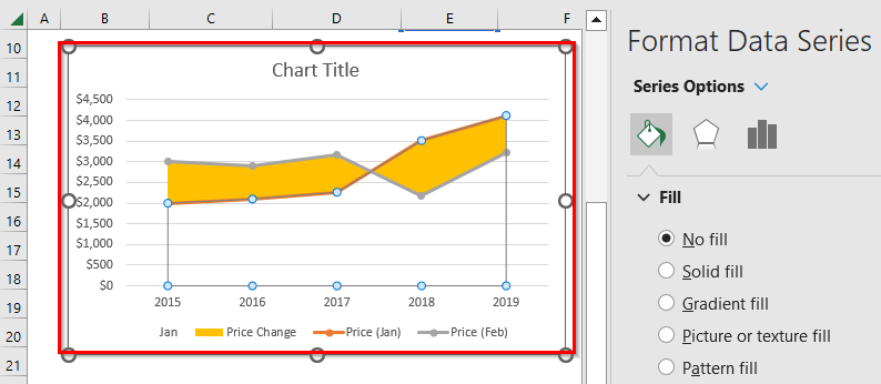
You will get the following output.
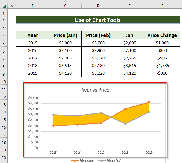
- Here, I have changed the chart title and deleted the Jan and Price Change lines.
So, the following is the final result.
Read More: How to Create a Combination Chart in Excel
Download Practice Workbook
Related Articles
- How to Combine Two Graphs in Excel
- How to Create Column and Line Chart Combo in Excel
- How to Draw Target Line in Excel Graph
- How to Draw a Horizontal Line in Excel Graph
- How to Make a Forest Plot in Excel
- How to Add a Marker Line in Excel Graph
<< Go Back to Excel Combo Chart | Excel Charts | Learn Excel
Get FREE Advanced Excel Exercises with Solutions!
