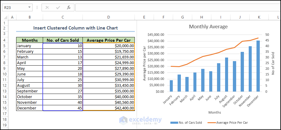
Step 1 – Insert the Clustered Combo Chart in the Worksheet
- Select all the columns from the given data set
- Go to the Insert tab and the Charts group.
- Select Combo and choose Clustered Column Line.
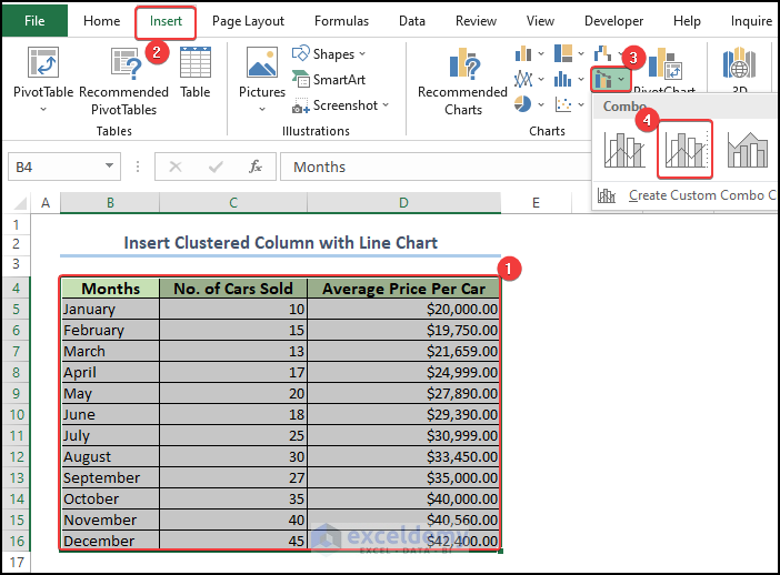
- This adds a chart to the sheet.
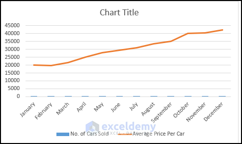
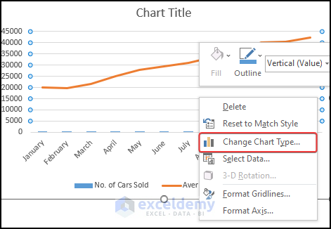
Step 2 – Change the Chart Type
- Right-click on the plot area and select Change Chart Type.
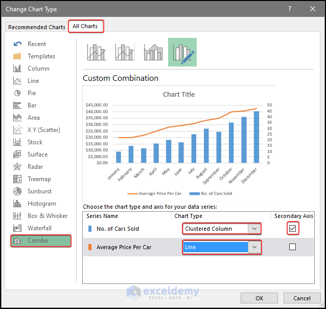
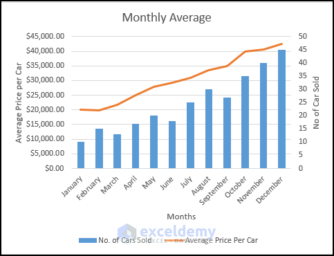
Step 3 – Set the Type of the Chart and Assign the Secondary Axis
- From the All Charts option, click on Combo at the bottom.
- Choose the Clustered Column Chart for the No of cars sold option.
- Check the Secondary Axis option.
- For the Average price of the car option, choose the Line chart.
- Press OK.
Step 4 – Final Form of the Combined Column and Line Chart
- The chart now has both the clustered column and the line type of chart in the worksheet.
- Add the chart title and the chart axis title to the chart.
- We now have the column chart with the line chart in the same plot area.
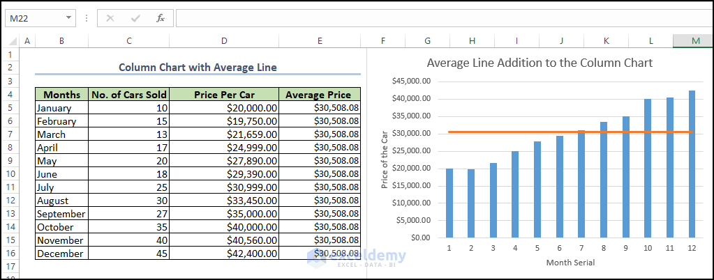
Draw an Average Line in the Excel Stacked Plot with a Column Chart
Steps
- Enter the following formula in cell E5:
=AVERAGE($D$5:$D$17)
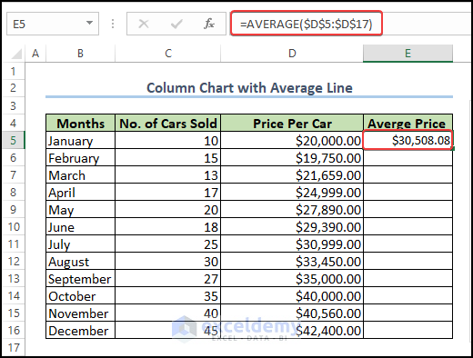
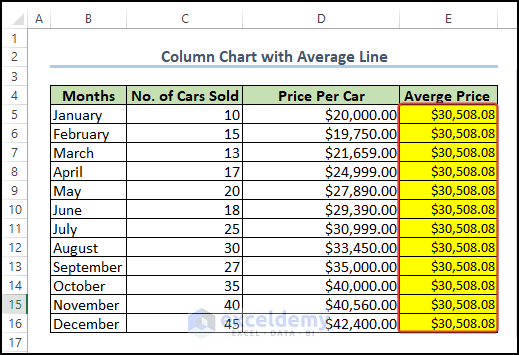
- Drag the Fill Handle to cell E16 to get the average of the car price for each month.
- Select the range of cell D4:E16 and then go to Insert tab and the Charts group.
- Choose Combo and pick Clustered Column.
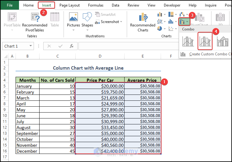
- You can preview how the chart is going to look after the chart type selection.
- There is an average line showing over the stacked column, denoting the average car prices over the months.
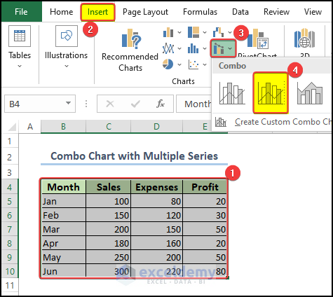
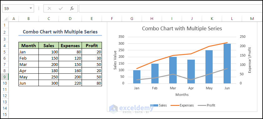
Create a Combo Chart in Excel with Multiple Data Series
Steps
- Select the range of cell B4:E10.
- From Insert and the Chart group, go to Combo Chart and pick Clustered Column with Line.
- There is a preview showing the chart with two separate columns and a line.
- Right-click on the chart and select Change Chart Type.
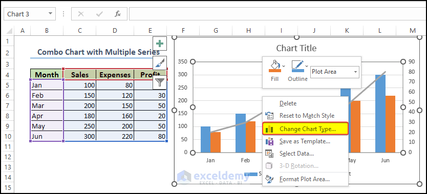
- You will get another window where you can set up the chart type and the axes.
- Select Combo chart and then select a Clustered chart.
- Set the Line type chart for the Expenses and the Profit.
- Check Profit and Expenses. These two values are going to be set on the same axis, which is the secondary axis.
- Click OK.
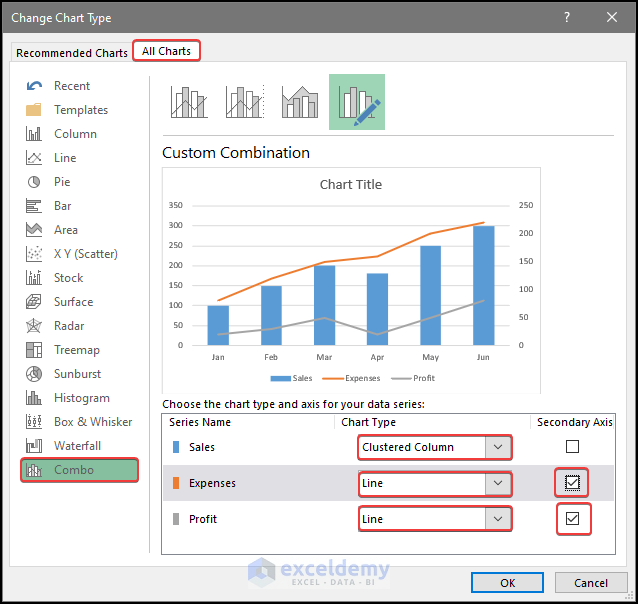
- The chart now has one column showing the Sales against the month in the primary axis, and two separate lines showing the Profit and Expenses against the Month in the secondary axis.
Read More: How to Combine Two Graphs in Excel
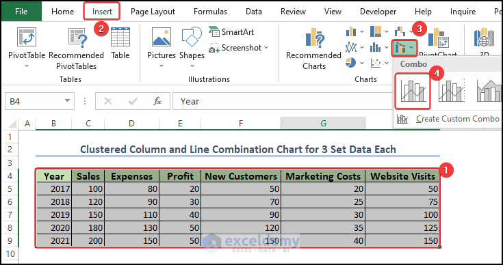
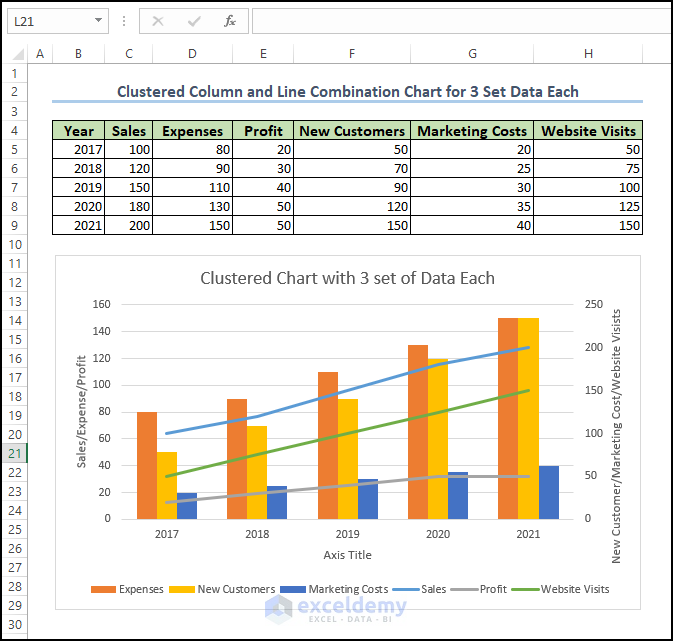
Create a Clustered Chart in Excel with Three Sets of Data
We’ll use the dataset below, containing the Year, the Expenses and Sales, New Customers, Marketing Costs, and the Website visits values.
Steps
- Select the range of cell B4:H9, go to the Insert tab and the Chart group.
- Select Combo Chart, then Clustered Column – Line.
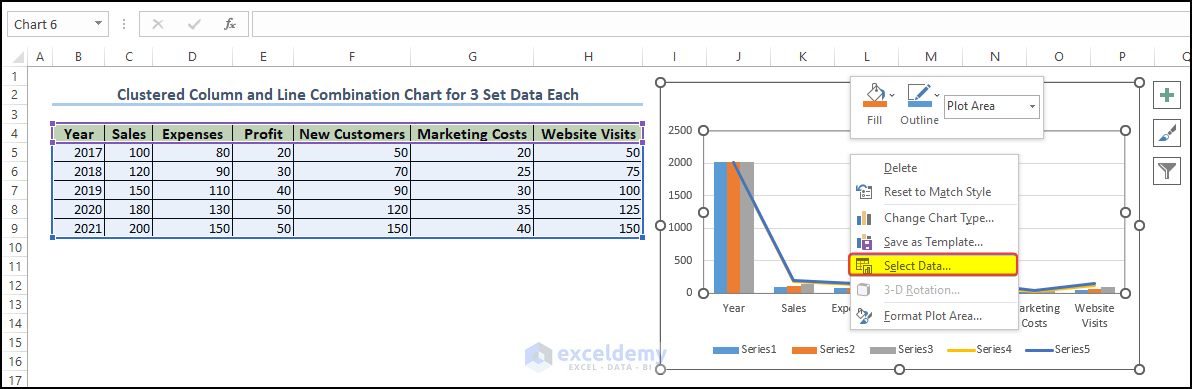
- Click on the plot area and then right-click on it.
- Pick Select Data.
- In the Select Data Source window, we can switch the Row with Columns.
- Click OK.
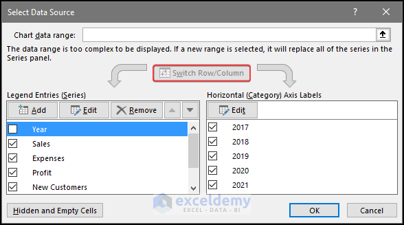
- After clicking OK, we can see that the row column is now switched.
- Click on the plot area and then right-click on it.
- Choose Change the Chart Type.
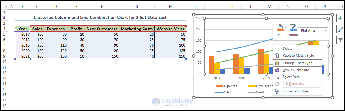
- There will be another window where you can set up the chart type and the axes.
- After setting the chart type and axis, click OK after this.
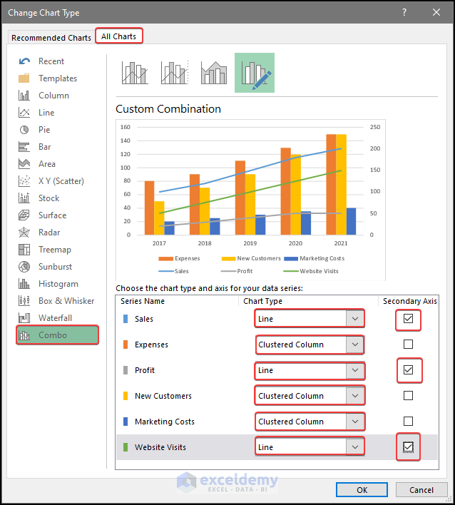
- After clicking OK, the chart now has 3 separate columns on the primary axis and three separate lines on the secondary axis.
Tips to Effectively Use Column and Line Charts in Excel
- Choose the right chart type: Column charts are best used for comparing data across categories or time periods, while line charts are best used for showing trends over time.
- Limit the number of data series: Too many data series on a chart can make it difficult to read and interpret. Stick to a maximum of 3-4 data series per chart.
- Label axes and data points clearly: Make sure that both the x-axis and y-axis are labeled clearly and that each data point is clearly labeled as well.
- Use colors wisely: Use colors to highlight important data or to differentiate between data series, but avoid using too many colors that can make the chart overwhelming.
- Minimize clutter: Remove unnecessary gridlines, axis ticks, and chart elements that don’t add value to the chart.
- Use data labels and callouts: Use data labels and callouts to highlight specific data points or to provide additional context for the data.
- Use a consistent format: Use a consistent chart format throughout your presentation or report to make it easy for readers to understand and compare data.
- Test and refine: Always test your chart with a sample audience and refine it based on their feedback to ensure that it effectively communicates your data.
Frequently Asked Questions
What is a Column and Line chart?
Line Chart: A line chart is a type of chart that displays data as a series of points connected by a line. It is commonly used to show trends over time or to compare multiple data sets. In Microsoft Excel, creating a line chart is relatively straightforward.
Column Chart: A column chart in Excel is used to visually represent data in columns or vertical bars. It is one of the most commonly used chart types in Excel. And it can be useful for a wide range of data analysis tasks.
A column chart in Excel is a commonly used chart type that displays data in columns or vertical bars. It is useful for a wide range of data analysis tasks, including comparing data, showing trends, highlighting differences, identifying patterns, and visualizing data. With Excel’s column chart features, users can customize the chart’s appearance and functionality to fit their specific needs. They can adjust the chart’s formatting, add labels and titles, and apply different colors and styles to the chart’s columns and markers. Excel’s built-in data analysis features can also be used to calculate and display additional information on the chart, such as averages or trends.
What are the advantages and disadvantages of a Line Chart?
Advantages:
- Line charts are useful for showing trends and changes over time. As the line connects data points in a series.
- They are easy to read and interpret, even for those who are not familiar with data analysis.
- Line charts can compare multiple data series on the same chart. Making it easy to identify patterns and trends across multiple data sets.
- They are flexible and can display a wide range of data types. Such as continuous data, categorical data, and date/time data.
- They can be easily customized to suit specific needs, with options for changing colors, labels, axes, and more.
Disadvantages:
- Line charts can be misleading if the data is not accurate or if the scale is not appropriate.
- They are not effective for showing data that has a lot of variability or noise, as the line may not accurately represent the data points.
- Line charts can be difficult to read if there are too many data series on the chart or if the data is too complex.
- They do not work well for data that is not continuous, such as data with large gaps or missing values.
- Line charts may not be the best choice for comparing data that has significant differences in magnitude or scale.
What type of data is presented in a Line Chart?
Line charts are typically used to display and visualize continuous data over time, such as stock prices, temperature changes, or population growth. They can show trends and changes in data that are not necessarily continuous, such as survey results over time or changes in sales revenue from month to month. Additionally, line charts can be used to compare data sets with similar units of measurement. Such as the performance of different products or the sales of a particular product in different regions. Overall, line charts are useful for visualizing and interpreting data that show trends or patterns over time.
What are the elements of a Line Chart?
- X-axis: This is the horizontal axis that represents the independent variable or the data category. Such as time, age, or other numerical or categorical data.
- Y-axis: This is the vertical axis that represents the dependent variable or the data values. Such as sales revenue, temperature, or other numerical data.
- Data points: These are the individual points that represent the specific data values for each data category or time period. They are on the chart using the x and y values.
- Line: This is the line that connects the data points on the chart. forming a continuous curve that represents the trend or pattern in the data.
- Legend: This is the key that explains what each line represents. Particularly useful when multiple data series are on the same chart.
- Gridlines: These are the horizontal and vertical lines that run across the chart and help the reader to better understand the data and follow the trend.
- Title: This is the name or description of the chart that typically provides a brief summary of what the chart is displaying.
- Axis labels: These are the labels that provide context to the data points. Indicating the units of measurement and scale for each axis.
Things to Remember
Choose the right chart type: There are many different types of charts available in Excel. Including column charts, bar charts, line charts, pie charts, and more. Choose the chart type that best represents the data you want to display.
Label your data: Make sure your data is clear with titles, axis labels, and data labels where appropriate. This makes it easier for viewers to understand the chart.
Use appropriate scaling: Choose an appropriate scale for your chart to ensure that it is easy to read and understand. Make sure the minimum and maximum values are appropriate for the data you are displaying.
Format your chart: Use formatting such as colors, fonts, and borders to make your chart visually appealing and easy to read. Use consistent formatting across all charts in a set to ensure they are easily comparable.
Consider using additional features: Excel has many additional features to help you create more complex charts. Such as trendlines, data labels, and error bars. Consider using these features to enhance your charts and make them more informative.
Check your data: Always double-check your data before creating a chart to ensure accuracy. Mistakes in data can lead to misleading charts.
Keep it simple: Avoid cluttering your chart with too much data or too many design elements. Simple charts are often the easiest to read and understand.
Update your chart: If your data changes, update your chart accordingly. This ensures that your chart always accurately represents your data.
Download the Practice Workbook
Related Articles
- How to Draw Target Line in Excel Graph
- How to Create a Combination Chart in Excel
- How to Make a Forest Plot in Excel
- How to Draw a Horizontal Line in Excel Graph
- How to Add a Marker Line in Excel Graph
- How to Shade Area Between Two Lines in a Chart in Excel
<< Go Back to Excel Combo Chart | Excel Charts | Learn Excel
Get FREE Advanced Excel Exercises with Solutions!
