Introduction to Target Line in Excel Graphs
When you want to compare performance against a specific goal, adding a target or goal line to an Excel bar graph can be quite useful. These lines can be horizontal for horizontal bar graphs or vertical for vertical bar graphs. By using target lines as benchmarks, individuals or organizations can visually assess the impact of their activities and determine whether any adjustments are necessary.
For example, if a sales team’s daily sales quota is 160, you can draw a goal line on the Y-axis starting from that number. This way, they can easily see if they’ve achieved their daily sales goal.
Dataset Overview
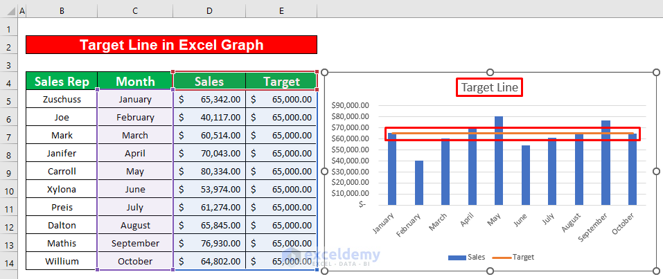
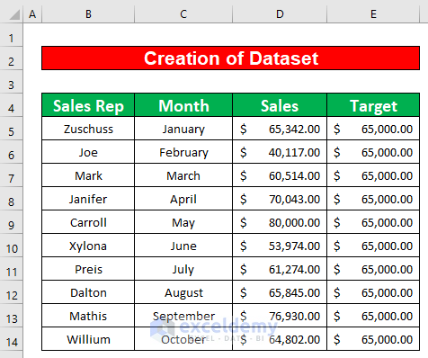
We’ll use a dataset that contains information about several Sales representatives of XYZ group. The Name of the Sales representatives, their sales in several months, and the sales target are given in columns B, C, D, and E respectively. From our dataset, we will set the target of sales as $65,000.00, and make a target line in an Excel graph. To do that, we will use the Insert ribbon as well as the Chart Design ribbon. Here’s an overview of the dataset for our task.
Step 1 – Creating a Dataset with Proper Parameters in Excel
- Create a dataset that contains sales data for several months, organized by sales representatives.
- Set the target sales value (e.g., $65,000.00) for the sales representatives.
Step 2 – Creating Graph from Dataset
- Use the Insert ribbon in Excel to import a graph from your dataset.
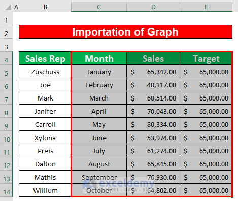
- Select the range of data you want to include in the graph (e.g., C4 to E14).
- Go to Insert, select Charts and click on the 2-D Column option.
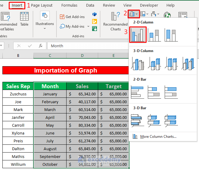
This will create a graph based on the dataset.

Step 3 – Drawing the Target Line in Excel Graph
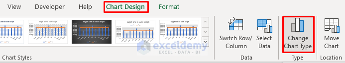
- Navigate to the Chart Design ribbon.
- Click on Type and select Change Chart Type. A dialog box will appear.
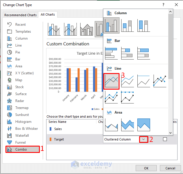
- In the dialog box, choose Combo.
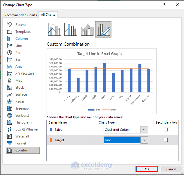
- From the Clustered Column drop-down list, select the Line option.
- Press OK to apply the changes.
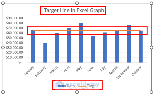
By following these steps, you’ll successfully draw a target line in your Excel graph. Refer to the screenshot below for a visual representation.
Things to Remember
- The #N/A! error occurs when a formula or function fails to find the referenced data.
- The #DIV/0! error happens when a value is divided by zero 0 or the cell reference is blank.
Download Practice Workbook
You can download the practice workbook from here:
Related Articles
- How to Draw a Horizontal Line in Excel Graph
- How to Add a Marker Line in Excel Graph
- How to Shade Area Between Two Lines in a Chart in Excel
- How to Create a Combination Chart in Excel
- How to Combine Two Graphs in Excel
- How to Create Column and Line Chart Combo in Excel
- How to Make a Forest Plot in Excel
<< Go Back to Excel Combo Chart | Excel Charts | Learn Excel

