Example 1 – Adding a Marker Line in a Line Chart
Steps:
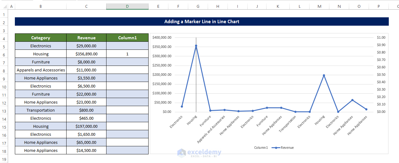
- Select cell D5 and enter the following formula:
=IF(MAX($C$5:$C$18)=$C5,1,"")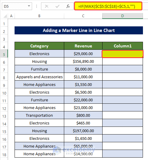
- Drag the Fill Handle to cell D18. This will search for the maximum value and compare each cell value with the maximum value.
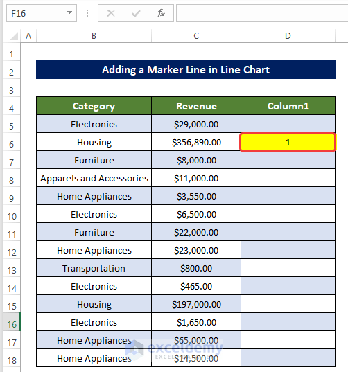
- A 1 will be on the side of the maximum value.
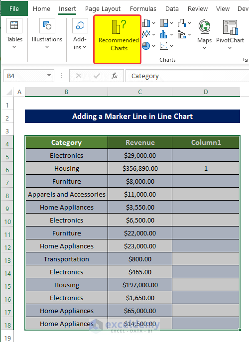
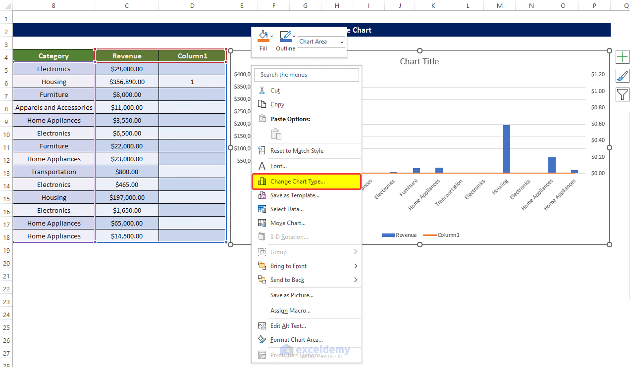
- Select the whole data range B4:D18 and then go to Insert Tab > Charts group.
- Click on the Recommended Charts.
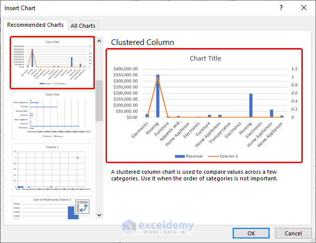
- A new window will open.
- Select the Clustered Column chart as shown in the image below.
- Click OK.
You will see a new chart with the Columns (Revenue) and Line (Column 1) present.
- Right-click on the chart and select Change Chart Type.
- A new window will open.
- Select the Chart Type for the Revenue as Line with Markers.
- Set chart type for Column 1 as Clustered Column.
- Click OK.
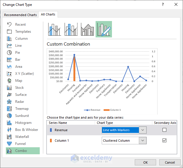
The chart is now modified according to our settings.
- Right-click on the rightmost axis.
- From the context menu, click on the Format Axis.
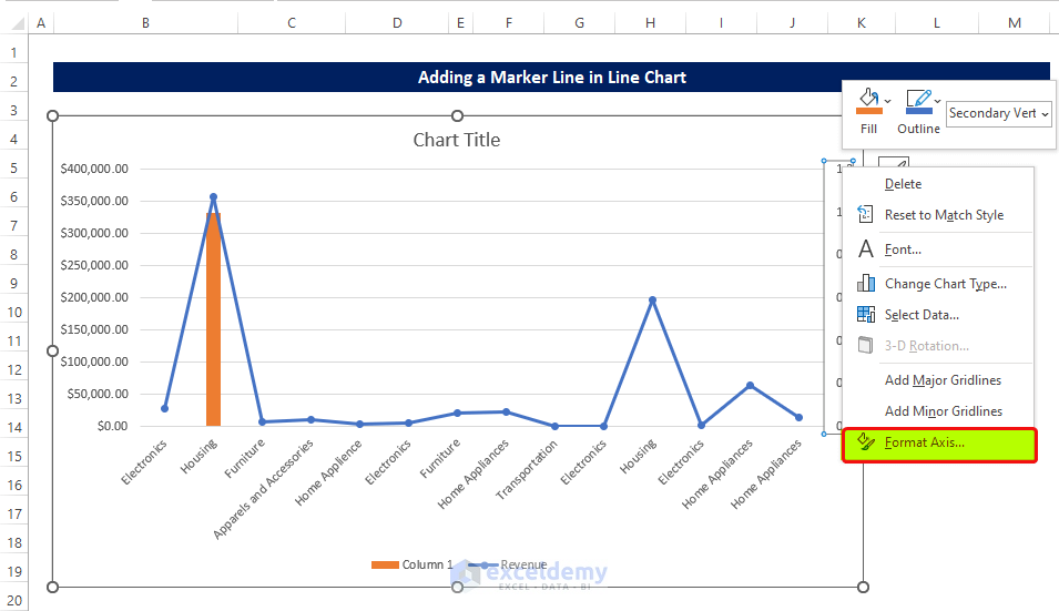
- In the Format Axis side panel, go to the Axis Options and set the Maximum value as 1.
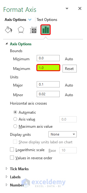
The column has now touched the ceiling of the chart.
- Click on the plus sign on the side of the chart and Error Bars > More Options.
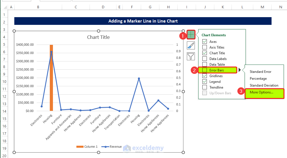
- A new dialog box named Add Error Bar will open.
- Click on Column 1 and then click OK.
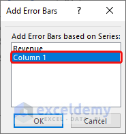
- A new side panel will open on the right side of the sheet.
- Select Minus from the Vertical Error Bar.
- Set the percentage to 100% in the Error Amount.
The chart now has a vertical line to the top of the ceiling.
- Select the column and right-click on it.
- From the context menu, click on the Format Data Series.
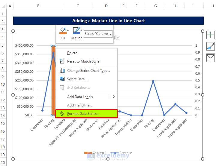
- In the side panel, select No Fill in the Fill Options.
- And No Line in the Border options.
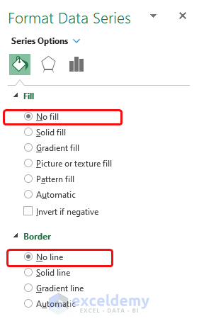
You will see the marker line added for the maximum value in your Excel graph.
Read More: How to Draw Target Line in Excel Graph
Example 2 – Adding a Marker Line in a Scatter Plot
Steps
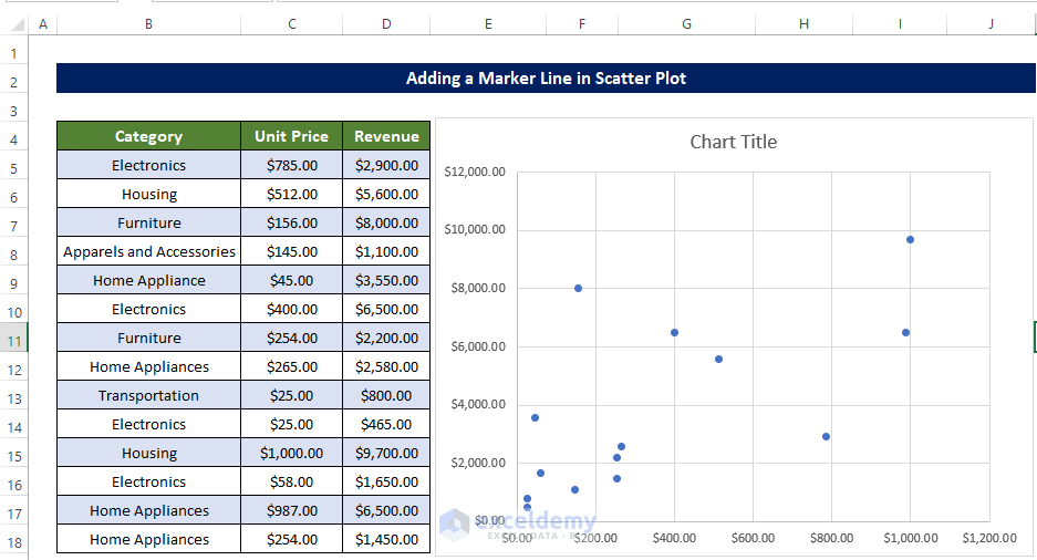
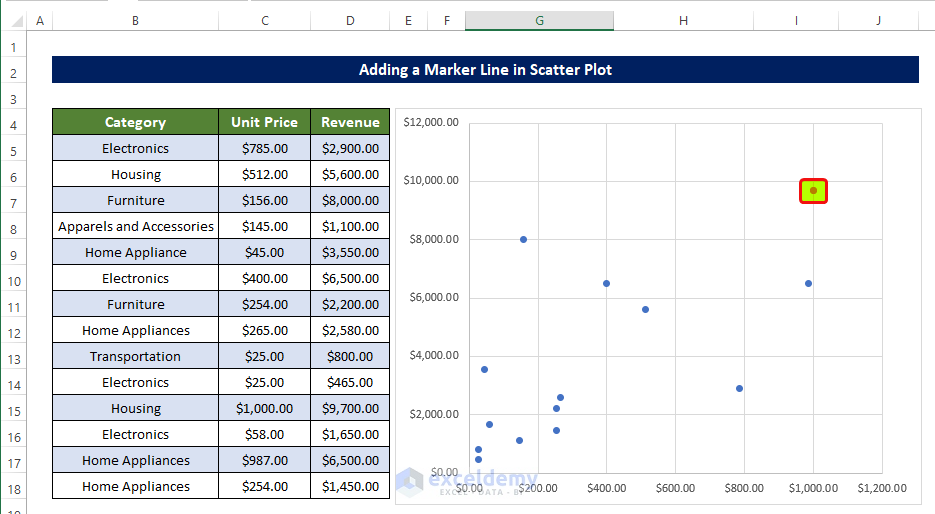
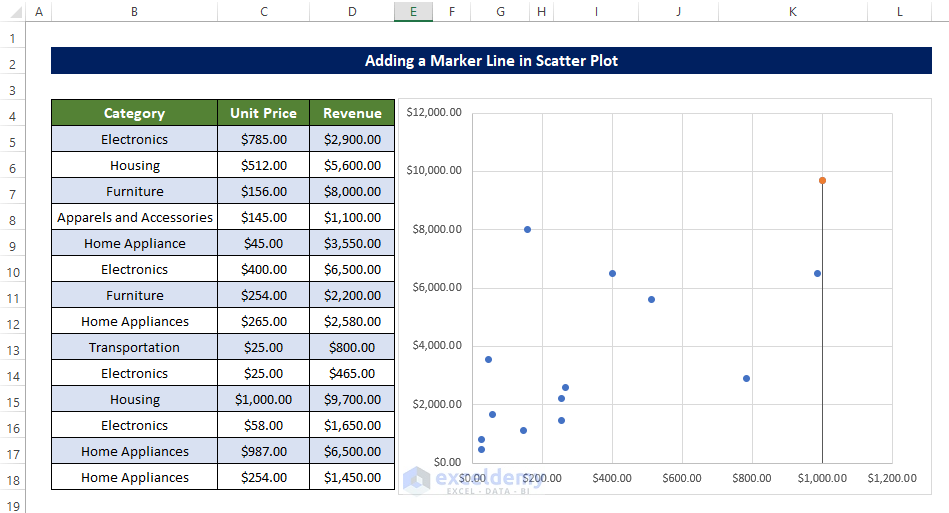
- Select the range of cells B5:D18 and create a scatter plot.
The scatter plot will look like the below image.
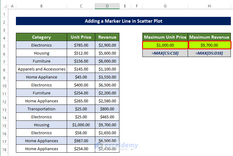
- Select cell G5 and enter the following formula:
=MAX(C5:C18)
- Select cell H5 and enter the following formula:
=MAX(D5:D18)
- Right-click on the chart, and from the context menu, click on Select Data.
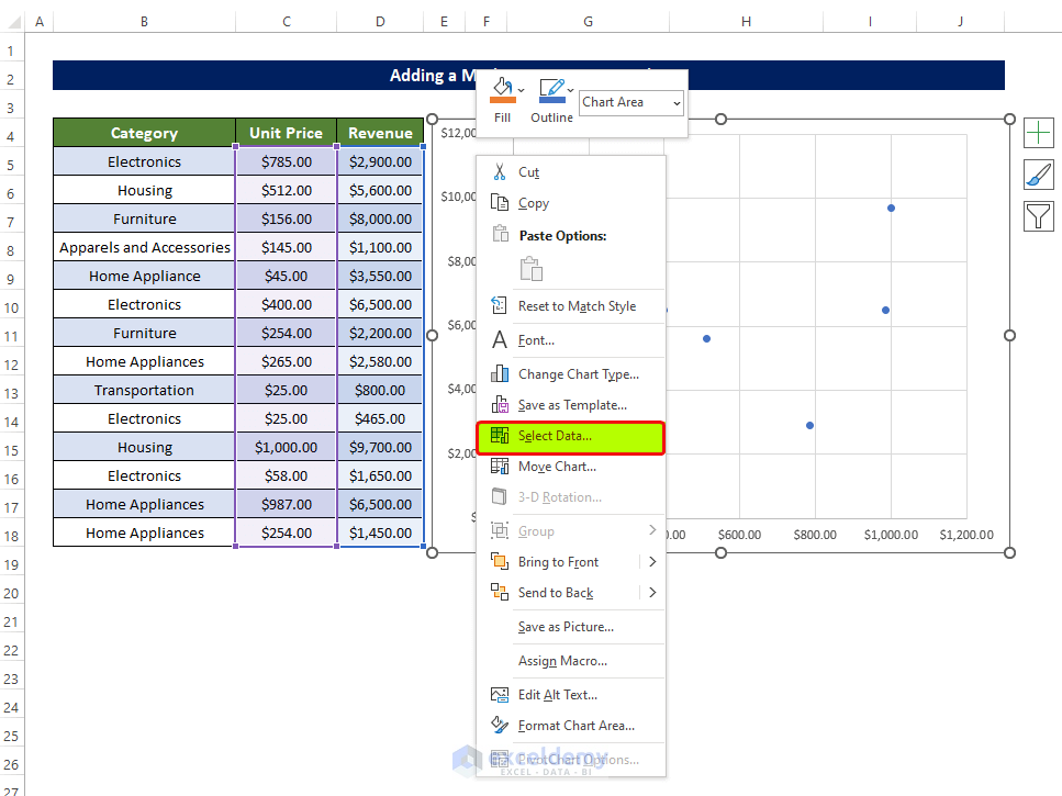
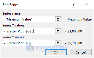
- Select the cell G5 in the Series X values.
- Select cell H5 in the Series Y values.
- Click OK.
You will see the data point in the chart in orange.
- Select the newly added data point and click on the Plus Sign.
- Go to Error bars > Percentage.
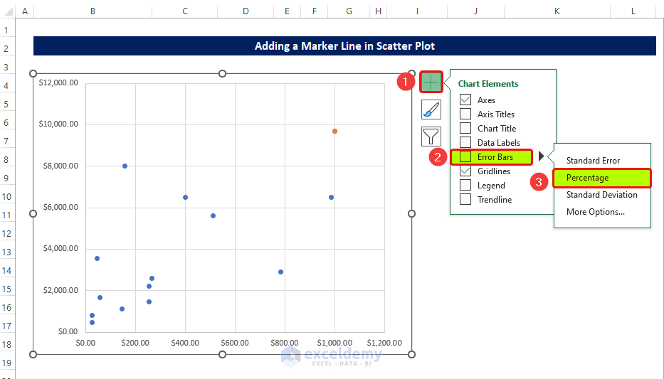
The data point shows two error bars, one in the vertical direction and another in the horizontal direction.
- Click on the Horizontal Error bar and right-click on it.
- From the context menu, click on the Format Error Bar.
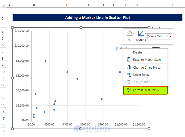
- A new side panel named Format Error Bar will appear.
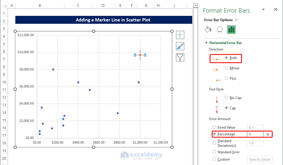
- From that panel, select Both in the Direction options.
- Set the Percentage to 0% in the Error Amount.
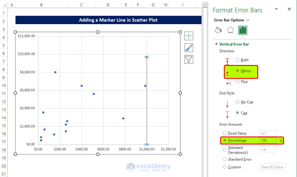
- Select the Vertical Error bar without closing the side panel.
- Select Minus in the Direction option.
- Set the Percentage to 100% in the Error Amount.
The chart shows the marker line, which marks the Maximum values of both the Unit Price and revenue values.
Read More: How to Draw a Horizontal Line in Excel Graph
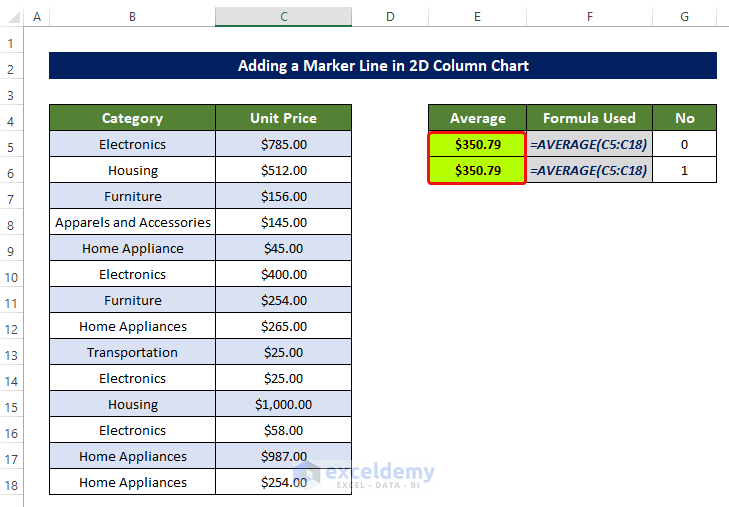
Example 3 – Adding a Marker Line in a 2D Column Chart
Steps
- Select cell E5 and enter the following formula:
=AVERAGE(C5:C18)- Repeat the same process for cell E6.
- Input 0 in cell G5 and input 1 in cell G6.
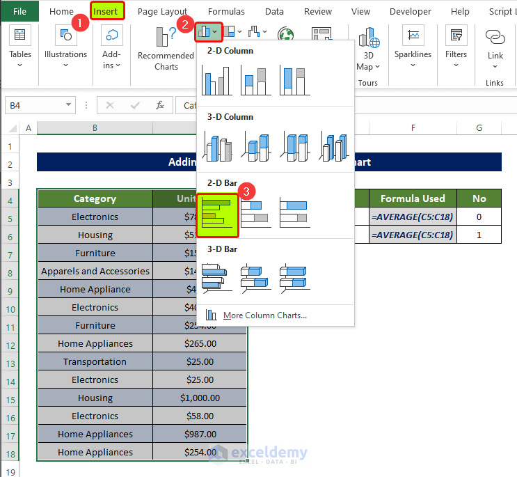
- Select the range of cells B4:C18, and go to Insert tab > Charts group.
- Click on the 2-D Bar.
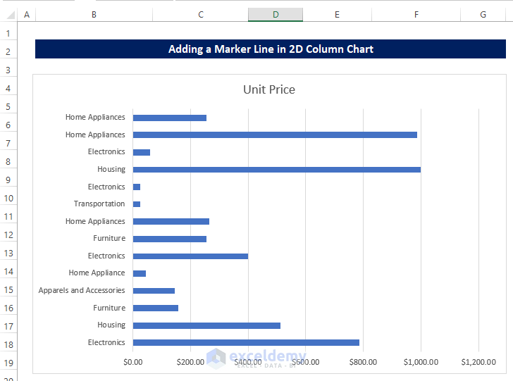
- You will notice a 2-D bar chart about the price of products.
- Select the 2-D chart, and we will see that there is a chart demonstrating the price of the products.
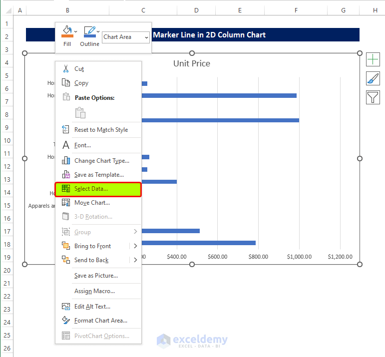
- Select the chart and right-click on it.
- From the context menu, click on Select Data.
- Click on the Add Button in the following dialog box.
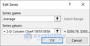
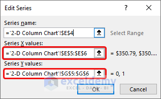
- In the Edit Series dialog box, select E5:E6 in the Series Values range box.
- Click OK.
- You will see the Average value in the chart.
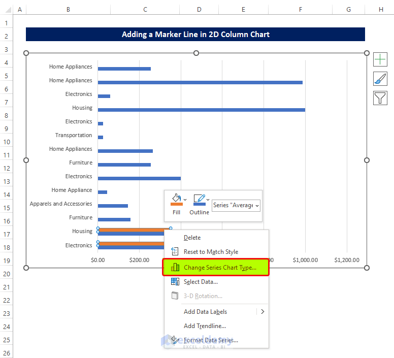
- Select the average data bar and right-click on it.
- From the context menu, click on the Change Series Chart Type.
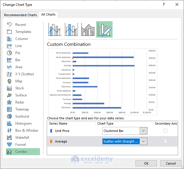
- In the change chart type window, select Clustered Bar in the Unit Price.
- Select Scatter with Straight Line in the Average.
- Click OK.
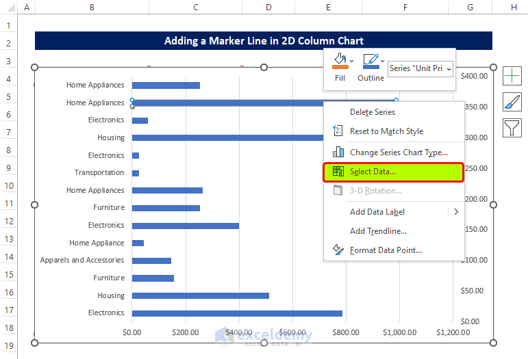
- Select the dataset and right-click on it.
- From the context menu, click on Select Data.
- There will be a new dialog box named Select Data Source.
- Click the previously created Average.
- Click Edit.
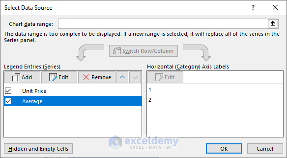
- In the Edit Series dialog box, select E5:E6 in the Series X values.
- Select G5:G6 in the Series Y values.
- Click OK.
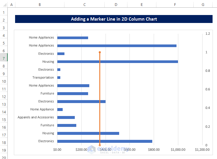
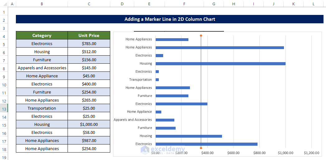
You will see that an orange line marks the Average of the Products’ Unit Prices.
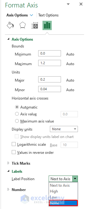
- Right-click on the axis, and from the side panel, click on the labels
- From the position of the label, select None from the drop-down menu.
We get the marker line that will denote the Average value of the Product prices.
Read More: How to Shade Area Between Two Lines in a Chart in Excel
Download the Practice Workbook
Download this practice workbook below.
Related Articles
- How to Create a Combination Chart in Excel
- How to Combine Two Graphs in Excel
- How to Create Column and Line Chart Combo in Excel
- How to Make a Forest Plot in Excel
<< Go Back to Excel Combo Chart | Excel Charts | Learn Excel

